

YLaw website analysis
A detailed critique of the homepage's craft, originality, usability, and ability to move visitors toward its intended goal.
Our observations
A visually distinctive and commercially credible legal homepage with strong brand personality, but it requires substantial accessibility and information-hierarchy remediation before it can be considered an exemplary gallery reference.
Best practices
The page covers many expected trust and decision-support elements, including services, team members, client feedback, awards, offices, case victories, and consultation calls to action. Structural and accessibility quality is significantly weaker than the visual polish.
What works
- Clear legal-service coverage across family, employment, immigration, estate litigation, and strata law.
- Includes trust-building content such as awards, client feedback, lawyer profiles, offices, and case victories.
- Has one main landmark and a recognizable primary consultation action.
- Provides search and location-finding functionality.
Opportunities
- Resolve 43 links without accessible names, the missing image alternative, and three controls or fields without labels.
- Address the 70 reported text-contrast failures, especially links and content over light or photographic surfaces.
- Remove duplicate IDs, correct the skipped heading level, and consolidate the two H1 elements into a coherent document outline.
- Audit carousel, accordion, search, and map controls for keyboard focus, state announcements, and usable names.
Design
The homepage has a memorable, high-energy visual identity that makes the firm feel human and established. Its impact is reduced by the very long scroll, dense content regions, and inconsistent legibility across supporting text.
What works
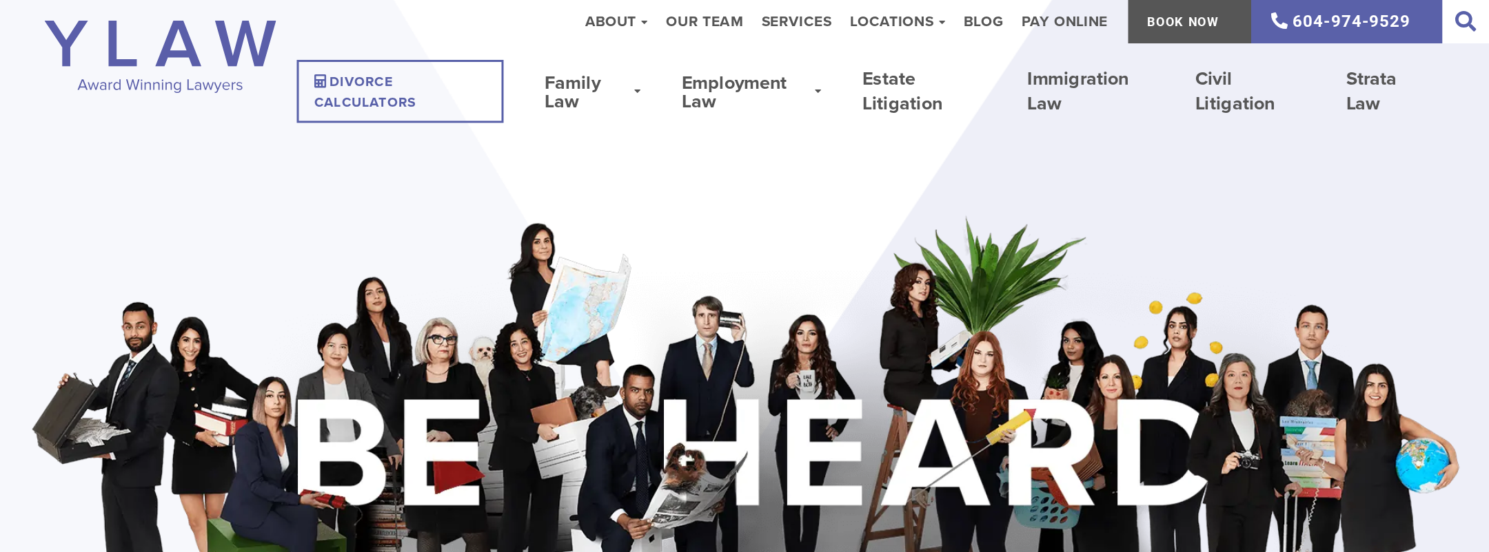
- The “Be Heard” hero creates an immediate and relevant emotional proposition for a legal audience.
- Large section titles create recognizable chapters in an otherwise extensive page.
- Portrait photography and team grids make the firm’s scale and people visible.
- Indigo, lavender, white, and charcoal form a coherent brand palette with a clear action color.
Opportunities
- Reduce competing visual layers in long sections and give the consultation path more persistent emphasis.
- Improve the typographic scale and line length for dense explanatory content.
- Use a more controlled treatment for award marks, lawyer portraits, and repeated profile content so the page feels less crowded.
- Reserve oversized display headings for the most important transitions and strengthen intermediate hierarchy.
Uniqueness
The page is more distinctive than a typical law-firm template because it combines a people-centered campaign aesthetic with a highly visible team, outcomes, and community-oriented presentation.
What works
- The group-photo hero and “Be Heard” positioning create a recognizable identity.
- The unusually prominent lawyer portrait system supports a collaborative, human brand impression.
- The sequence from strategic positioning to team, victories, testimonials, and connection feels tailored to this firm’s story.
Opportunities
- Translate the distinctive visual identity into a simpler service-selection experience so originality does not depend on page length.
- Make the firm’s specific differentiators more scannable near the first consultation decision point.
- Ensure awards and case-victory content is clearly contextualized rather than functioning primarily as visual credibility signals.
User experience
The page appears to offer broad information coverage, but the quantity of navigation, profiles, links, carousels, and location content creates substantial cognitive and accessibility friction. The supplied evidence does not establish successful task completion or user testing.
What works
- Visitors can find multiple routes to services, lawyers, consultation, offices, and contact information.
- The service categories are visibly separated and the team section exposes substantial expertise.
- The location finder and map support visitors who need an office-specific next step.
- Animated section reveals create a sense of progression in the long narrative.
Opportunities
- Provide a compact “choose your legal issue” pathway near the hero with direct service destinations.
- Reduce or progressively load the full lawyer directory and secondary content on the homepage.
- Make carousel controls, accordion states, search controls, and award links fully descriptive and keyboard-operable.
- Verify that animations do not delay access to essential content and honor reduced-motion preferences.
Conversion optimization
For a law-firm acquisition page, YLaw provides credible conversion ingredients and repeated consultation/contact opportunities. Conversion clarity is diluted by competing navigation and by the lack of a tightly prioritized first-step journey.
What works
- The hero includes a direct contact action, while a later section presents a prominent consultation action.
- Awards, client feedback, lawyer profiles, and victories provide several forms of social proof.
- Office details, phone access, and location search support local-intent visitors.
- The service breadth can capture visitors with several different legal needs.
Opportunities
- Place a concise consultation or triage action adjacent to each major service group.
- State what the initial consultation involves, who it is for, and what information a visitor should prepare.
- Use a consistent primary CTA label and stronger visual priority across the header, hero, and service sections.
- Reduce navigation and footer competition around the primary consultation path, especially on mobile.
What we'd improve
- 01high
Repair the accessibility foundation
Give every linked award, logo, icon control, image, search field, and location control an accessible name or appropriate alternative text. Fix the 70 contrast failures, duplicate IDs, heading-level skip, and multiple H1 structure, then retest with keyboard and screen-reader checks.
- 02high
Create a direct legal-needs pathway
Add a compact decision module near the hero that routes visitors by legal issue—such as family, employment, immigration, estate, or strata law—to a dedicated service page and consultation action.
- 03high
Strengthen consultation clarity
Explain the initial consultation in plain language, including intended audience, expected next step, and key preparation details. Keep one consistent primary action visible in the header and at major service transitions.
- 04medium
Reduce homepage density
Move the full lawyer directory, selected case material, and secondary affiliations behind focused pages or progressive disclosure. Retain a representative subset on the homepage with clear links to explore more.
- 05medium
Audit interactive content and motion
Test accordions, sliders, search overlays, the location finder, and animated reveals for keyboard operation, focus visibility, state announcements, loading behavior, and reduced-motion support.
- 06low
Refine the visual hierarchy
Preserve the strong editorial photography and indigo identity while reducing oversized heading repetition, tightening long text blocks, and improving legibility on light and image-based backgrounds.