

Visitors website analysis
A detailed critique of the homepage's craft, originality, usability, and ability to move visitors toward its intended goal.
Our observations
Visually strong and commercially complete, but not ready for an accessibility-focused gallery without remediation of serious contrast, naming, landmark, and document-structure issues.
Best practices
The page demonstrates strong marketing fundamentals but has substantial accessibility and semantic implementation problems.
What works
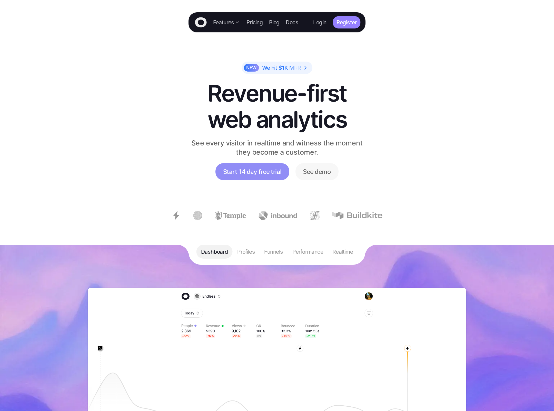
- One clear h1 establishes the product proposition.
- The page includes a broad information architecture covering features, comparison, pricing, FAQs, and footer navigation.
- The primary free-trial action is prominent and repeated.
- The layout appears to use responsive grid variants and a dedicated comparison-table treatment.
Opportunities
- Fix the reported 77 contrast failures, prioritizing text and CTA states that are difficult to distinguish.
- Add accessible names to the seven unnamed links and labels to interactive map marker buttons.
- Resolve duplicate IDs and heading-level skips, and add a proper main landmark.
- Verify focus visibility, keyboard order, and reduced-motion behavior in interactive sections.
Design
A cohesive, polished SaaS visual system with strong product visualization and disciplined use of accent color.
What works
- The dashboard preview gives the hero immediate product credibility.
- Rounded cards, soft borders, compact interface previews, and generous whitespace create a consistent visual language.
- The purple-blue hero atmosphere provides a recognizable focal point without overwhelming the interface.
- The page maintains a clear visual rhythm across feature, comparison, pricing, and FAQ sections.
Opportunities
- Increase the visual prominence of proof points such as customer outcomes, privacy assurances, or recognizable trust signals.
- Review the smallest gray labels and metadata for legibility against their backgrounds.
- Introduce slightly more variation between repeated card sections so the long page feels less templated.
Uniqueness
The page is more distinctive than a generic SaaS template because of its atmospheric hero and product-specific analytics visualizations, though its overall section sequence remains familiar.
What works
- The combination of revenue attribution, visitor profiles, live activity, and map visualizations gives the product story a specific point of view.
- The hero gradient and embedded dashboard treatment create a recognizable first impression.
- The comparison and pricing sections feel integrated into the product narrative rather than appended.
Opportunities
- Develop a more ownable brand motif beyond gradients, rounded panels, and dashboard screenshots.
- Use a stronger original storytelling device for privacy or revenue attribution to differentiate the category positioning.
User experience
The page offers a logical path from proposition to evaluation, but accessibility defects and a long, dense scroll reduce confidence in inclusive usability.
What works
- Navigation exposes core destinations including features, pricing, blog, and documentation.
- The page answers common evaluation questions before the final CTA.
- Feature cards and dashboard previews support both quick scanning and deeper product inspection.
- The CTA pair distinguishes immediate trial intent from users who prefer a demo.
Opportunities
- Create explicit semantic landmarks and correct the heading hierarchy to improve orientation for assistive-technology users.
- Make every icon-only or image-based link understandable without relying on visual context.
- Ensure map markers have useful accessible labels and an alternative non-map representation of the same information.
- Test the full page at narrow widths and with keyboard-only navigation, especially the comparison and pricing sections.
Conversion optimization
The page is well structured for trial consideration, with a clear value proposition, product proof, comparison, pricing, FAQs, and repeated calls to action.
What works
- The free-trial CTA is visible in both the header and hero.
- The hero communicates a business outcome rather than only describing a feature set.
- Product screenshots reduce ambiguity about what the buyer receives.
- Comparison, pricing, and FAQs address several common purchase objections.
Opportunities
- Place a concise privacy or data-handling reassurance closer to the first CTA, since privacy is central to the apparent positioning.
- Add more specific evidence near the conversion path, such as quantified outcomes, customer attribution, or a clear no-credit-card statement if applicable.
- Use descriptive accessible names for logo and customer links so trust signals remain meaningful beyond the visual presentation.
- Validate whether the long page retains CTA visibility and comprehension on mobile.
What we'd improve
- 01high
Remediate the accessibility foundation
Correct the reported contrast failures, add a main landmark, repair heading order, provide accessible names for all links and map controls, and remove duplicate IDs. Re-run automated and manual keyboard checks after remediation.
- 02high
Strengthen the first conversion moment
Pair the hero CTA with a compact privacy/data-handling reassurance and one concrete trust signal. Keep the trial action primary while making the demo path clearly secondary.
- 03medium
Improve semantic alternatives for visual product demos
Provide meaningful accessible summaries for dashboard, map, and comparison visuals, including a non-map alternative for location-based information and descriptive labels for interactive controls.
- 04medium
Review responsive density
Test the fixed header, dashboard previews, comparison table, pricing panel, FAQ rows, and CTA wrapping across narrow widths and increased text sizes. Prevent small labels from becoming clipped or low contrast.
- 05low
Build a more ownable brand signature
Extend the visual identity beyond the purple-blue gradient with a distinctive privacy or revenue-attribution motif that can recur across product marketing and documentation.