

Slopes website analysis
A detailed critique of the homepage's craft, originality, usability, and ability to move visitors toward its intended goal.
Our observations
Visually excellent and distinctive, but accessibility defects are material enough to require remediation before publication.
Best practices
The page demonstrates strong landing-page fundamentals but falls short on accessible structure and content alternatives.
What works
- Clear single H1 and a recognizable product purpose above the fold.
- Prominent platform-specific download calls to action appear in the hero and closing section.
- Feature, trust, and footer content provide a reasonably complete product narrative.
- No duplicate IDs were detected in the supplied audit.
Opportunities
- Add descriptive alternative text to the ten identified images, including product screenshots and decorative imagery treatment where appropriate.
- Provide accessible names for the seven identified links, particularly app-store and footer links.
- Correct the heading-level skip and introduce a semantic main landmark.
- Audit the 28 reported contrast failures, especially blue labels, light text, and small supporting copy.
Design
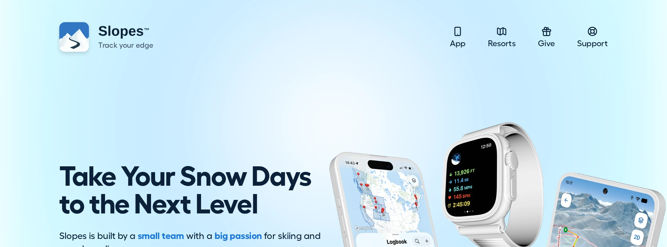
A cohesive and polished visual system makes the product feel credible, energetic, and closely connected to its alpine use case.
What works
- Strong consistency across gradients, topographic textures, device mockups, and blue accents.
- The hero composition communicates a mobile product immediately without relying on dense interface chrome.
- Alternating feature layouts create visual variety while retaining a common editorial rhythm.
- The blue closing panel provides a clear visual endpoint and reinforces the primary action.
Opportunities
- Reduce some of the large vertical gaps between feature bands to improve pacing and content density.
- Increase the visual size or legibility of supporting copy where it competes with detailed device imagery.
- Consider adding more distinctive brand or illustration moments beyond the recurring map-and-device pattern.
Uniqueness
The alpine mapping context is expressed with more specificity than a generic app landing page, though the device-mockup convention is familiar.
What works
- Topographic linework and route visualizations provide a relevant, ownable visual metaphor.
- The combination of phone, watch, trail, and resort imagery connects tracking features to real outdoor use.
- The page maintains a recognizable snow-inspired atmosphere throughout rather than switching to unrelated visual styles.
Opportunities
- Develop a more singular signature element that can identify Slopes without the logo or screenshots.
- Use the testimonial photography and route data to create stronger narrative moments rather than treating them mainly as supporting decoration.
User experience
The information architecture is understandable and the primary task is easy to find, but audit findings create significant barriers for users of assistive technology and users affected by low contrast.
What works
- The page follows a familiar progression from product promise to features, benefits, social proof, and download action.
- Repeated store badges reduce the need to return to the top to install the app.
- Feature headings are concise and benefit-oriented.
Opportunities
- Resolve missing image alternatives and link names before release; these affect core product and download content.
- Improve text contrast and verify legibility at actual mobile sizes, not only in the desktop composition.
- Add semantic landmarks and repair heading order to support screen-reader navigation.
- Verify keyboard focus visibility, touch target sizing, and reduced-motion behavior; these were not established by the supplied evidence.
Conversion optimization
The page is well optimized for an app-download objective, with a direct hero proposition, recognizable store badges, product proof, testimonials, and a repeated final CTA.
What works
- The hero places both major platform download options near the primary value proposition.
- Feature storytelling answers several likely pre-install questions, including maps, statistics, social location sharing, and resort information.
- Testimonials and a large closing CTA provide trust and a clear final decision point.
- The CTA is repeated without overwhelming the page with unrelated competing actions.
Opportunities
- Clarify the most important differentiator earlier, since the hero headline is evocative but does not explicitly state the tracking-app category.
- Add concise reassurance near the download actions about pricing, supported platforms, privacy, or offline use if those are central purchase objections.
- Ensure store-badge links have explicit accessible labels and remain legible against their backgrounds.
What we'd improve
- 01high
Repair accessibility fundamentals
Add meaningful alt text or intentional decorative treatment to all identified images, give every store and footer link an explicit accessible name, add a semantic main landmark, and correct the heading hierarchy.
- 02high
Resolve contrast failures
Review every reported contrast failure, prioritizing small blue labels, light text, and text over gradients or imagery. Recheck at normal and enlarged text sizes.
- 03medium
Tighten feature-section pacing
Reduce excessive vertical separation between feature blocks and use more compact responsive spacing so the page retains momentum on long desktop and mobile scrolls.
- 04medium
Strengthen the hero proposition
Pair the expressive headline with a plain-language descriptor that immediately identifies Slopes as a ski and snowboard tracking app and explains the primary benefit.
- 05low
Verify interaction and responsive states
Test keyboard focus, touch targets, store-badge labeling, reduced-motion behavior, and mobile wrapping at representative viewport sizes before publishing.