

Sundrop website analysis
A detailed critique of the homepage's craft, originality, usability, and ability to move visitors toward its intended goal.
Our observations
A memorable, emotionally appropriate app landing page with unusually strong art direction and a clear feature narrative. It is suitable for a curated gallery, with accessibility and information-density improvements recommended before treating it as a best-practice reference.
Best practices
The page has one H1, an ordered heading structure, a main landmark, repeated CTAs, privacy information, an FAQ, and a semantic footer. Automated accessibility scoring is relatively strong overall, but three serious text-contrast failures remain.
What works
- Clear single-page hierarchy from hero through features, trust content, FAQ, and closing CTA.
- One detected H1 and no heading skips support a coherent document outline.
- Primary download actions recur in the hero, closing section, and sticky CTA.
- Privacy and contact content address important trust questions for a family-photo product.
Opportunities
- Resolve all three reported text-contrast failures, especially the small CTA caption text.
- Verify visible focus states, keyboard access, accessible names for decorative and product imagery, and FAQ behavior.
- Test the fixed sticky CTA on small screens so it does not obscure content or compete with the primary page action.
Design
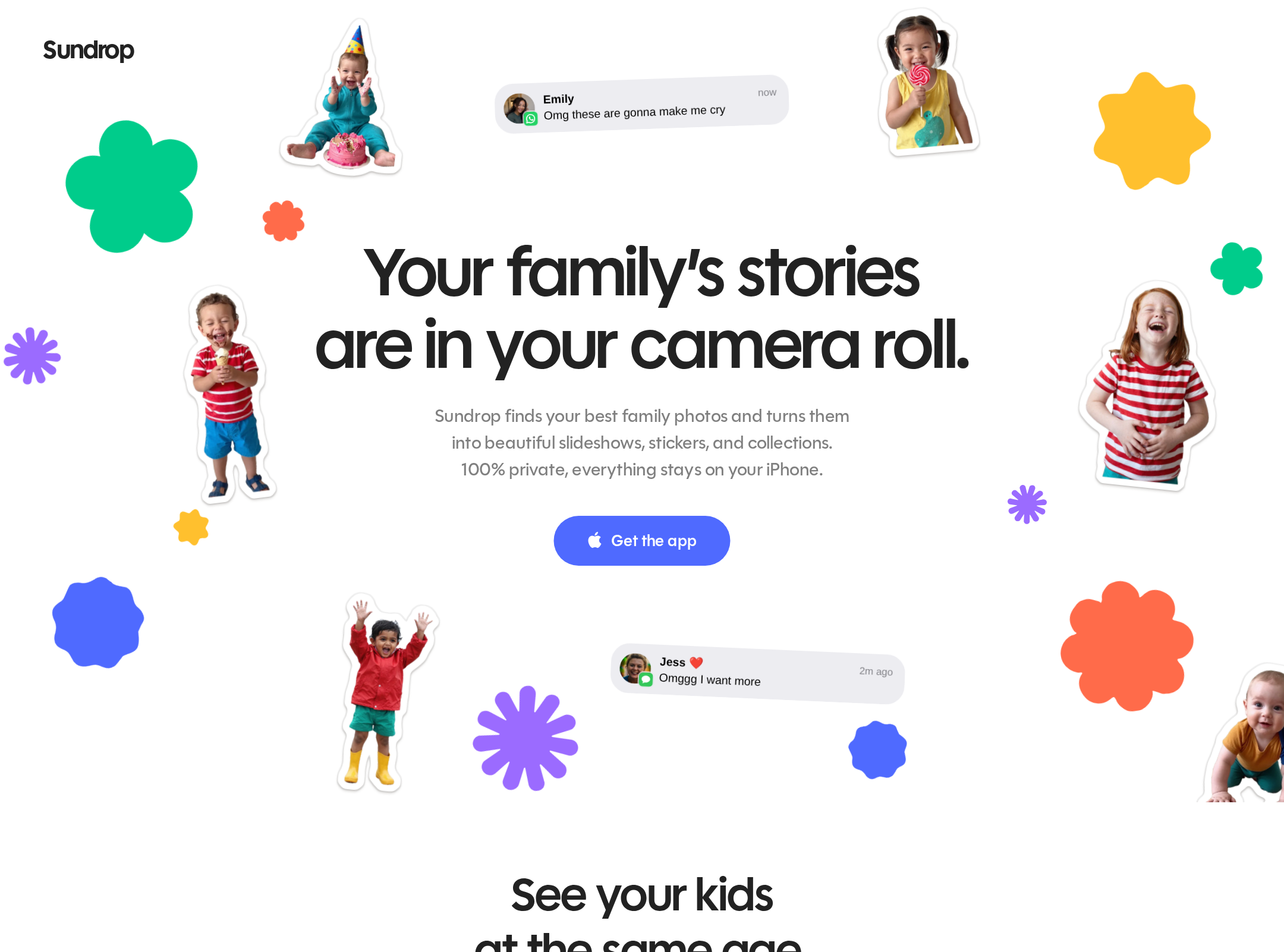
The visual system is highly coherent, expressive, and well matched to the emotional nature of family photography. Product screenshots remain legible focal points within a playful collage language.
What works
- Distinctive collage art direction differentiates the page from conventional SaaS and app templates.
- Colorful organic shapes and family cutouts create a warm, memorable emotional tone.
- Feature sections repeat a clear visual grammar while varying the product story.
- Typography, handwritten annotations, notes, phones, and polaroids work together as a recognizable brand world.
Opportunities
- Reduce decorative competition around the hero on smaller screens so the main promise and CTA remain dominant.
- Increase the legibility of low-contrast supporting copy without losing the informal visual character.
- Use more explicit visual separation between decorative objects and content-bearing product imagery.
Uniqueness
Sundrop has a notably original personality. Its scrapbook-like family collage, colorful cutouts, and benefit-specific product demonstrations feel authored rather than assembled from generic app-marketing patterns.
What works
- The combination of family cutouts, playful shapes, and mobile UI storytelling is highly specific to the product.
- The visual tone consistently communicates memory, intimacy, and sharing.
- The page avoids the default dark-gradient or abstract-3D language common in contemporary technology marketing.
Opportunities
- Extend the distinctive visual language into more concrete product proof, such as a brief preview of the photo-selection or organization process.
- Ensure future campaign pages retain the same specificity rather than relying only on decorative motifs.
User experience
The page offers a straightforward scroll narrative and uses concise benefit headlines, but its long, highly visual structure may slow visitors who want pricing, platform details, or a fast explanation of the workflow.
What works
- Benefit-led headings make the sequence of capabilities easy to scan.
- Phone demonstrations connect each claim to a visible product outcome.
- The privacy section and FAQ appear late in the journey but address common adoption concerns.
- The mobile screenshot shows a coherent single-column reading experience.
Opportunities
- Add a compact section near the hero that explains the core workflow in practical terms.
- Consider lightweight anchor navigation or an at-a-glance feature summary for long-page visitors.
- Check text size and spacing for users who need more readable supporting copy, especially around the CTA and FAQ areas.
- Validate reduced-motion behavior and ensure no essential information is conveyed only through animation.
Conversion optimization
Conversion intent is clear and appropriately centered on App Store acquisition. The emotional promise is strong, and repeated download actions are supported by product previews, privacy messaging, and an FAQ.
What works
- The hero communicates the camera-roll problem and presents an immediate app-download action.
- Repeated App Store CTAs provide multiple opportunities to convert after feature discovery.
- Privacy positioning is particularly relevant for a family-photo application.
- The closing CTA returns to the central value proposition after the feature sequence.
Opportunities
- Surface platform availability, pricing or subscription expectations, and the first-use experience earlier if those details are relevant to adoption.
- Pair the download CTA with a short reassurance about setup, permissions, or data handling.
- Make the supporting CTA caption text pass contrast checks and remain readable at all responsive sizes.
- Use a concise proof point or representative outcome near the hero if substantiated by product data.
What we'd improve
- 01high
Fix CTA contrast failures
Update the three reported low-contrast CTA caption instances and recheck the full download component in both the hero and sticky CTA states.
- 02high
Clarify the product workflow near the hero
Add a short, scannable explanation of how Sundrop moves from camera-roll photos to curated family experiences, without requiring visitors to traverse the full feature sequence.
- 03medium
Audit mobile sticky behavior
Test the fixed download action across narrow widths, landscape orientation, dynamic text sizing, keyboard navigation, and safe-area insets to prevent obstruction or cramped controls.
- 04medium
Strengthen practical conversion information
Place verified information about platform support, pricing, permissions, and setup closer to the first App Store CTA or within a compact trust panel.
- 05low
Separate decoration from content hierarchy
Review the hero and closing compositions at small widths so cutouts and motifs frame the message without reducing heading, CTA, or supporting-copy prominence.