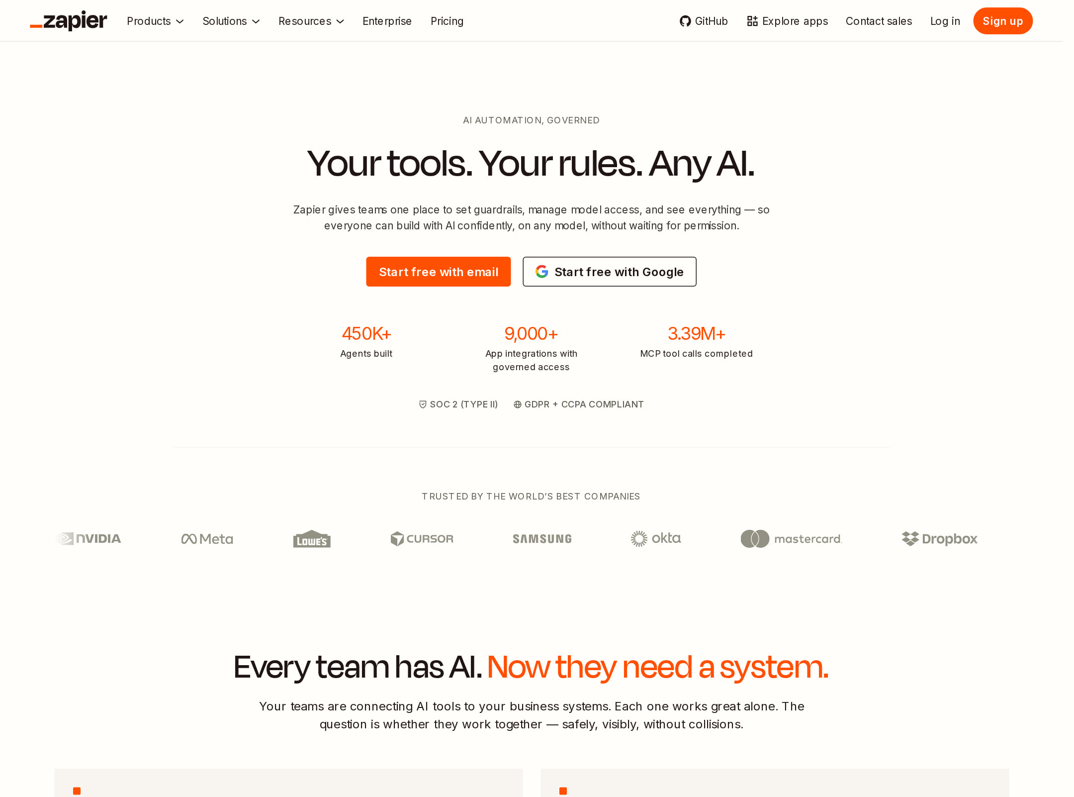


Zapier website analysis
A detailed critique of the homepage's craft, originality, usability, and ability to move visitors toward its intended goal.
Our observations
Publish. This is an unusually polished and visually coherent enterprise marketing homepage with strong editorial direction, clear product storytelling, and substantial proof content. It merits inclusion after addressing the documented contrast failures and reviewing the length and density of the experience.
Best practices
The page has sound structural foundations, including one H1, one main landmark, semantic navigation and footer regions, and no detected heading skips or duplicate IDs. Its main weakness is accessibility rather than information architecture: automated checks report 14 serious text-contrast failures across 437 samples.
What works
- A single H1 and a clear hero section establish page purpose immediately.
- Navigation, main content, and footer landmarks are present.
- The long-form sequence provides multiple opportunities to understand the product, its capabilities, and its use cases.
- The page uses repeated headings, cards, diagrams, and CTAs to segment a substantial amount of content.
Opportunities
- Resolve all 14 reported contrast failures, prioritizing the hero CTA, navigation links, diagram labels, and product-section actions.
- Retest contrast across hover, focus, disabled, and animated states rather than relying only on the dominant palette.
- Review the many decorative and animated elements for meaningful alternative text and non-motion fallbacks; the supplied data confirms motion but does not establish how every visual is exposed to assistive technology.
- Validate the long page at mobile widths and with reduced-motion settings; the supplied observations do not provide those results.
Design
A strong, memorable visual system combines warm neutrals, dark panels, orange emphasis, oversized display type, diagrams, statistics, and product imagery. The page feels cohesive while still varying its section treatments. Dense copy, very small supporting text in parts of the screenshot, and occasional low-contrast combinations prevent an exceptional score.
What works
- The off-white, near-black, and orange palette is distinctive and consistently applied.
- Degular Display, Inter, and selective serif typography create a clear hierarchy and editorial character.
- Diagrams, product UI imagery, bento cards, testimonial content, and large numerical proof provide visual variety.
- Alternating light and dark sections create strong pacing through a long marketing narrative.
Opportunities
- Increase the visual breathing room around the densest feature and proof sections so the page scans more easily.
- Use contrast-safe variants of the orange and muted text colors instead of preserving a color treatment that compromises legibility.
- Consider reducing decorative motion and transitions where they compete with the primary message or make dense sections harder to parse.
Uniqueness
The combination of enterprise automation messaging, editorial typography, warm neutrals, diagram-led explanation, and dark outcome storytelling gives the homepage a recognisable identity. It is more authored than a conventional feature-grid SaaS page, though some familiar patterns remain.
What works
- The orange-on-warm-neutral identity is immediately recognisable and sustained across the page.
- The central architecture diagram gives an abstract AI and integration product a tangible visual explanation.
- The page blends technical concepts, customer proof, statistics, and use cases instead of relying on a single generic hero illustration.
- The mix of display and serif typography adds character uncommon in standard B2B software pages.
Opportunities
- Make the technical differentiator even more concrete with a concise before-and-after workflow or an annotated real-world automation near the hero.
- Differentiate the customer proof modules further so testimonials, statistics, and use cases do not feel like variations of the same evidence pattern.
- Clarify the relationship between the platform, AI tools, integrations, and developer-facing offerings in one compact visual model.
User experience
The page appears thoughtfully structured for progressive product discovery, with a strong above-the-fold entry point and multiple routes for different audiences. However, its very long scroll, numerous sections, repeated CTAs, animations, and contrast failures introduce friction. The screenshot and metadata do not establish interaction behavior, mobile quality, or successful user testing.
What works
- The hero includes a concise headline, supporting context, CTA treatment, and visible proof signals.
- Section headings create a readable narrative from product concept to capabilities, examples, outcomes, and social proof.
- The page serves several audiences, including teams, enterprise buyers, and technical users, through distinct feature and use-case sections.
- Animation and transition treatments are used to reveal diagrams and content rather than presenting one entirely static wall of text.
Opportunities
- Add a persistent or section-aware contents mechanism for a page of this length, especially for visitors seeking technical details or pricing-oriented information.
- Reduce repetitive navigation and CTA choices by giving each section one clearly prioritized next action.
- Ensure all animated diagrams, carousels, and videos have keyboard-accessible controls, pause options where appropriate, and equivalent static explanations.
- Improve scanability by shortening supporting paragraphs and exposing key differences between the product areas earlier.
Conversion optimization
For a B2B AI automation marketing page, the homepage has strong conversion ingredients: clear positioning, repeated CTAs, customer credibility, outcome statistics, product demonstrations, technical detail, and audience-specific use cases. The main conversion risk is dilution: visitors must traverse a large amount of content and may encounter multiple competing paths before reaching the action most relevant to them.
What works
- The hero places a high-visibility primary CTA near the core value proposition.
- Customer logos or trust content, quantified outcomes, testimonials, and named examples support buyer confidence.
- Product diagrams and UI imagery help translate abstract platform capabilities into visible evidence.
- Repeated calls to action accommodate visitors who need more education before acting.
Opportunities
- Pair the hero CTA with a short qualifier such as destination, time commitment, or whether it starts a trial, demo, or product exploration.
- Segment the primary conversion path by visitor intent—such as individual user, business team, or developer—without making the hero choice set feel crowded.
- Move a compact pricing, implementation, or security reassurance closer to the first high-intent CTA if those details are important to evaluation.
- Audit low-contrast CTA states immediately, since a visually prominent action that is difficult to read can directly reduce usable conversion opportunities.
What we'd improve
- 01high
Fix the 14 contrast failures
Replace failing foreground/background combinations in navigation, hero and product CTAs, diagram labels, and other flagged controls with tested color pairs. Recheck normal, hover, focus, and responsive states across the full page.
- 02high
Create a clearer long-page navigation strategy
Add a compact contents or jump-link pattern for major destinations such as platform, integrations, use cases, outcomes, and technical resources. Keep the primary CTA persistent but visually secondary to the current section.
- 03medium
Clarify the first conversion action
Make the hero CTA label and destination explicit, then provide one secondary route for visitors who need a demo or technical overview. Track the two paths separately rather than presenting several similarly weighted actions.
- 04medium
Compress dense explanatory sections
Shorten supporting copy, highlight the key takeaway in each card or diagram, and use a consistent three-part structure—problem, mechanism, result—to improve scanning without removing technical depth.
- 05low
Strengthen motion accessibility and resilience
Provide static equivalents for the 19 videos and animated diagrams, honor reduced-motion preferences, and ensure animation does not hide essential labels or alter the order in which key product information is understood.