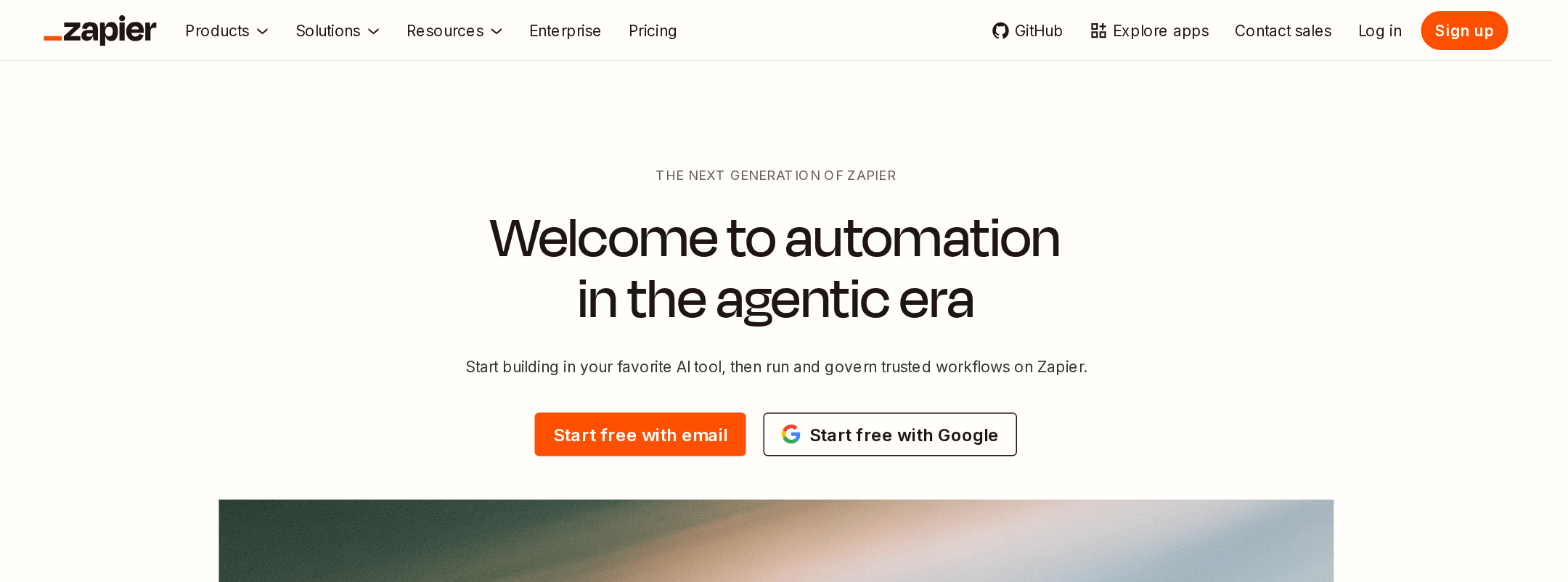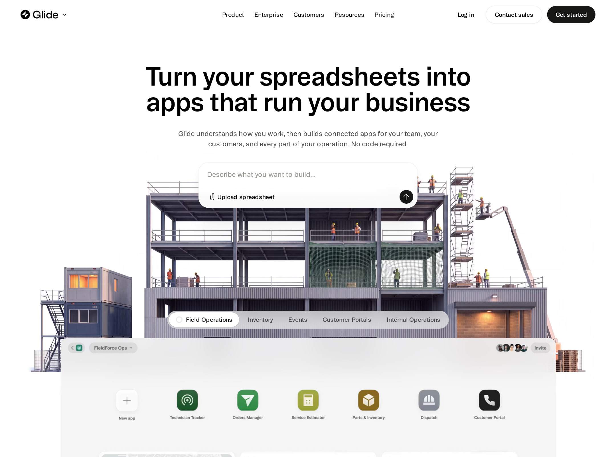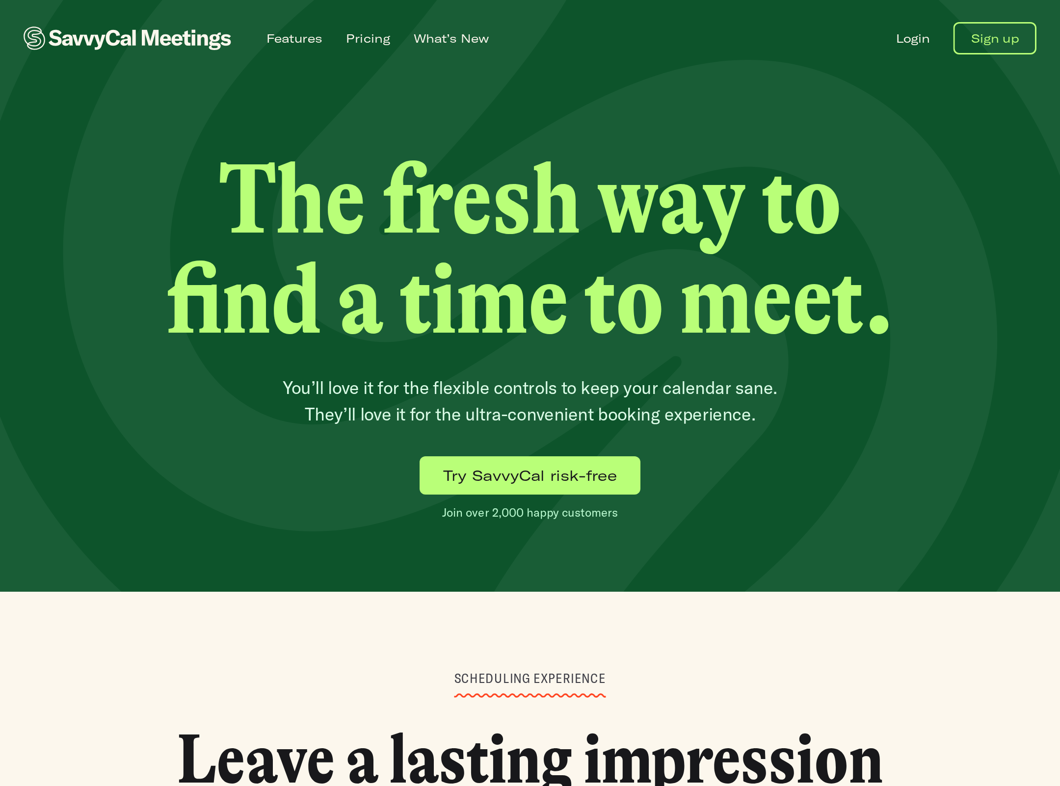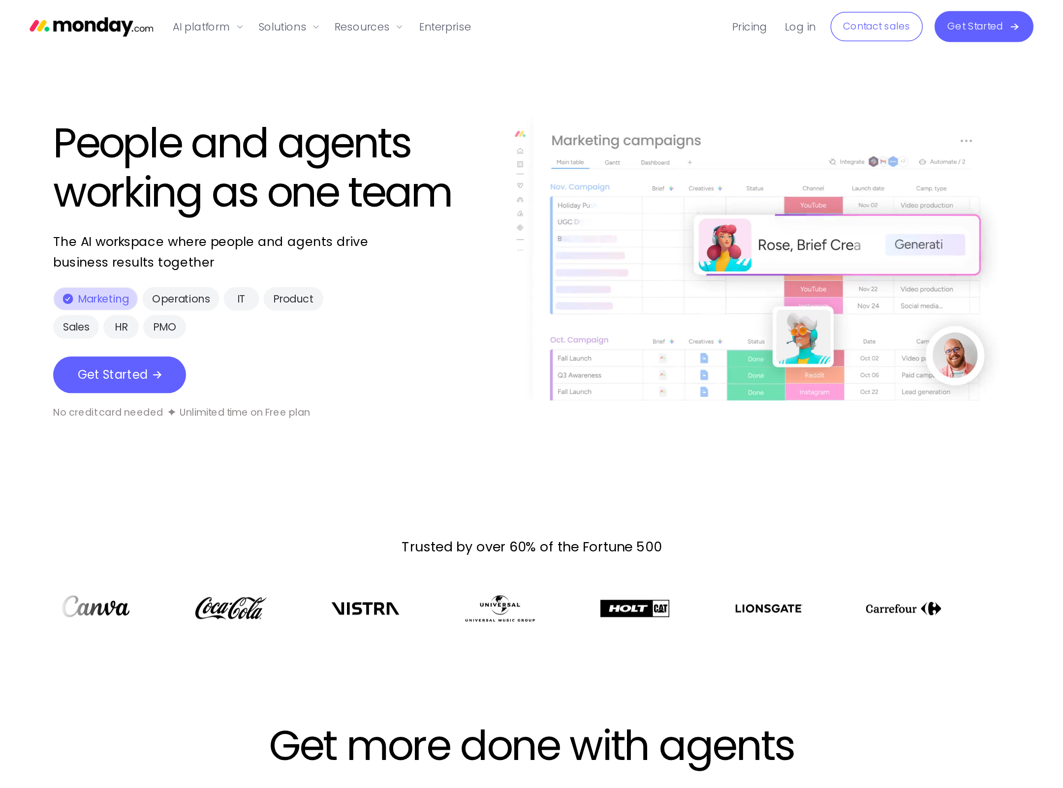


Unify website analysis
A detailed critique of the homepage's craft, originality, usability, and ability to move visitors toward its intended goal.
Our observations
A distinctive, high-quality SaaS marketing homepage with exceptional art direction and product storytelling, held back from top-tier gallery status by serious measured contrast issues, heading-structure defects, and a potentially overloaded conversion journey.
Best practices
The page has a clear semantic main region, one detected H1, persistent navigation, product evidence, proof points, and multiple pathways into product information. Automated accessibility evidence reports a score of 72, with 30 contrast failures, duplicate IDs, and one skipped heading level.
What works
- Clear above-fold positioning for an outbound-sales product.
- A single detected H1 and a semantic navigation landmark support basic page orientation.
- Product demonstrations, customer proof, statistics, and feature explanations reinforce the commercial narrative.
- Visible controls and tabs provide multiple ways to explore the product story.
Opportunities
- Resolve all 30 reported contrast failures, especially muted labels and text placed over pale or photographic surfaces.
- Remove the duplicate IDs associated with the repeated mask identifier.
- Repair the heading hierarchy so the detected level-five product heading is introduced by appropriate intermediate levels.
- Audit focus states, tab semantics, autoplay video behavior, and alternative text directly; these are not established by the supplied evidence.
Design
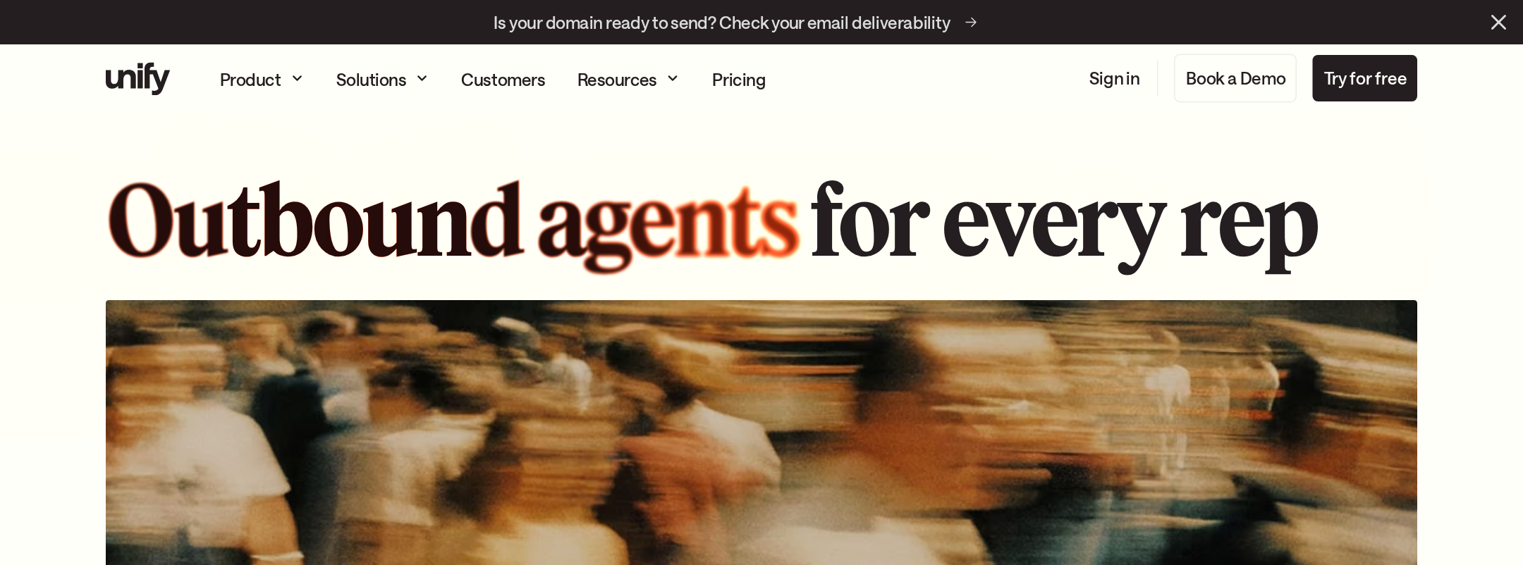
The homepage demonstrates unusually confident art direction for a B2B SaaS site. Editorial typography, warm imagery, product frames, and spacious pale sections produce a coherent and memorable visual identity.
What works
- Strong typographic contrast between large display headlines and compact interface copy.
- Consistent warm palette with a focused orange accent used for emphasis.
- Product interfaces are integrated into the visual narrative rather than treated as generic screenshots.
- Alternating visual intensity creates a deliberate long-form rhythm.
Opportunities
- Reduce the number of simultaneous visual devices in dense sections so product comprehension remains immediate.
- Improve legibility of small supporting copy against image-heavy sections without flattening the art direction.
- Make the most important primary action more visually dominant than secondary navigation and exploratory controls.
Uniqueness
The combination of editorial serif display treatment, warm motion photography, and detailed AI-workflow interfaces is highly distinctive within typical SaaS marketing patterns.
What works
- The page avoids the common blue-gradient enterprise SaaS vocabulary.
- The cinematic imagery gives the product story an emotional and tactile dimension.
- The embedded research and chat demonstrations provide a recognizable interaction metaphor.
Opportunities
- Differentiate further through a more ownable visual explanation of the platform's data and agent relationships, rather than relying primarily on interface frames and photography.
- Ensure motion and imagery remain supporting assets so the identity is not perceived as a collection of visual treatments without a single signature device.
User experience
The page offers a logical narrative from promise to demonstration, proof, feature explanation, and customer outcomes. However, the long page, multiple tabs, moving content, and contrast failures create avoidable cognitive and accessibility friction.
What works
- The hero combines a concise positioning statement with an immediately relevant product interaction.
- Feature storytelling connects product capabilities to an understandable prospecting workflow.
- Customer evidence appears throughout the journey rather than being isolated at the bottom.
- The sticky navigation supports orientation on a long page.
Opportunities
- Provide a persistent or repeated primary CTA as visitors move through the long narrative.
- Add clearer section-level signposting and reduce competing exploratory links around key conversion moments.
- Offer pause, stop, or static alternatives for animated marquees, video, and auto-progressing storytelling.
- Validate mobile layouts, keyboard navigation, focus order, and tab behavior before publication.
Conversion optimization
For a B2B product-marketing homepage, the page builds substantial credibility through product demonstrations, quantified outcomes, customer logos, and testimonials. Conversion intent is present but could be made more direct and less dependent on exploration.
What works
- The hero positions the product around a concrete sales workflow rather than a generic AI claim.
- Interactive prompts create a product-led entry point and invite visitor participation.
- Proof is distributed across statistics, customer logos, case studies, and performance claims.
- The capability section helps visitors understand the breadth of the platform.
Opportunities
- Make the primary next step explicit near the hero and repeat it after the first proof section.
- Pair performance claims with concise context, methodology, or links to supporting evidence to strengthen trust.
- Segment the CTA path for different audiences such as individual reps, sales leaders, and operations teams.
- Test whether the interactive prompt improves qualified engagement compared with a conventional demo or trial CTA.
What we'd improve
- 01high
Fix measured accessibility defects
Address the 30 reported contrast failures, duplicate mask IDs, and skipped heading level. Re-run automated checks after changes, then manually test keyboard focus, tabs, video controls, and screen-reader naming.
- 02high
Clarify the primary conversion path
Define one dominant hero action and repeat it at the transition from product proof to feature exploration. Keep secondary links available but visually subordinate.
- 03high
Provide motion and media alternatives
Add pause or reduced-motion behavior for marquees, shimmer effects, transitions, and autoplay media. Preserve equivalent product information in static text or screenshots.
- 04medium
Reduce cognitive load in long sections
Group the feature catalogue into fewer user-oriented themes and add concise section summaries so visitors can scan capabilities without reading every card.
- 05medium
Strengthen proof transparency
Add context beside large pipeline and performance claims, including timeframe, customer cohort, or a case-study link where appropriate.
- 06low
Refine responsive validation
Review the 992px breakpoint and test narrow layouts for headline wrapping, prompt usability, tab controls, image crops, testimonial density, and minimum touch-target sizes.