

SavvyCal website analysis
A detailed critique of the homepage's craft, originality, usability, and ability to move visitors toward its intended goal.
Our observations
Visually distinctive and commercially clear, but it requires an accessibility pass before publication in a curated gallery.
Best practices
The page has a clear H1, orderly heading progression, repeated CTA placement, descriptive section grouping, and a visible footer. Automated evidence reports one H1 and no heading skips. However, the page has no detected main landmark, two missing image alt attributes, one unnamed link, and 11 contrast failures.
What works
- One H1 establishes the page purpose.
- Heading levels progress from H1 to H2 and H3 without reported skips.
- The navigation, feature sections, testimonials, CTA, and footer form a recognizable marketing-page structure.
- Repeated product imagery makes the feature claims visually concrete.
Opportunities
- Add a semantic main landmark around the primary page content.
- Add concise, functional alt text to the two portrait/image instances identified by the audit.
- Give the unnamed link an accessible name that communicates its destination or action.
- Resolve all 11 reported contrast failures, especially in navigation, large headings, and section headings, then re-test at all responsive states.
Design
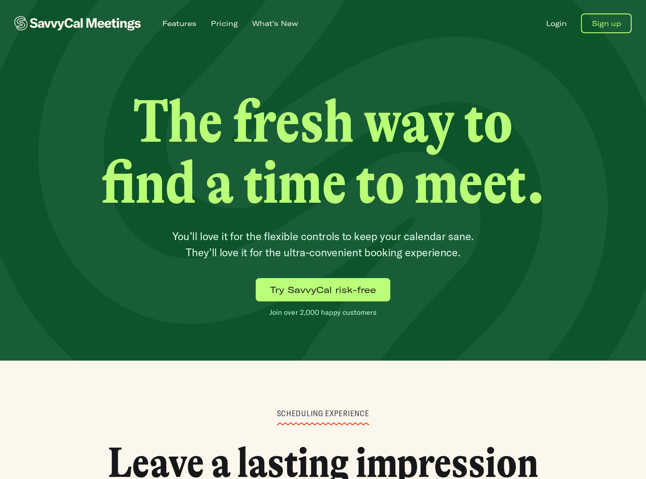
The page demonstrates a confident editorial art direction: condensed display typography, warm neutral surfaces, bright coral accents, dark feature bands, and illustrated details create a recognizable identity. Product screenshots are consistently framed and positioned as the visual proof of each section.
What works
- Strong typographic hierarchy supported by a deliberately mixed type system.
- Cohesive alternation between oatmeal, pink, and dark sections creates rhythm.
- Large product screenshots communicate the scheduling interface without relying only on abstract claims.
- The testimonials and hand-drawn decorative elements add warmth to an otherwise functional SaaS category.
Opportunities
- Check the legibility of the extremely large 136px H1 and 96px section headings on smaller screens.
- Reduce visual competition between oversized headings, scenic screenshot backgrounds, and decorative artwork where necessary.
- Use more consistent image descriptions and captions so visual storytelling remains understandable without imagery.
Uniqueness
The combination of editorial serif-like condensed headlines, playful hand-drawn graphics, coral-framed interface screenshots, and product-focused feature storytelling is notably differentiated from conventional blue or gradient scheduling pages.
What works
- A strong, ownable visual language rather than a generic SaaS template.
- The visual treatment connects product utility with personality and human testimonials.
- The three thematic sections create a memorable narrative around scheduling experience, focus protection, and teamwork.
Opportunities
- Extend the distinctive illustration and framing language into smaller interaction states without increasing clutter.
- Make the product differentiator even more explicit near the hero so the visual originality is paired with immediate category clarity.
User experience
The page appears easy to scan at a high level: a single hero promise leads into three feature themes, supporting screenshots, testimonials, and a final free-start CTA. The main UX limitations are inferred accessibility and density risks rather than a broken visual flow; automated evidence cannot verify interaction behavior, mobile performance, or user comprehension.
What works
- Clear progression from headline to feature proof to testimonials and final CTA.
- Feature groupings such as Branding, Custom Domains, Calendar Overlay, Buffers & Limits, and team modes make the product breadth scannable.
- Repeated screenshots provide context for otherwise abstract scheduling concepts.
- The final CTA makes the low-commitment entry point prominent.
Opportunities
- Improve contrast for the 11 failing text samples, including navigation and major headings.
- Ensure all image content and decorative links remain understandable to screen-reader and keyboard users.
- Add or verify mobile navigation affordances and focus visibility; the supplied evidence shows hidden navigation groups but not their controls or behavior.
- Consider shorter supporting copy or stronger inline signposts if the long page creates excessive scrolling.
Conversion optimization
For a product-led SaaS homepage, the page presents a credible conversion path: a direct hero CTA, feature evidence, testimonials, and a repeated free-start message. Conversion strength is moderated by the limited supplied evidence about CTA labeling, pricing context, trust signals, and interactive behavior.
What works
- The hero immediately states the scheduling problem and presents a primary CTA.
- Product screenshots appear directly beneath feature framing, helping visitors evaluate the interface.
- Testimonials are placed after feature evidence and before the page's closing conversion prompt.
- The closing message reduces perceived commitment by positioning the product as free to try and upgradeable later.
Opportunities
- Make the hero CTA's exact value proposition and next step unmistakable without depending on surrounding text.
- Surface a concise pricing or free-plan explanation earlier if it is not already visible above the fold.
- Add stronger trust evidence such as recognizable customer context, quantified adoption, or security information only where substantiated by the product.
- Repeat a compact CTA after major feature groups for visitors who decide before reaching the footer.
What we'd improve
- 01high
Repair accessibility findings
Add alt text to both reported image instances, provide an accessible name for the unnamed link, introduce a semantic main landmark, and remediate the 11 reported contrast failures. Re-run automated checks after desktop and mobile verification.
- 02high
Validate responsive display typography
Create breakpoint-specific sizes for the 136px hero H1 and 96px section headings, then inspect wrapping, overlap, screenshot visibility, and CTA reachability on narrow screens.
- 03medium
Clarify the first conversion step
Make the hero CTA communicate both the action and the low-commitment offer, and place a similarly explicit CTA after the first major product section.
- 04medium
Strengthen trust context
Add concise, verifiable customer or product reassurance near the hero or first testimonial, such as customer role/context or a substantiated service detail, without inventing performance claims.
- 05low
Document motion and reduced-motion behavior
Audit the three reported transition elements and any decorative effects, then define keyboard-visible, hover, and prefers-reduced-motion states so the visual language remains informative without animation.