

Glide website analysis
A detailed critique of the homepage's craft, originality, usability, and ability to move visitors toward its intended goal.
Our observations
A strong candidate for publication: visually distinctive, commercially legible, and unusually well-composed for a long-form SaaS homepage. It has meaningful accessibility and readability issues that should be addressed, but no evidence of a broken or unusable page in the supplied screenshot and metadata.
Best practices
The page has a clear semantic structure, one detected H1, logical H2 progression, a main landmark, and a visible navigation and conversion path. Automated checks nevertheless report one unlabeled form control and 28 contrast failures across 139 sampled elements.
What works
- A single, descriptive H1 establishes the product’s central value proposition.
- The page uses a clear sequence of sections covering product capabilities, use cases, integrations, security, templates, and customer proof.
- Heading levels are reported without skips, and a main landmark is present.
- The visual system is consistently applied across light, dark, photographic, and product-demo sections.
Opportunities
- Add an explicit accessible label to the form control identified by the automated audit.
- Review all 28 reported contrast failures, especially white text over imagery and small text in testimonial or card overlays.
- Check contrast and legibility at smaller viewport sizes, where product screenshots and supporting copy appear compact.
- Provide robust text alternatives and meaningful accessible names for product imagery, logos, icon controls, and carousel-like content.
Design
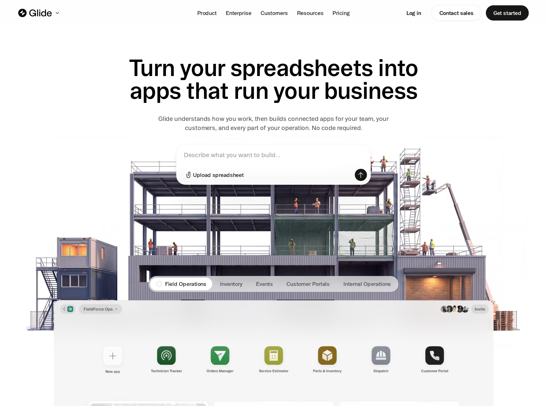
The visual design is excellent: restrained, editorial, and product-focused, with a confident balance of interface demonstrations, real-world photography, and whitespace.
What works
- The opening product composition quickly communicates a spreadsheet-to-app transformation through a large, concrete visual demonstration.
- Alternating layouts prevent the long page from becoming a repetitive sequence of identical feature bands.
- The warm off-white surfaces, black sections, subtle borders, and two-font treatment create a recognizable visual identity.
- Customer imagery and interface screenshots support the operational positioning of the product.
Opportunities
- Some product screenshots contain fine detail that is difficult to inspect at the page scale; pair them with clearer annotated callouts or optional enlarged views.
- The many sections share similar restrained typography, so stronger visual signposting could help visitors distinguish capabilities, proof, and conversion moments.
- Ensure text overlays remain readable across every image crop and responsive breakpoint.
Uniqueness
Glide differentiates itself from generic no-code landing pages through an editorial art direction and an unusually integrated use of field, workplace, and product imagery.
What works
- The industrial and workplace imagery gives the product a practical, business-operations character.
- The spread of app icons and interface examples makes the platform feel broad without relying solely on abstract gradients or oversized claims.
- The page’s pacing and serif display accents create a more magazine-like presentation than a conventional feature grid.
Opportunities
- The overall category conventions remain familiar: hero CTA, integrations, security section, templates, testimonials, and final signup prompt.
- A sharper, more explicit visual explanation of what makes Glide different from adjacent spreadsheet and internal-tool platforms would strengthen the distinctive positioning.
User experience
The page appears easy to scan and follows a sensible evaluation journey, though its long-form density, small supporting text, and image-overlay contrast can impede quick comprehension.
What works
- The hero is visible above the fold and communicates the core transformation directly.
- Sections are arranged in a user-centered order, moving from understanding the product to trust, applications, integrations, security, and social proof.
- Repeated CTAs and template-oriented content support both exploratory and product-led visitors.
- The navigation and page structure appear compact and unobtrusive rather than competing with the hero.
Opportunities
- Make the primary next step more prominent and consistently differentiated from secondary links throughout the long page.
- Add stronger section-level summaries or jump navigation for visitors who want to move directly to integrations, security, templates, or customer examples.
- Improve the readability of small copy and overlay captions, particularly in the cards and testimonial areas.
- Validate keyboard, focus, carousel, and reduced-motion behavior in an interactive review; the supplied data confirms transitions but does not establish their usability.
Conversion optimization
Conversion support is strong for a product-led SaaS homepage: the value proposition is immediate, the product is shown in context, and trust is reinforced through integrations, security, templates, and customer evidence. The page could reduce decision friction by making the offer and CTA hierarchy more explicit.
What works
- The hero frames a concrete outcome rather than only naming technical features.
- Product UI appears early, helping visitors understand what they might build.
- Security messaging, recognizable integrations, templates, and testimonials address common objections for business buyers.
- The closing signup prompt provides a natural endpoint after the long-form argument.
Opportunities
- State the signup or trial commitment more explicitly near the hero, including what happens after clicking the primary CTA if applicable.
- Add concise proof points such as time-to-first-app, adoption scale, or quantified customer outcomes only where substantiated by the source content.
- Differentiate paths for technical builders, business operators, and enterprise evaluators so each audience can reach the most relevant proof faster.
- Test whether the long page repeats enough actionable CTAs without diluting the main conversion action; behavior and performance cannot be inferred from the screenshot alone.
What we'd improve
- 01high
Resolve form labeling and contrast failures
Label the audited form control programmatically and review the 28 contrast failures, prioritizing white text over photographs, dark overlays, testimonial captions, and small supporting copy.
- 02high
Clarify the primary conversion path
Make the main hero CTA visually dominant, explain the signup or trial commitment nearby, and provide distinct secondary paths for visitors who want templates, demos, or enterprise information.
- 03medium
Improve long-page navigation
Introduce clearer section labels, a compact contents mechanism, or audience-specific entry points so visitors can reach integrations, security, templates, and customer proof without scanning the entire page.
- 04medium
Increase product-image comprehension
Add concise annotations, larger detail states, or expandable views for interface screenshots whose controls and data are too small to understand at the displayed scale.
- 05low
Strengthen differentiated positioning
Use one focused comparison or visual explanation to show why Glide is distinct from other spreadsheet-to-app and internal-tool products, while keeping the editorial visual language intact.