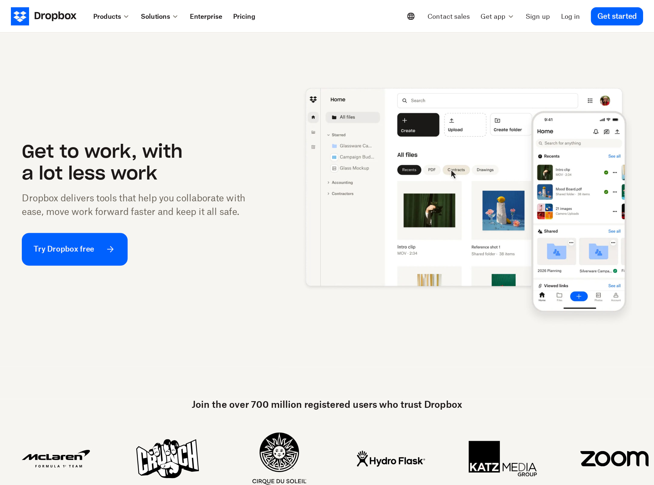


Dropbox Homepage website analysis
A detailed critique of the homepage's craft, originality, usability, and ability to move visitors toward its intended goal.
Our observations
A strong, highly recognizable SaaS marketing page with excellent brand control and a clear content narrative. It is suitable for publication, but its contrast failures and some unusually low-information whitespace areas prevent it from reaching exceptional status.
Best practices
The structural foundation is strong, with a single H1, a main landmark, semantic navigation and footer, and no detected heading skips or duplicate IDs. However, automated observations report seven serious text-contrast failures across feature and dark-card content.
What works
- The page exposes a clear H1 in the hero and follows it with a broad set of logically grouped sections.
- A primary navigation and sticky navigation treatment provide a persistent route into the site.
- The homepage includes a skip-to-main-content control and a detected main landmark.
- The page uses a consistent visual system across product, testimonial, industry, and resource content.
Opportunities
- Resolve all seven reported contrast failures, prioritizing body copy, button labels, and text over graphite backgrounds.
- Recheck contrast across responsive breakpoints and hover or animated states rather than treating the automated sample as comprehensive.
- Preserve the strong heading structure while reviewing whether every visually prominent card has an equally clear accessible name and action.
Design
The visual direction is refined and distinctive, using Dropbox’s blue-and-black identity within an editorial, spacious layout. Product UI imagery and varied dark and light sections create rhythm, but the long page occasionally relies on whitespace where stronger visual or informational transitions could improve continuity.
What works
- The hero has a confident typographic focal point and pairs messaging with a recognizable product interface composition.
- The restrained off-white palette gives the blue CTA and black content panels strong brand contrast at a macro level.
- Asymmetric image placement and editorial card layouts create more personality than a conventional feature grid.
- The dark AI and security sections provide useful tonal variation and help separate major narrative chapters.
Opportunities
- Reduce or rebalance the largest empty vertical areas between feature stories so the page feels less interrupted when scrolling.
- Make lower-page card density more consistent with the spacious upper sections, or add stronger section dividers to clarify the change in pace.
- Audit small text rendered inside image-led cards, where the screenshot suggests readability is weakest at the supplied viewport size.
Uniqueness
The page is clearly branded and more editorial than a generic SaaS template, particularly in its asymmetric imagery, dark testimonial compositions, and integration-focused section. Its overall content architecture still follows familiar enterprise software marketing conventions.
What works
- The combination of editorial photography, product UI collages, and large negative space creates a recognizable Dropbox presentation.
- AI integration content is given a dedicated dark visual treatment rather than being reduced to a generic feature bullet.
- Industry-specific cards and customer-oriented security messaging extend the page beyond a simple product overview.
Opportunities
- Develop a more singular interactive or visual metaphor for organizing and finding content, which would make the core product promise more memorable.
- Differentiate the lower resource and industry grids further from standard SaaS card patterns through stronger art direction or more varied composition.
User experience
The apparent journey is easy to understand: introduce the product, establish trust, explain AI and core capabilities, address security, show industry relevance, and offer learning resources. The page is very long and the supplied narrow screenshot makes some text and controls difficult to inspect, so interaction quality and responsive behavior remain partly unverified.
What works
- The hero places the primary proposition and a visible action near the top of the page.
- Trust signals appear early through a large registered-user claim and recognizable partner or customer logos.
- Content is segmented into clear thematic sections such as AI tools, storage, sharing, security, industries, and learning.
- A sticky navigation can help users move through a long marketing page.
Opportunities
- Add or strengthen persistent section navigation or a clearer progress cue for users scanning the unusually long page.
- Ensure video and animated content has concise adjacent summaries and usable pause or reduced-motion behavior; the observations confirm motion but not its controls.
- Improve small-screen legibility and spacing, especially for dense cards and dark testimonial panels.
Conversion optimization
For a broad SaaS acquisition page, the homepage presents a clear top-of-funnel proposition, an above-fold CTA, trust evidence, product benefits, security reassurance, and several audience paths. Conversion intent becomes less concentrated lower on the page because the experience prioritizes storytelling and discovery over repeated decisive actions.
What works
- The hero offers a direct next step instead of relying only on product explanation.
- The user-count claim, logos, customer quotes, and security section provide multiple forms of reassurance before deeper conversion decisions.
- Industry categories create useful relevance paths for professional audiences with different use cases.
- The page supports both product exploration and educational discovery, appropriate for a large SaaS ecosystem.
Opportunities
- Repeat a contextually specific CTA after major decision sections such as storage, sharing, and security rather than concentrating action primarily near the hero.
- Clarify the distinction between individual and business journeys earlier so visitors can self-select without navigating broad menus.
- Place concise pricing, plan, or commitment expectations near the primary acquisition path if those details are not available through the visible CTA.
- Use stronger card-level action hierarchy in the industry and resource sections so secondary exploration does not compete with the main conversion route.
What we'd improve
- 01high
Fix the seven contrast failures
Review the flagged headings, paragraphs, button labels, and graphite-card text against their actual backgrounds. Increase text contrast or adjust surfaces, then retest normal, hover, focus, and responsive states.
- 02high
Strengthen conversion paths after key sections
Add clearly labeled, repeated actions after the core storage, sharing, and security narratives, with wording that distinguishes starting a free account, exploring plans, or contacting sales where applicable.
- 03medium
Compress the long-form scroll rhythm
Reduce the largest empty gaps between image-led feature blocks or use those spaces for concise proof points, diagrams, or section navigation so the page maintains momentum.
- 04medium
Improve responsive card readability
Increase minimum text size, line-height, and contrast in dark testimonial and lower-page cards, and verify that image overlays do not obscure labels at narrow widths.
- 05low
Add clearer page orientation
Introduce an unobtrusive section index, anchored navigation, or more explicit chapter markers to help visitors understand where they are in the long homepage narrative.