

Baked Design website analysis
A detailed critique of the homepage's craft, originality, usability, and ability to move visitors toward its intended goal.
Our observations
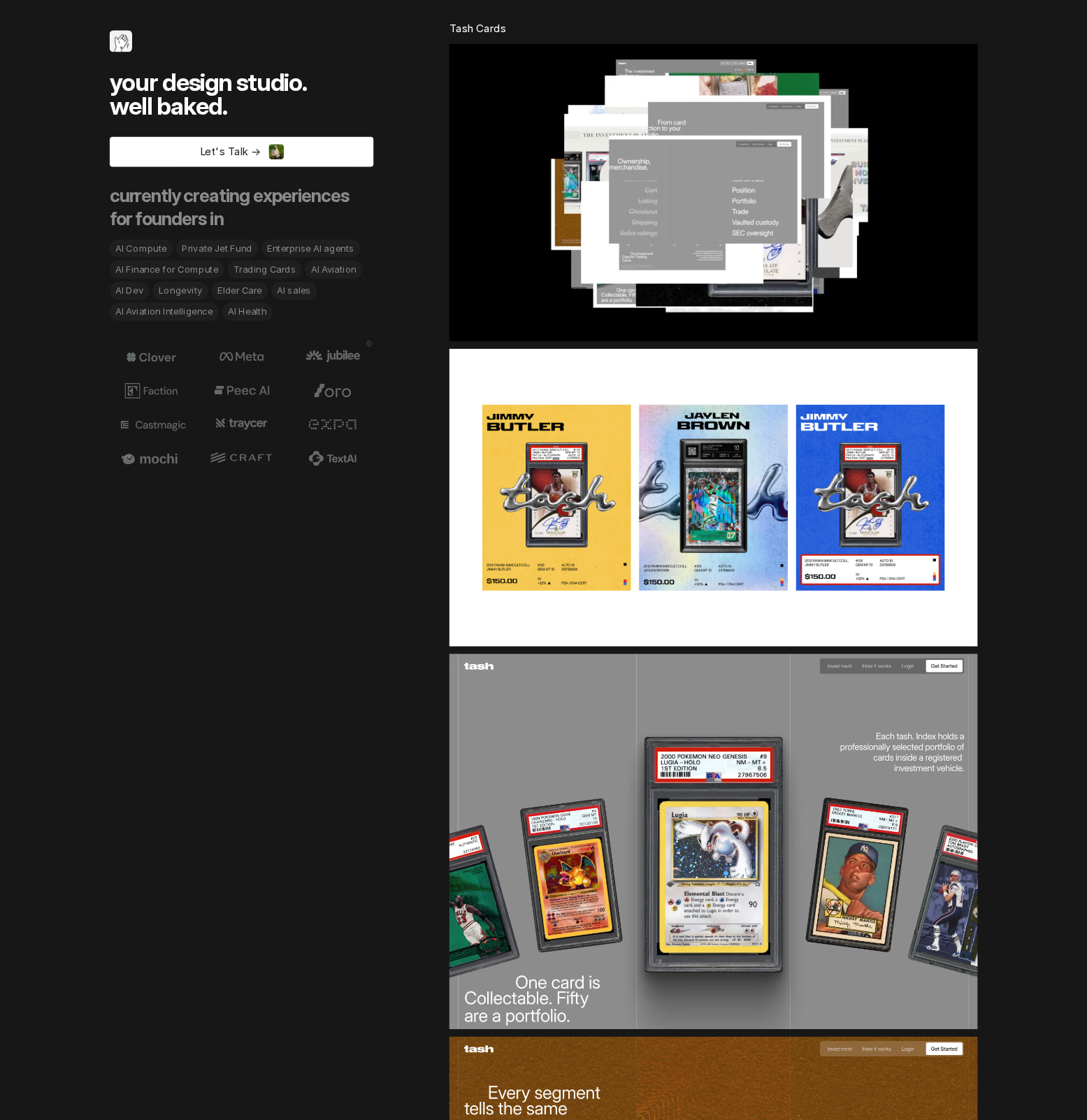
A visually distinctive, publishable product-design portfolio with strong art direction and substantial work coverage. It earns gallery consideration because the presentation is cohesive and image-led, but the long, dense sequence needs clearer wayfinding, stronger semantic structure, and more explicit project context to become an especially effective studio homepage.
Best practices
The page has a coherent visual system and a substantial portfolio surface, but automated observations identify several structural and accessibility shortcomings.
What works
- The predominantly black and white palette creates consistent contrast across most of the page; the supplied audit reports 88% accessibility score and only one sampled contrast failure among 57 samples.
- The repeated presentation pattern gives the extensive portfolio a recognizable system rather than making each project feel unrelated.
- The page appears to include project links and two videos, indicating a portfolio that is intended to be explored rather than only viewed as a static poster.
Opportunities
- The audit reports no h1, no main landmark, and two links without accessible names, which weakens document structure and assistive-technology navigation.
- One serious text-contrast issue is reported; the low-frequency gray text should be checked against its actual background and increased where necessary.
- Add descriptive accessible names to the two unnamed links, including image-only project links, and ensure decorative imagery is not exposed as redundant content.
- The screenshot cannot verify keyboard focus visibility, image alternative text, loading performance, or mobile behavior; these should be reviewed before treating the page as fully accessible.
Design
A confident dark-mode portfolio treatment that lets a wide range of product screens provide the visual color and texture. The work is presented with a strong sense of consistency, although the sheer volume reduces emphasis and creates a visually compressed reading experience.
What works
- The black canvas is a clear, memorable framing device for colorful product mockups and interface captures.
- The long sequence creates an editorial, collection-like rhythm and demonstrates breadth without relying on generic agency stock imagery.
- Typography is restrained and mostly consistent, with Inter and Inter Display forming a practical interface-oriented typographic foundation.
- The work samples visibly span multiple interface types and visual languages, giving the studio a substantial and credible design vocabulary.
Opportunities
- Create more pronounced separation between projects through spacing, labels, or stronger title treatments so the page reads as a curated set rather than one uninterrupted image column.
- Use consistent aspect ratios or intentional art direction for previews; abrupt changes in image scale can make the scroll rhythm feel incidental.
- The page appears to depend heavily on screenshots for meaning. Pair each major visual with concise project, role, and outcome context to improve comprehension without compromising the image-led aesthetic.
Uniqueness
The homepage stands apart from conventional agency sites by treating the portfolio as an extended visual sequence. Its distinctiveness comes from the scale and persistence of the presentation rather than from an unusual color palette or ornamental interface effects.
What works
- The archive-like, scroll-heavy composition is a clear point of view and avoids the common hero-plus-three-cards agency template.
- The contrast between a nearly monochrome shell and highly varied product imagery gives the page a recognizable visual signature.
- Showing a broad series of actual product interfaces makes the studio's specialization legible through evidence rather than generic claims.
Opportunities
- The organizing principle is not immediately obvious from the supplied screenshot. Make the curation logic clearer through categories, chronology, client type, or a featured-project tier.
- A more recognizable studio voice could be established with a concise positioning statement, distinctive project annotations, or a recurring editorial detail beyond the black frame.
- Avoid allowing quantity alone to become the differentiator; a smaller set of deeply contextualized flagship projects could create stronger memorability.
User experience
The page is likely effective for visitors who want to browse a large body of work, but the very long image stream presents discoverability and orientation risks. The supplied evidence does not confirm interaction behavior, responsive layout, or whether previews are easy to scan.
What works
- The portfolio is immediately central, so visitors can encounter the studio's capabilities without navigating through several promotional sections first.
- Visual variety supports rapid browsing and may help prospective clients identify relevant product or interface experience.
- A dark background reduces distractions and keeps attention on the work.
Opportunities
- Add persistent or nearby project titles, categories, and short descriptions so visitors can identify what they are seeing without decoding screenshots.
- Provide a compact index, sticky navigation, or filterable project directory to reduce the cost of finding relevant work in a page of this length.
- Use clear hover, focus, and active states for project links; the supplied audit's unnamed-link findings suggest that link affordances and semantics need particular attention.
- Consider progressive loading or grouped sections for the extensive media sequence. The presence of two videos and the large number of visual assets makes performance a material UX consideration, although load behavior is not observable here.
Conversion optimization
For a studio portfolio, the page does a good job of proving visual capability, but it appears less optimized for turning that proof into a clear inquiry or next step. Conversion here means prompting a prospective client, collaborator, or recruiter to contact or explore the studio.
What works
- The quantity and range of work can build confidence for visitors evaluating product-design experience.
- A visually focused portfolio can communicate quality faster than a long service description, especially for design-aware prospects.
- Project links create opportunities for deeper engagement if each case study includes context and a clear route back to contact.
Opportunities
- Place a concise positioning statement and a prominent contact or project-inquiry action near the top, then repeat the action after the portfolio rather than relying on visitors to infer the next step.
- Surface outcomes, responsibilities, and project type alongside selected previews; screenshots alone demonstrate craft but not necessarily strategic or business value.
- Feature a small number of strongest case studies above the full archive, with explicit calls to view the case study or discuss a similar project.
- Add trust signals appropriate to a design studio, such as recognizable client names, testimonials, measurable outcomes, or a clearly described engagement process, where accurate and available.
What we'd improve
- 01high
Repair semantic and accessible navigation
Add one meaningful h1, define a main landmark, and give all image-only or icon-only links descriptive accessible names. Also verify keyboard focus states and alternative text for project media.
- 02high
Make the inquiry path explicit
Add a concise studio proposition and a prominent contact/project-inquiry CTA near the first viewport, with a second CTA after the portfolio. Use action labels that explain what happens next.
- 03high
Add project context to the visual archive
Attach a consistent label block to every preview containing project name, product category, studio role, and a short outcome-oriented description. Keep the labels compact so the image-led aesthetic remains intact.
- 04medium
Improve long-page wayfinding
Introduce a featured-work section, sticky project index, categories, or grouped chapters so visitors can scan and jump to relevant work instead of traversing the entire sequence.
- 05medium
Audit media performance and responsive behavior
Lazy-load below-the-fold images and videos, provide appropriate responsive image sizes, and test the dense sequence at narrow and wide viewports. Preserve clear captions and link targets at every breakpoint.
- 06low
Strengthen the editorial point of view
Use a consistent curation device—such as project numbering, sectors, outcomes, or a short studio note—to explain why the projects appear in this order and make the archive feel intentionally authored.