Luma website analysis
A detailed critique of the homepage's craft, originality, usability, and ability to move visitors toward its intended goal.
Our observations
A visually distinctive and commercially credible event platform homepage with strong art direction and clear browsing pathways, but it requires accessibility and semantic fixes before it is gallery-ready as a best-practice reference.
Best practices
The page has a coherent structure, clear primary actions, repeated card patterns, and a semantic footer, but the automated audit identifies several meaningful implementation issues.
What works
- Clear top-level paths for signing in, creating an event, discovering events, and getting the app.
- Consistent card treatment makes a large amount of content approachable.
- No duplicate IDs or heading skips were detected in the supplied audit.
- The page uses a recognizable footer and a logical progression from hero to discovery content.
Opportunities
- Resolve twelve missing alt attributes on category imagery and verify decorative images are correctly hidden from assistive technology.
- Correct the six reported text-contrast failures, especially in the colorful hero copy and low-emphasis example links.
- Reduce the two-H1 condition by exposing one canonical page heading and treating alternate animated states appropriately.
- Add a main landmark and verify keyboard focus, hover, and motion states across the card grids.
Design
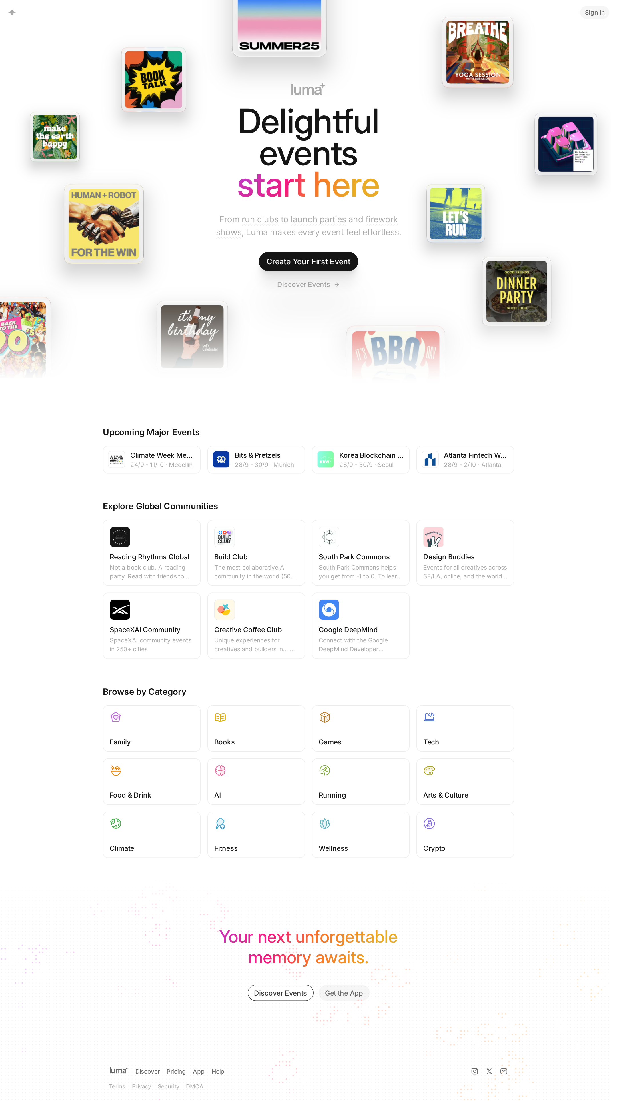
The visual system is polished, memorable, and unusually well matched to the subject of events.
What works
- The floating poster field gives the hero a distinctive cultural and editorial character.
- The restrained white canvas lets imagery and gradient type provide the visual energy.
- The transition from expressive hero to compact discovery cards is clear and purposeful.
- Rounded cards, small avatars, and consistent spacing create a cohesive component language.
Opportunities
- Increase the visual prominence or explanatory support around the main creation action for visitors who do not yet understand the product.
- Review truncation in event and community cards so key names remain identifiable without relying on hover or context.
- Ensure the decorative hero canvas does not compete with the message or reduce legibility at smaller widths.
Uniqueness
The event-poster composition and colorful typographic treatment give the homepage a strong point of view beyond the typical SaaS template.
What works
- The hero frames event creation as a creative, social activity rather than only an administrative task.
- The combination of curated major events, communities, and categories communicates a broad ecosystem.
- The visual treatment is specific to event culture and avoids a generic dashboard-led SaaS presentation.
Opportunities
- Differentiate the discovery modules further through more editorial curation or contextual explanation rather than relying primarily on repeated card grids.
- Make the relationship between hosting and discovering events more explicit so both sides of the platform feel equally distinctive.
User experience
The page offers straightforward routes into creation and discovery, but information density, contrast, semantics, and unverified responsive behavior limit confidence in the experience.
What works
- The hero presents a direct creation CTA and a secondary discovery path.
- Major events, communities, and categories support different user intents without requiring a search-first workflow.
- The compact event cards expose names, dates, and locations in a quickly scannable format.
Opportunities
- Improve text contrast and image alternatives before relying on the page for broad public discovery.
- Test the grid and hero at mobile widths, including poster collisions, card truncation, and touch target spacing.
- Provide stronger visible focus states and confirm that canvas-based decoration does not obscure content or controls.
- Clarify whether the alternating hero messages are content variants, animation states, or duplicate headings.
Conversion optimization
The page supports both sides of the platform with a prominent creation CTA and multiple discovery routes, though the conversion narrative could be more explicit.
What works
- The primary CTA is visually prominent and action-oriented.
- Discovery is demonstrated rather than merely described through real-looking event, community, and category examples.
- A repeated footer CTA provides another conversion opportunity after browsing.
Opportunities
- Add concise proof or product context near the hero so first-time visitors understand what happens after creating an event.
- Segment the host and attendee journeys more clearly, possibly with paired actions or supporting microcopy.
- Use the event and community sections to reinforce why Luma is preferable to a generic event listing service.
- Preserve clear, complete labels on narrower layouts so truncated names do not weaken click confidence.
What we'd improve
- 01high
Fix accessibility and document semantics
Add meaningful alt text to informative category imagery, mark decorative imagery appropriately, repair the six contrast failures, add a main landmark, and expose only one canonical H1.
- 02high
Validate the hero at responsive breakpoints
Test the canvas, floating posters, headline, CTA, and alternate hero state from mobile through wide desktop. Confirm that content remains legible, non-overlapping, and keyboard accessible.
- 03medium
Strengthen first-visit product comprehension
Place a short, plain-language explanation near the primary CTA that distinguishes event hosting from event discovery and sets expectations for the next step.
- 04medium
Improve card legibility
Review line clamping and narrow card widths so event, community, and category names remain identifiable; use responsive layout changes rather than aggressive truncation where necessary.
- 05low
Clarify motion behavior
Define reduced-motion behavior for the title animation, canvas effects, and transition-heavy interactions, then verify focus and hover states do not depend on motion.