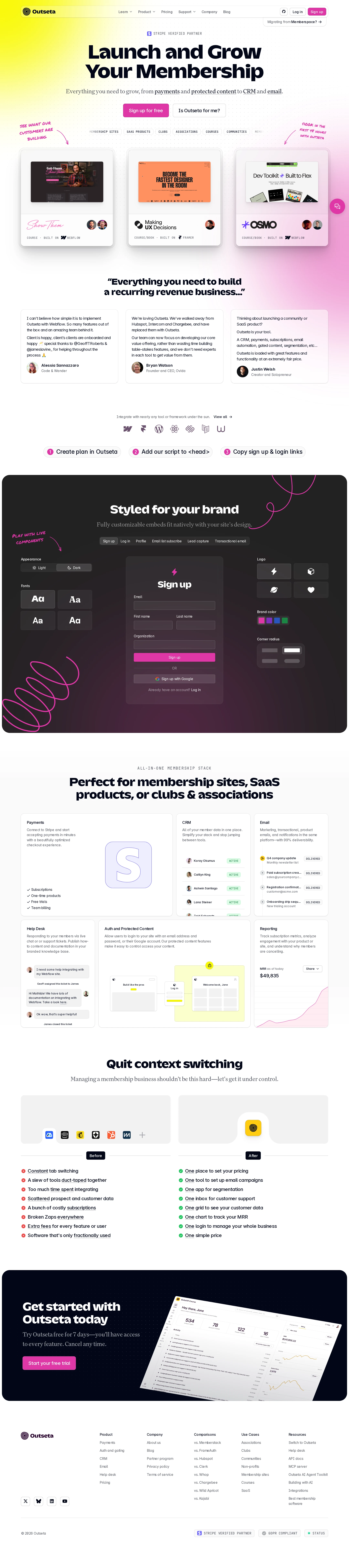
Outseta website analysis
A detailed critique of the homepage's craft, originality, usability, and ability to move visitors toward its intended goal.
Our observations
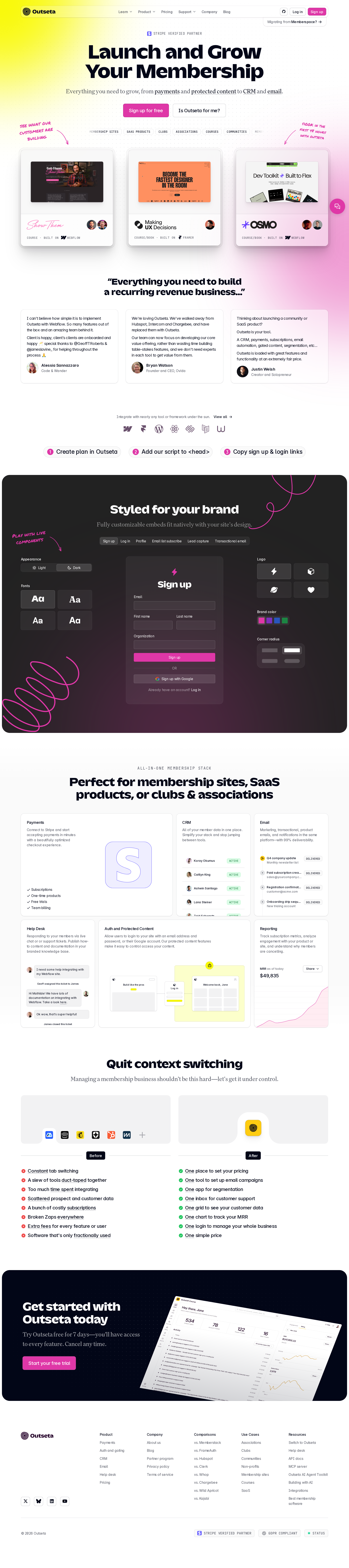
A strong and distinctive SaaS landing page with an unusually expressive product narrative. It merits gallery consideration after accessibility remediation, particularly for contrast, link naming, and form labeling.
Best practices
The page demonstrates strong semantic structure and a clear landing-page progression, but its automated accessibility score is 44 and identifies several serious issues.
What works
- A single prominent H1 establishes the page purpose clearly.
- The homepage is organized into recognizable hero, proof, product, comparison, CTA, and footer sections.
- The navigation and content hierarchy are substantial enough to support exploration beyond the primary signup action.
- The page uses multiple forms of product evidence rather than relying only on marketing claims.
Opportunities
- Resolve the 54 reported contrast failures, prioritizing CTA text, muted copy, tab labels, and dark-section controls.
- Give all 11 unnamed links accessible names, especially full-card links, navigation actions, and icon-oriented controls.
- Associate visible labels with all four reported form inputs and verify that embedded signup fields expose useful names and instructions.
- Audit small interface text and decorative annotations at zoomed and narrow viewport sizes.
Design
The design is polished, cohesive, and visually confident, with a clear contrast between expressive brand moments and structured product explanation.
What works
- The hero quickly combines category clarity, a strong headline, and a visible signup path.
- The customer showcase cards make the abstract membership-platform proposition concrete.
- The dark customization section is a memorable visual centerpiece and communicates configurability through tangible interface examples.
- The page maintains a consistent relationship between rounded cards, interface mockups, mono metadata, and vivid accent colors.
Opportunities
- Reduce visual competition in the hero so the primary action and core product explanation remain dominant on smaller screens.
- Increase the legibility of supporting copy inside dense cards and interface mockups.
- Ensure handwritten annotations remain supplementary and do not become necessary for understanding the proposition.
Uniqueness
Outseta has a recognizable creative direction that goes beyond the common neutral SaaS template while remaining anchored in product evidence.
What works
- The combination of technical interface graphics, handwritten callouts, and vivid pink/yellow accents creates a distinctive brand voice.
- The customization section gives the page a strong editorial focal point rather than presenting a sequence of interchangeable feature blocks.
- The customer gallery and workflow comparison create a more specific narrative than a generic all-in-one software page.
Opportunities
- Make the source of customer examples and proof points more explicit where possible so the distinctive visual storytelling is supported by equally distinctive evidence.
- Avoid allowing decorative treatments and interface density to become the primary memory of the brand over the actual product advantage.
User experience
The information architecture is persuasive and the sequence is easy to scan visually, but accessibility findings and dense embedded controls create meaningful usability risk.
What works
- The page answers several natural evaluation questions: what the product is, who uses it, how it can look, what it includes, and why consolidation matters.
- Section headings provide useful wayfinding through a long page.
- The product capability grid and workflow comparison help users move from broad positioning to concrete functionality.
- The closing CTA arrives after substantial product context, supporting users who need more information before signup.
Opportunities
- Improve contrast and control labeling before treating the page as broadly usable; the reported failures affect core navigation and forms.
- Provide clearer accessible states for tabs, radio controls, card links, and hover-dependent content.
- Test the full experience with keyboard navigation, screen readers, browser zoom, and reduced motion; these behaviors are not established by the supplied evidence.
- Verify that product mockups and compact text remain understandable without relying on visual inspection alone.
Conversion optimization
The page has a well-developed conversion path for a product-led SaaS audience, with a clear signup action repeated across the journey and supported by product detail.
What works
- The hero places a direct signup action next to a secondary fit-oriented path, accommodating both ready and researching visitors.
- Customer examples, testimonials, customization previews, capability cards, and workflow comparisons progressively reduce uncertainty.
- The final CTA reinforces the signup path after the visitor has seen the product’s breadth and presentation quality.
- The visual treatment makes the product feel configurable and approachable rather than purely technical.
Opportunities
- Clarify the immediate signup commitment and any trial or pricing expectations near the first CTA; the supplied screenshot does not make those details prominent.
- Reduce friction in embedded forms through explicit labels, concise instructions, and clearly communicated error states.
- Consider a more persistent conversion affordance for long-page visitors while preserving the visual hierarchy.
- Use accessible, descriptive names for all CTA and card links so assistive-technology users receive the same conversion paths.
What we'd improve
- 01high
Repair accessibility blockers in navigation, controls, and forms
Resolve the 11 unnamed links and four unlabeled inputs, then re-run an accessibility audit. Prioritize full-card links, navigation CTA wrappers, embedded signup fields, and customization controls because they affect primary tasks.
- 02high
Rework low-contrast text and controls
Address the 54 contrast failures across CTA text, muted copy, tabs, and embedded controls. Validate normal and large text states, focus states, disabled states, and the dark customization section at the actual rendered sizes.
- 03high
Test the long landing page beyond the desktop screenshot
Verify narrow mobile layouts, keyboard order, touch targets, zoom behavior, screen-reader names, and reduced-motion behavior. Pay particular attention to customer-card grids, decorative callouts, embedded forms, and workflow comparison panels.
- 04medium
Make the first conversion decision more explicit
Add concise supporting context beside the hero signup action—such as trial expectations, setup effort, or a direct route to pricing or product fit—so visitors can evaluate the commitment without searching the navigation.
- 05medium
Simplify dense supporting interface content
Increase the readability of small labels and mockup annotations, and ensure that decorative interface details do not compete with the core product explanation. Preserve the visual richness while creating a clearer fallback reading path.
- 06low
Strengthen proof transparency
Where customer examples and testimonials are used, make the relationship between each example, customer identity, and product outcome more explicit. This would reinforce the otherwise strong visual proof system.