

Weave website analysis
A detailed critique of the homepage's craft, originality, usability, and ability to move visitors toward its intended goal.
Our observations
A strong, polished B2B healthcare SaaS homepage with a clear product story and credible visual execution. It is suitable for publication, with accessibility hierarchy and contrast issues preventing an exceptional rating.
Best practices
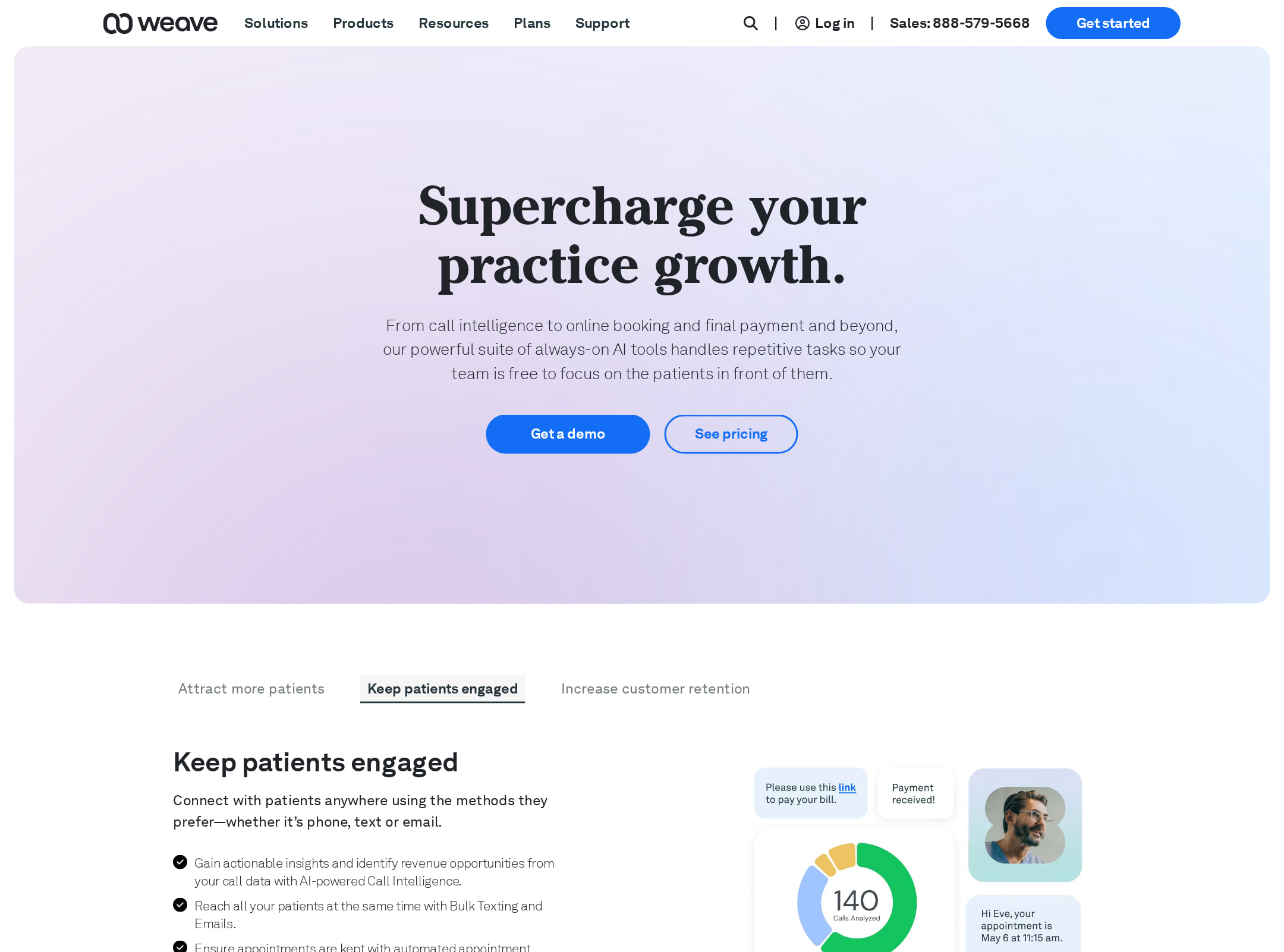
The page has a single visible H1, a semantic navigation and footer, clear sectioning, multiple calls to action, and supporting product evidence. Automated observations identify one unlabeled control, four heading-level skips, and three contrast failures, including CTA links and a video sound control.
What works
- The hero communicates a specific business outcome and places primary and secondary actions directly beneath it.
- The page includes a single H1 and a clear sequence of product, capability, AI, testimonial, and footer content.
- Product UI imagery and a customer video provide concrete support for the platform claims.
- The fixed dark navigation contrasts with the light content sections and keeps the brand frame consistent.
Opportunities
- Repair the four heading-level skips so subsection headings follow a coherent document outline rather than jumping to H4 or H6.
- Add an accessible name or visible label to the navigation button identified as missing a form-control label.
- Increase contrast for the three flagged text/control combinations, especially the link-style CTAs and the video sound control.
- Validate the fixed navigation, animated sections, and video controls with keyboard navigation and reduced-motion settings; the supplied observations do not establish those outcomes.
Design
The visual design is cohesive and polished, combining editorial typography with soft gradients, rounded panels, and recognizable product screens. The composition is more refined than distinctive, and some sections rely on a similar card-and-screenshot pattern.
What works
- The blue, lavender, mint, and warm neutral accents create a consistent healthcare SaaS palette without making the page feel overly corporate.
- Rounded feature panels and product screenshots establish a clear visual rhythm across the long page.
- The limited use of a serif display face against the Akkurat sans-serif system adds an editorial layer to the brand presentation.
- The video testimonial near the lower section provides a strong visual interruption after several interface-led sections.
Opportunities
- Reduce repetition between the pale product sections by introducing more varied visual storytelling or stronger section-level contrast.
- Increase the scale or weight of supporting copy in key product sections; the screenshot suggests several paragraphs and labels become difficult to scan at full-page view.
- Make the relationship between navigation categories, product modules, and the page's healthcare audience more visually explicit.
Uniqueness
The page has a recognizable brand voice through its serif display typography, soft healthcare-adjacent palette, and AI-plus-communications positioning, but its overall pattern is familiar for contemporary B2B SaaS marketing sites.
What works
- The combination of practice-growth messaging, communication workflows, payment capabilities, and AI tools gives the product story a specific vertical focus.
- The serif display treatment and pastel interface presentation distinguish the page somewhat from more conventional blue enterprise SaaS sites.
- The feature sequence covers operational outcomes rather than presenting only a generic platform overview.
Opportunities
- Show a more unmistakable signature interaction or visual motif instead of relying primarily on standard product screenshots and feature cards.
- Bring the practice context into more of the imagery and examples so the healthcare specialization is visible beyond the copy and testimonial.
- Use a sharper visual contrast between the core platform story and the AI feature showcase to give each proposition a more memorable identity.
User experience
The page appears easy to follow as a guided marketing narrative, with repeated links and a clear progression from growth outcomes to product capabilities and proof. Long-page length, small text, motion, and heading structure may make scanning and assistive-technology navigation less efficient.
What works
- The hero is compact and focused, with the main proposition and actions visible above the fold.
- Sections are grouped into understandable themes such as flexibility, productivity, results, platform benefits, and AI tools.
- Feature cards use short labels and interface imagery to support visual scanning.
- A testimonial video and attribution offer a human proof point late in the journey.
Opportunities
- Add stronger in-page wayfinding or a compact summary of major capabilities for visitors who do not want to traverse the entire page.
- Ensure all animated transitions and the three embedded videos have predictable keyboard, pause, and sound controls.
- Correct the heading hierarchy so screen-reader users can navigate the page by sections reliably.
- Consider shortening or progressively revealing secondary copy in dense sections to improve mobile scanning.
Conversion optimization
Conversion is strong for a B2B product-marketing page: the hero presents clear actions, product benefits recur throughout the page, and the narrative builds toward proof. The supplied screenshot does not show pricing, a form, or the destination and friction of the primary CTA, so lead-generation effectiveness cannot be confirmed.
What works
- The primary and secondary hero CTAs are prominent and visually differentiated.
- Benefit-led sections connect platform capabilities to practice growth, efficiency, patient attraction, and faster results.
- Repeated contextual links give visitors several opportunities to continue toward evaluation without relying only on the top navigation.
- The customer video and named professional testimonial add credibility near the end of the journey.
Opportunities
- State the next step and expected commitment beside the primary CTA, such as whether it opens a demo request, contact flow, or product tour.
- Add concise proof metrics, customer logos, or recognizable practice outcomes near the hero if substantiated by available evidence.
- Surface a persistent or end-of-section conversion path after the AI and product-feature modules rather than making visitors depend on navigation.
- Test CTA contrast and wording after addressing the flagged contrast failures; the current link-style treatments may be less prominent than the surrounding product content.
What we'd improve
- 01high
Fix accessibility structure and control labeling
Correct the four heading-level skips, add an accessible name to the unlabeled navigation button, and audit all interactive controls in the video and feature areas with keyboard navigation.
- 02high
Resolve flagged contrast failures
Adjust the three identified text/control color combinations, prioritizing link-style CTAs and the video sound control, then re-run contrast checks across their hover and focus states.
- 03medium
Clarify the primary conversion path
Make the hero CTA explain its destination and commitment level, and repeat that same action after the main AI/product showcase so evaluation does not require returning to the top.
- 04medium
Improve long-page scanability
Add a concise capability overview or in-page anchor navigation, and increase hierarchy or spacing for small supporting text in the product sections.
- 05low
Strengthen brand distinctiveness
Introduce a signature visual or interactive device tied to healthcare practice workflows, while reducing reliance on repeated rounded screenshot panels.