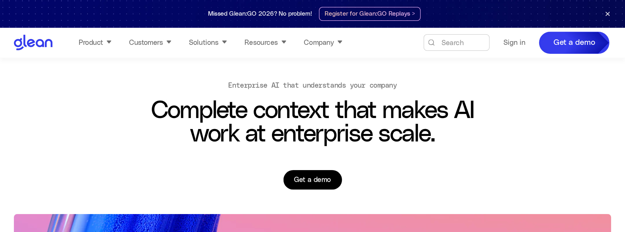


Glean website analysis
A detailed critique of the homepage's craft, originality, usability, and ability to move visitors toward its intended goal.
Our observations
Publishable gallery entry with a visually exceptional system and meaningful accessibility and markup debt to address before treating it as a best-practice reference.
Best practices
The page has a single detected H1, one main landmark, a semantic footer, and no heading-level skips. However, automated checks report serious naming, contrast, form-label, and markup-integrity problems.
What works
- The page exposes a clear H1 and a consistent heading hierarchy, with no detected heading skips.
- A main landmark and semantic footer are present.
- The homepage communicates product scope through structured sections, customer proof, statistics, testimonials, and resource links.
- The visual system is consistent across product mockups, gradients, cards, and dark sections.
Opportunities
- Provide an accessible name for the search form control identified as #search-box.
- Add meaningful accessible names to the 31 unnamed links, especially the brand link and testimonial video controls.
- Resolve the 251 duplicate-ID findings, including repeated navigation, SVG, and component identifiers.
- Audit the 39 reported contrast failures, prioritizing announcement banners, promotional text, muted statistics, and CTA labels.
Design
A confident, premium B2B design that balances expressive imagery with structured enterprise content. Its strongest quality is the contrast between colorful AI-product visuals and restrained editorial layouts.
What works
- The blue, pink, green, and orange ribbon treatments provide a memorable visual signature rather than generic stock imagery.
- Product UI demonstrations are integrated into the visual storytelling and make an abstract AI proposition more tangible.
- Large metric grids, bordered cards, and alternating light and dark sections create clear pacing over a very long page.
- The dark footer and dark explanatory section provide useful visual relief after the predominantly pale content areas.
Opportunities
- Reduce the number of competing promotional moments and statistics so the core product narrative remains dominant.
- Make the purpose of some dense card and accordion groups more immediately scannable through stronger labels or shorter supporting copy.
- Preserve the visual system while testing whether decorative gradients can be simplified in lower-priority sections to improve focus and performance.
Uniqueness
The combination of enterprise AI messaging, vivid generative ribbons, modular product screens, and metric-led storytelling feels more distinctive than a conventional enterprise SaaS template.
What works
- The ribbon imagery is used as a recurring brand asset across hero, feature, resource, and lower-page sections.
- The page mixes product interface evidence with operational statistics and customer-department narratives instead of relying only on generic AI imagery.
- The monospaced treatment for large metrics adds a technical, systems-oriented detail to the visual identity.
Opportunities
- The broader AI category increasingly uses luminous gradients and abstract motion, so the brand could further differentiate through more proprietary interaction patterns or clearer demonstrations of real workflows.
- Customer proof could be made more visually specific through richer case-study artifacts rather than primarily logo, quote, and metric formats.
User experience
The information architecture appears comprehensive and the top-level proposition is understandable, but the unusually long page and multiple interactive modules create potential scanning and accessibility friction.
What works
- The hero states the enterprise-scale value proposition immediately and is followed by a product-oriented visual demonstration.
- Navigation, search, customer stories, testimonials, resources, and footer groupings support different enterprise research needs.
- Department-focused content and quantified outcomes help visitors map the product to practical organizational use cases.
- The page appears to provide several routes for both high-intent demo visitors and visitors still learning about the category.
Opportunities
- Add a persistent or more prominent in-page path to product overview, pricing or evaluation guidance, and demo conversion as visitors move through the long page.
- Ensure sliders, accordions, video controls, and promotional close controls expose clear labels and keyboard states; the unnamed-link findings indicate this is currently incomplete.
- Review mobile layouts and interaction density separately; the supplied screenshot is narrow, but no responsive or touch behavior is confirmed by the metadata.
- Use stronger section navigation or progressive disclosure to reduce the amount of uninterrupted scrolling.
Conversion optimization
For an enterprise AI marketing site, the homepage presents a persuasive mix of product explanation, recognizable enterprise positioning, quantified outcomes, testimonials, and repeated CTAs. Conversion intent is strong, though the amount of content can dilute the primary action.
What works
- The opening proposition is direct and enterprise-specific rather than describing AI in purely abstract terms.
- The page supports trust with named enterprise positioning, customer stories, testimonials, adoption figures, uptime, integrations, and time-saved metrics.
- Repeated CTA placements give visitors opportunities to act after learning about the product instead of requiring a return to the hero.
- The product mockups help bridge the gap between a strategic enterprise claim and a concrete interface experience.
Opportunities
- Make the primary CTA wording and visual priority more consistent across the announcement banner, hero, feature sections, and lower-page modules.
- Add concise qualification or expectation-setting near the main conversion action, such as what a demo includes or who it is intended for.
- Pair headline statistics with methodology, timeframe, or customer context where possible so high-consideration buyers can assess their relevance.
- Avoid letting event promotion and multiple resource blocks compete with the core demo or product-evaluation path.
What we'd improve
- 01high
Repair accessible names and contrast
Label the #search-box input and form, give the brand link an explicit accessible name, and replace icon-only testimonial controls with names such as “Play customer video” and “Open testimonial.” Recheck the 39 contrast failures with emphasis on muted text and banner CTAs.
- 02high
Eliminate duplicate IDs
Generate unique IDs for repeated navigation elements, SVG definitions, cards, and interactive components. Verify every label, control relationship, fragment link, and ARIA reference after the change.
- 03high
Clarify the primary conversion path
Choose one dominant action for enterprise evaluation, keep its label and treatment consistent, and repeat it at logical decision points without allowing event banners or resource cards to visually outrank it.
- 04medium
Improve long-page orientation
Introduce a compact section index, stronger in-page anchors, or more deliberate grouping around product, proof, security, and resources so visitors can scan rather than traverse every module sequentially.
- 05medium
Strengthen interactive-state communication
Audit the testimonial slider, accordion, search, video controls, and promotional close controls for visible focus, expanded/current states, descriptive labels, and reduced-motion behavior. The metadata confirms transitions and videos but does not confirm these states.
- 06low
Make proof more comparable
Add brief context beside major metrics—such as customer segment, measurement period, or source—so enterprise visitors can interpret the figures without leaving the page.