

Stripe website analysis
A detailed critique of the homepage's craft, originality, usability, and ability to move visitors toward its intended goal.
Our observations
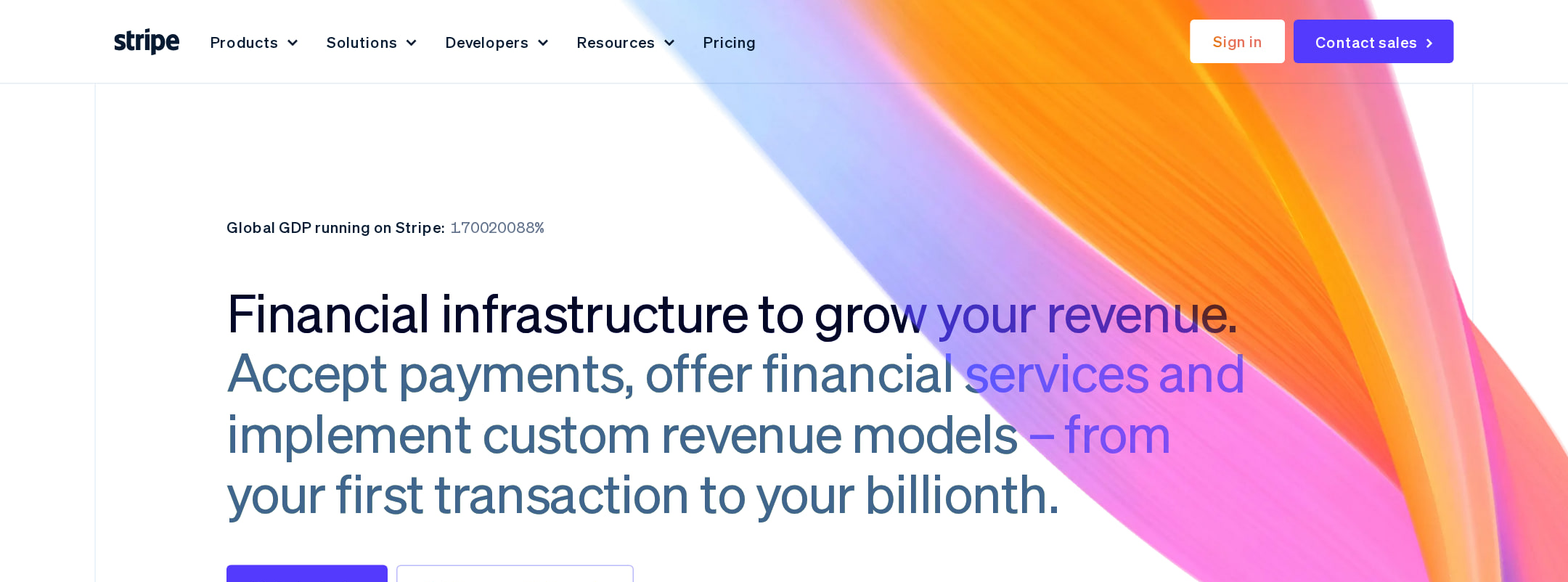
An exceptional, highly art-directed B2B fintech homepage with unusually strong product visualization and information architecture. It is suitable for publication, with accessibility semantics and contrast as the main areas requiring review.
Best practices
The page has a clear semantic structure, a single main region, consistent navigation, strong section hierarchy and multiple proof points. However, the automated accessibility score is 52, with serious link-name, form-label and contrast findings, plus duplicate h1 content.
What works
- A clear hero introduces the business value and leads into distinct product and business-model sections.
- The page includes concrete metrics, customer examples and product demonstrations rather than relying only on brand claims.
- Heading levels are generally ordered without detected skips, and the page exposes one main landmark and semantic navigation.
- Calls to action recur throughout the page for different audiences, including startups, enterprises and developers.
Opportunities
- Provide accessible names for the 28 logo-carousel links, especially where logos function as navigation or customer references.
- Resolve the 36 detected contrast failures across hero, transaction-interface and checkout-interface text.
- Add an accessible label or appropriate semantic role to the replay button identified as a missing form-control label.
- Consolidate the duplicated h1 elements so the document has one programmatic primary heading.
Design
The visual execution is exceptional: a distinctive gradient language, restrained typography and realistic product graphics create a premium, coherent fintech identity across a very long page.
What works
- Product UI mockups give each solution area a concrete visual anchor.
- The navy, white, purple, orange and pale-blue palette remains recognizable across both light and dark sections.
- The modular card layouts and repeated spacing system make a large amount of content feel organized.
- Metrics, logos, diagrams and customer imagery provide useful visual rhythm and prevent the page from becoming text-heavy.
Opportunities
- Reduce or group some repeated visual treatments so the numerous cards, mockups and gradients do not compete for attention.
- Use more explicit visual differentiation between closely related infrastructure products to support faster scanning.
Uniqueness
The combination of technical product graphics, animated data-like visuals, bold gradients and a sophisticated editorial structure is highly recognizable and more distinctive than a conventional enterprise software homepage.
What works
- The page turns payment and infrastructure concepts into a consistent visual world of interfaces, network diagrams and flowing gradients.
- The product-led art direction feels specific to financial infrastructure rather than interchangeable with a generic SaaS template.
- Dark technical sections contrast effectively with light product and customer-story areas.
Opportunities
- Some familiar B2B patterns remain, including logo rails, metric bands, bento cards and customer-story modules; more novel interaction or storytelling could make the structure feel even more ownable.
- Ensure motion and decorative graphics remain secondary to the product explanation, particularly for users navigating a very long page.
User experience
The information architecture supports several audiences and offers many paths into the product ecosystem, but the homepage is extremely long and the recorded accessibility issues create meaningful friction for some users.
What works
- Navigation and repeated section-level calls to action help visitors move from broad positioning toward relevant product areas.
- The sequence from solutions to proof, business sizes, customer stories and implementation support addresses different stages of evaluation.
- Interface examples and customer content help users understand both capability and application.
Opportunities
- Add stronger in-page orientation, such as a persistent section index or clearer jump navigation, to reduce the cost of exploring the long homepage.
- Make carousel and replay controls fully labeled and keyboard-oriented based on the automated findings.
- Audit small interface text and low-contrast labels in both decorative mockups and primary content rather than treating them as purely visual detail.
- Consider surfacing audience-specific routes earlier for developers, startups and enterprise buyers.
Conversion optimization
For a complex B2B infrastructure provider, the page does a strong job of building credibility before presenting multiple conversion routes. Conversion could improve through sharper audience segmentation and reduced decision load.
What works
- The hero establishes a broad value proposition and provides prominent next steps.
- Customer names, business metrics, platform examples and solution categories support trust during a considered purchase journey.
- Multiple calls to action accommodate self-serve exploration, sales-oriented enterprise evaluation and developer research.
- The footer continues the conversion path with feature-oriented prompts instead of ending abruptly.
Opportunities
- Pair the primary hero CTA with a more explicit secondary route for visitors who want documentation, pricing or sales contact, if those are priority journeys.
- Make the intended next action for each product card more consistent so users can compare destinations without guessing.
- Bring pricing, implementation expectations or qualification information closer to relevant product sections where appropriate for evaluation-stage visitors.
- Use audience-specific proof and calls to action instead of asking every visitor to interpret the full product breadth.
What we'd improve
- 01high
Fix accessible names, labels and contrast
Give every logo-carousel link a meaningful accessible name, label the replay control, and remediate the 36 detected contrast failures across hero and product graphics. Re-test at responsive sizes and with keyboard and screen-reader navigation.
- 02high
Correct the heading structure
Keep a single programmatic h1 for the hero and convert the duplicate instance to a non-heading presentation element if it is required for visual layout.
- 03medium
Improve long-page orientation
Add a compact in-page navigation or audience/product index that links to major sections such as payments, billing, startups, enterprise and developer resources.
- 04medium
Clarify conversion routes by audience
Make hero and section CTAs explicitly distinguish self-serve product exploration, developer documentation and enterprise consultation, then align each product card with a predictable destination.
- 05low
Reduce visual competition
Review repeated gradients, carousels and interface animations for hierarchy, preserving the strongest demonstrations while simplifying decorative treatments that do not support comprehension.