

Lemon Squeezy website analysis
A detailed critique of the homepage's craft, originality, usability, and ability to move visitors toward its intended goal.
Our observations
A visually distinctive and commercially persuasive SaaS homepage with strong product storytelling, but accessibility and information-density issues prevent it from reaching an exceptional tier.
Best practices
The page has a semantic main region, one detected H1, no heading skips, and a substantial set of recognizable content sections. However, the automated audit reports serious contrast problems and link-label issues, plus duplicate IDs.
What works
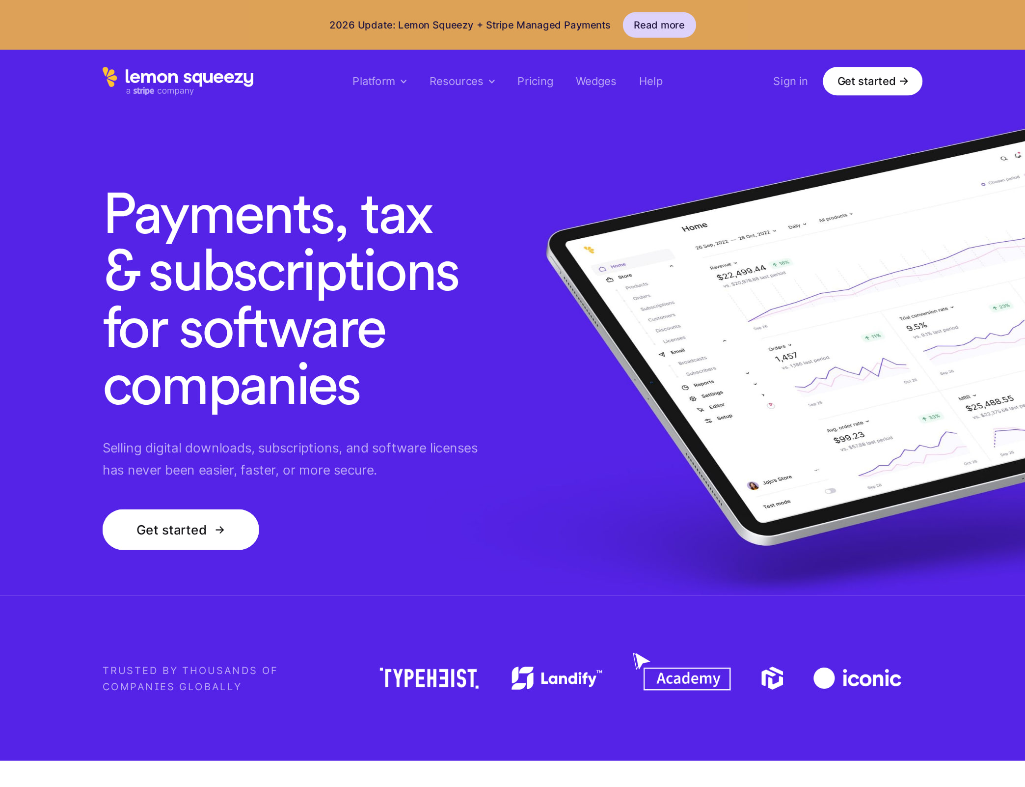
- The primary heading communicates the product category and audience directly: payments, tax, and subscriptions for software companies.
- The heading structure is generally orderly, with one H1 followed by section-level H2s and feature-level H3s.
- The page includes visible trust, testimonial, feature, and customer-story sections rather than relying on a single undifferentiated hero.
- A dark foreground and light neutral surfaces provide a stable base for the otherwise colorful palette.
Opportunities
- Resolve all 22 reported text-contrast failures, especially colored headings and feature-card text identified by the audit.
- Give the three unnamed links accessible names, including the logo, tab-related control, and Stripe badge link.
- Remove the duplicate IDs to improve document integrity and assistive-technology navigation.
- Verify focus states, keyboard access to feature tabs and dropdown navigation, and mobile behavior; these cannot be established from the screenshot or supplied metrics.
Design
The visual design is polished, expressive, and cohesive across a very long page. Its strongest quality is the combination of a consistent product UI language with bold color-blocked sections.
What works
- The saturated violet brand color creates an immediately recognizable visual anchor.
- Alternating pink, blue, green, purple, and neutral sections make a complex product story easy to scan at a macro level.
- Product screenshots, device mockups, and customer imagery make payments and digital commerce features more concrete.
- Typography, spacing, rounded interface elements, and repeated card patterns establish a consistent design system.
Opportunities
- Reduce visual competition between the many saturated sections by reserving the strongest colors for the most important product moments and calls to action.
- Condense or group related feature areas so the page feels less exhaustive and more prioritized.
- Increase legibility where small text sits on tinted or colored backgrounds, independently of the formal contrast fixes.
Uniqueness
The page has a distinctive editorial-product presentation that is more characterful than a conventional payments landing page, though its section-and-mockup pattern remains familiar in SaaS marketing.
What works
- The candy-bright palette gives a payments infrastructure product an unusually energetic and approachable personality.
- The page connects operational capabilities such as tax, fraud, billing, and licensing to varied visual scenes instead of presenting only dashboard screenshots.
- The customer stories and product-specific examples add narrative texture beyond generic feature claims.
Opportunities
- Make the merchant-of-record distinction even more visually dominant earlier in the page so the positioning is unmistakable beside the broad platform feature set.
- Use one or two signature interaction or illustration motifs more consistently to create a stronger proprietary visual fingerprint.
User experience
The visible structure supports progressive discovery and repeated scanning, but the page's exceptional length, dense feature inventory, and reported accessibility defects create friction for some visitors.
What works
- The hero establishes the audience and core problem before the page expands into feature detail.
- Feature groups are organized around recognizable jobs: buying experiences, business growth, payments, subscriptions, and digital products.
- Customer proof appears deep in the page, providing context after the platform explanation.
- Repeated section calls to action give visitors multiple opportunities to continue without returning to the top.
Opportunities
- Add a persistent or strategically repeated summary of the primary next step so visitors do not lose the conversion path during the long scroll.
- Provide a compact comparison or capabilities overview near the beginning for visitors who do not need the full narrative.
- Ensure tabs, dropdowns, cards, and decorative links have clear keyboard focus, names, and state announcements.
- Consider a sticky section index or in-page navigation for the long-form content, provided it does not compete with the primary CTA.
Conversion optimization
For a platform marketing homepage, the page presents a credible conversion sequence: clear category positioning, broad capability coverage, social proof, customer stories, and repeated CTAs. Conversion performance itself cannot be confirmed from the supplied evidence.
What works
- The hero headline identifies both the product area and its target software-company audience.
- Trust messaging and customer proof address credibility concerns relevant to payments and tax infrastructure.
- The breadth of feature sections helps visitors map the platform to multiple operational needs.
- Product mockups and customer examples support the transition from abstract promise to practical use cases.
Opportunities
- Clarify the main CTA's expected commitment and destination at the point of first interaction, such as whether it starts an account, requests access, or provides a demo.
- Surface pricing, fees, payout information, and merchant-of-record implications earlier if they are available, since these are likely high-intent evaluation questions.
- Add a concise proof point near the hero that is specific to reliability, tax coverage, or customer outcomes rather than relying mainly on the later trust section.
- Audit CTA hierarchy so secondary feature links do not visually compete with the primary signup or product-entry action.
What we'd improve
- 01high
Fix contrast and accessible names
Address each of the 22 contrast failures, prioritizing colored headings and feature-card text, then add explicit accessible names to the three reported unnamed links. Recheck the complete page at all responsive states.
- 02high
Repair duplicate IDs
Generate unique IDs for the six repeated references and verify that tabs, labels, anchors, and any ARIA relationships still resolve to the intended elements.
- 03medium
Strengthen early decision support
Add a concise capability or use-case summary near the hero, with a prominent path for software companies evaluating payments, subscriptions, and tax handling.
- 04medium
Improve long-page navigation
Introduce an unobtrusive sticky section index or grouped jump links, and make the primary CTA persistently discoverable without overwhelming the content.
- 05low
Reduce color competition
Reserve the most intense background colors for key narrative transitions and conversion moments, while using lighter variants for secondary feature sections to improve hierarchy and reading comfort.