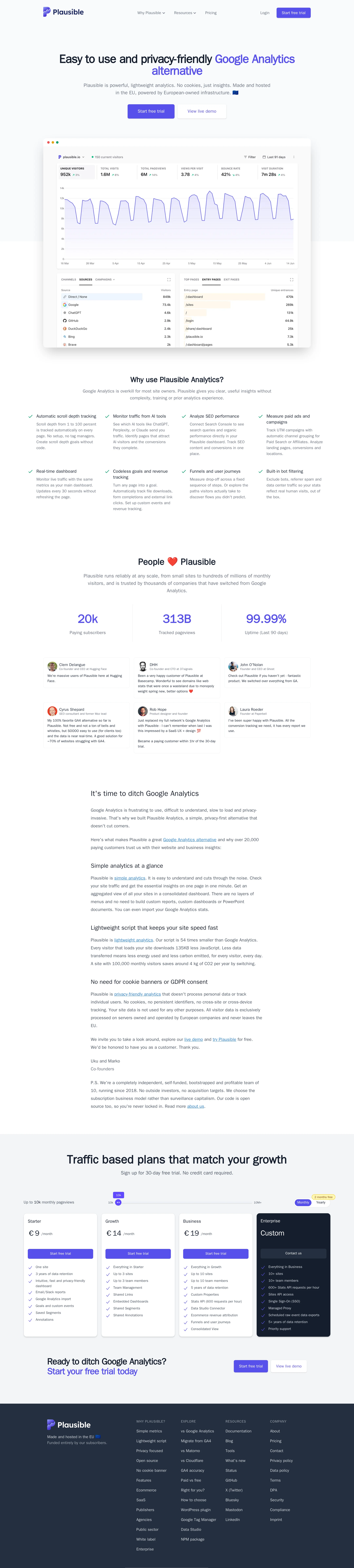
Plausible Analytics website analysis
A detailed critique of the homepage's craft, originality, usability, and ability to move visitors toward its intended goal.
Our observations
A polished and credible SaaS marketing homepage with strong information architecture and clear conversion paths. It is suitable for gallery consideration after accessibility refinements, but the documented contrast and labeling issues prevent an unqualified publish recommendation.
Best practices
The page has a clear heading hierarchy, one detected H1, a semantic main region, navigation, visible pricing, and repeated trial CTAs. Automated checks nevertheless report several meaningful accessibility defects.
What works
- The page contains one H1 and no detected heading skips.
- The navigation, main content region, hero, and pricing section are structurally identifiable.
- The page provides multiple paths to action, including trial and demo-oriented CTAs.
- Pricing is presented openly in four distinct tiers, including an enterprise option.
Opportunities
- Add meaningful alt text to the detected image in the footer or adjacent content area.
- Give the unnamed navigation link an accessible name, especially if it is a logo or icon-only control.
- Associate a visible or programmatic label with the #volume form control.
- Resolve the seven reported text-contrast failures rather than relying on visual context alone.
Design
The composition is cohesive, restrained, and product-led, with an effective indigo/navy palette and generous whitespace. Its visual execution is strong, although the approach is familiar within SaaS design and some sections become text-heavy.
What works
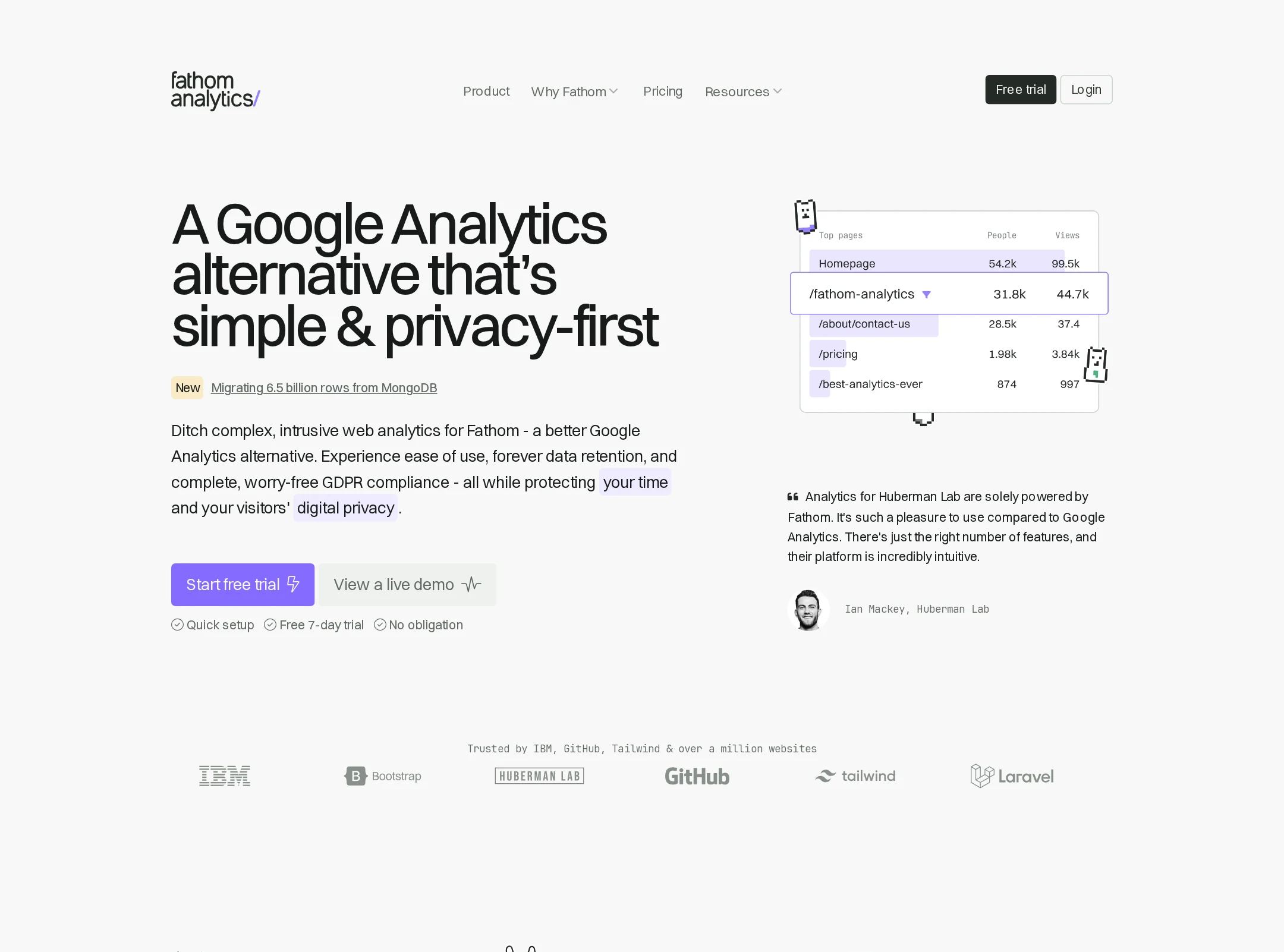
- The large dashboard preview immediately communicates the product category and provides visual credibility.
- Indigo accents consistently identify primary actions and key metrics without overwhelming the page.
- The sequence of benefits, proof points, explanatory content, pricing, and CTA creates a clear visual rhythm.
- The dark footer and pricing card provide useful contrast against the predominantly white page.
Opportunities
- Reduce or reformat dense explanatory copy to improve scanability, particularly in the long Google Analytics comparison section.
- Increase the visual distinction between secondary content blocks and body copy where the page becomes predominantly text.
- Consider a more distinctive illustration, interaction, or brand motif to make the page less visually interchangeable with other SaaS sites.
Uniqueness
The privacy and open-source positioning is differentiated at the product level, but the homepage uses familiar SaaS conventions: dashboard mockup, benefit grid, testimonials, metric counters, pricing cards, and a free-trial close.
What works
- Privacy-friendly and open-source analytics gives the page a focused, clearly differentiated product narrative.
- The combination of customer quotes, usage metrics, and a dashboard preview supports the product's credibility.
- The pricing presentation includes traffic-based plans, which is relevant to an analytics product.
Opportunities
- Make the privacy and ownership model more visually ownable instead of communicating most of the differentiation through standard text sections.
- Use a distinctive data-visualization treatment or interactive product story to separate the brand from generic analytics alternatives.
- Clarify the open-source proposition earlier and more prominently in the visual hierarchy.
User experience
The page is easy to follow and provides enough context for visitors evaluating an analytics tool. The supplied screenshot cannot verify interaction, mobile behavior, or keyboard usability, and the automated accessibility findings indicate friction for some users.
What works
- The hero states the category and primary benefit directly.
- The dashboard image helps visitors understand the product before reaching the detailed sections.
- Testimonials and quantified proof appear before pricing, supporting evaluation without forcing an immediate signup.
- The final CTA repeats the trial invitation after visitors have seen features and plans.
Opportunities
- Correct the missing accessible names and labels identified by the automated audit.
- Improve contrast for the seven flagged link samples, particularly in muted informational copy.
- Review small text sizes and dense copy in the lower sections for readability at common zoom levels.
- Ensure the pricing control associated with #volume clearly communicates its purpose and updated values to assistive technology.
Conversion optimization
Conversion structure is strong for a self-serve SaaS product: the hero includes a primary trial action, a secondary exploration action, transparent pricing, social proof, and a repeated closing CTA. The screenshot does not provide evidence about signup completion or CTA performance.
What works
- The primary trial CTA appears above the fold and again after pricing.
- A secondary action gives less-ready visitors a lower-commitment route to learn more.
- Customer testimonials and usage metrics are placed before the pricing decision.
- Four pricing tiers make the offer legible for different traffic volumes and business sizes.
Opportunities
- Add concise reassurance near the primary CTA about trial duration, payment requirements, or cancellation if those claims are accurate.
- Make the recommended pricing tier visually explicit if there is a preferred starting plan.
- Reduce the amount of text between the proof section and pricing, or add a compact comparison summary for visitors ready to evaluate plans.
- Ensure CTA labels remain sufficiently high contrast and accessible across all states.
What we'd improve
- 01high
Repair the documented accessibility defects
Add alt text to the missing image, provide an accessible name for the unnamed navigation link, label #volume programmatically, and update the seven flagged link colors to meet the required contrast threshold.
- 02high
Improve the pricing control’s semantics
Give the traffic-volume control a visible label, associate it with the input, expose its current value, and ensure plan prices and selected states are announced clearly when the value changes.
- 03medium
Tighten the long-form comparison section
Break the Google Analytics replacement copy into shorter blocks, bullets, or expandable details so visitors can reach the pricing decision with less reading friction.
- 04medium
Strengthen the primary plan decision
Visually identify the most suitable starting plan and add a brief, factual explanation of who each tier is for, while retaining the transparent traffic-based pricing.
- 05low
Build more distinctive visual differentiation
Introduce a branded visualization, privacy diagram, or product interaction that communicates the open-source and privacy model more memorably than standard SaaS feature grids.