Artykul website analysis
A detailed critique of the homepage's craft, originality, usability, and ability to move visitors toward its intended goal.
Our observations
A polished and focused product showcase with strong visual restraint and clear platform positioning. It is suitable for the gallery after accessibility cleanup, but its visual identity and conversion argument remain conventional.
Best practices
The page has a clear H1, consistent hierarchy, strong contrast in the sampled content, and a coherent page sequence. Automated evidence also reports no duplicate IDs or heading skips. Four download links lack accessible names and no main landmark was detected, creating meaningful semantic and assistive-technology concerns.
What works
- One clear H1 frames the product and its core use case.
- The page uses repeated structure consistently, making the long feature sequence easy to scan visually.
- Contrast sampling reported no failures across 20 samples.
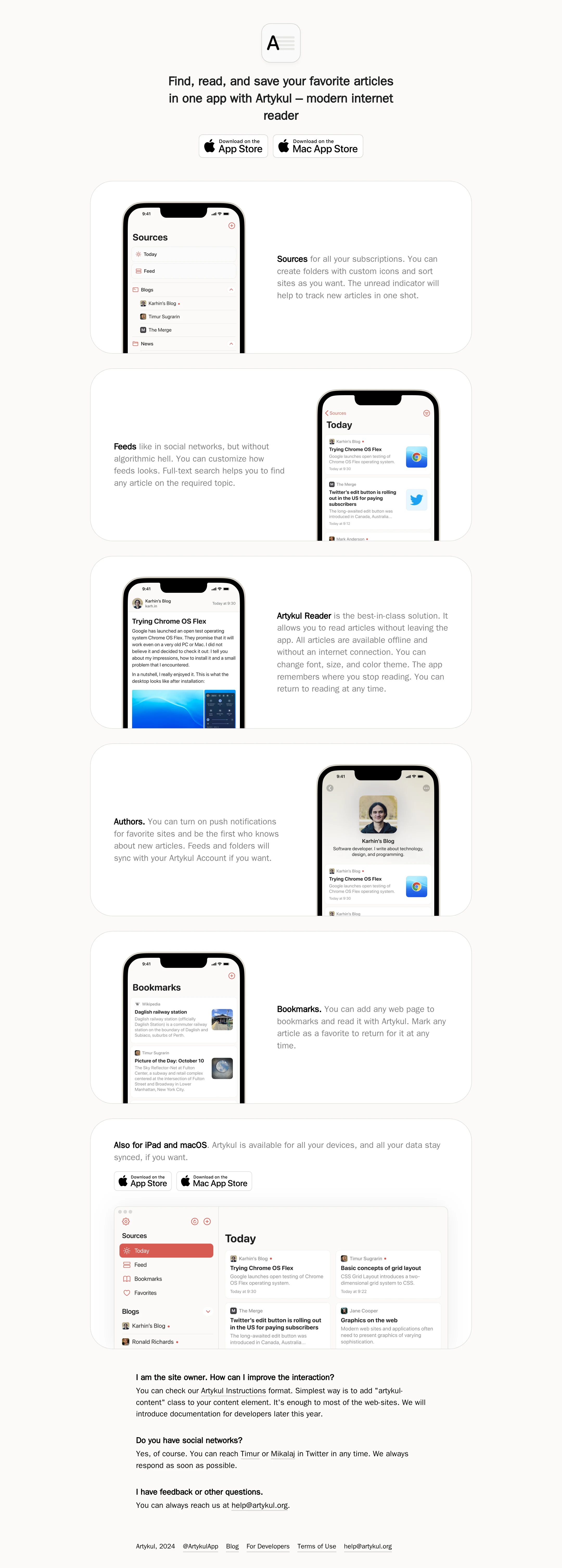
- The product is demonstrated with concrete interface screenshots rather than relying only on claims.
Opportunities
- Provide explicit accessible names for all four App Store and Mac App Store links.
- Add a semantic main landmark around the primary page content.
- Verify keyboard focus visibility and the reading order of alternating image/text cards.
- Test the fixed-size screenshot and card layouts at small and intermediate widths.
Design
A restrained, cohesive visual system that matches the product’s reading-focused positioning. Large rounded panels and alternating imagery create an orderly rhythm, though the sparse identity and familiar Apple-download conventions limit expressive distinction.
What works
- The warm off-white background and white cards create subtle depth without excessive decoration.
- Alternating phone placement keeps repeated feature sections from feeling completely static.
- The screenshots are legible enough to communicate product breadth and platform support.
- Spacing, radius, typography, and border treatment remain consistent throughout the page.
Opportunities
- Strengthen Artykul-specific branding beyond the minimal lettermark and neutral palette.
- Reduce the mechanical repetition of six similarly shaped content panels with more varied editorial grouping.
- Improve copy editing and emphasis so the most important user benefits stand out faster.
Uniqueness
The page is well executed but belongs to a familiar category of minimalist Apple software landing pages. Its alternating screenshots and quiet palette are coherent rather than novel, and the brand system provides limited independent recognition.
What works
- The combination of RSS-specific screens and a final desktop view gives the product a credible, concrete narrative.
- The calm editorial tone is appropriate for a reader application.
- The page avoids trend-driven effects that could compete with the product interface.
Opportunities
- Introduce a more distinctive visual motif tied to reading, sources, or personal curation.
- Replace generic capability sequencing with a sharper point of view about why Artykul differs from algorithmic feeds.
- Develop stronger branded details in the hero, iconography, or supporting illustrations.
User experience
The page offers a straightforward scroll-based explanation: identify the product, show core workflows, then confirm device availability. The compact sections are easy to understand visually, but the long repeated sequence and limited navigation may make deeper information less efficient to reach.
What works
- The hero establishes the product and immediately exposes both platform download paths.
- Each feature is paired with a relevant screenshot, reducing ambiguity about the described capability.
- The alternating layout supports scanning and prevents all content from aligning identically.
- The closing section confirms iPad and macOS availability before the FAQ and footer.
Opportunities
- Add lightweight section navigation or a more explicit feature overview for users who do not want to read every card.
- Make the primary audience and strongest use case more explicit above the fold.
- Ensure mobile layouts preserve the intended relationship between each screenshot and its description.
- Improve the semantic structure so assistive technology users receive the same clear sequence as visual users.
Conversion optimization
For an app-download landing page, the page has an appropriate conversion path and repeats platform-specific calls to action. Conversion support is limited by the absence of visible pricing, privacy or account expectations near the decision point, testimonials, or a sharper articulation of the product’s differentiating value.
What works
- Download actions appear in the hero and again in the cross-platform section.
- The page demonstrates multiple workflows before the final call to action, supporting product understanding.
- Platform coverage is clearly communicated for iPhone, iPad, and macOS.
Opportunities
- Clarify the strongest reason to choose Artykul over competing RSS readers before the first download action.
- Add concise information about pricing, trial availability, account requirements, or privacy if applicable.
- Use descriptive accessible link labels so the conversion path works reliably with assistive technology.
- Consider a more direct final CTA after the feature explanation rather than relying only on badges inside the platform card.
What we'd improve
- 01high
Repair accessible download links
Give each App Store and Mac App Store anchor an explicit accessible name, preserving the visible badge while ensuring screen readers can distinguish the destination and platform.
- 02high
Add semantic page landmarks
Wrap the primary product content in a main landmark and verify that the hero, feature sequence, FAQ, and footer form a logical landmark and heading structure.
- 03high
Validate responsive card behavior
Test the alternating feature cards and fixed screenshot dimensions across phone, tablet, and desktop widths; prevent clipping, awkward text wrapping, or a mismatch between image and description.
- 04medium
Sharpen the value proposition
Rewrite the hero and feature copy around a small number of differentiated benefits, especially control over sources, offline reading, and the non-algorithmic experience.
- 05medium
Build stronger brand distinction
Add a recognizable Artykul visual motif or editorial device that can carry through the hero, cards, and footer without compromising the restrained aesthetic.
- 06low
Improve long-page wayfinding
Consider a compact feature index, section labels, or another low-visual-noise navigation aid so visitors can reach platform support and download actions more efficiently.