Artifacts website analysis
A detailed critique of the homepage's craft, originality, usability, and ability to move visitors toward its intended goal.
Our observations
A distinctive and visually disciplined object-catalog landing page with excellent composition, held back by accessibility weaknesses and an intentionally sparse first-visit explanation.
Best practices
The page has a clear heading, a single main region, a simple navigation structure, and a focused content hierarchy. Supplied automated evidence reports one heading, no heading skips, one main landmark, and no duplicate IDs.
What works
- Strong single-focus hierarchy centered on the featured artifact.
- Semantic navigation and main landmarks are present in the supplied evidence.
- The fixed header keeps the brand and sign-up path visible.
- The layout avoids unnecessary visual noise and competing calls to action.
Opportunities
- The featured media link is missing an accessible name, identified as a serious issue in the supplied evidence.
- Two contrast failures affect secondary text and reduce readability.
- Very small type and tight line-height make supporting content harder to scan.
- Responsive and keyboard interaction behavior cannot be confirmed from the supplied desktop evidence.
Design
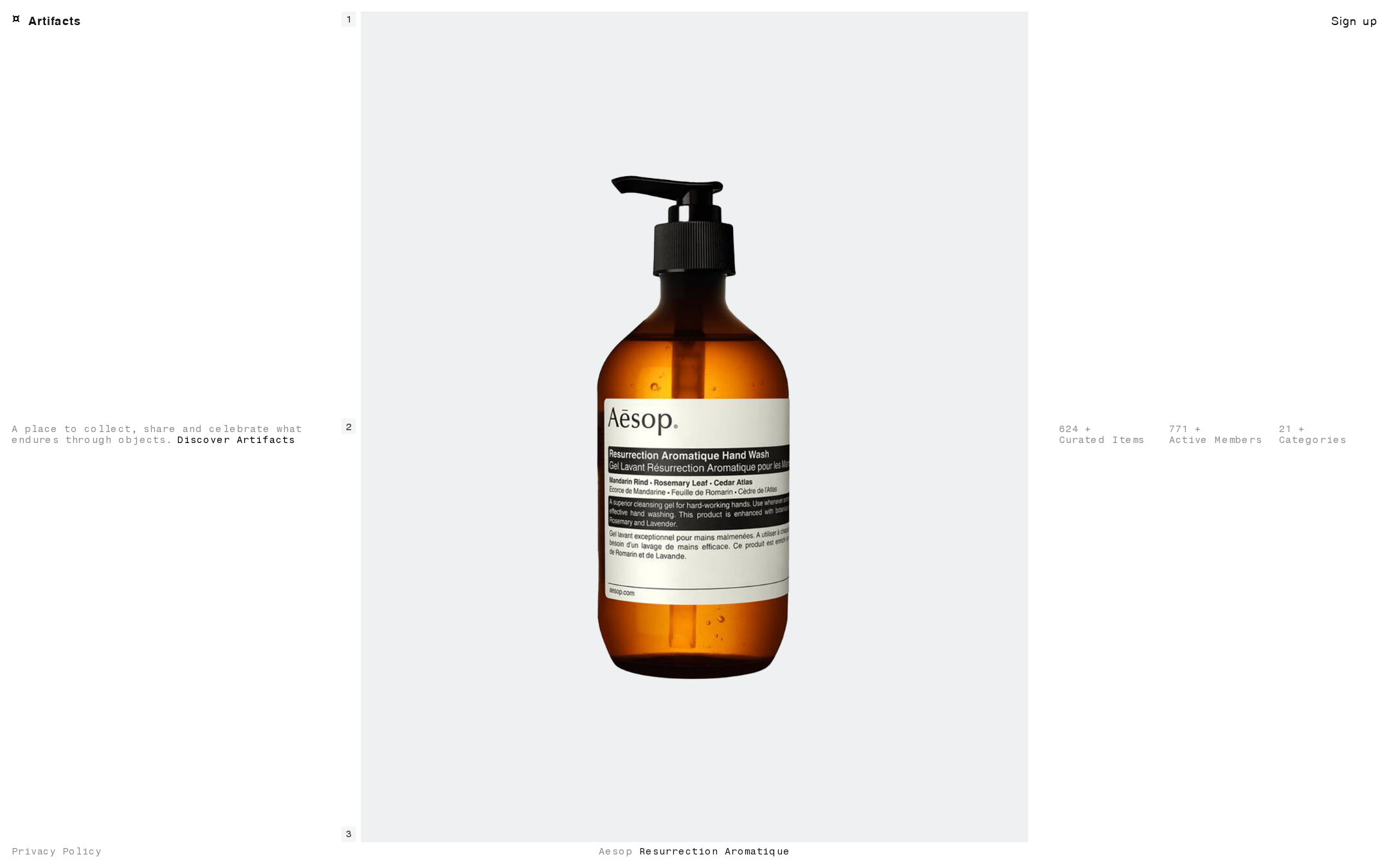
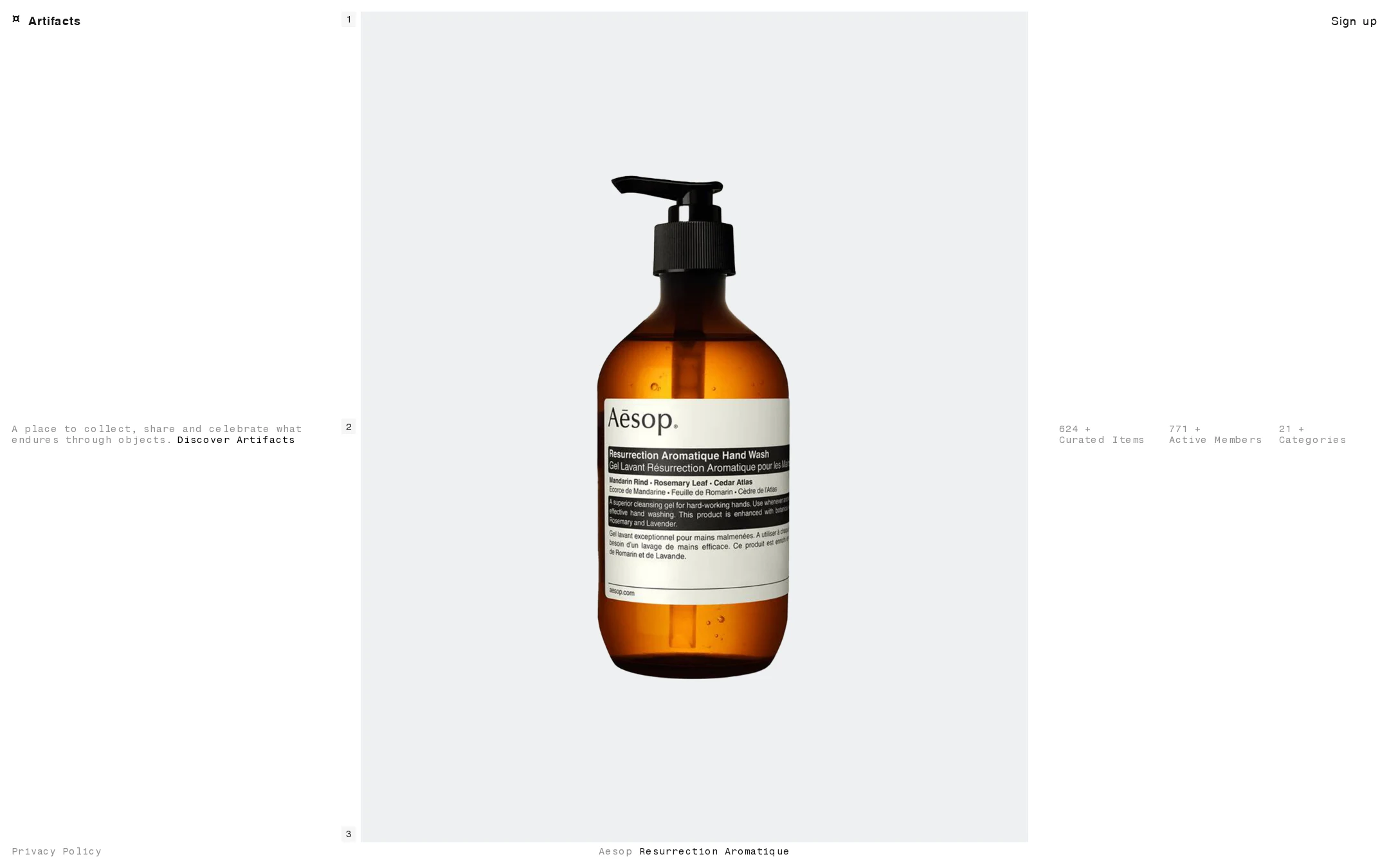
The composition is exceptionally controlled: a large neutral image field, generous negative space, and small catalog-style labels produce a coherent editorial identity.
What works
- The central artifact dominates immediately and is presented with strong visual clarity.
- The sparse grid gives the page a gallery or archive character rather than a generic startup layout.
- The restrained palette lets the amber object provide natural emphasis.
- Typography, numbering, and edge placement work together as a consistent visual system.
Opportunities
- The image field is so dominant that the page provides little visual indication of what happens when the object is selected.
- The small gray labels are aesthetically consistent but visually underweighted for important supporting information.
- A clearer distinction between navigation, statistics, and artifact metadata could improve comprehension without compromising restraint.
Uniqueness
The page has a recognizable point of view and avoids common hero-page conventions. Its object-first, catalog-inspired framing is more distinctive than a standard community or commerce landing page.
What works
- Uses a single everyday object as a curatorial statement rather than a generic lifestyle image.
- Numbered labels and distributed metadata create an unusual archival rhythm.
- The deliberately quiet presentation supports the brand premise of enduring objects.
Opportunities
- The concept could become even more ownable through a stronger explanation of what makes an artifact worth collecting.
- The current visual language is distinctive, but the product’s unique community behavior is not yet visible in the first viewport.
User experience
The page is easy to visually parse, but its extreme minimalism leaves important interaction and product context implicit.
What works
- The primary subject and brand are immediately identifiable.
- The short mission statement communicates the broad purpose of the platform.
- Collection, member, and category figures provide useful proof of activity.
- The sign-up link is consistently available in the header.
Opportunities
- Give the large image link a descriptive accessible name and visible interaction feedback.
- Clarify whether the featured object opens a detail page, collection, or discovery experience.
- Increase the legibility of gray supporting text and confirm adequate focus indicators.
- Test narrow-screen layouts, especially the relationship between the large media tile and side statistics.
Conversion optimization
For a community or curation platform, the page establishes atmosphere and credibility but leaves the next step unusually understated.
What works
- The sign-up action is visible without competing with the editorial presentation.
- Member and collection counts provide lightweight social proof.
- The mission statement gives visitors a reason to investigate the service.
Opportunities
- Add a concise, explicit explanation of what members can do after signing up.
- Make the primary discovery path more prominent than the privacy link and secondary labels.
- Use the featured artifact caption or image interaction to create a clearer route into browsing.
- Consider a secondary action for visitors who want to explore before registering.
What we'd improve
- 01high
Repair the unnamed featured link
Provide the large artifact link with an accessible, descriptive name that identifies the destination or object, rather than relying only on the image or an empty link label.
- 02high
Raise secondary text contrast
Adjust the gray supporting labels and policy text to a darker color or stronger background relationship, then recheck contrast at their rendered font size.
- 03high
Clarify the featured-object interaction
Add an explicit accessible label, visible hover/focus treatment, and concise supporting cue indicating whether selecting the artifact opens details, discovery, or a collection.
- 04medium
Explain the member value proposition
Add one short sentence near the existing mission statement describing the core member action, such as saving, organizing, or sharing artifacts.
- 05medium
Validate responsive composition
Test the fixed header, oversized image, side statistics, absolute footer link, and caption at mobile and intermediate widths; preserve reading order and avoid overlap.
- 06low
Strengthen the discovery path
Give the discovery action a clearer visual role or pair it with a secondary browse action so visitors can explore without committing to sign-up.