

Karri Saarinen website analysis
A detailed critique of the homepage's craft, originality, usability, and ability to move visitors toward its intended goal.
Our observations
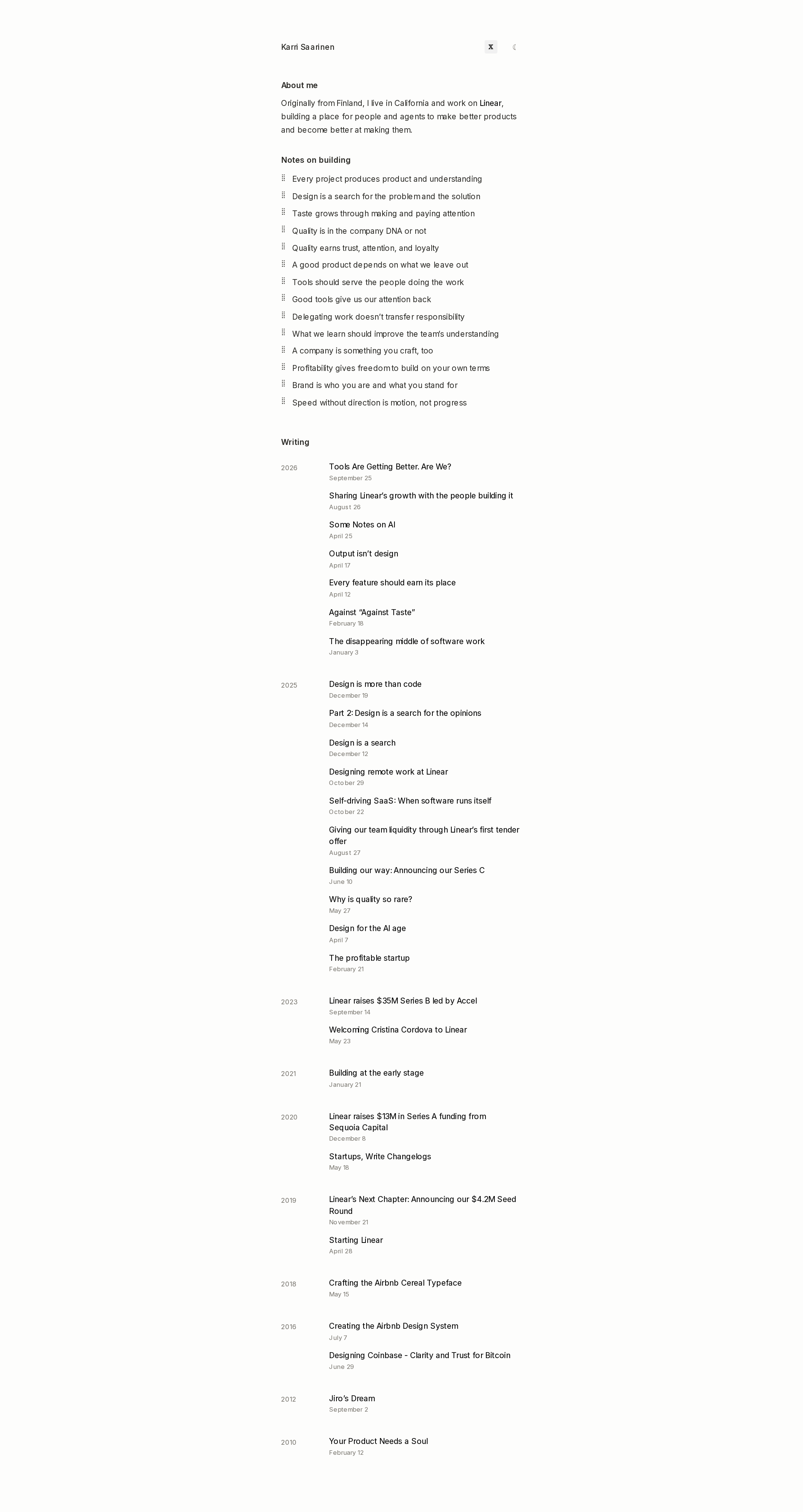
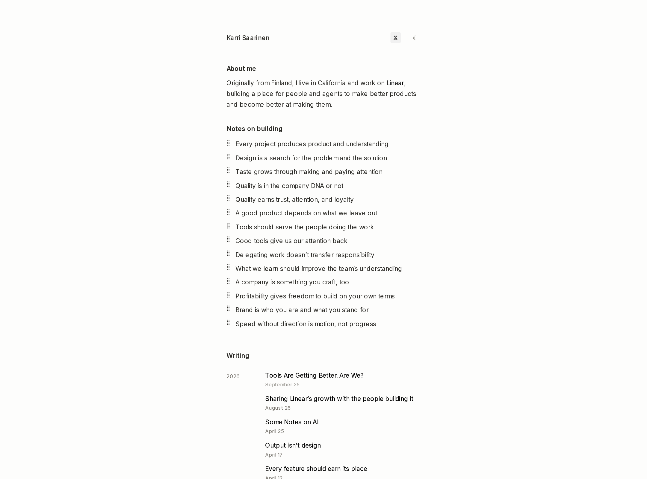
A publishable, exceptionally focused personal archive with excellent typographic discipline and accessibility signals. It is stronger as a writing index and professional identity document than as a visually expressive portfolio.
Best practices
The page demonstrates strong structural and editorial fundamentals, with clear headings, a single main region, semantic navigation, and a consistent hierarchy.
What works
- Supplied accessibility checks report no contrast failures, duplicate IDs, heading skips, or landmark-count issues.
- The single H1 and ordered H2/H3 hierarchy make the page structure easy to interpret.
- The archive is organized chronologically and exposes a substantial body of work without relying on visual cards or hidden navigation.
- The restrained system-font approach supports fast rendering and broad platform compatibility.
Opportunities
- The sparse header provides little explicit wayfinding beyond the theme control and social link; clearer labels could help first-time visitors.
- The supplied evidence does not verify focus styling, touch-target sizing, keyboard behavior, or mobile layout.
- A long archive would benefit from lightweight filtering, topic labels, or a more prominent recent-work entry point if discoverability is a priority.
Design
The visual system is cohesive, disciplined, and unusually comfortable with negative space, though it offers limited visual richness for a portfolio context.
What works
- The narrow centered column creates a strong reading rhythm and keeps the page visually calm.
- Typography, muted dates, and consistent alignment create a clear editorial hierarchy.
- The near-monochrome palette and absence of decorative effects reinforce the author’s product and writing focus.
- The year-grouped archive gives the page a distinctive document-like identity.
Opportunities
- The visual language is intentionally austere, but a small amount of authored visual material could make the professional portfolio dimension more apparent.
- The extremely compact type and low-contrast metadata may feel delicate or undersized for some readers despite the supplied contrast results.
- The header and opening section could use a stronger visual anchor to distinguish identity from the archive below.
Uniqueness
The page is differentiated by its refusal to behave like a conventional portfolio: it foregrounds principles and a durable writing record instead of projects, testimonials, or visual case studies.
What works
- The archive-first structure communicates sustained thinking and authorship rather than a campaign-oriented personal brand.
- The combination of a concise introduction, principles list, and multi-year index feels specific to an individual practitioner.
- The lack of motion and ornamental UI is a deliberate and coherent choice in a category that often overuses both.
Opportunities
- The visual approach remains close to the broader minimalist personal-site tradition, so stronger signature details could increase memorability.
- A clearer relationship between the author’s current role, past work, and selected writing could add narrative distinction without compromising restraint.
User experience
The experience is direct and low-friction for readers seeking biographical context or essays, with a visible archive and little interface overhead.
What works
- Visitors can understand the site’s purpose quickly from the opening identity and biography.
- The page presents recent and historical writing in one scannable chronological system.
- Consistent text links and restrained metadata support predictable browsing.
- No motion is detected, reducing distraction and motion-related risk.
Opportunities
- The long vertical archive may require substantial scanning before older material can be reached.
- The screenshot does not establish whether the theme toggle is clearly labeled to assistive technology or whether the social control is sufficiently descriptive.
- Essay grouping by year alone gives limited topical context, especially for visitors unfamiliar with the author’s work.
Conversion optimization
Conversion is appropriately understated for a personal knowledge archive, but the page could do more to guide professional connections, reading choices, or visits to related work.
What works
- The page establishes credibility through a clear identity, current professional context, principles, and an extensive publication history.
- Writing titles are prominent enough to act as natural entry points for deeper engagement.
- The lack of aggressive calls to action fits an author-led portfolio and avoids distracting from the intended reading journey.
Opportunities
- The primary next step for a visitor is not explicit; a concise contact, speaking, or professional-links pathway could improve connection without adding sales pressure.
- Featured or recommended essays could help new visitors start with the most representative work rather than scanning the full archive.
- The homepage could distinguish current work from historical material more clearly if attracting collaborators or hiring teams is an objective.
What we'd improve
- 01high
Clarify the primary visitor path
Add a small, visible set of labeled destinations for the author’s current work, selected writing, and professional contact or social presence. Keep the treatment text-based so it remains consistent with the editorial direction.
- 02medium
Create an entry point into the archive
Introduce a restrained featured-reading or “start here” area above the full chronology, using a few representative essays and one-line context to reduce scanning effort for first-time visitors.
- 03medium
Strengthen portfolio storytelling
Connect the biography and principles to a concise selection of notable products, teams, or design work. Short contextual summaries would make the site serve both readers and professional visitors without turning it into a conventional case-study grid.
- 04low
Validate interaction and responsive details
Test keyboard focus visibility, theme-toggle labeling, touch-target dimensions, text wrapping, and archive readability across narrow mobile and zoomed layouts. The supplied automated observations do not verify these behaviors.