Allagi website analysis
A detailed critique of the homepage's craft, originality, usability, and ability to move visitors toward its intended goal.
Our observations
A polished and memorable music-release microsite with strong visual restraint and a clear central interaction. It merits inclusion, with semantic structure, link naming, and small-screen timeline behavior requiring review before being treated as exemplary.
Best practices
The page is visually coherent and reports no sampled contrast failures, but important structural and naming gaps reduce its accessibility and robustness.
What works
- No contrast failures were reported across the supplied samples.
- The primary release, artist, track, playback, and streaming actions are visually easy to locate.
- The implementation appears lightweight, with no video detected and limited motion complexity.
Opportunities
- Add a meaningful H1 that identifies the release or artist.
- Provide accessible names for the two unnamed links, including the logo link and any platform-generated badge link.
- Ensure playback controls expose clear labels and state to assistive technology; this cannot be verified from the screenshot alone.
- Test the page with keyboard navigation and screen readers rather than relying on the automated accessibility score.
Design
A disciplined, image-first composition gives the release a strong sense of presence and avoids the clutter common to music promotion pages.
What works
- The centered axis and generous whitespace establish a calm, intentional hierarchy.
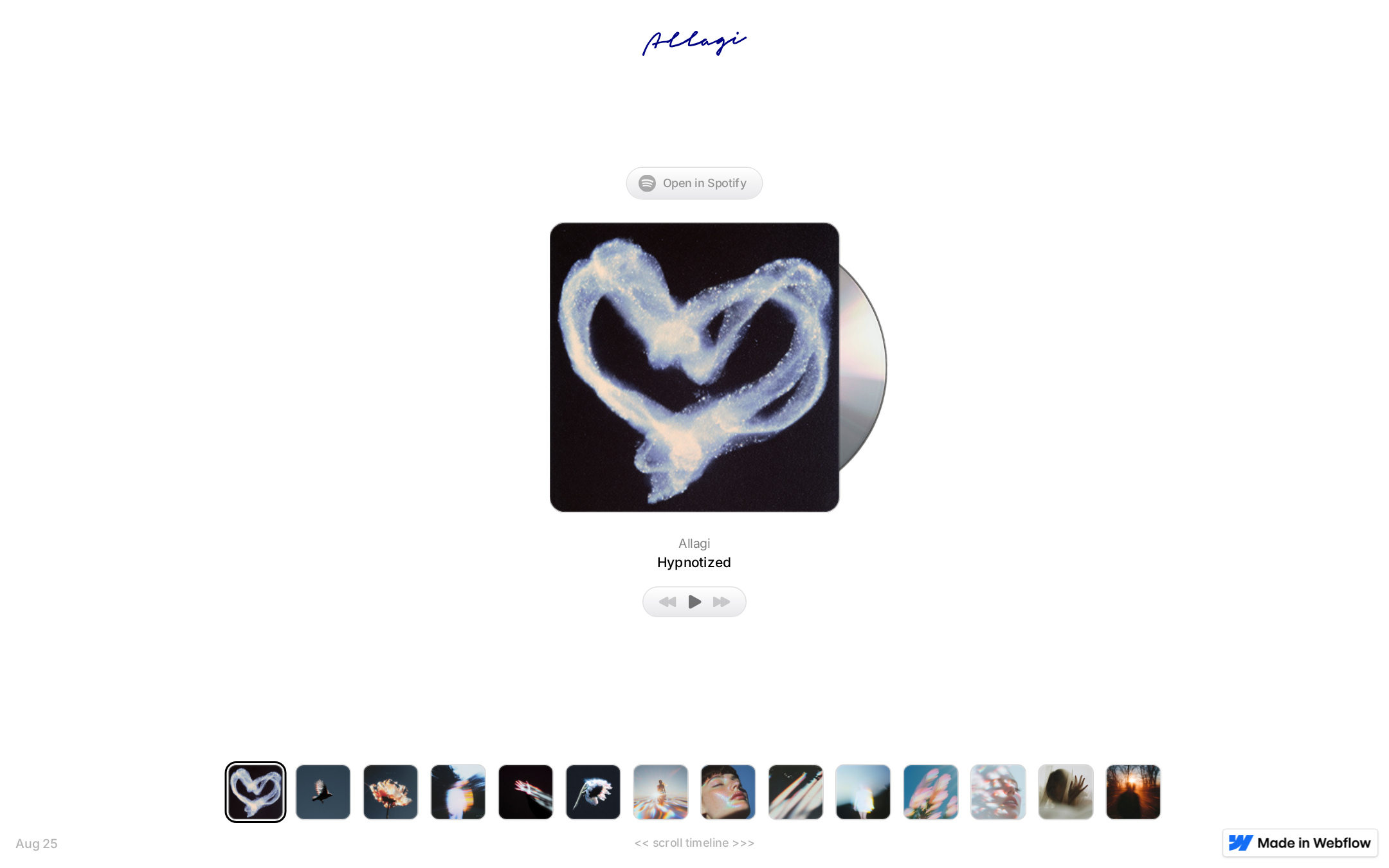
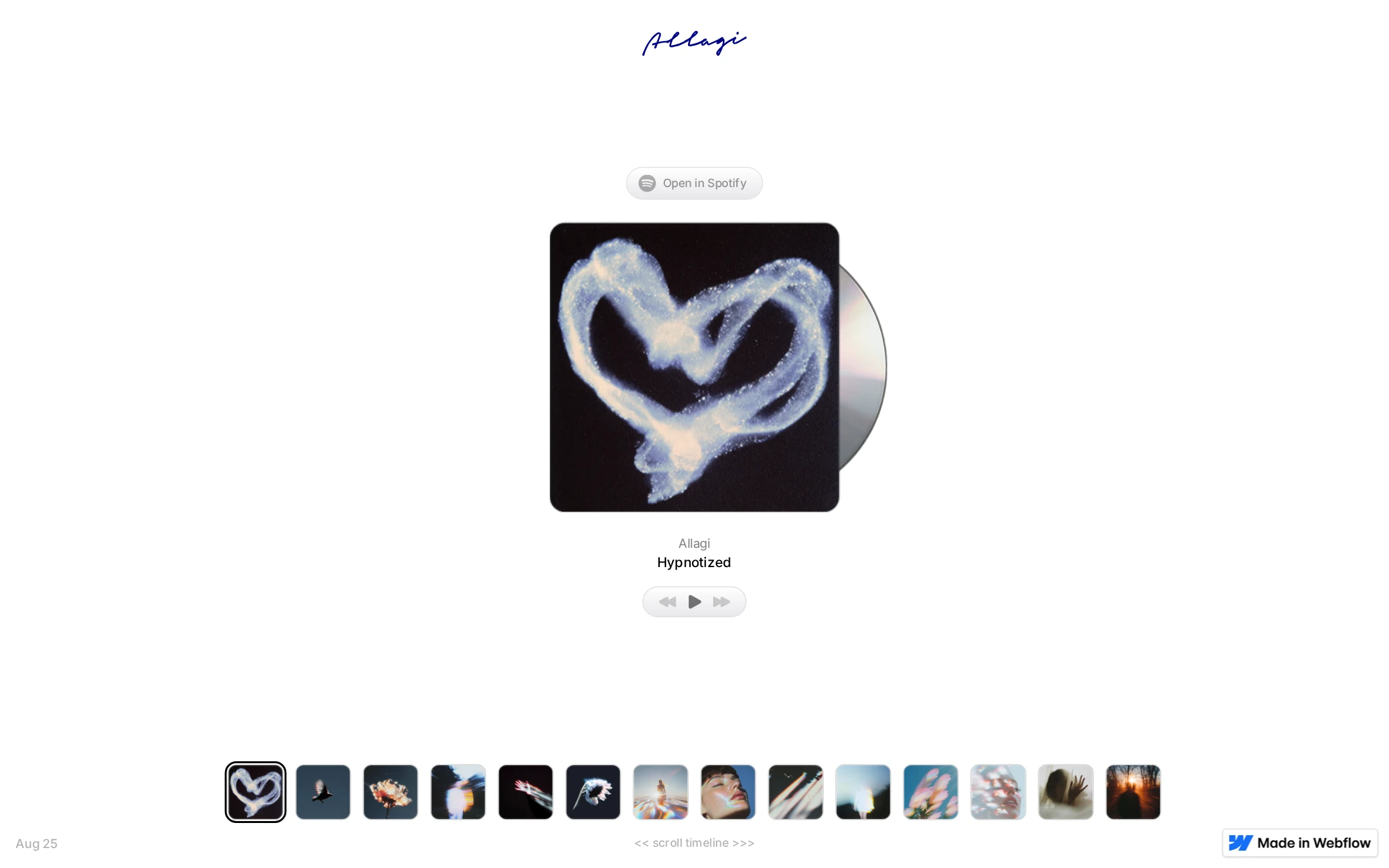
- The CD sleeve and partially revealed disc create a memorable physical-media metaphor.
- The thumbnail timeline adds visual richness while remaining subordinate to the featured release.
- The restrained white, charcoal, gray, and blue palette supports the contemplative tone.
Opportunities
- Increase the visual distinction of secondary instructional text so the timeline affordance is not easily missed.
- Consider a slightly stronger typographic scale for artist and release context on larger screens.
- Clarify whether the bottom timeline is chronological navigation, a catalog, or a visual gallery.
Uniqueness
The physical release metaphor, understated player, and image timeline form a distinctive presentation that feels more like a digital record sleeve than a conventional artist landing page.
What works
- The disc emerging from the cover creates a recognizable visual signature.
- The page prioritizes a single listening moment instead of using generic promotional sections.
- The selected thumbnail treatment and blurred artwork create a cohesive visual catalog.
Opportunities
- Add a small amount of original release context or credits to deepen the identity beyond the artwork and track title.
- Make the relationship between the timeline images and the featured release more explicit without sacrificing the sparse aesthetic.
User experience
The primary path from artwork to listening is direct, but discoverability and non-visual access are less resolved than the visual presentation.
What works
- The main CTA is close to the featured release and clearly points to Spotify.
- The current artist and track labels sit directly beneath the artwork.
- The thumbnail row offers an efficient way to browse multiple visual items.
Opportunities
- Give the timeline a visible label or clearer interaction cue.
- Make selected, hover, and keyboard-focus states consistently understandable across the thumbnail navigation.
- Verify that the horizontal thumbnail row remains usable without awkward scrolling or clipped items on mobile.
- Expose equivalent text alternatives for artwork and controls.
Conversion optimization
For an artist page whose apparent goal is to send visitors to a streaming service, the prominent Spotify CTA is effective, though the page could do more to establish why a visitor should continue exploring.
What works
- The streaming destination is placed above the artwork and is visually separated as a discrete action.
- The featured track is immediately identifiable, reducing friction for a returning listener.
- The compact presentation keeps attention on the release rather than competing promotional messages.
Opportunities
- Add a concise release descriptor, date, or supporting context to strengthen the decision to listen.
- Make timeline items explicitly actionable and identify what changes when one is selected.
- Offer additional accessible listening or platform options if distribution strategy requires more than one destination.
- Confirm that the CTA and player remain prominent at smaller viewport sizes.
What we'd improve
- 01high
Repair semantic and accessible naming gaps
Add a single descriptive H1 for the featured release, give the logo link an accessible name, and remove or properly label the unnamed platform-generated link. Label playback controls and artwork alternatives as well.
- 02high
Clarify the timeline interaction
Add a concise visible label or supporting cue explaining what the thumbnail strip represents, and provide clear selected and keyboard-focus states for each item.
- 03medium
Validate the mobile listening flow
Test narrow layouts for thumbnail overflow, touch target size, artwork scaling, CTA placement, and whether the central release remains the dominant focal point.
- 04medium
Add lightweight release context
Introduce brief, well-structured metadata such as release date, format, or credits so the page communicates more than the track name while preserving its minimal tone.
- 05low
Broaden the listening pathway
If relevant to the artist’s distribution goals, provide clearly labeled alternatives to Spotify without allowing additional platform links to dilute the primary action.