

Spek website analysis
A detailed critique of the homepage's craft, originality, usability, and ability to move visitors toward its intended goal.
Our observations
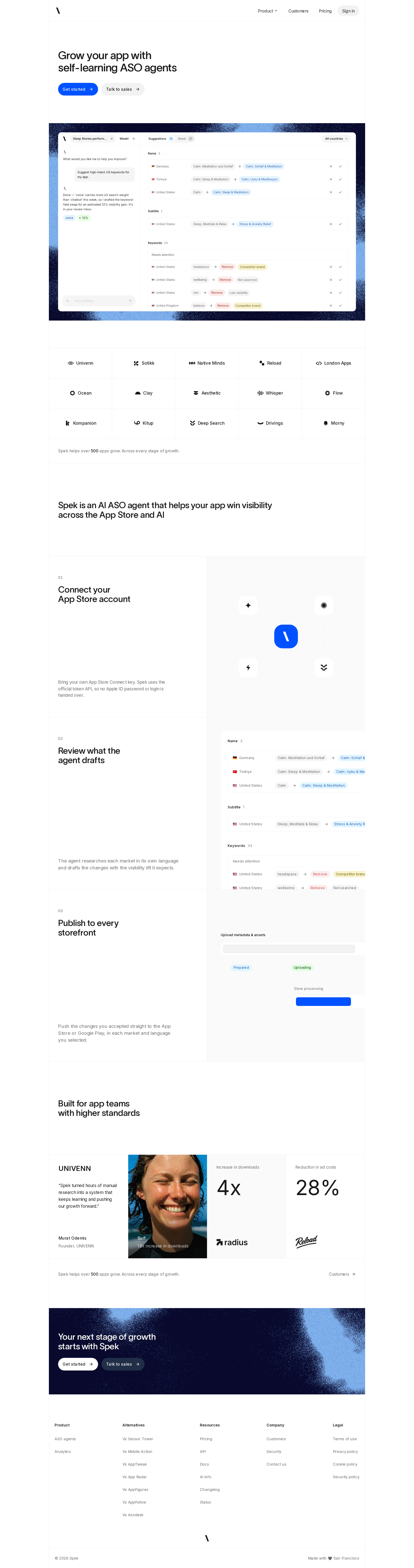
A polished and distinctive SaaS homepage with strong product storytelling and a well-resolved visual system. It is gallery-worthy, though accessibility and small supporting text should be addressed before treating it as a best-in-class reference.
Best practices
The page has a clear landmark structure, one H1, consistent section hierarchy, repeated calls to action, and a coherent content progression. Automated evidence reports no duplicate IDs or heading skips.
What works
- Clear primary and secondary conversion paths in the hero and closing panel.
- One H1 and consistent H2-based section organization.
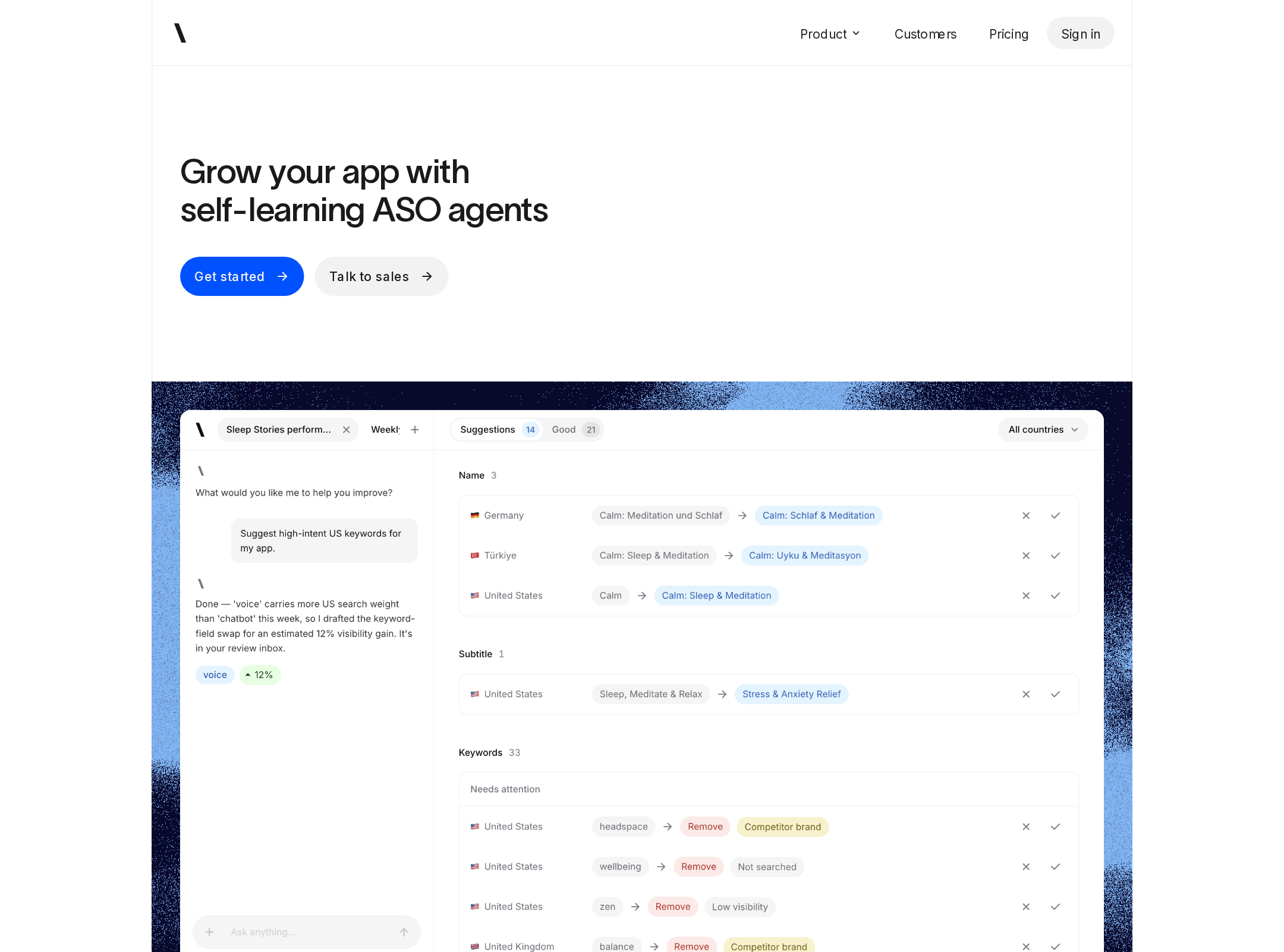
- Strong use of actual product interface previews instead of purely conceptual marketing imagery.
- Customer logos and quantified proof appear before the final conversion moment.
Opportunities
- Resolve the six reported text-contrast failures, particularly in customer proof and footer areas.
- Validate keyboard focus states, image alternative text, form behavior, and reduced-motion behavior through interactive testing.
- Review small labels and attribution text at common desktop and mobile viewing distances.
Design
The visual system is unusually disciplined for a B2B software page. Editorial headline typography, restrained surfaces, precise borders, and a limited blue accent palette produce a confident and premium result.
What works
- Strong contrast between quiet content areas and dark or textured product moments.
- The serif display treatment gives the page personality without overwhelming the product.
- Feature sections maintain a clear relationship between narrative copy and interface evidence.
- Consistent pill actions, grid lines, and soft product framing create a coherent component language.
Opportunities
- The long feature walkthrough could use slightly stronger section-level signposting to reduce visual repetition.
- Some supporting copy is visually subordinate to the point that it risks being overlooked.
- The sparse layout should be checked at smaller viewport widths so generous whitespace does not become excessive scrolling.
Uniqueness
Spek differentiates itself through a measured editorial approach and a workflow-first product narrative rather than relying on common AI gradients or oversized abstract imagery.
What works
- The combination of Lausanne-style display typography, Inter, product screenshots, and blue grain texture feels considered and recognizable.
- The page demonstrates a specific ASO workflow from connection through review to publishing.
- Customer proof is integrated into the narrative rather than isolated in a generic logo wall.
Opportunities
- A more explicit visual distinction for the AI-agent concept could strengthen memorability beyond the interface screenshots.
- The testimonial and metric treatment could present a more ownable point of view instead of relying primarily on familiar SaaS proof conventions.
User experience
The information architecture is easy to follow and the page makes the product workflow legible. The main friction is likely small, low-contrast supporting content and the amount of vertical travel required to reach later proof and conversion content.
What works
- The hero communicates the category and offers immediate next steps.
- Numbered feature stages make the workflow easy to scan.
- Interface previews provide useful context for a specialized product.
- Footer navigation is grouped into understandable categories.
Opportunities
- Increase the legibility of low-contrast customer and footer text.
- Consider a persistent or repeated contextual CTA for visitors who understand the product before reaching the final panel.
- Ensure product screenshots remain readable and navigable on narrow screens; this cannot be confirmed from the supplied desktop evidence.
Conversion optimization
Conversion strategy is strong for a product-led B2B landing page: the page establishes the proposition, shows the product, explains the workflow, supplies customer proof, and repeats the CTA. More qualification detail could improve decision confidence for higher-consideration buyers.
What works
- Hero actions distinguish self-serve intent from sales intent.
- Product evidence appears before the page asks for a commitment.
- The workflow explanation addresses trust-sensitive steps such as account connection, review, and publishing.
- Customer metrics and recognizable customer references support the final CTA.
Opportunities
- Clarify pricing, trial expectations, implementation effort, or qualification requirements if those details exist elsewhere.
- Add concise reassurance near the primary hero action about setup time, data access, or account security.
- Make customer outcomes more specific and attributable where permitted, while keeping the restrained visual style.
What we'd improve
- 01high
Repair reported contrast failures
Audit the six flagged text instances, especially customer attribution, muted labels, and the closing CTA heading. Increase contrast while preserving the quiet palette, then re-run automated checks and inspect the result at normal reading size.
- 02high
Validate mobile and keyboard experiences
Test the hero preview, split feature rows, logo grid, navigation, CTA focus states, and footer at narrow widths and with keyboard navigation. Confirm that product screenshots remain understandable without relying on hover or animation.
- 03medium
Strengthen early trust signals
Add a compact reassurance line near the hero actions covering setup, security, or trial expectations, provided those claims are accurate. This would reduce uncertainty before visitors commit to a workflow-heavy product.
- 04medium
Improve scanability in the walkthrough
Give each numbered feature a slightly more prominent benefit label or outcome cue so the three long rows read as distinct value propositions rather than only sequential product steps.
- 05low
Increase proof specificity
Where evidence is available, pair customer metrics with a short timeframe, baseline, or clearly attributed outcome. Preserve the current restrained layout while making the proof more decision-useful.