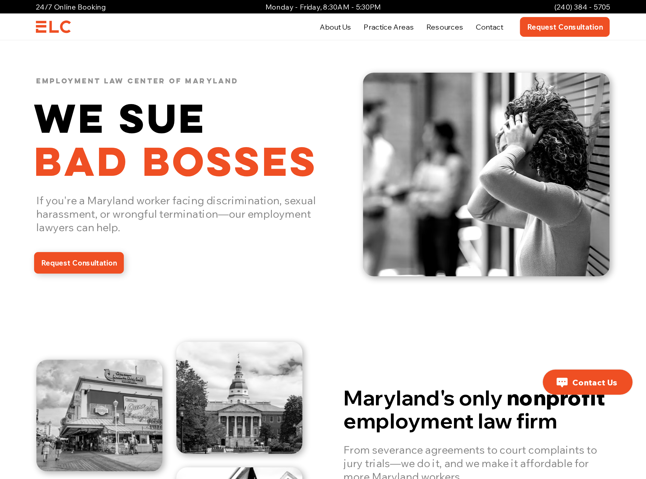


Employment Law Center of Maryland website analysis
A detailed critique of the homepage's craft, originality, usability, and ability to move visitors toward its intended goal.
Our observations
A strong, distinctive nonprofit legal homepage with an effective advocacy voice, held back from gallery-ready status by serious accessibility and semantic issues.
Best practices
The page communicates purpose and credibility well, but automated accessibility findings reveal material structural and contrast problems.
What works
- The primary service proposition is immediately visible in the hero.
- The page provides multiple trust signals, including results, testimonials, staff presentation, and educational resources.
- Repeated calls to action make consultation access easy to find.
- No duplicate IDs were detected in the supplied accessibility evidence.
Opportunities
- Add a meaningful main landmark and correct the heading hierarchy.
- Give every linked image, icon, and card an accessible name and descriptive purpose.
- Resolve the 25 recorded contrast failures, including button and supporting-text treatments.
- Reduce reliance on very small supporting copy and verify focus visibility and touch-target sizing.
Design
A polished, approachable visual system uses assertive typography, documentary imagery, and a disciplined orange accent to make legal advocacy feel human and accessible.
What works
- The hero creates strong initial impact through concise copy and a large typographic contrast.
- The sequence from practice areas to testimonials to resources supports a persuasive narrative.
- Photography and portraiture add warmth and credibility to a serious subject.
- The long page maintains recognizable section markers and recurring action patterns.
Opportunities
- Increase text size or spacing in dense testimonials, resource labels, and small metadata.
- Simplify some repeated section treatments so the page feels less vertically extended.
- Improve the visual distinction between informational links and primary conversion actions.
- Review image crops and card density at narrow widths to preserve clarity.
Uniqueness
The direct, adversarial headline and nonprofit positioning give the page a recognizable voice, although its broader visual conventions remain familiar within legal and professional-services websites.
What works
- The assertive opening language is more memorable than a generic firm introduction.
- The combination of worker-centered testimonials, local Maryland imagery, and unconventional positioning supports a specific identity.
- The orange accent and editorial image treatment create a coherent point of view.
Opportunities
- Develop a more proprietary visual motif or illustration language beyond standard cards, portraits, and stock-style photography.
- Make the nonprofit mission and community impact more visually central rather than treating them mainly as supporting proof.
- Use more distinctive resource and practice-area navigation patterns while preserving usability.
User experience
The information architecture is understandable in the screenshot, but the recorded accessibility defects create substantial barriers for users of assistive technology and users who need high-contrast content.
What works
- The page offers several paths for visitors with different needs: practice areas, consultation, testimonials, resources, and team information.
- The hero and practice-area section make the firm’s focus easy to infer.
- The content is organized into predictable, recognizable sections.
Opportunities
- Repair unnamed links, especially large image/card links that currently lack usable labels.
- Replace skipped H6/H4 patterns with a logical heading sequence and retain one clear page H1.
- Correct the two-H1 structure so the page has one primary document heading.
- Test keyboard navigation, screen-reader announcements, zoom, reduced motion, and narrow-screen reflow manually.
Conversion optimization
The homepage presents a clear consultation goal and supports it with relevant proof, but urgency and qualification information could be made more explicit for prospective clients.
What works
- Consultation actions appear in the header, hero, mid-page, and closing CTA.
- The practice-area list helps visitors self-identify their issue.
- Testimonials, outcome statistics, and attorney presentation reduce uncertainty.
- The closing message provides an emotionally supportive conversion moment.
Opportunities
- Clarify what happens after requesting a consultation, including response timing, eligibility, and whether the service is free or limited.
- Add a concise intake-oriented pathway for visitors who are unsure whether their situation qualifies.
- Strengthen the relationship between each practice area and its next step instead of relying on generic card links.
- Place key trust and expectation-setting information closer to the first consultation action.
What we'd improve
- 01high
Fix the accessibility foundation
Name all 24 currently unnamed links, correct the 25 contrast failures, add a main landmark, and verify visible focus states with keyboard and screen-reader testing.
- 02high
Repair document semantics
Reduce the page to one meaningful H1 and establish a sequential heading hierarchy for the hero, proof, practice areas, testimonials, resources, and footer content.
- 03high
Improve small-screen readability
Audit the smallest text, line lengths, testimonial density, card spacing, and image crops at mobile widths and at 200% zoom.
- 04medium
Make consultation expectations explicit
Explain eligibility, cost or nonprofit limitations, expected response time, and the next step directly beside the primary consultation action.
- 05medium
Differentiate informational and action links
Use consistent labels and visual states so practice-area, resource, and consultation actions are immediately distinguishable.
- 06low
Deepen the visual identity
Introduce an original supporting motif or illustration approach that reinforces worker advocacy and Maryland context without depending on generic legal-service patterns.