

Morning Brew Inc. website analysis
A detailed critique of the homepage's craft, originality, usability, and ability to move visitors toward its intended goal.
Our observations
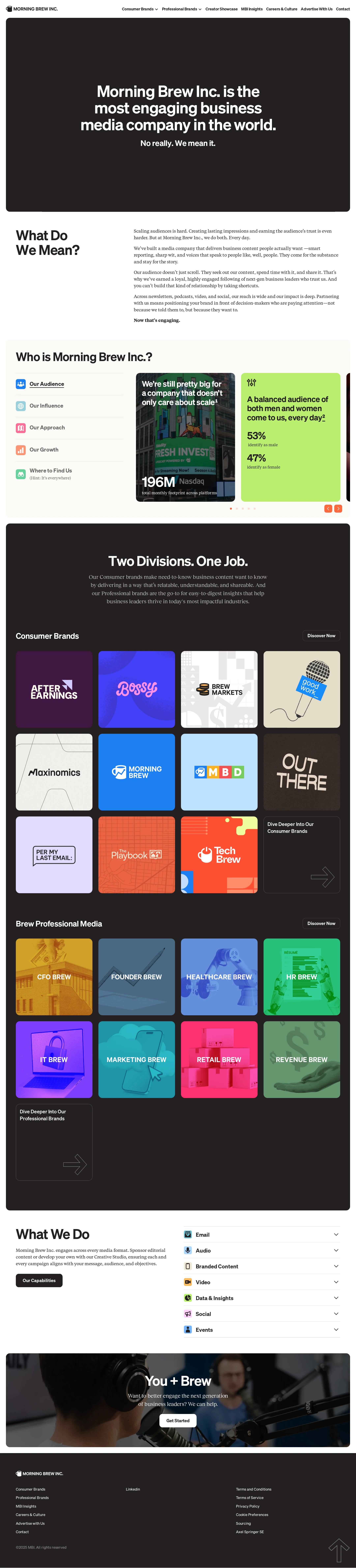
A visually strong and distinctive media-company homepage with excellent brand presentation, but it should receive accessibility and interaction review before publication in a curated gallery.
Best practices
The page has one detected H1 and a main landmark, but automated observations identify substantial semantic and contrast problems.
What works
- The homepage has a single detected H1 that clearly states the company’s purpose.
- A navigation landmark and main landmark are present.
- The page uses recognizable section groupings for company information, divisions, capabilities, and contact.
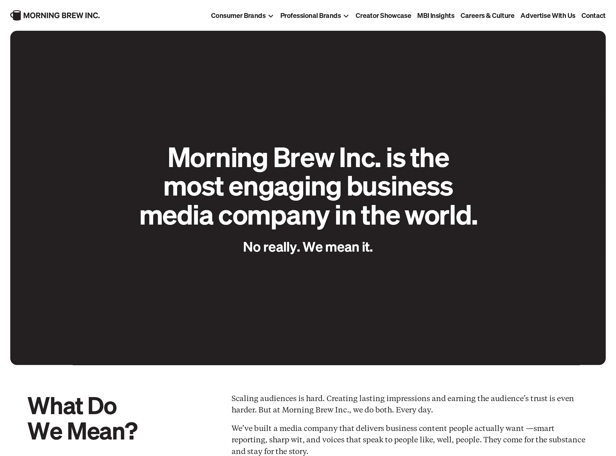
- The visual hierarchy makes the primary company statement prominent above the fold.
Opportunities
- 21 links are reported without accessible names, including repeated brand and navigation-related elements; add visible or programmatic link names and verify that image-based cards expose their destination.
- 34 of 244 sampled text combinations fail contrast checks, which is especially concerning in the dense brand and information sections; revise foreground/background pairs and test text at actual rendered sizes.
- Six heading-level skips are reported, including H5 and H6 headings following higher-level headings; rebuild the document outline with sequential, meaningful heading levels.
- Verify keyboard focus visibility, carousel control labels, video alternatives, and responsive behavior; these cannot be established from the supplied screenshot and observations alone.
Design
The visual design is cohesive, expressive, and unusually well matched to a contemporary business-media brand.
What works
- The near-black sections and bright tile palette create a memorable editorial rhythm.
- The consumer and professional media brands are presented as a coherent portfolio rather than as a generic list of services.
- The contrast between Söhne sans-serif typography and Tiempos/other serif styles gives the page a publication-like character.
- The large brand grid provides a strong visual centerpiece and communicates breadth quickly.
Opportunities
- The brand grid is visually dense and can compete with the explanatory copy; add more grouping cues or a clearer priority between featured and secondary brands.
- Several copy blocks appear small relative to the large section titles; increase reading scale or reduce copy density in the most compressed areas.
- Use a more consistent treatment for arrow controls, card affordances, and section CTAs so interactive behavior is easier to predict.
Uniqueness
The homepage has a strong point of view and avoids the interchangeable appearance common to corporate media sites.
What works
- The hand-made, colorful brand cards give the portfolio section a recognizable visual signature.
- The combination of editorial typography, audience statistics, and media-brand packaging feels specific to a publishing business.
- The page balances serious corporate positioning with playful, magazine-like art direction.
Opportunities
- The large claim in the hero is confident but broad; support it earlier with a concise, concrete differentiator or proof point.
- The visual language is strongest in the brand grid; extend a few of its distinctive motifs into the capabilities and contact sections without reducing clarity.
User experience
The page offers a logical narrative from positioning to proof, portfolio, capabilities, and contact, though content density and accessibility defects create friction.
What works
- The sequence explains what the company is before introducing its audience, divisions, and services.
- The audience section combines navigation labels, imagery, and statistics to encourage exploration.
- The capabilities section uses compact expandable-looking rows to keep a broad service list manageable.
- The closing “You + Brew” section gives the page a clear contact-oriented endpoint.
Opportunities
- Provide persistent or more prominent in-page navigation for a long homepage so visitors can jump directly to brands, capabilities, or contact.
- Make the selected audience tab and carousel state more explicit, and ensure controls have descriptive accessible names.
- Improve the readability of small body copy and low-contrast labels, particularly in the audience and footer areas.
- Clarify whether brand tiles open case studies, brand sites, or another destination before relying on the tile imagery as the primary affordance.
Conversion optimization
For a media-company marketing site, the page communicates scale and capabilities well and ends with a contact pathway, but the business value proposition and conversion route could be more direct.
What works
- The hero immediately identifies the company as a business media organization.
- The brand portfolio provides broad evidence of reach and specialization.
- Audience figures and named divisions help prospective partners understand the company’s scope.
- The capabilities section connects the portfolio to practical professional-media services, while the final contact section supplies a clear next step.
Opportunities
- Add a prominent above-the-fold CTA for advertisers, partners, or prospective clients instead of making visitors progress through the full page to find the contact route.
- State the primary commercial outcome more explicitly—such as audience access, branded content, events, or media partnerships—near the hero and capabilities introduction.
- Add concise proof near the conversion points, such as representative outcomes, client categories, or examples of work, if available.
- Use distinct CTAs for consumer brand discovery and professional media inquiries so different audiences do not share an ambiguous path.
What we'd improve
- 01high
Repair accessible names and contrast
Audit all 21 unnamed links and assign descriptive accessible names that identify the card or destination. Resolve the 34 detected contrast failures, prioritizing small labels, statistics, footer text, and text placed over imagery or saturated tiles.
- 02high
Correct the heading hierarchy
Replace the reported H5/H6 structural skips with sequential headings that reflect the visual sections, while preserving the existing single H1 and meaningful section titles.
- 03high
Strengthen the primary conversion path
Add a clear hero-level CTA for media partnerships or inquiries, then repeat a context-specific CTA after the capabilities section and at the final contact panel.
- 04medium
Make portfolio interactions self-explanatory
Add visible labels or supporting microcopy that explain what each brand tile opens, and expose the current state and purpose of any audience carousel controls.
- 05medium
Reduce long-page navigation friction
Add an anchored section menu or sticky navigation with clear destinations such as About, Brands, Capabilities, and Contact; test the behavior at narrow viewport widths.
- 06low
Improve reading density
Increase body-text size and line spacing in dense explanatory sections, and trim or progressively reveal secondary copy so the strong visual system does not overpower comprehension.