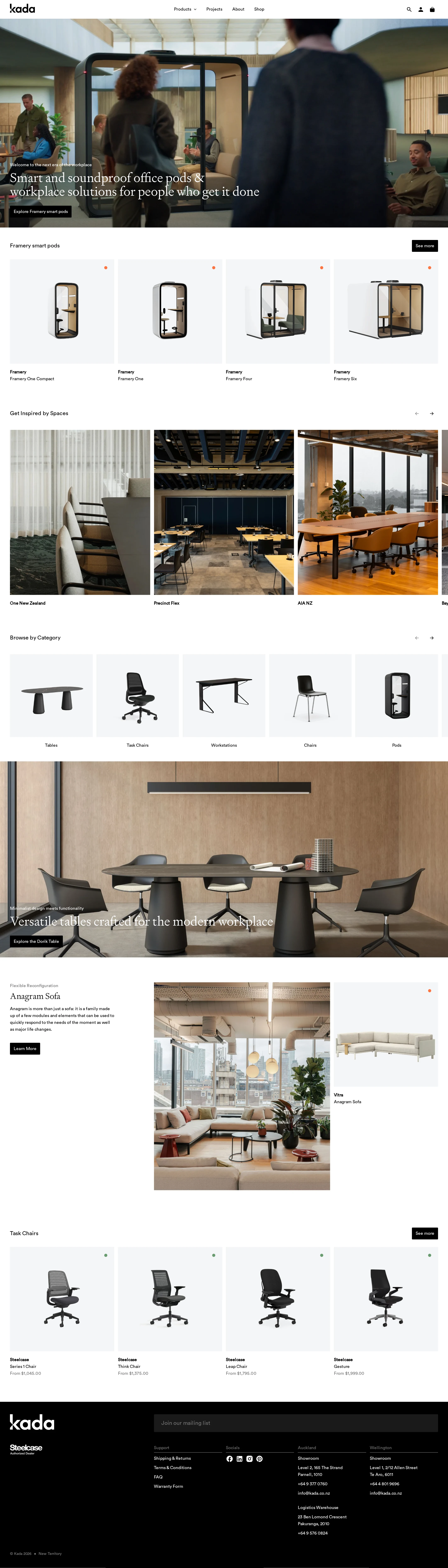
Kada website analysis
A detailed critique of the homepage's craft, originality, usability, and ability to move visitors toward its intended goal.
Our observations
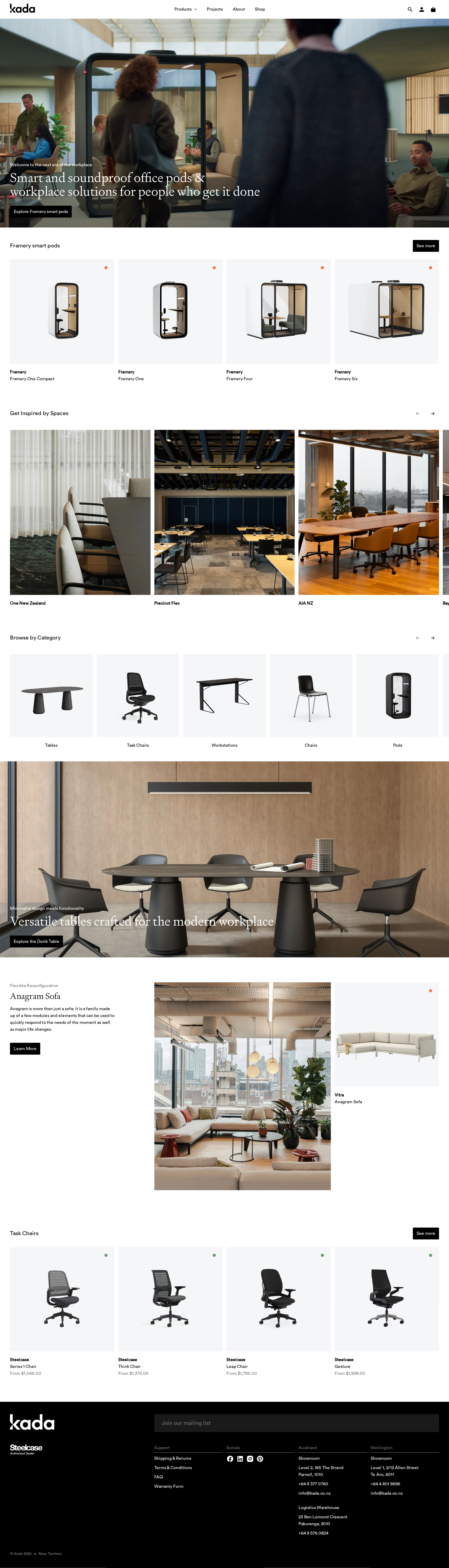
A strong, commercially credible workplace ecommerce homepage with premium imagery and clear merchandising flow, held back by meaningful accessibility and document-structure defects.
Best practices
The page has a clear main region, semantic navigation and footer, descriptive product and hero image text, and an evident skip-link mechanism. Automated evidence also identifies several issues that affect robustness.
What works
- A clear above-the-fold proposition and primary action establish the page purpose quickly.
- Product, inspiration, category, and featured-product sections create a coherent browsing path.
- Image elements include descriptive text in the supplied DOM evidence.
- The interface uses relatively simple controls and avoids excessive decorative effects.
Opportunities
- Add a single, properly ordered H1 for the primary homepage proposition; the automated check reports zero H1 elements.
- Resolve the seven reported text-contrast failures, especially over hero and footer content.
- Give the identified mega-menu image link an accessible name and remove the duplicate cart-related ID.
- Verify keyboard focus visibility, carousel announcements, and touch target sizing across interactive controls.
Design
A polished and disciplined visual system pairs premium workplace photography with clean product merchandising and restrained accents.
What works
- The hero image communicates the workplace context immediately and supports a strong category proposition.
- Product renders sit on consistent pale backgrounds, improving visual comparison across the catalogue.
- The sequence from inspiration to products gives the page both brand character and shopping utility.
- The dark footer provides a decisive visual close and reinforces the Kada identity.
Opportunities
- Increase the visual distinction between some section headings and supporting labels, which can appear very small at the supplied viewport.
- Introduce a slightly more distinctive brand gesture beyond the established furniture-retail pattern of neutral grids and monochrome buttons.
- Review hero text placement and contrast across different video or image frames rather than relying only on a subtle overlay.
Uniqueness
The combination of New Zealand workplace imagery, office-pod specialization, and editorial product storytelling gives Kada a credible point of view, though the interface conventions are familiar.
What works
- The workplace scenes feel specific and human rather than purely studio-driven.
- Office pods and workplace environments form a recognizable category narrative.
- The blend of spatial inspiration with commerce is more differentiated than a straightforward product listing.
Opportunities
- Make Kada’s sustainability and considered-environment positioning more visibly concrete through proof points, certifications, materials, or sourcing stories.
- Develop a stronger recurring editorial motif or branded interaction to distinguish the experience from premium furniture catalogues.
- Use the local/New Zealand perspective more explicitly where it can support trust and relevance.
User experience
The visible information architecture is easy to scan and supports both inspiration-led and product-led browsing, but small text and unverified responsive behavior create usability risk.
What works
- The homepage presents multiple entry points through products, categories, inspiration, and featured campaigns.
- Consistent cards and repeated section patterns make scanning predictable.
- Search and cart actions are exposed in the header, supporting returning shoppers.
Opportunities
- Test the small product labels, prices, footer copy, and hero text at common laptop and mobile widths.
- Ensure carousel controls communicate position and content to screen readers and remain usable by keyboard and touch.
- Confirm that sticky navigation does not obscure focused content or hero actions.
- Provide clear fallback behavior for hero media and any motion-sensitive users; the supplied evidence does not establish how the media behaves in reduced-motion mode.
Conversion optimization
The homepage supports discovery well and includes repeated routes into the catalogue, but its conversion messaging is stronger for browsing than for high-consideration workplace purchasing.
What works
- The hero includes a direct route into office-pod exploration.
- Repeated 'See more' actions reduce the effort required to continue into product collections.
- Product cards expose recognizable brands and product names, helping visitors qualify options quickly.
- The page combines emotional workplace imagery with tangible product categories, supporting different purchase motivations.
Opportunities
- Add a prominent consultation, specification, or project-enquiry pathway for commercial buyers who are not ready to purchase directly.
- Surface practical decision information earlier, such as delivery regions, installation, lead times, warranty, or workplace planning support.
- Clarify the relationship between retail product purchasing and larger workplace-solutions services.
- Use stronger supporting proof near the first conversion point, such as client environments, certifications, or measurable acoustic and sustainability claims.
What we'd improve
- 01high
Repair heading hierarchy and accessibility defects
Add one meaningful H1, preserve a logical heading sequence, provide an accessible name for the mega-menu image link, remove duplicate cart IDs, and remediate the seven reported contrast failures.
- 02high
Strengthen the commercial path for workplace projects
Place a visible consultation or project-enquiry route near the hero and repeat it near relevant workplace-solution sections, alongside concise information about planning, installation, and lead times.
- 03medium
Improve decision support in product discovery
Add useful qualifying information to product cards or collection entry points, such as use case, capacity, acoustic benefit, availability, or delivery context, without making the grids visually dense.
- 04medium
Validate responsive and motion behavior
Test the hero, product rails, carousels, sticky header, focus states, and reduced-motion experience at mobile and tablet widths; the supplied evidence primarily represents desktop behavior.
- 05low
Increase brand distinctiveness
Turn Kada’s New Zealand, sustainability, and considered-workplace positioning into visible proof-led editorial modules rather than leaving those ideas primarily to the metadata and imagery.