MICRtype
micrtype.com
Eight retail stores, digital-goods shops and product catalogues show different ways to connect brand color with shopping. Compare the neutral page structure, merchandise photography, promotional emphasis and buying controls in each example. Reviewed on October 22, 2026 using retained desktop and mobile captures. Extracted swatches can include imagery as well as interface colors. Test text and button contrast in your own screens, and visit each original for its current products and interactions.
Open a website to explore the full capture and design details.
micrtype.com
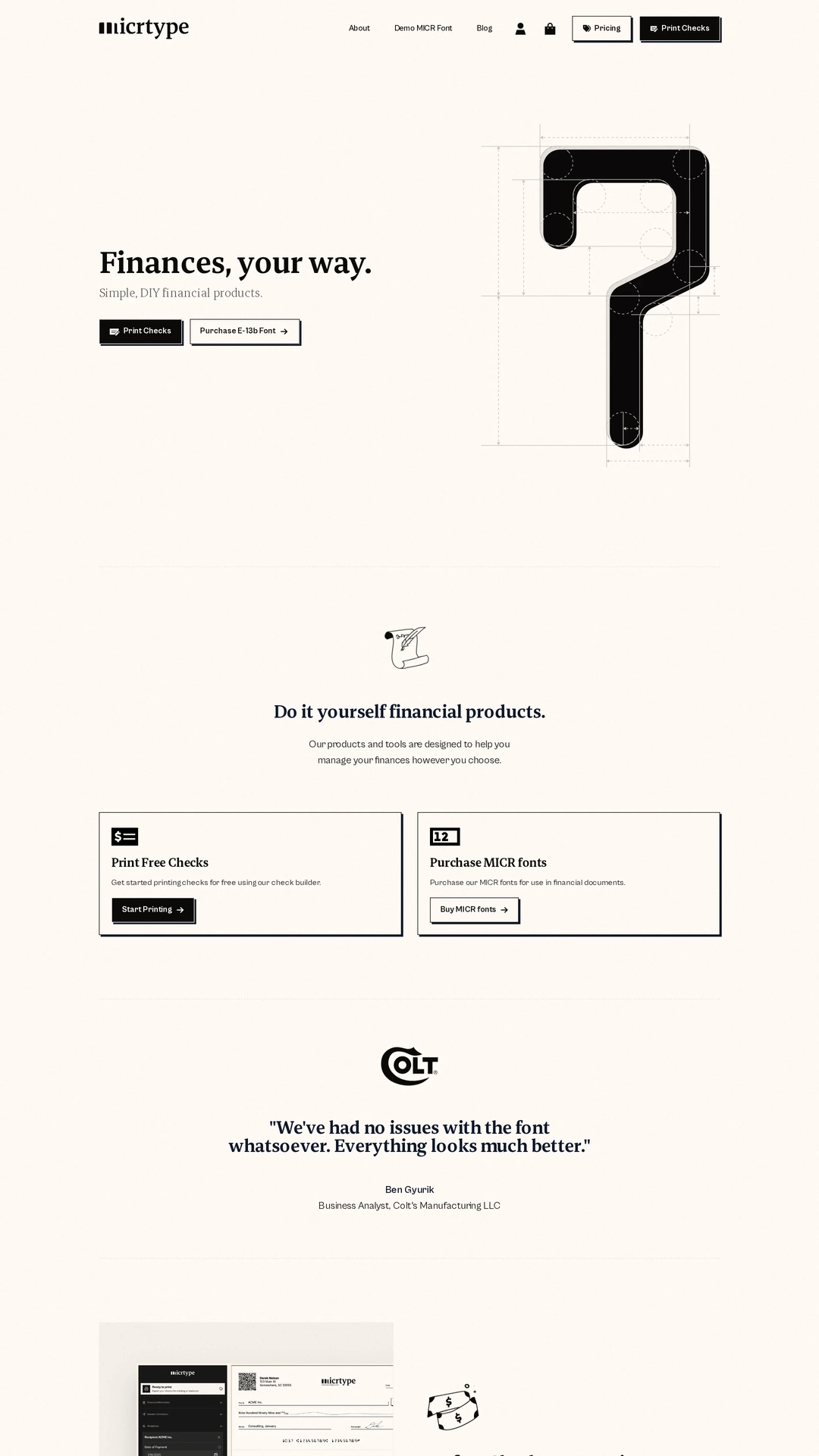
MICRtype sells digital font tools alongside check-printing products. Warm paper tones and near-black type make the technical illustrations and outlined buying actions feel like one system. Its restrained palette shows how a digital-goods store can build character through typography; the small supporting labels still need careful contrast and size checks.
giganticcandy.com
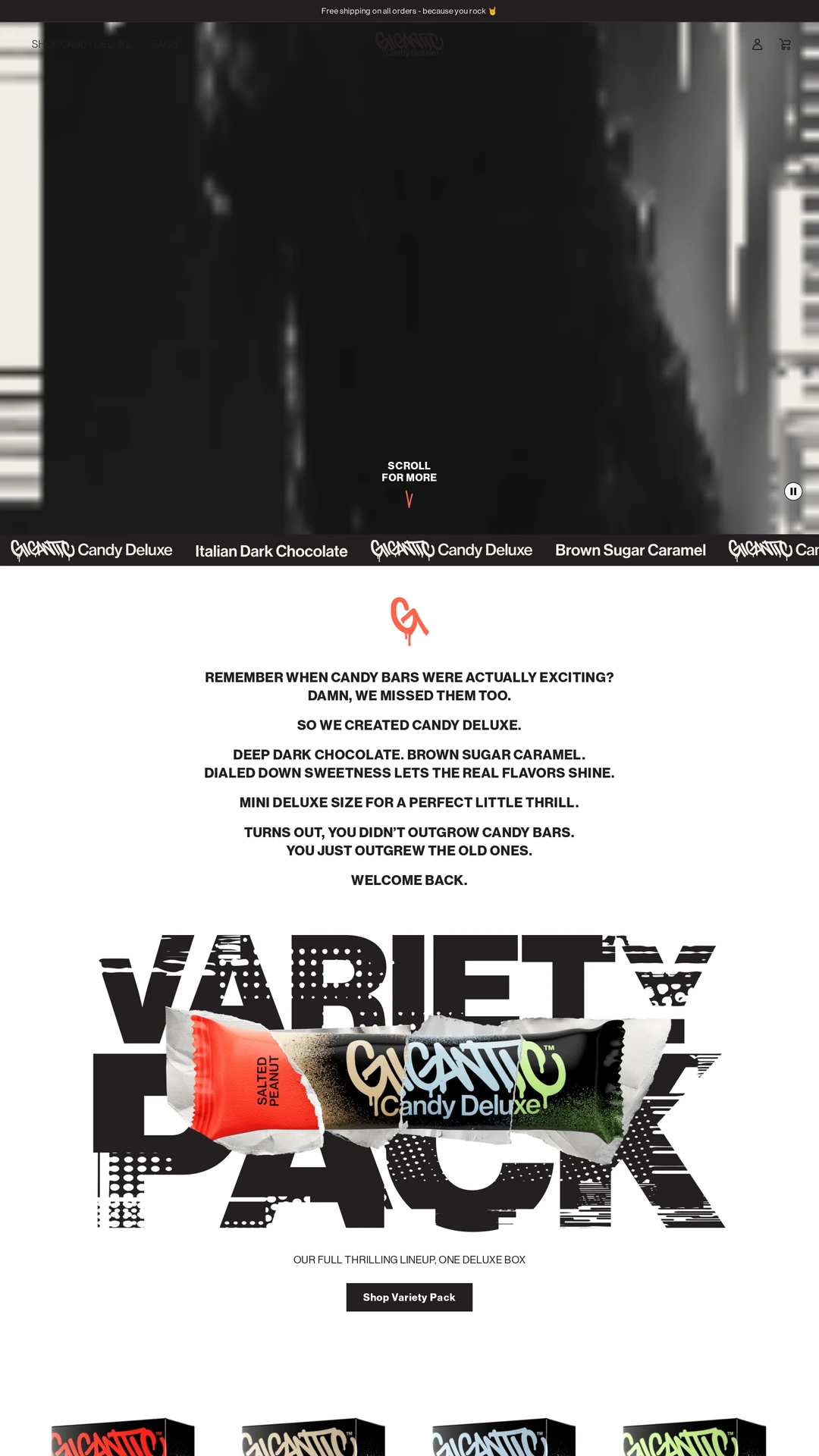
Gigantic gives its flavor-coded packaging a mostly black, cream and white stage, then uses a coral footer as a strong final change of pace. The distressed display type and pack colors carry the personality while buying controls stay simple. The retained grainy opening media supplies little product context until the visitor scrolls.
instacart.com
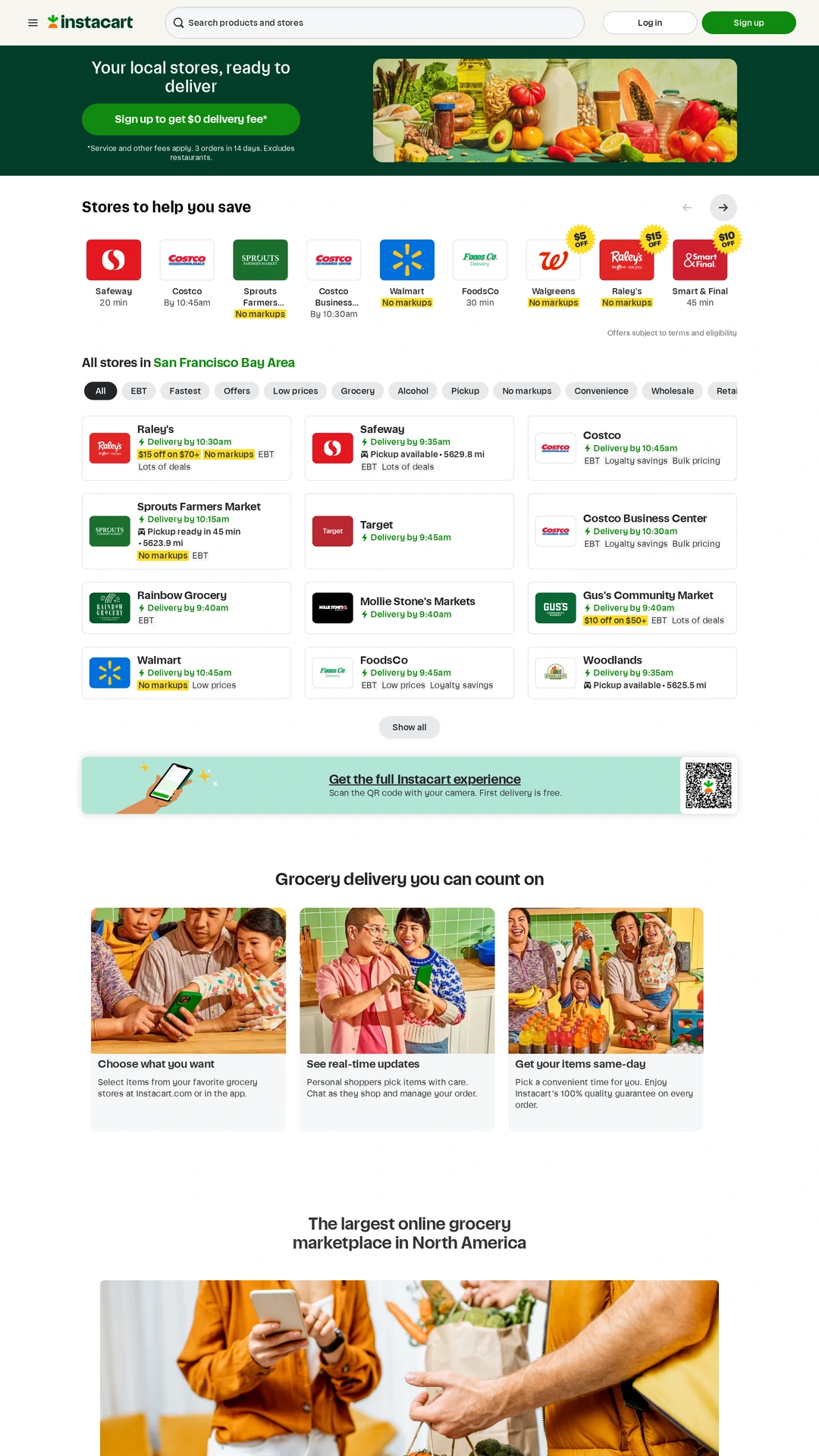
Instacart uses deep green for its opening context and brighter green for actions, leaving most store and product information on neutral surfaces. Yellow promotional labels provide another attention level. This is a useful comparison for dense shopping interfaces: brand color organizes the page, but the many retailer logos and offer labels still compete for attention.
mytopicals.com
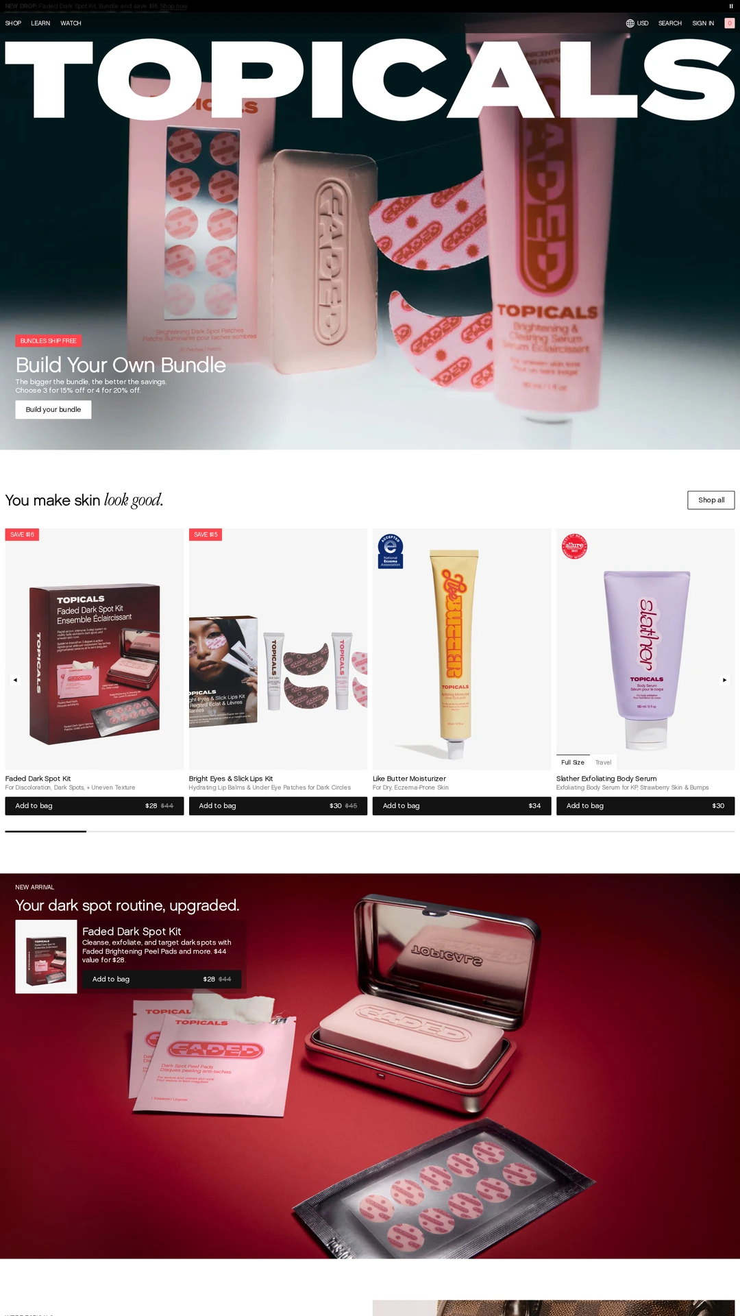
Topicals keeps a white and black shopping structure around burgundy, pink and lilac product imagery. Coral-red sale labels add emphasis without turning every control into a brand-colored block. The captured mobile store preserves the same distinction between imagery and buying actions; several small gray labels remain harder to read.
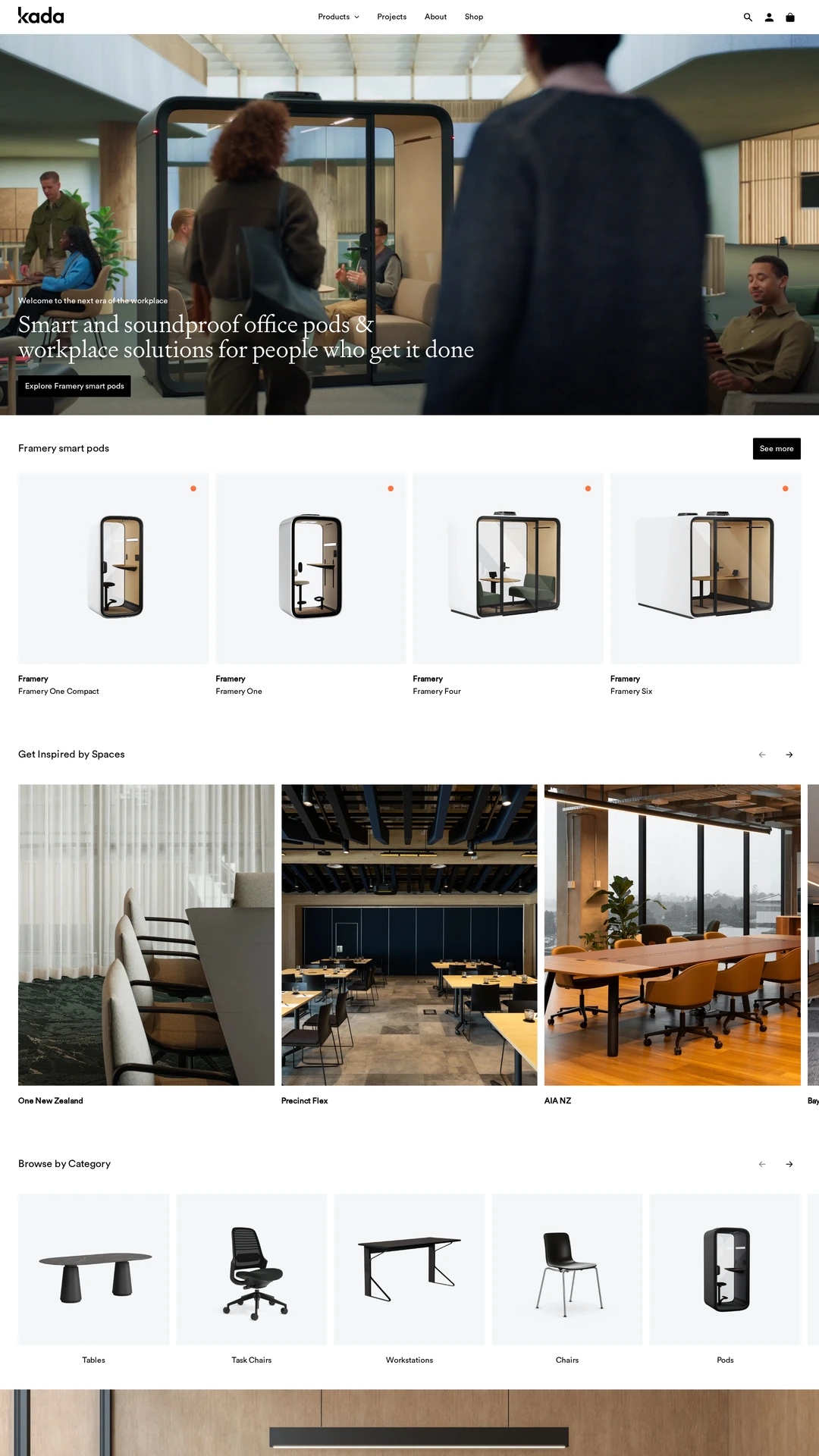
kada.co.nz
Kada uses white, pale gray and black controls so furniture materials and workplace photography can supply the warmer color. Small accents stay secondary to product names, prices and imagery. Its mobile catalogue keeps this restrained approach, though horizontal rails reveal only part of the available range at once.
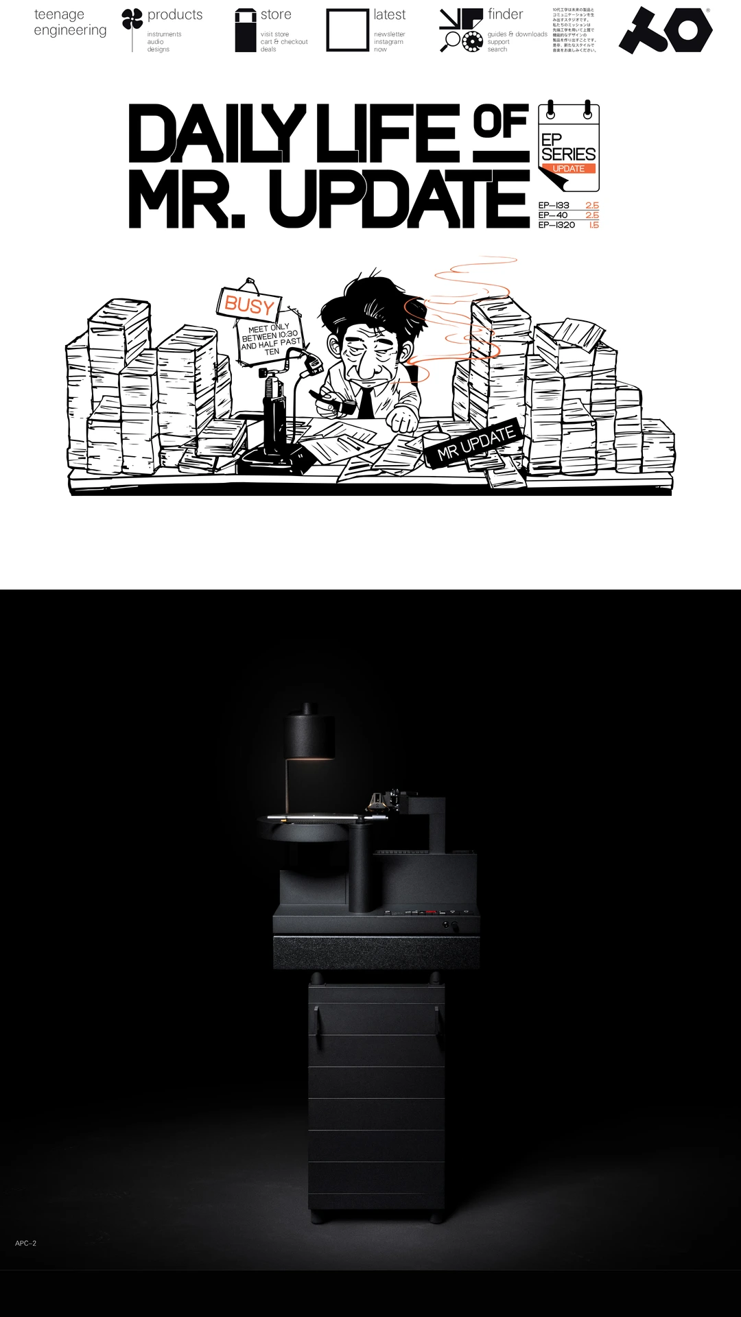
teenage.engineering
Teenage engineering sets a largely black and white catalogue around richly colored instruments, packaging and campaign photographs. Small blue buying links create a quieter action signal than a page full of filled buttons. Compare the deliberate separation of neutral structure and merchandise color; dense desktop navigation becomes much simpler in the mobile capture.
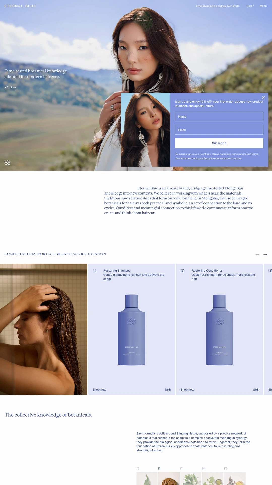
eternalblue.co.nz
Eternal Blue repeats periwinkle and deeper blue across its packaging, page surfaces and product presentation, with pale backgrounds keeping the range cohesive. Landscape imagery adds warmer variation without replacing that identity. In the retained capture, a newsletter popup covers part of the opening, especially on mobile; small muted text is another tradeoff.
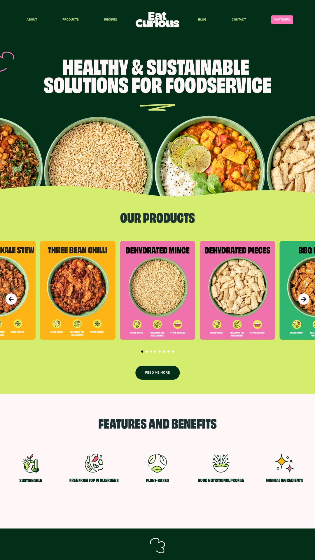
eat-curious.com
Eat Curious combines forest green, lime, pink and warm yellow around food photography and product cards. The repeated colors connect catalogue browsing, recipes and the brand story, including on mobile. Some pale text on saturated accents has weaker contrast, so use the role of each color as the reference and test your own text and controls.