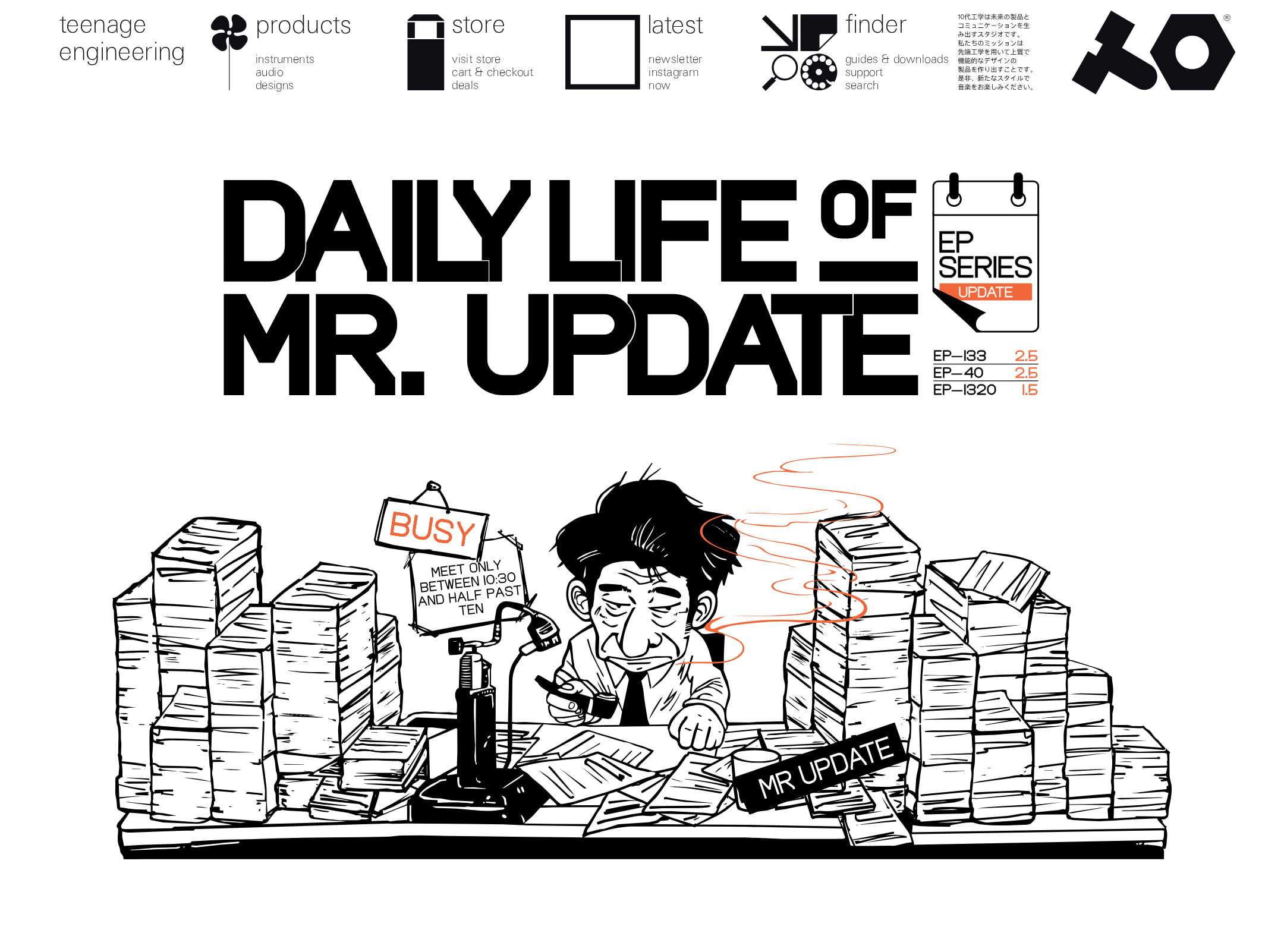


teenage engineering website analysis
A detailed critique of the homepage's craft, originality, usability, and ability to move visitors toward its intended goal.
Our observations
A publishable and exceptionally recognizable ecommerce homepage with strong art direction and product presentation. It merits gallery inclusion, with accessibility, semantic structure, and product-discovery improvements recommended before treating it as a best-practice reference.
Best practices
The page demonstrates disciplined visual consistency and a clear single-brand experience, but the audit identifies meaningful implementation and accessibility concerns.
What works
- The page has one detected main landmark and a clear navigation and footer structure.
- The catalogue is visually consistent across product showcases, campaign panels, and variant groups.
- The sparse interface avoids competing controls and keeps attention on the products.
Opportunities
- Add a meaningful h1 and a logical heading hierarchy; the supplied audit reports zero h1 elements.
- Resolve repeated IDs reported across the page to improve labeling, scripting reliability, and assistive-technology behavior.
- Address the four sampled contrast failures, especially text placed over imagery or dark surfaces.
- Confirm that every product image has useful alternative text and that product links expose their destination clearly.
Design
The visual system is unusually confident, cohesive, and recognizable, combining industrial product photography with editorial campaign art.
What works
- The alternating black and pale sections create a deliberate, memorable browsing rhythm.
- Large product imagery gives instruments strong presence and communicates form, finish, and scale.
- The restrained palette makes occasional saturated campaign colors feel intentional and valuable.
- The opening graphic and long catalogue sequence establish a strong brand point of view rather than defaulting to generic retail patterns.
Opportunities
- Introduce slightly clearer metadata hierarchy so the visual restraint does not obscure product names, categories, or purchasing context.
- Use a small number of consistent informational anchors to help first-time visitors understand how the catalogue is organized.
Uniqueness
The combination of precision hardware photography, stark staging, compact typography, and graphic editorial inserts is highly distinctive within ecommerce.
What works
- The page feels authored as a visual catalogue rather than assembled from familiar ecommerce modules.
- Product variants and collections are presented as part of a broader design culture, not only as transactional listings.
- The contrast between technical objects and expressive campaign artwork creates a recognizable brand signature.
Opportunities
- Make the underlying information architecture as distinctive and legible as the visual presentation by exposing collection logic more directly.
- Ensure future campaigns retain the editorial character without allowing visual novelty to reduce product findability.
User experience
The page offers an immersive browsing experience with clear visual progression, but its minimal labeling and reported accessibility defects may increase cognitive and navigational friction.
What works
- The sequence of large feature panels and smaller grids supports exploratory browsing.
- The concise navigation keeps global actions visually quiet and easy to identify for users familiar with the brand.
- Variant groupings allow visitors to compare related products visually.
Opportunities
- Add persistent or repeated cues for product name, type, and purchase path within image-led sections.
- Provide an accessible skip link, visible focus states, and keyboard verification for navigation, search, and product tiles.
- Test long-page scanning and mobile performance, particularly where large imagery dominates the viewport.
- Check whether low-contrast labels remain readable over every photographic treatment, not only the sampled cases.
Conversion optimization
The page is effective at creating desire and communicating product quality, while its conversion path is intentionally understated and may be less efficient for unfamiliar shoppers.
What works
- High-impact product presentation supports premium positioning and creates strong initial interest.
- The catalogue visibly communicates range, variants, and related hardware in a single continuous journey.
- Search and store-oriented navigation are present, supporting visitors with higher purchase intent.
Opportunities
- Make product names, prices, availability, and primary actions consistently visible near each product group.
- Add lightweight category or use-case pathways for visitors who do not know the product range yet.
- Use clearer purchase affordances on feature panels while preserving the page's editorial restraint.
- Measure progression from campaign panels to product detail and cart actions; the supplied evidence does not establish actual conversion performance.
What we'd improve
- 01high
Repair semantic and accessibility foundations
Add one descriptive h1, restore a logical heading hierarchy, remove duplicate IDs, and remediate the four reported contrast failures. Re-test keyboard navigation, focus visibility, labels, and image alternatives across the full catalogue.
- 02high
Clarify product information at the point of discovery
Pair each major image or product group with consistently placed product name, category, price or availability where applicable, and an explicit detail or shop action.
- 03medium
Improve catalogue orientation
Introduce restrained collection, category, or use-case cues so new visitors can move from brand discovery to a relevant product family without scanning the entire page.
- 04medium
Validate responsive image behavior
Test narrow layouts for crop quality, content order, text-over-image legibility, touch target sizing, and loading performance; the supplied observations do not verify mobile behavior.
- 05low
Preserve the editorial character during optimization
Use measurement and progressive disclosure rather than adding dense retail controls. Keep the strong image-led rhythm while making essential product and purchase information easier to access.