

In Common With website analysis
A detailed critique of the homepage's craft, originality, usability, and ability to move visitors toward its intended goal.
Our observations
Publish with accessibility and heading-structure revisions recommended. The homepage is visually exceptional and commercially credible, with a clear editorial point of view and strong product presentation.
Best practices
The page has a coherent content system, semantic navigation and footer landmarks, product/category pathways, newsletter capture, and a consistent visual language. Automated evidence identifies significant text-contrast issues and no detected H1, preventing a higher score.
What works
- Clear navigation includes shop, collections, information, search, and cart pathways.
- Content is organized into recognizable catalogue, collection, product, trade, newsletter, and footer sections.
- Product imagery is paired with direct collection and product links.
- A semantic navigation region, main landmark, and footer were detected.
Opportunities
- Resolve the 26 reported text-contrast failures, especially light text over photographic or colored backgrounds.
- Add one clear, appropriately structured H1 that communicates the homepage purpose.
- Audit carousel controls, focus states, image alternatives, and keyboard operation beyond the supplied automated evidence.
- Confirm that small interface text and form controls remain legible and usable at narrow widths.
Design
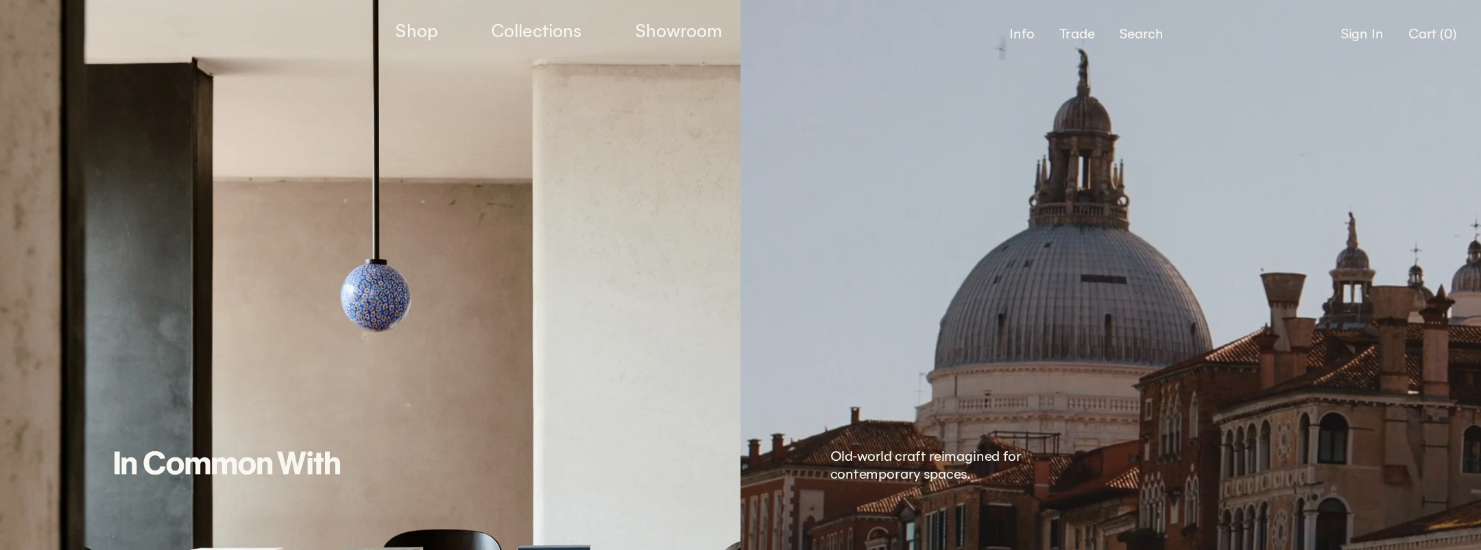
This is a highly resolved editorial retail design. The restrained palette, varied image scale, controlled typography, and room-context photography create a premium atmosphere without resorting to excessive decoration.
What works
- Strong art direction makes the products feel situated in real architectural and domestic contexts.
- The oxblood, ivory, clay, and cool blue-gray palette is distinctive and materially appropriate.
- Serif collection titles provide a measured editorial counterpoint to the sans-serif interface.
- The page maintains a consistent low-chrome language across navigation, cards, dividers, and forms.
Opportunities
- Some supporting copy is visually diminutive relative to the scale and richness of the imagery.
- The long sequence of similarly quiet sections can soften hierarchy and make the next action less obvious.
- A more pronounced distinction between editorial storytelling and shopping modules could improve wayfinding without compromising the aesthetic.
Uniqueness
The homepage has a recognizable point of view that separates it from generic lighting storefronts. Its identity comes from the integration of product photography, interiors, art direction, and restrained typography rather than from decorative interface novelty.
What works
- Lighting is presented as part of an environment and material story, not only as isolated inventory.
- The split hero and curated interior imagery establish a distinctive visual signature.
- The combination of oxblood interface color and archival/editorial image treatment feels specific to the studio.
Opportunities
- The design could further differentiate product discovery with a signature merchandising interaction or clearer material/specification storytelling.
- Collection and product modules could introduce more variation in information density while retaining the established visual discipline.
User experience
The primary paths are discoverable and the visual hierarchy is polished, but the homepage is lengthy and relies heavily on image interpretation. Automated accessibility findings and the absence of a detected H1 are meaningful usability limitations.
What works
- Shop, collection, search, cart, trade, and newsletter paths are represented in the visible structure.
- Category browsing exposes multiple lighting types and product counts.
- Large imagery provides useful contextual understanding for an interiors-focused audience.
- Carousel previous/next controls are present in the deterministic component evidence.
Opportunities
- Improve text contrast and ensure labels remain readable across every photographic state.
- Introduce stronger section summaries or persistent cues so users can understand their position on the long page.
- Make product names, categories, and primary actions easier to scan independently of the images.
- Verify touch sizing, swipe behavior, focus management, and reduced-motion behavior on mobile and keyboard navigation.
Conversion optimization
For a design-led lighting retailer, the page balances inspiration and commerce effectively. It provides several routes into products and collections, though the quiet hierarchy and late newsletter placement may reduce action clarity for visitors ready to buy or request trade support.
What works
- Multiple collection and product links connect editorial content to shopping journeys.
- Featured products and category groupings support both browsing and targeted discovery.
- A dedicated trade program section addresses a valuable professional audience.
- Newsletter forms provide a low-commitment retention path.
Opportunities
- Give the primary shopping action more consistent visual priority across hero, collection, and featured-product modules.
- Surface trade-program benefits and its next step more explicitly for professional visitors.
- Add concise product context such as material, scale, or availability near featured items where appropriate.
- Test whether a shorter route to catalogue and search improves product discovery without removing the editorial sequence.
What we'd improve
- 01high
Repair contrast failures
Review all 26 reported text-contrast failures, prioritizing navigation, hero overlays, collection labels, and any text placed over imagery. Use stronger overlay treatment, adjusted color, or alternate text placement while preserving the visual tone.
- 02high
Establish a meaningful H1
Add one visible or appropriately accessible H1 that identifies the studio and the homepage purpose, then confirm that subsequent section headings follow a logical hierarchy.
- 03high
Strengthen action hierarchy
Define a consistent primary shopping action for the hero and featured-product areas so visitors can distinguish inspiration, catalogue browsing, and product detail actions at a glance.
- 04medium
Improve long-page wayfinding
Add clearer section framing, concise supporting labels, or lightweight progress cues to help users scan the extended editorial sequence without adding visual clutter.
- 05medium
Audit carousel accessibility
Verify keyboard access, focus visibility, slide announcements, pause or reduced-motion behavior, and touch interaction for all collection and product carousels.
- 06low
Clarify trade conversion
Make the trade-program value proposition and application/contact path more prominent for designers, architects, and hospitality buyers.