

Eternal Blue website analysis
A detailed critique of the homepage's craft, originality, usability, and ability to move visitors toward its intended goal.
Our observations
A visually distinctive and thoughtfully art-directed ecommerce homepage with strong editorial positioning, held back by serious accessibility defects and understated interaction cues.
Best practices
The page has a clear heading structure and a coherent progression from introduction to products, education, evidence, and brand story, but the audit identifies substantial technical accessibility debt.
What works
- One primary heading is present and no heading-level skips were detected.
- The content sequence supports both product discovery and brand education.
- A dedicated research section adds credibility beyond standard beauty merchandising.
Opportunities
- Resolve the reported 31 contrast failures, prioritizing hero headings, calls to action, announcement text, and utility controls.
- Add meaningful alternative text to product imagery and accessible names to image-link product cards.
- Remove duplicate IDs from search, currency, and form-related controls.
- Verify keyboard focus visibility and carousel announcements, which were not established by the supplied evidence.
Design
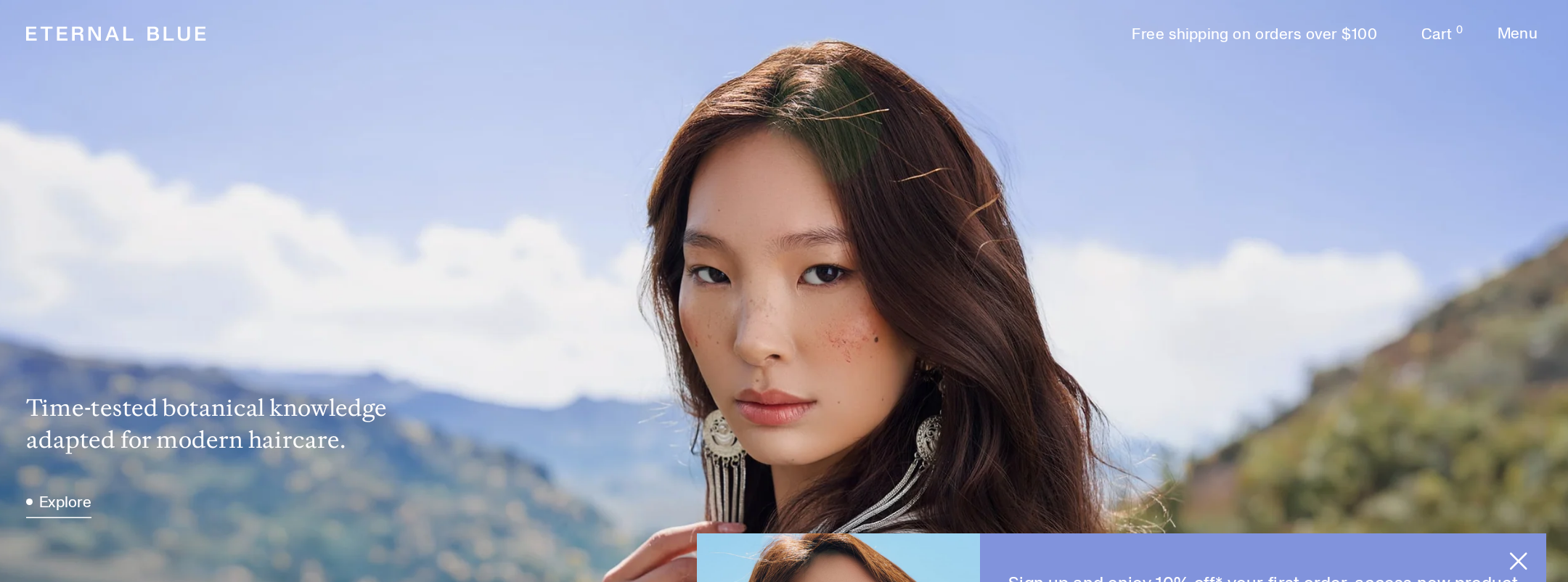
The visual direction is unusually cohesive for a haircare store, pairing landscape photography and botanical references with a restrained product system.
What works
- Strong art direction creates a recognizable sense of place and premium positioning.
- The cool blue palette is carried consistently from product panels through the footer.
- Alternating image, text, product, ingredient, and research sections creates editorial rhythm.
Opportunities
- Increase the visual prominence of primary shopping actions without abandoning the quiet tone.
- Reduce the density of long-form research copy or introduce stronger wayfinding between content chapters.
- Standardize typography roles so small interface text does not compete with the larger editorial voice.
Uniqueness
The combination of Mongolian botanical context, landscape-led photography, and independently framed research gives the homepage a more specific identity than a generic clean-beauty template.
What works
- The setting and cultural premise are integrated into both imagery and content architecture.
- Research and ingredient storytelling make the brand feel knowledge-led rather than purely cosmetic.
- The restrained periwinkle product treatment is memorable and consistent.
Opportunities
- Make the provenance and relationships behind the botanical knowledge more explicit through carefully sourced, accessible editorial content.
- Ensure that the visual identity remains recognizable when imagery is unavailable or blocked by adding stronger textual brand cues.
User experience
The page offers a rich discovery journey, but long scrolling, carousel dependence, low-contrast overlays, and ambiguous image links may obstruct users trying to shop efficiently.
What works
- Products are introduced within a clear ritual and restoration context.
- The page provides several routes into the brand: products, ingredients, study results, and story.
- The fixed header can preserve access to core navigation while browsing long content.
Opportunities
- Add persistent or repeated access to the core product collection and cart journey.
- Provide visible carousel status, labeled controls, and a non-carousel alternative for product and study content.
- Improve text-background separation in photographic sections and confirm readable sizing at mobile widths.
- Use descriptive link labels instead of relying on image-only product-card targets.
Conversion optimization
The homepage supports premium-brand conversion through product cards, a restoring set feature, research content, and newsletter capture, but the commercial path is less direct than the storytelling path.
What works
- Product names, descriptions, prices, and shopping links are present in the product carousel.
- The restoring set receives a dedicated visual feature that can support higher-value purchase intent.
- Independent evaluation and before-and-after study content provide useful reassurance for a hair-growth category.
Opportunities
- Place a clearer primary shopping action immediately within the first viewport and repeat it after the initial brand introduction.
- Expose key purchase reassurance—shipping, returns, usage expectations, and suitability—near product entry points.
- Pair study claims with concise methodology and context so evidence strengthens trust without appearing overstated.
- Make newsletter value and consent expectations explicit beside the signup form.
What we'd improve
- 01high
Repair contrast and accessible naming
Correct the reported contrast failures across hero overlays, announcement content, cart and menu controls, and calls to action. Add descriptive alternative text to product imagery and accessible names to image-based product links.
- 02high
Remove duplicate form and control IDs
Ensure every search, currency, and newsletter field has a unique ID with one associated label. Re-test the page with keyboard and assistive-technology navigation after the changes.
- 03high
Strengthen the shopping path
Introduce a clearly differentiated primary shop action in the opening viewport, preserve it after the brand introduction, and provide a direct collection route that does not depend on carousel interaction.
- 04medium
Improve carousel transparency
Add visible position indicators, descriptive previous and next labels, keyboard support, and a static or list-based fallback for product, ingredient, and study carousels.
- 05medium
Clarify evidence and product reassurance
Present study scope, timing, and limitations beside the results, and place concise usage, suitability, shipping, and returns information near each key product entry point.
- 06low
Refine long-form wayfinding
Use a compact contents treatment or stronger chapter markers to help visitors move between the ritual, ingredients, research, and shopping sections without losing orientation.