

Albina Nikiforova website analysis
A detailed critique of the homepage's craft, originality, usability, and ability to move visitors toward its intended goal.
Our observations
A highly original and publishable portfolio concept with strong art direction and storytelling. Its main weaknesses are readability, the very long path to actionable project information, and an under-specified conversion goal.
Best practices
The page has a valid semantic structure with one H1, orderly heading progression, a main landmark, semantic navigation, and no duplicate IDs. Accessibility evidence still identifies a serious contrast problem affecting 60 samples, and the supplied evidence does not establish responsive or reduced-motion performance.
What works
- One H1 and a coherent H1-to-H2 heading hierarchy are present.
- The page exposes semantic navigation, main content, and footer regions.
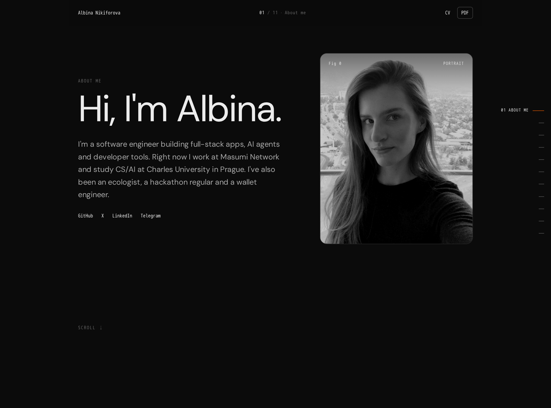
- Image content includes a descriptive portrait alternative, and the visual chapters have a consistent structural pattern.
Opportunities
- Resolve the 60 reported contrast failures, prioritizing secondary copy, navigation metadata, labels, and scroll guidance.
- Verify keyboard focus visibility, skip navigation, accessible names for chapter controls, and reading order when grids alternate.
- Add and test a prefers-reduced-motion mode; the supplied evidence reports animation but no reduced-motion state.
- Audit narrow-screen behavior and ensure illustration labels do not become clipped or unreadable.
Design
The visual system is unusually cohesive for a personal portfolio. Its dark editorial treatment, technical diagrams, portrait, and repeated chapter framing create a recognizable point of view.
What works
- The illustrated chapters create a strong connection between subject matter and visual language.
- Alternating composition prevents the long page from feeling mechanically repetitive.
- Typography, borders, framing, and restrained color work together as a consistent presentation system.
- The personal portrait and autobiographical chapters add warmth to an otherwise technical interface.
Opportunities
- Increase the visual distinction between primary case studies and autobiographical material so visitors can scan professional relevance faster.
- Give the most important project outcomes more visual emphasis than decorative metadata.
- Use a slightly brighter or more varied accent treatment for key interactive states and calls to action.
Uniqueness
The combination of technical illustration, autobiographical sequencing, and editorial pacing is highly distinctive among personal portfolios.
What works
- The page communicates personality through a curated sequence rather than a generic résumé or card grid.
- Custom diagrams provide a memorable visual signature across varied topics.
- The chapter structure turns breadth of experience into a coherent narrative arc.
Opportunities
- Make the portfolio’s central promise more explicit so the unusual format is immediately connected to the visitor’s needs.
- Attach concise, scannable outcome signals to chapters to distinguish original storytelling from purely atmospheric presentation.
User experience
The navigation and chapter progression provide orientation, but the long-scroll format, small supporting type, and low-contrast annotations increase cognitive and visual load.
What works
- A persistent navigation and chapter system help users understand where they are in the sequence.
- The repeated image-and-text modules establish predictable reading behavior.
- The opening portrait and introduction quickly establish a human identity.
Opportunities
- Provide a compact overview or project index near the top for visitors who need to scan before reading the full story.
- Increase the size and contrast of supporting copy and illustration labels.
- Add clearer chapter summaries or outcome lines so users can decide which sections deserve deeper attention.
- Confirm that motion does not interfere with reading or navigation and provide a reduced-motion alternative.
Conversion optimization
The page is effective at building personal affinity, but its conversion path is less direct than its visual storytelling. The apparent contact action and social links are present, yet the visitor’s next step and Albina’s preferred collaboration context could be clearer.
What works
- The introduction establishes a credible personal identity before asking visitors to explore.
- Social links and a contact-oriented navigation action give interested visitors routes forward.
- The narrative format can build trust by showing range, curiosity, and communication ability.
Opportunities
- State the ideal collaboration, role, or audience in the hero rather than relying on broad capability themes.
- Add a prominent, specific primary action such as hiring, consulting, speaking, or starting a conversation, depending on the intended goal.
- Surface selected project outcomes, responsibilities, and links earlier so recruiters and prospective collaborators can evaluate fit quickly.
- Repeat a clear contact action after the strongest professional chapters instead of relying mainly on the final footer.
What we'd improve
- 01high
Repair text contrast and legibility
Replace low-contrast secondary values used for navigation metadata, labels, eyebrows, and scroll guidance with accessible alternatives, then re-run contrast checks across the full chapter sequence. Do not depend on the dark background alone to create hierarchy.
- 02high
Clarify the portfolio’s professional proposition
Rewrite the hero supporting copy to identify the audiences Albina helps, the type of work she takes on, and the preferred next step. Keep the personal tone, but make the value immediately scannable.
- 03high
Add a top-level work index
Introduce a compact overview near the hero that names the principal projects or capabilities and links to chapters. This preserves the long-form story while giving time-constrained visitors a fast route through the work.
- 04medium
Add outcome-oriented project summaries
For each professional chapter, expose a short summary of the problem, Albina’s contribution, and the result or artifact. Use links where available so illustrations support evaluation rather than replace it.
- 05medium
Implement motion and responsive safeguards
Provide reduced-motion behavior for the reported led, scan, and spin animations, and test the sticky navigation, chapter rail, alternating grids, labels, and artwork at narrow widths and zoomed text sizes.
- 06low
Strengthen interaction-state feedback
Make hover, focus, and active states visibly distinct for navigation, chapter controls, social links, and the contact action while retaining the restrained editorial aesthetic.