

House of Honey website analysis
A detailed critique of the homepage's craft, originality, usability, and ability to move visitors toward its intended goal.
Our observations
A memorable and commercially credible studio homepage with exceptional art direction, held back from top-tier execution by contrast and heading-structure issues.
Best practices
The page demonstrates strong content organization and a coherent navigation-to-contact journey, but automated accessibility evidence identifies meaningful issues.
What works
- A single main region and semantic footer were detected.
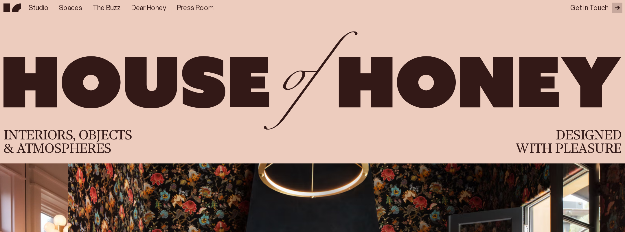
- Navigation exposes clear destinations including Studio, Spaces, The Buzz, Dear Honey, and Press Room.
- The page presents a logical sequence from positioning to work, editorial content, and contact.
- The color and type system remains consistent across major sections.
Opportunities
- Two serious text-contrast failures were detected in marquee or accent treatments.
- No H1 was detected, weakening page hierarchy and document semantics.
- Validate the fixed navigation, decorative motion, and image overlays with keyboard and screen-reader testing.
- Ensure every project image and decorative canvas has an appropriate accessible treatment.
Design
The homepage has a confident, highly authored visual identity that is unusually consistent for an interior-design portfolio.
What works
- The blush, espresso, and pink palette creates immediate recognition and a strong emotional tone.
- Interior photography is given enough scale to communicate the quality and range of the studio’s work.
- Large script overlays and restrained sans-serif copy create a clear editorial contrast.
- Section transitions feel intentional rather than template-driven.
Opportunities
- Reduce or reposition decorative script where it competes with key explanatory text.
- Increase the visual distinction of project metadata without disrupting the art direction.
- Use a more consistent contrast treatment for text placed over photography.
Uniqueness
The visual concept is notably distinctive and avoids the generic neutral-minimalist pattern common to design-studio portfolios.
What works
- The combination of expressive interiors, blush grounds, dark narrative panels, and oversized calligraphy creates a recognizable point of view.
- The page treats the studio’s philosophy and portfolio as one editorial story.
- The geometric footer and oversized display type extend the identity beyond photography alone.
Opportunities
- Make the studio’s service proposition or process slightly more explicit so the strong visual identity is paired with equally memorable positioning.
- Consider introducing one additional proof point, such as location, project scope, or press credibility, without diluting the atmosphere.
User experience
The journey is visually engaging and discoverable, but readability and hierarchy are less dependable than the visual presentation.
What works
- The project collection is easy to scan through repeated image-and-title patterns.
- The page provides multiple routes to explore work and editorial content.
- The contact section is present and framed as a clear invitation.
- The responsive screenshot preserves the overall narrative on a narrow viewport.
Opportunities
- Add a clear H1 that states the studio name and purpose in accessible document structure.
- Improve small text sizing and contrast in image captions, marquee treatments, and dark sections.
- Provide a reduced-motion experience for moving marquee and scroll effects.
- Check touch target sizing and focus visibility for fixed navigation and compact footer controls.
Conversion optimization
For a premium interior-design studio, the homepage successfully builds desire and credibility before inviting contact, though the conversion path is understated.
What works
- The portfolio imagery communicates quality before asking visitors to make contact.
- The studio statement establishes a clear creative attitude and audience fit.
- The contact section is positioned after substantial visual and editorial proof.
- Navigation includes several discovery paths for visitors at different stages of interest.
Opportunities
- Make the primary contact action more visually prominent earlier in the page for visitors with high intent.
- Add concise service, project-type, or engagement information near the studio introduction.
- Give project cards a slightly clearer action cue while preserving their editorial character.
- Clarify whether the contact invitation is intended for prospective clients, press, collaborators, or all three.
What we'd improve
- 01high
Repair contrast in animated accent treatments
Review the two automated contrast failures affecting marquee or accent text and provide a compliant foreground/background treatment. Preserve the pink accent as decoration where necessary, but do not rely on it for essential copy.
- 02high
Add an accessible primary heading
Introduce one descriptive H1 that identifies House of Honey and its interior-design purpose, then preserve the existing section headings as a coherent hierarchy.
- 03high
Create a reduced-motion presentation
Respect prefers-reduced-motion by disabling or simplifying marquee, scroll-linked, and introductory transitions while keeping all content and navigation available.
- 04medium
Strengthen the contact pathway
Add a discreet but unmistakable contact prompt near the introductory positioning statement, with the larger contact invitation retained later in the page.
- 05medium
Improve project metadata readability
Increase the legibility and contrast of project labels and location details, particularly where text sits on or near photography.
- 06low
Add practical studio context
Include a compact statement about services, project geography, or typical engagements so visitors can understand fit without interrupting the editorial flow.