Dunderville website analysis
A detailed critique of the homepage's craft, originality, usability, and ability to move visitors toward its intended goal.
Our observations
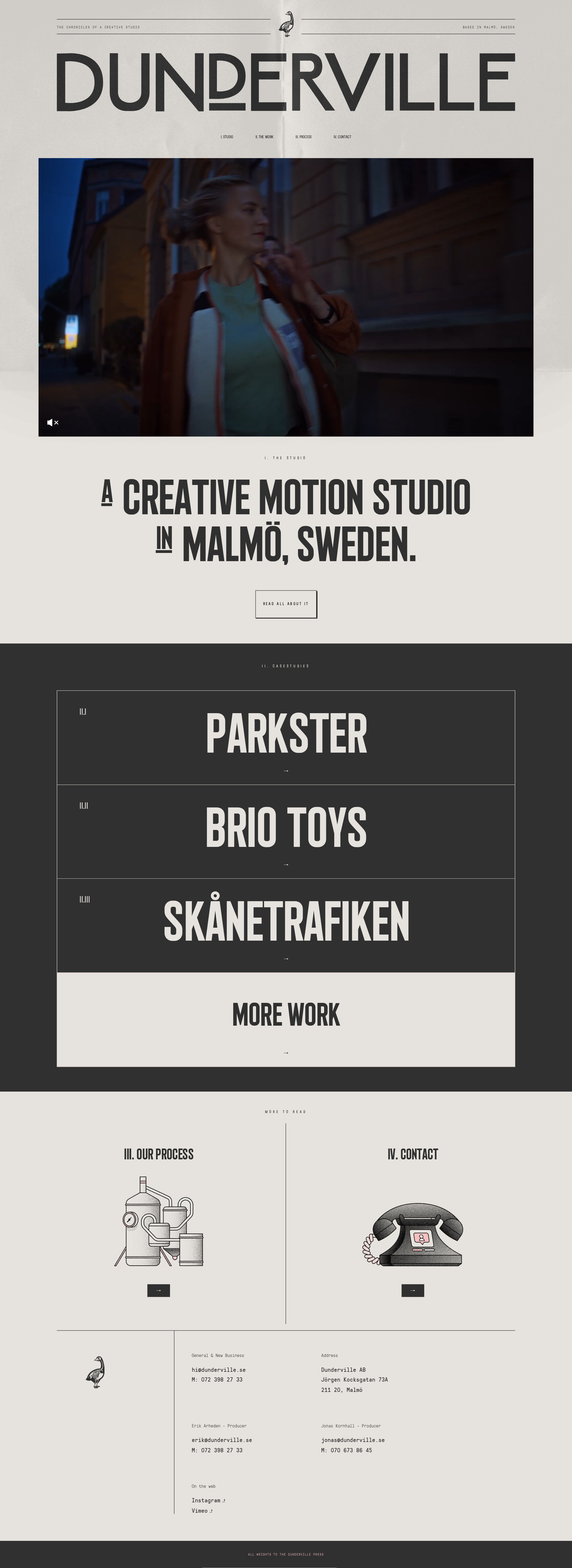
A distinctive, highly art-directed creative-studio portfolio that earns gallery consideration through strong typographic identity, disciplined composition, and a memorable editorial mood. Its main opportunity is to make project value and next steps more explicit without weakening the visual restraint.
Best practices
The page has a coherent semantic progression from introduction to work, process, contact, and footer, with one detected H1 and no automated contrast failures in the supplied samples.
What works
- Clear high-level hierarchy from showreel to studio positioning, selected work, process, and contact.
- Consistent visual treatment across navigation, case rows, illustrations, and footer details.
- Automated evidence reports no duplicate IDs, heading skips, or sampled contrast failures.
- Direct email, address, and social contact information are available in the footer.
Opportunities
- The evidence reports no main landmark, so the page structure should be reviewed for stronger landmark semantics.
- Small utility labels and footer copy may be difficult to read despite the sampled contrast result.
- Verify keyboard focus visibility, accessible names for icon-only controls, and reduced-motion behavior; these were not established by the supplied evidence.
- Test the fixed and absolute media layers across mobile sizes and zoom settings.
Design
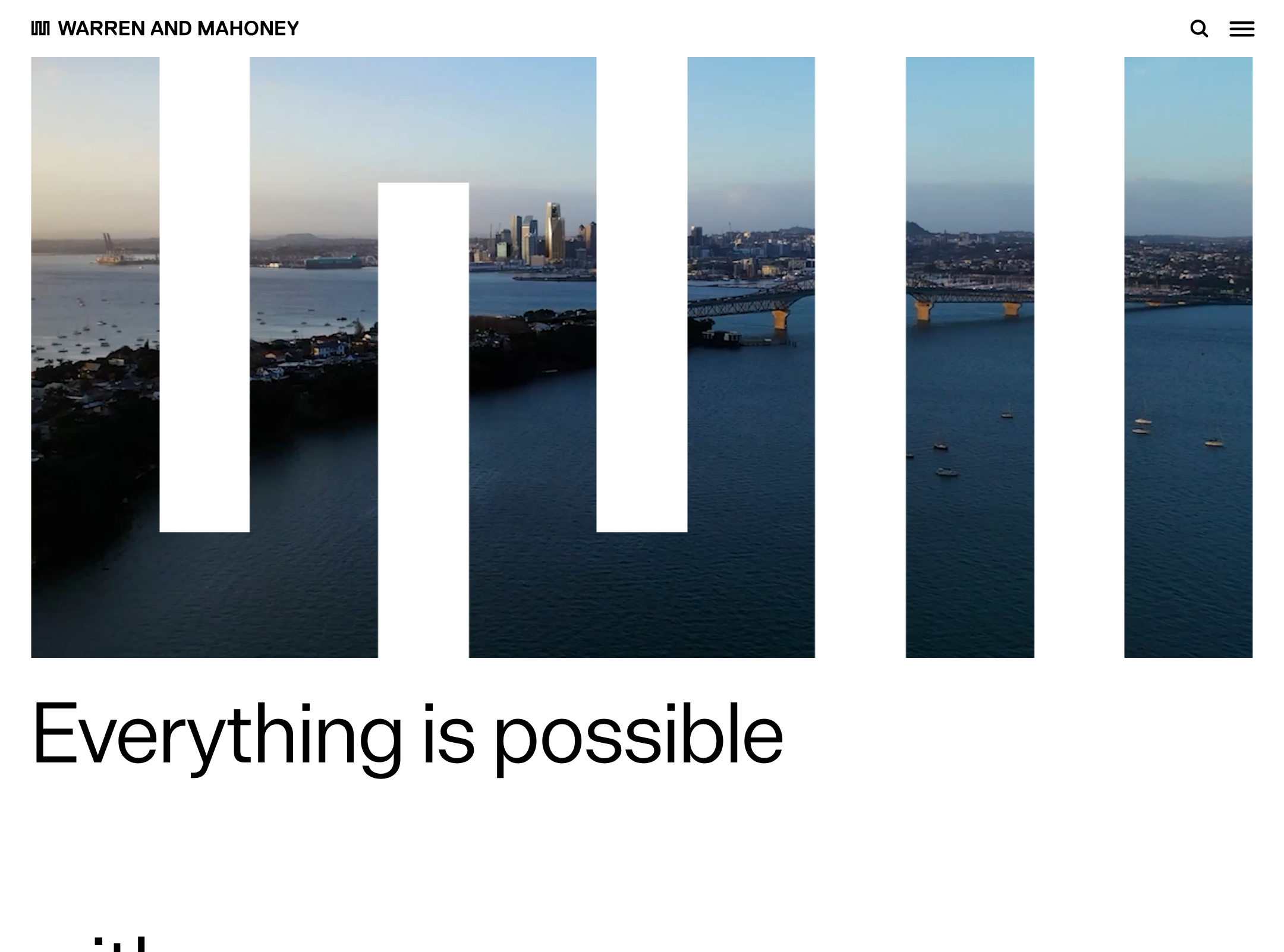
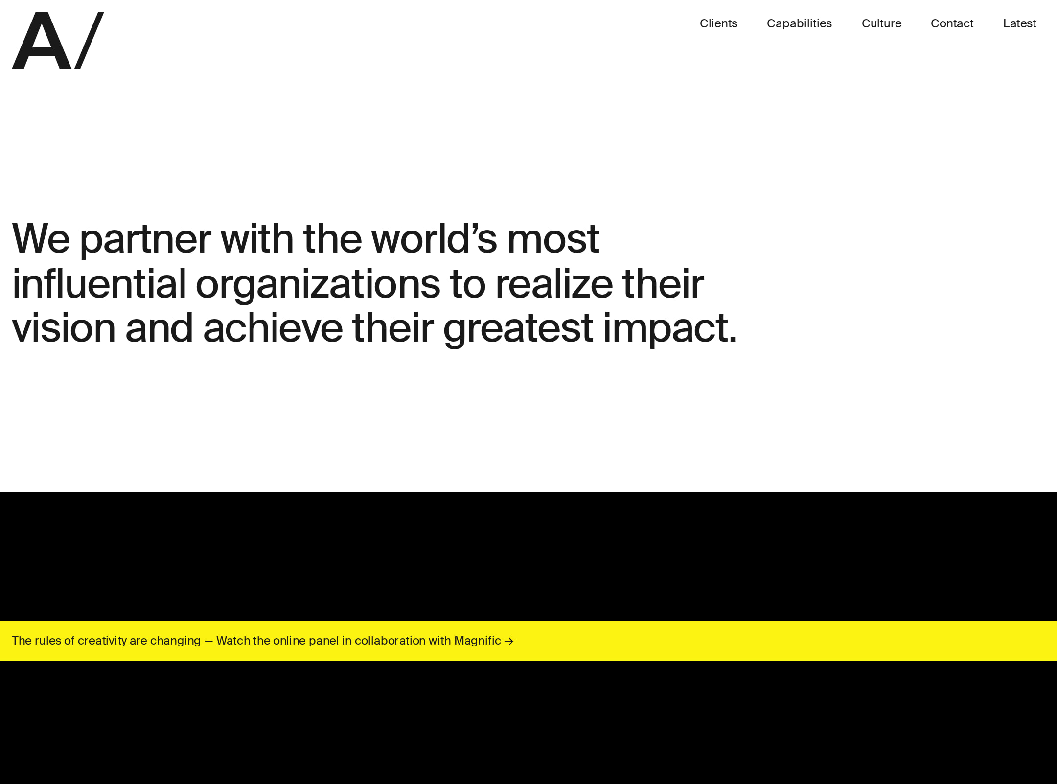
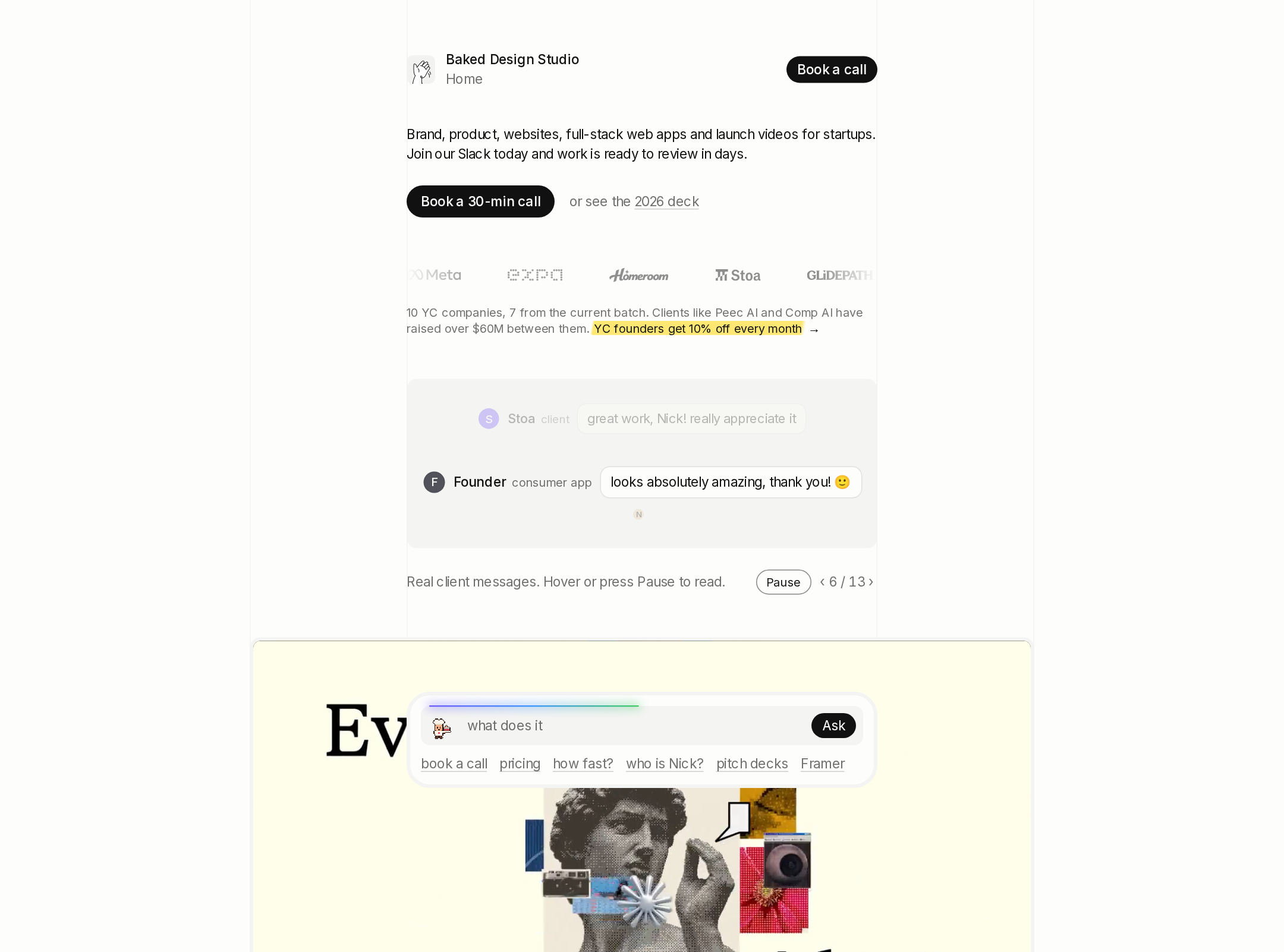
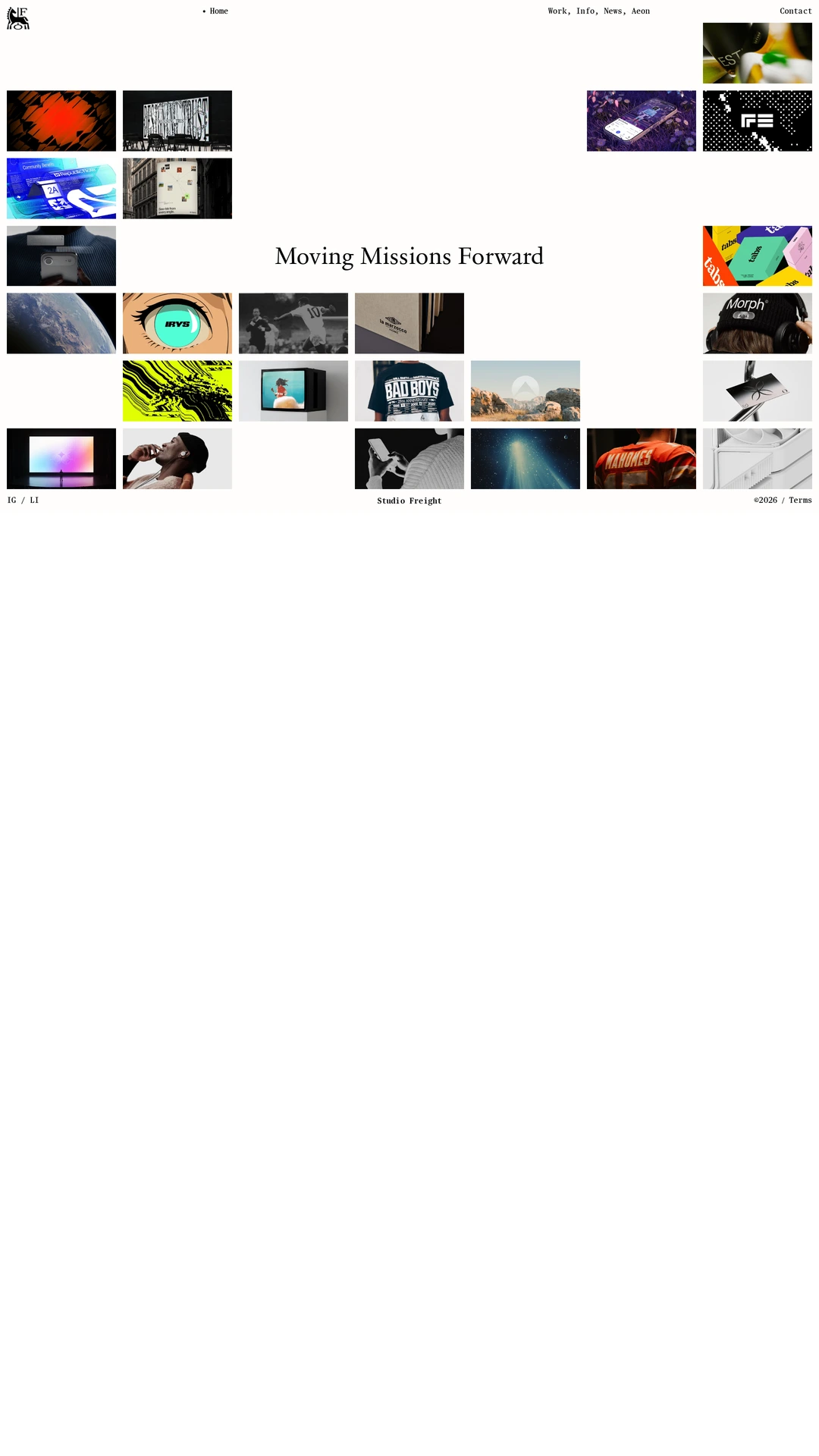
The visual system is unusually cohesive and specific, combining oversized condensed typography, archival illustration, cinematic imagery, and restrained editorial spacing.
What works
- Strong contrast between the warm opening section and charcoal work section creates a memorable page rhythm.
- The condensed display face gives the studio statement and project names a distinctive poster-like presence.
- Fine rules, numbered labels, and illustrated process/contact panels reinforce a consistent production-studio vocabulary.
- The page avoids generic agency patterns such as card-heavy dashboards, gradients, or excessive UI decoration.
Opportunities
- The opening brand lockup and large statement compete for attention; a slightly clearer first-reading priority could improve orientation.
- The visual language is highly stylized, so supporting copy should remain sufficiently prominent to prevent the page from feeling cryptic.
- Case-study presentation could use a small amount of secondary context while preserving the minimalist composition.
Uniqueness
Dunderville has a recognizable identity built from the combination of cinematic work, compressed typography, numbered editorial navigation, and hand-drawn technical illustrations.
What works
- The illustration treatment gives the process and contact content a personal, non-stock character.
- The use of oversized condensed type as the primary portfolio interface is confident and consistent.
- The work list behaves more like a typographic index than a conventional project-card grid.
Opportunities
- The numbered editorial format and condensed display typography are increasingly familiar in creative portfolios; proprietary imagery, case-study storytelling, and interaction details should continue carrying the differentiation.
- More visible evidence of the studio’s production methodology could make the identity feel less dependent on surface art direction.
User experience
The page offers a logical scroll narrative and clear section labels, but its atmosphere-first approach may require visitors to work harder to understand capabilities and project relevance.
What works
- The sequence of studio, work, process, and contact matches the likely decision path for a prospective client.
- Selected work occupies a substantial, easy-to-locate section rather than being hidden behind a complex menu.
- The process and contact destinations are visually separated and easy to distinguish.
- The single prominent studio statement communicates location and category immediately.
Opportunities
- Add concise project descriptors, roles, deliverables, or outcomes to the work entries so visitors can assess relevance faster.
- Make the sound control’s state and accessible label unambiguous, especially when the showreel is the first major interaction.
- Review the extremely small route and metadata text on mobile and at browser zoom.
- Confirm that motion, hover states, and page-reveal behavior do not obscure content or delay access to the primary navigation.
Conversion optimization
For a creative production studio, the page provides credible work, a process explanation, and contact details, but the path from interest to inquiry is understated.
What works
- The showreel creates an immediate proof-of-capability moment.
- Selected client/project names provide social proof and a clear route into deeper work.
- Contact information is direct and includes multiple people and channels.
- The process section helps reduce uncertainty about how an engagement may work.
Opportunities
- Introduce a clearer inquiry action near the studio statement or selected-work section instead of relying mainly on the footer.
- Add a short positioning line that explains the studio’s typical engagement, production scope, or ideal client.
- Give each project a visible one-line outcome or service descriptor before the visitor opens it.
- Preserve the editorial tone while making the next action explicit, such as discussing a brief or viewing the full reel.
What we'd improve
- 01high
Clarify the value of each featured project
Add concise descriptors for role, format, client challenge, or outcome to the selected-work rows so prospective clients can evaluate relevance without sacrificing the typographic presentation.
- 02high
Strengthen the primary inquiry path
Place a prominent, accessible contact or project-discussion action after the studio statement and again near the selected-work section, rather than reserving the clearest contact route for the footer.
- 03medium
Audit small text and icon controls responsively
Check route labels, footer metadata, sound-control states, focus indicators, and line wrapping at mobile widths and increased text size. Keep the editorial hierarchy while improving practical readability.
- 04medium
Validate motion and reduced-motion states
Test the page-reveal, hover transitions, showreel loading, and sound behavior with reduced-motion preferences and keyboard navigation; the supplied evidence indicates motion-related structures but cannot confirm their runtime behavior.
- 05low
Add lightweight production context
Use brief supporting copy around the process or studio statement to explain what Dunderville produces and how teams are assembled, improving orientation for visitors unfamiliar with the studio.