Studio Freight website analysis
A detailed critique of the homepage's craft, originality, usability, and ability to move visitors toward its intended goal.
Our observations
A distinctive, high-quality creative portfolio homepage with strong editorial art direction. It is suitable for the gallery, with accessibility and wayfinding refinements recommended before treating it as a fully resolved reference.
Best practices
The page has one detected h1, no heading skips, one main landmark, and clear semantic navigation evidence. Its principal weakness is small-text contrast: automated evidence reports 18 serious contrast failures.
What works
- Clear primary heading and main content structure.
- Navigation and project entries are represented as links.
- The interface remains visually restrained and avoids unnecessary decorative complexity.
- The page makes the portfolio work immediately available above the fold.
Opportunities
- Repair the 18 detected text-contrast failures, especially compact labels and navigation-adjacent text.
- Verify keyboard focus visibility and focus order across the spatially dispersed gallery.
- Test image alternatives, link naming, and mobile touch targets at smaller breakpoints.
Design
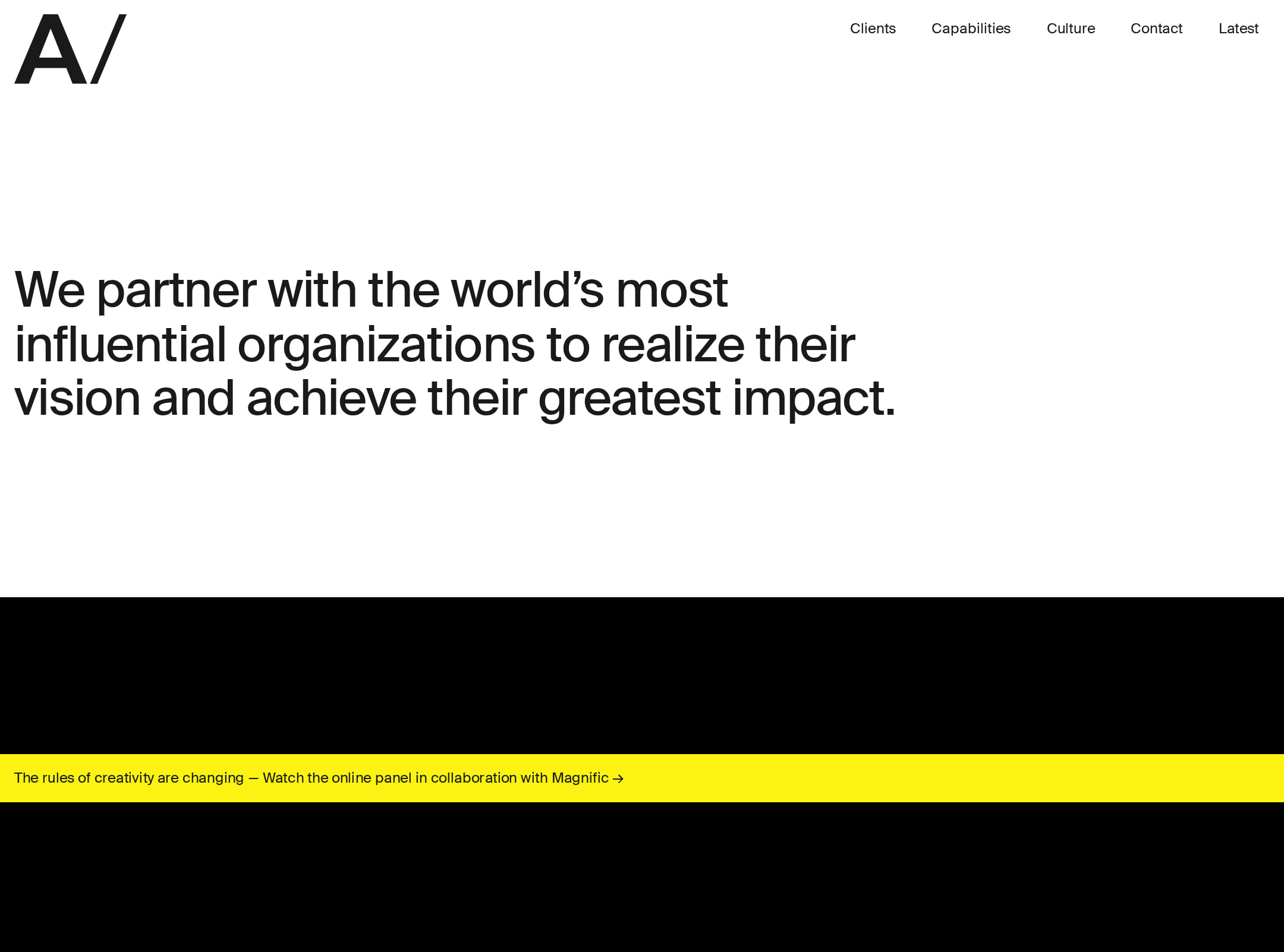
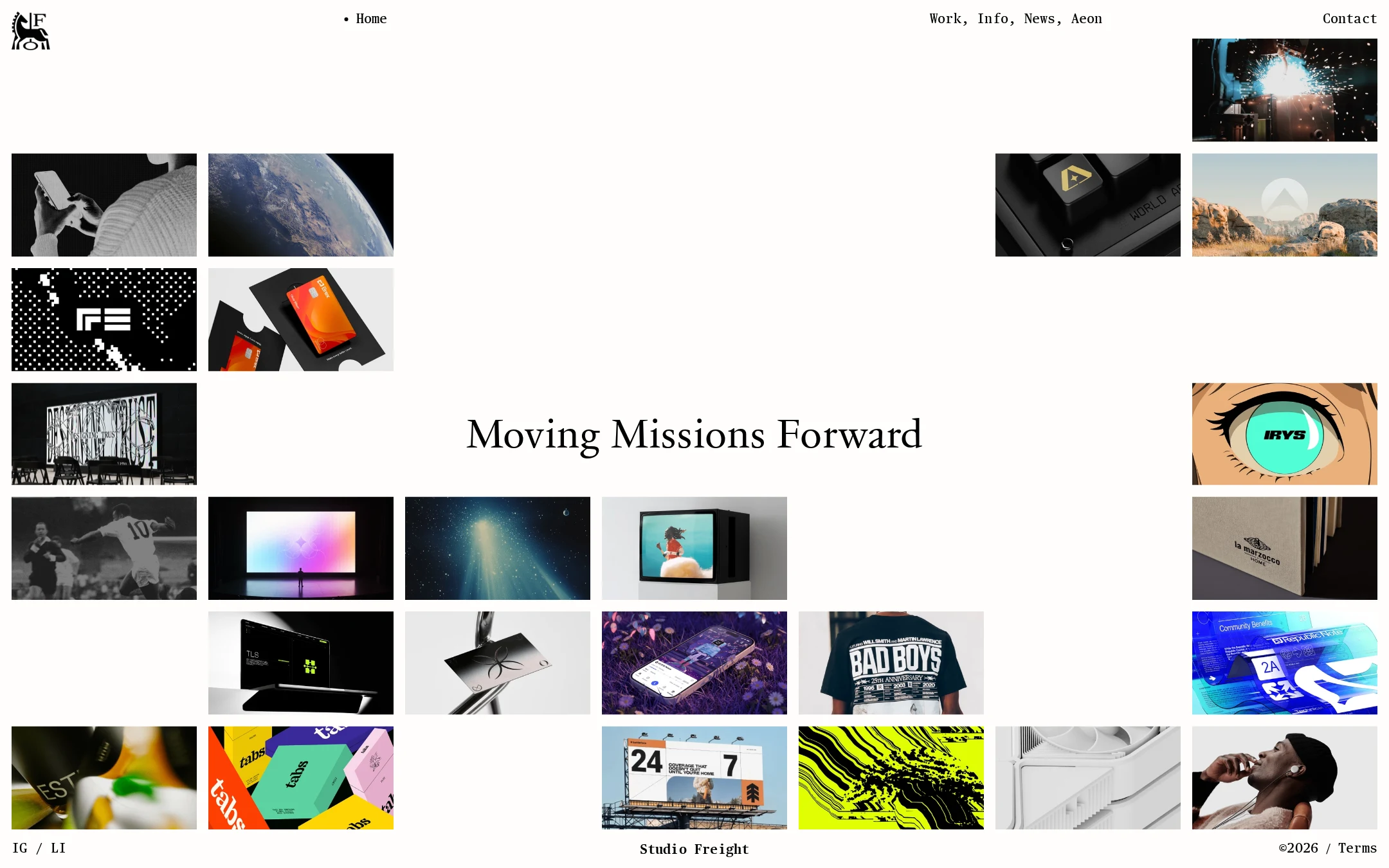
The homepage demonstrates exceptional control of negative space, hierarchy, and visual curation. Its ivory field, oversized serif statement, and varied image clusters form a coherent editorial composition without relying on common agency-site tropes.
What works
- Strong visual hierarchy centered on the positioning statement.
- Asymmetric composition gives the portfolio a gallery-like character.
- Restrained interface colors let project imagery provide contrast and personality.
- Typography creates a clear distinction between brand voice and utility navigation.
Opportunities
- Introduce slightly stronger contextual cues so the spatial abstraction does not obscure how projects relate to the studio.
- Ensure the central statement remains balanced when the image set or viewport changes.
Uniqueness
The page has a recognizable point of view and avoids the predictable hero-plus-case-study-card structure. The distributed image field and unusually large areas of negative space make the homepage memorable.
What works
- The homepage reads as a curated exhibition rather than a generic agency landing page.
- Mixed project imagery creates breadth without requiring a dense services pitch.
- The restrained shell provides a distinctive frame for otherwise varied work.
Opportunities
- Make the project taxonomy or studio specialty more legible if differentiation depends on more than visual taste.
- Preserve the spatial concept while adding a small amount of original explanatory context.
User experience
The visual experience is calm and engaging, and the portfolio is immediately scannable. However, intentionally sparse grouping, compact labels, and unverified responsive behavior create discoverability and accessibility risks.
What works
- The work is visible immediately rather than hidden behind a long introduction.
- Navigation remains compact and easy to identify at desktop size.
- The single prominent statement quickly communicates an ambitious studio position.
Opportunities
- Clarify which image regions are interactive and provide more informative project labels or metadata.
- Review reading and focus order against the visual arrangement, especially where absolute positioning is used.
- Validate the layout on narrow screens and with zoomed text; these behaviors are not established by the supplied evidence.
Conversion optimization
For a creative-agency portfolio, the homepage succeeds at establishing taste and showing breadth. Conversion is intentionally secondary, but the sparse presentation and low-context project links may make it harder for a prospective client to understand fit or take the next step.
What works
- A visible Contact destination supports direct inquiry.
- The work itself functions as the primary credibility signal.
- The central positioning statement gives the portfolio a clear strategic frame.
Opportunities
- Add concise project descriptors, disciplines, or outcomes so visitors can assess relevance faster.
- Give the contact route a slightly stronger priority on smaller screens and in the end-of-page state.
- Consider a brief capabilities or client-fit cue without weakening the gallery-like composition.
What we'd improve
- 01high
Resolve small-text contrast failures
Audit the 18 reported contrast failures across navigation, dot, and interface-label elements. Increase text/background contrast while preserving the monochrome art direction, then recheck states over image or tinted surfaces.
- 02high
Validate responsive and keyboard behavior
Test the asymmetric gallery at narrow widths, browser zoom, keyboard navigation, and reduced-motion settings. Confirm that project links follow a logical reading order and that all interactive targets retain visible focus.
- 03medium
Add concise project context
Pair each project entry with a short discipline, client, or outcome label where appropriate. This would improve scanning and commercial relevance while keeping the image field visually dominant.
- 04medium
Strengthen the contact path proportionally
Keep Contact in the compact navigation, but reinforce it with a clear end-of-page invitation or brief availability cue so visitors who have browsed the gallery have an obvious next step.
- 05low
Protect the composition across content changes
Define layout rules for image count, crop behavior, and headline wrapping so future portfolio additions do not create accidental collisions or excessive empty regions.