Snog Productions website analysis
A detailed critique of the homepage's craft, originality, usability, and ability to move visitors toward its intended goal.
Our observations
A visually exceptional and distinctive portfolio presentation with substantial semantic and accessibility work still required.
Best practices
The page is visually coherent but the supplied audit identifies several foundational implementation issues.
What works
- Clear visual identity and consistent navigation treatment.
- Limited palette and restrained component styling reduce visual noise.
- Project imagery is presented prominently and with strong editorial intent.
Opportunities
- Add a meaningful page language declaration and a semantic main landmark.
- Provide a single descriptive H1 that establishes the studio and page purpose.
- Give every linked project and logo an accessible name, ideally including project context.
- Resolve repeated IDs and the documented contrast failures, then verify keyboard focus visibility.
Design
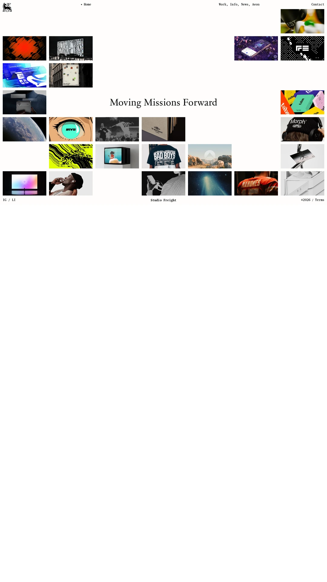
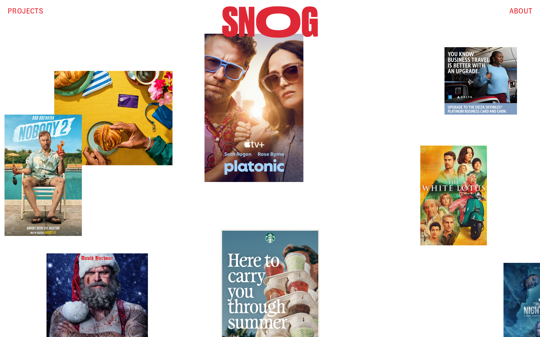
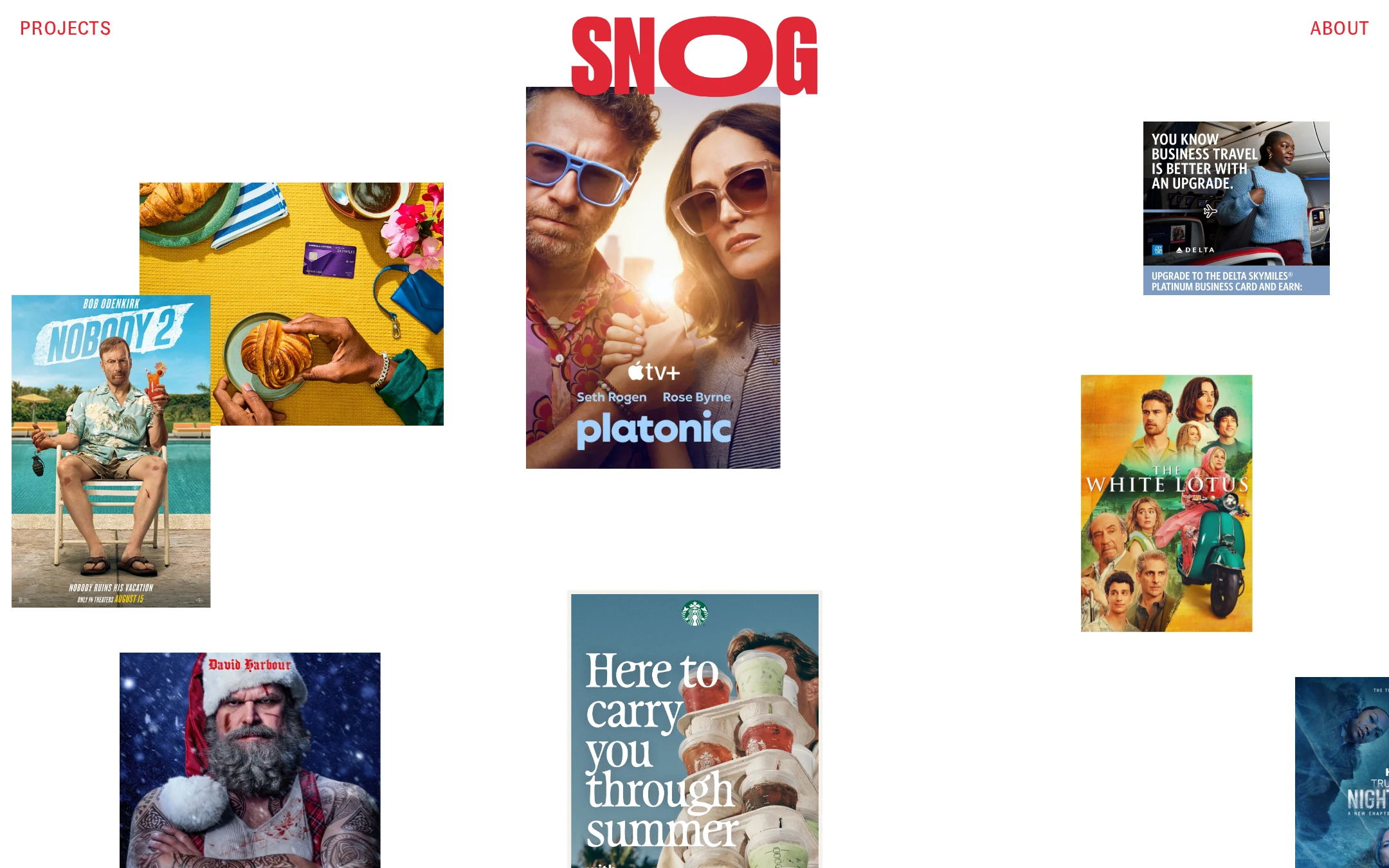
The homepage demonstrates strong art direction, hierarchy, and control of negative space.
What works
- The red wordmark creates an immediate focal anchor.
- Asymmetric image placement feels intentional rather than template-driven.
- Mixed image dimensions create visual rhythm across the otherwise quiet canvas.
- The white background allows varied campaign artwork to remain the focus.
Opportunities
- Introduce subtle project metadata or a short positioning statement without weakening the gallery-like quality.
- Ensure the most important work has a clearer visual or editorial priority.
- Check that the composition remains understandable when images stack or resize at smaller widths.
Uniqueness
The exhibition-wall approach and oversized central identity give the portfolio a memorable point of view.
What works
- The dispersed composition avoids the familiar agency case-study grid.
- The combination of a compact red wordmark and large-scale campaign imagery is highly recognizable.
- The page presents commercial work through an authored curatorial lens.
Opportunities
- Make the studio’s specific production perspective more explicit through original supporting copy or categorization.
- Use project titles and disciplines to distinguish the portfolio beyond the artwork itself.
User experience
The visual path is simple, but discoverability and accessibility are weakened by missing semantics and sparse context.
What works
- Projects, navigation, and identity are visually easy to locate.
- The uncluttered layout reduces cognitive load for sighted desktop visitors.
- The image-led structure is appropriate for a production portfolio.
Opportunities
- Add descriptive accessible labels and meaningful alternative text to project links and imagery.
- Provide visible project titles, disciplines, or client context near each work sample.
- Test keyboard navigation, focus order, pointer alternatives, and small-screen layouts.
- Avoid relying on cursor-specific cues for discovering interactive content.
Conversion optimization
For a portfolio homepage, the page successfully creates desire to explore, but it does not clearly communicate the next professional action.
What works
- The work is presented immediately, which supports rapid visual qualification by prospective clients.
- The prominent identity and simple About/Projects navigation establish a basic route into the site.
- Strong presentation quality can build confidence in the studio’s creative capabilities.
Opportunities
- Add a clear contact or inquiries route, especially for users who arrive through the homepage.
- State the studio’s services and production specialties before or alongside the project index.
- Use project labels and concise case-study entry points to help visitors assess relevance quickly.
- Make the primary next step visible without requiring users to infer that images are interactive.
What we'd improve
- 01high
Repair semantic and accessible foundations
Add the document language, a meaningful H1, a main landmark, accessible names for all nine unnamed links, descriptive image alternatives, and unique IDs. Recheck the three documented contrast failures with keyboard and screen-reader navigation.
- 02high
Clarify the studio proposition
Add a concise, original statement describing what Snog Productions produces and for whom, plus visible project titles or disciplines. Keep it visually subordinate to the artwork so the editorial presentation remains intact.
- 03high
Establish an explicit contact path
Expose a clearly labeled contact or inquiries action in the primary navigation or near the portfolio introduction, rather than making conversion depend on discovering the About page.
- 04medium
Validate responsive and input behavior
Test the asymmetric image composition across narrow screens, zoom levels, touch input, keyboard focus, and reduced-motion preferences. Confirm that project links remain identifiable without cursor-only interactions.
- 05low
Strengthen portfolio wayfinding
Add lightweight filtering, project categories, or concise metadata if the collection grows, while preserving the intentionally spacious visual field.