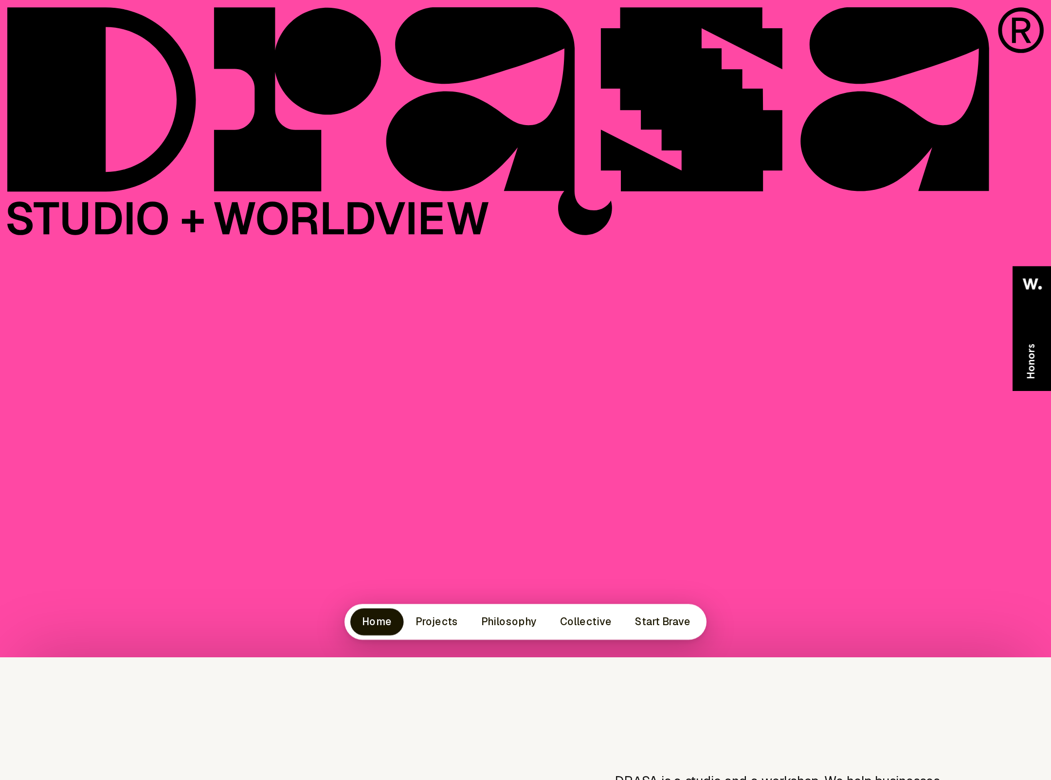


DRĄSA website analysis
A detailed critique of the homepage's craft, originality, usability, and ability to move visitors toward its intended goal.
Our observations
A distinctive and commercially credible studio homepage with exceptional art direction, strong portfolio presentation, and a clear point of view. It merits gallery inclusion after accessibility and heading-structure refinements.
Best practices
The page demonstrates strong structural discipline and a high automated accessibility score, but the missing H1 and two contrast failures are material semantic and accessibility issues.
What works
- A single main landmark and no duplicate IDs were detected.
- Navigation, portfolio, service, testimonial, CTA, and footer regions are clearly represented.
- The page provides skip-link and back-to-top affordances in the supplied evidence.
- The hierarchy is visually legible through recurring section titles and distinct content chapters.
Opportunities
- Add one descriptive H1 that communicates the studio’s offer, independent of the wordmark treatment.
- Resolve the two detected text-contrast failures and re-test accent text on bright surfaces.
- Verify keyboard focus visibility, carousel announcements, image alt quality, and mobile menu semantics manually.
- Confirm that large display headings remain readable and do not create excessive scrolling or awkward wrapping at intermediate widths.
Design
A polished and memorable visual system that balances expressive color and typography with a coherent card language.
What works
- The color-blocked section sequence gives the long page a strong narrative rhythm.
- The portfolio uses varied graphic treatments and proportions to make individual projects memorable.
- Oversized typography and mono labels create a recognizable editorial voice.
- Rounded cards, circular controls, and generous spacing provide continuity across contrasting sections.
Opportunities
- Clarify the hero’s plain-language value proposition alongside the identity-led opening.
- Increase the visual distinction between secondary labels and body copy where both become small on mobile.
- Consider slightly more consistent project metadata sizing so the portfolio remains scannable for fast evaluators.
Uniqueness
The combination of typographic scale, saturated chapter colors, asymmetric project tiles, and studio-specific language is unusually recognizable among agency homepages.
What works
- The homepage feels authored rather than assembled from a generic agency template.
- The collective section turns people and roles into a visual index with strong personality.
- The work grid’s varied color fields and geometric artwork create a distinctive portfolio signature.
- The closing lime CTA and dark footer provide a memorable end state.
Opportunities
- Make the studio’s central promise even more explicit so the distinctive art direction is paired with equally distinctive positioning.
- Use a small number of repeatable visual motifs in project case studies to strengthen recognition beyond the homepage.
User experience
The information journey is coherent and visually engaging, though the identity-first hero, compact labels, and carousel content may impose extra interpretation costs.
What works
- The sequence from philosophy to founder, collective, services, work, testimonials, and contact is logical.
- Persistent navigation supports movement through a long single-page experience.
- The portfolio provides recognizable evidence of work across several projects.
- The final CTA creates a clear endpoint rather than leaving visitors without a next step.
Opportunities
- Add a concise service or audience statement above the fold, not only a brand mark.
- Ensure the testimonial carousel exposes its current position and accessible labels to assistive technology.
- Make card and arrow affordances unmistakable on touch devices.
- Check that the asymmetrical portfolio remains easy to scan when viewed at tablet widths.
Conversion optimization
The page supports trust-building through services, named people, selected work, and testimonials, with a strong final contact prompt. Earlier conversion intent is comparatively understated.
What works
- The page establishes credibility through named team members, service areas, project examples, and testimonials.
- The closing CTA uses high contrast and a clear action-oriented invitation.
- Large work titles and project tiles make the portfolio a natural route for prospective clients.
Opportunities
- Introduce a primary project-enquiry action earlier, ideally in the hero or first major content section.
- Add concise context around the types of organisations or problems DRĄSA is best suited to help.
- Pair selected work with brief outcomes or client context where available to improve decision confidence.
- Make contact expectations clearer, such as what happens after initiating an enquiry.
What we'd improve
- 01high
Add a meaningful H1 and clarify the hero proposition
Use one visible or visually hidden H1 that states the studio’s research, design, and coaching offer, then pair it with a short audience- or outcome-focused sentence near the opening identity treatment.
- 02high
Fix the detected contrast failures
Review the two reported text-contrast locations, especially the navigation item and accent span within the large heading, and adjust foreground or background colors until they are readable at their rendered sizes.
- 03medium
Strengthen the first conversion path
Place a prominent project-enquiry or conversation action in the hero or immediately after the introductory philosophy section, while retaining the more expressive closing CTA.
- 04medium
Audit interactive content for accessibility
Manually test the carousel, fixed navigation, mobile menu, card links, focus states, screen-reader labels, and reduced-motion behavior across keyboard and touch input.
- 05low
Improve portfolio decision support
Add compact outcome, client, or engagement-context cues to selected work cards where appropriate so visitors can understand relevance before opening a project.