

Gigantic // Candy Deluxe website analysis
A detailed critique of the homepage's craft, originality, usability, and ability to move visitors toward its intended goal.
Our observations
A visually confident and commercially credible product homepage with a memorable brand system. It is suitable for a curated gallery, with the strongest opportunities centered on hero clarity, motion restraint, and conversion prominence.
Best practices
The page demonstrates strong structural and accessibility fundamentals in the supplied evidence, including one primary heading, no heading skips, one main landmark, a skip link, visible media controls, and no sampled contrast failures.
What works
- Semantic navigation, main content, heading, and footer structures are present.
- A skip-to-content control and video play/pause control are visible in the evidence.
- The page has one H1 and no detected heading-level skips.
- Contrast testing reported zero failures across 32 sampled combinations.
Opportunities
- Resolve the duplicate ID issue involving #B, which can create ambiguous references for assistive technology.
- Verify keyboard focus visibility and focus order across the fixed navigation drawer, product carousel, and animated sections.
- Test the hero and product layout at mobile widths and with reduced-motion enabled; those behaviors were not established by the supplied desktop evidence.
Design
The design has a coherent, recognizable art direction that treats packaging, typography, motion, and color as one brand experience rather than a generic storefront.
What works
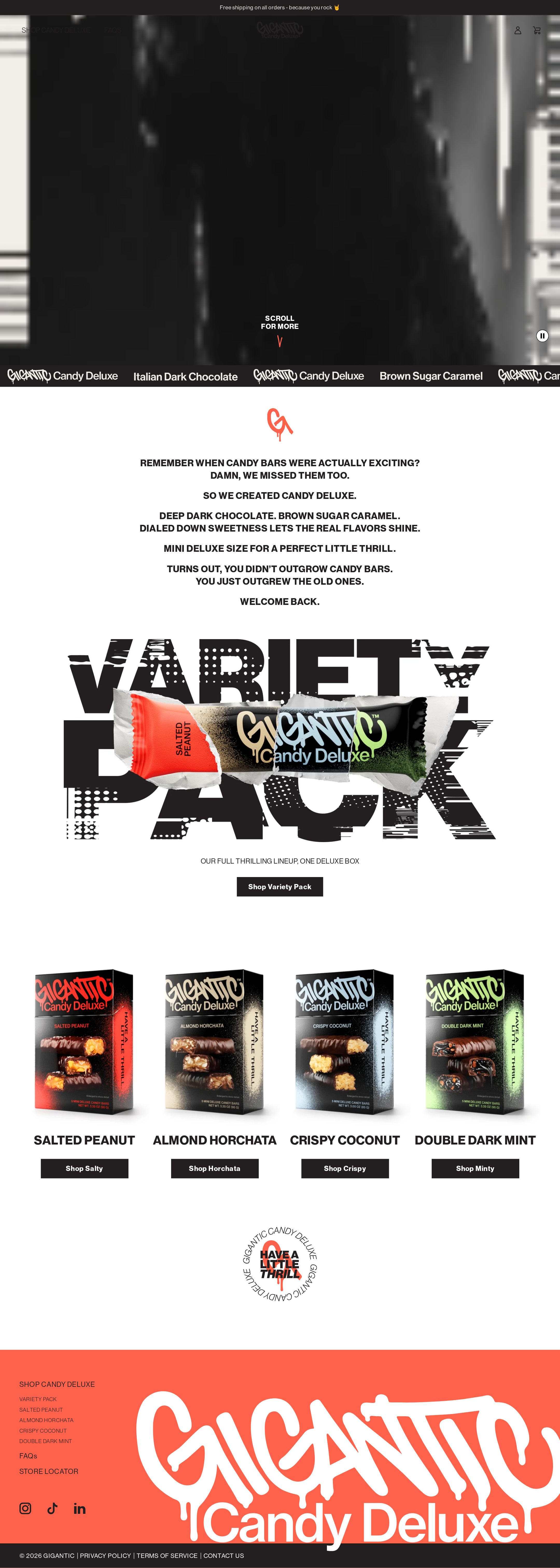
- The oversized variety-pack composition creates a strong and memorable merchandising focal point.
- The coral footer and flavor-specific packaging colors provide clear brand and product differentiation.
- The transition from dark cinematic imagery to a white editorial field creates useful visual pacing.
- Product names and shopping actions are visually grouped and easy to scan in the desktop product row.
Opportunities
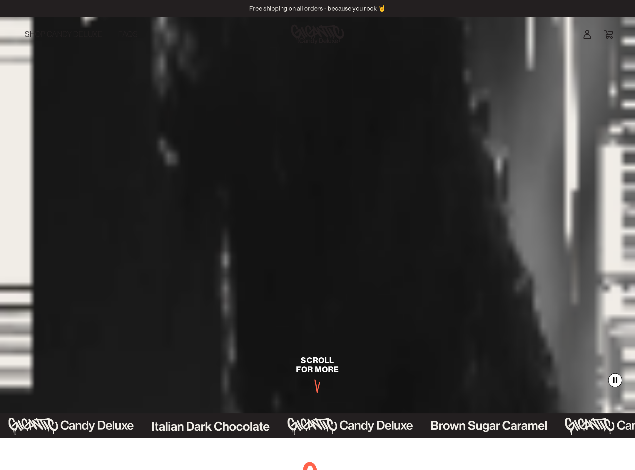
- Improve the legibility and subject recognition of the opening hero image, which appears deliberately atmospheric but visually unclear in the supplied screenshot.
- Reduce competition between the oversized background lettering and the product pack where the promotional message needs to remain immediately readable.
- Ensure the expressive display treatment does not obscure product details or essential information at smaller viewport sizes.
Uniqueness
The site has a notably distinctive visual voice, particularly in its distressed oversized type, package-led compositions, irreverent editorial copy, and coral-and-black brand world.
What works
- The variety-pack section feels authored rather than template-driven.
- Packaging is integrated into the graphic system instead of being presented as isolated catalog imagery.
- The combination of candy branding, editorial pacing, and oversized typographic disruption is highly recognizable.
Opportunities
- Keep future campaign sections disciplined so novelty remains tied to flavor and product communication rather than becoming decorative repetition.
- Use the strongest graphic experiments selectively around key commercial moments to preserve hierarchy.
User experience
The desktop journey is understandable from brand introduction to product selection, but the first screen prioritizes atmosphere and motion over immediate product comprehension.
What works
- The page provides a clear sequence from introduction to variety pack to individual flavors.
- Four product choices are visible together with descriptive names and dedicated shopping buttons.
- Navigation includes product, FAQ, and supporting discovery paths.
- A visible scroll cue helps explain the immersive hero treatment.
Opportunities
- State the Candy Deluxe proposition and primary shopping path more explicitly within the first viewport.
- Avoid relying on the marquee or scroll cue as the main explanation of what the visitor can do next.
- Confirm that the fixed navigation, animation controls, and product interactions remain easy to operate with keyboard and touch input.
- Review small footer text and dense product labels on narrow screens for readability.
Conversion optimization
The page has strong product desire and clear merchandise imagery, but its commercial path is less direct than its visual identity. Conversion assessment is based on the apparent goal of selling candy online, not on observed sales performance.
What works
- The variety pack receives a dedicated visual feature and a clearly labeled shopping CTA.
- Individual products are presented as a complete flavor lineup with distinct calls to action.
- The product packaging communicates flavor differentiation quickly once the visitor reaches the product section.
- The brand tone is emotionally specific and supports impulse-oriented purchase behavior.
Opportunities
- Add a concise, high-visibility hero CTA such as shopping the variety pack or exploring flavors.
- Bring price, pack size, shipping context, or a short purchase reassurance closer to the first product decision where appropriate.
- Make the primary CTA visually dominant over secondary navigation and decorative motion.
- Consider adding trust-building purchase information near the product grid without diluting the campaign-led art direction.
What we'd improve
- 01high
Clarify the first-screen shopping path
Add a concise Candy Deluxe value statement and one unmistakable primary CTA within or immediately below the hero, while preserving the cinematic visual treatment.
- 02high
Fix the duplicate ID
Replace the repeated #B identifier with unique IDs and recheck label, control, and fragment relationships after the change.
- 03high
Improve hero legibility
Provide a clearer poster frame or stronger tonal separation so visitors can recognize the product and campaign premise before interacting with or scrolling past the hero.
- 04medium
Strengthen product decision context
Place compact information such as pack configuration, flavor notes, or shipping reassurance near the product cards and variety-pack CTA.
- 05medium
Audit motion and responsive behavior
Test marquee, hover, rotation, fixed navigation, and product interactions on touch devices and under reduced-motion preferences; preserve access to all content when motion is disabled.
- 06low
Protect the graphic hierarchy
Use the distressed oversized typography selectively and verify that it never competes with product names, packaging details, or the primary purchase action.