

Eat Curious website analysis
A detailed critique of the homepage's craft, originality, usability, and ability to move visitors toward its intended goal.
Our observations
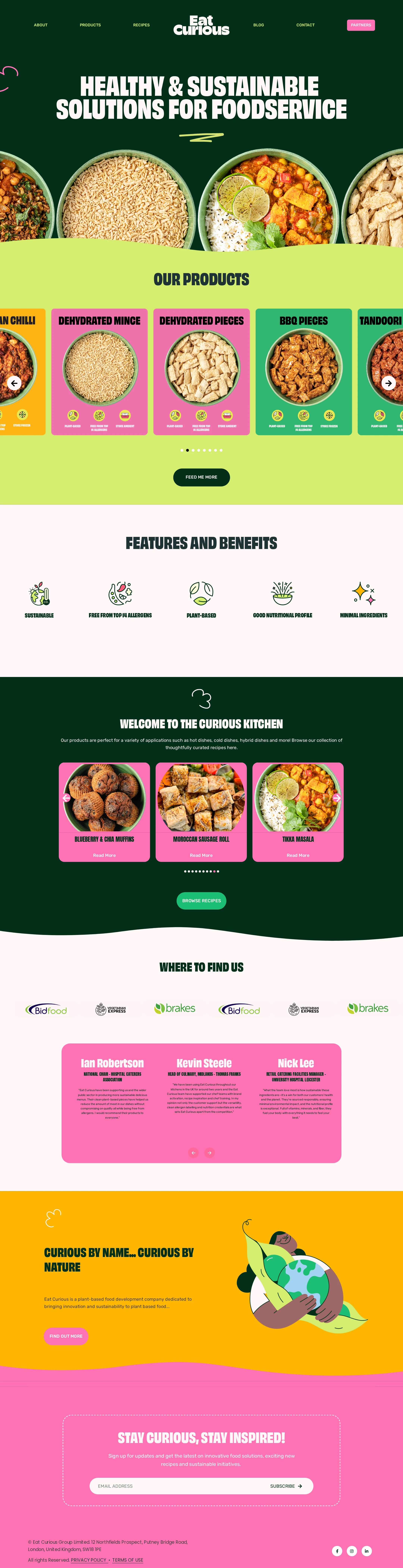
Strong visual direction with clear gallery appeal, but accessibility and semantic issues prevent publication without review.
Best practices
The page has a coherent content journey and useful commercial sections, but its semantic and accessibility implementation is materially below a polished standard.
What works
- The homepage covers multiple B2B decision needs: products, benefits, recipes, locations, testimonials, company story, and contact capture.
- The navigation, content sections, and footer provide a recognizable overall structure.
- Product and recipe imagery includes descriptive image text in the supplied evidence.
Opportunities
- Add a single meaningful H1; the automated evidence reports no H1 on the homepage.
- Correct the heading hierarchy instead of jumping from level 2 to level 5 for benefits and testimonials.
- Resolve missing accessible names for 39 links and missing labels for 19 carousel controls.
- Review the 36 reported contrast failures, especially colored buttons and overlaid carousel actions, and add visible keyboard focus states.
Design
A memorable and well-art-directed visual system turns a functional ingredient homepage into an expressive brand experience.
What works
- The dark green, lime, pink, and orange palette is distinctive and consistently applied across sections.
- Circular food photography, illustrated icons, organic curves, and oversized condensed headlines work together as a coherent art direction.
- The page alternates dense discovery modules with quieter benefit, proof, and story sections, creating useful visual pacing.
Opportunities
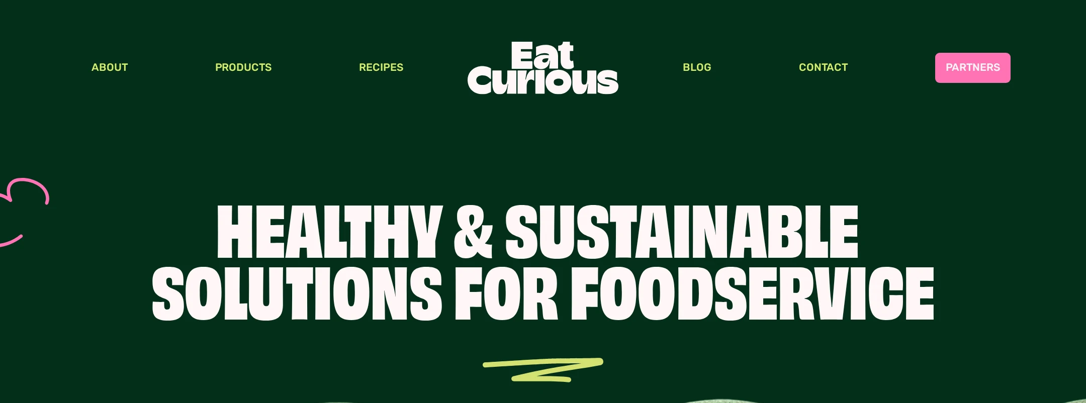
- Reduce the visual competition between very large headings, saturated backgrounds, and carousel content in the first viewport.
- Give supporting copy slightly more space and contrast in pink testimonial and footer areas.
- Make the primary B2B action more prominent and persistent relative to secondary exploration actions.
Uniqueness
The combination of plant-based food photography, poster-like condensed type, saturated color fields, and ecological illustration is highly recognizable.
What works
- The visual language feels specific to an energetic food brand rather than a generic corporate ingredient supplier.
- Organic section transitions and hand-drawn graphic details add personality beyond the photography.
- The product-card treatment makes the ingredient range visually easy to distinguish.
Opportunities
- Strengthen the distinctive B2B positioning with more visible proof of operational value, such as formats, applications, or service capabilities, if available.
- Avoid allowing the playful aesthetic to obscure technical product information important to foodservice buyers.
User experience
The information architecture is understandable from the screenshot, but carousels, small labels, motion, and accessibility defects create avoidable friction.
What works
- The sequence from products to benefits, recipes, distribution, proof, story, and signup is easy to follow.
- Carousel arrows and pagination are visually present, and product cards provide a clear browsing model.
- The newsletter field is visually prominent and placed at the end of a coherent narrative.
Opportunities
- Provide an accessible name and current-position state for every carousel control and ensure all carousel content is reachable by keyboard.
- Offer a non-carousel alternative or visible controls for users who cannot comfortably scan horizontally moving content.
- Increase the legibility of small captions and testimonial copy, particularly over bright or saturated backgrounds.
- Respect prefers-reduced-motion; the supplied evidence reports animation but no confirmed reduced-motion handling.
Conversion optimization
The page supports discovery and credibility well, but the principal B2B conversion path is less explicit than the visual storytelling.
What works
- Product browsing is placed near the top and supported by recipe content, benefits, partner logos, and testimonials.
- The email signup is a clear final action, and the brand-story panel provides a secondary route to learn more.
- Visual product cards make the range feel approachable and encourage exploration.
Opportunities
- Clarify the primary buyer action—such as requesting samples, contacting sales, or finding a distributor—above the fold and repeat it after product discovery.
- Pair product cards with stronger buyer-oriented details or direct next steps rather than relying mainly on visual appeal.
- Add concise reassurance around what happens after newsletter signup and distinguish marketing signup from sales contact.
- Ensure contrast and accessible names do not reduce the effectiveness of key calls to action.
What we'd improve
- 01high
Repair the semantic and accessible foundation
Add one descriptive H1, restore sequential heading levels, label every carousel dot and icon link, provide meaningful accessible names, and remove duplicate SVG IDs.
- 02high
Resolve contrast and focus failures
Audit the reported contrast failures across navigation, overlaid carousel actions, and colored buttons. Add persistent, high-visibility keyboard focus styles and verify controls against their actual backgrounds.
- 03high
Make the B2B conversion path explicit
Choose a primary buyer action and surface it in the header, hero, product area, and closing section. Keep recipe browsing and newsletter signup as supporting actions.
- 04medium
Improve carousel usability
Expose clear labels, slide counts or position states, pause controls where autoplay exists, and a static or list-based fallback for product, recipe, and testimonial content.
- 05medium
Improve small-screen readability
Test clipped product cards, condensed headings, testimonial copy, navigation, and the newsletter form at narrow widths. Ensure content remains readable without horizontal scrolling.
- 06low
Balance expressive motion with calm states
Reduce decorative entrance effects where they compete with content and implement a verified reduced-motion mode for marquees, transitions, and carousel movement.