

Aardvark Book Club website analysis
A detailed critique of the homepage's craft, originality, usability, and ability to move visitors toward its intended goal.
Our observations
A distinctive and commercially well-structured book-club homepage with exceptional visual personality, held back by substantial accessibility risks and a sometimes overloaded visual hierarchy.
Best practices
The page has a coherent content structure and a single H1, but automated accessibility findings materially reduce its best-practice score.
What works
- The homepage has one detected H1 and no heading-level skips.
- The navigation, FAQ accordions, promotional areas, and newsletter form support recognizable user tasks.
- The content sequence covers discovery, explanation, reassurance, gifting, and member engagement.
Opportunities
- Resolve the 69 detected contrast failures, prioritizing CTA text and text layered over saturated backgrounds.
- Provide an accessible name for the missing header link and an explicit label for the email field.
- Remove duplicate IDs and test keyboard focus, accordion semantics, slider controls, and canvas fallbacks manually.
Design
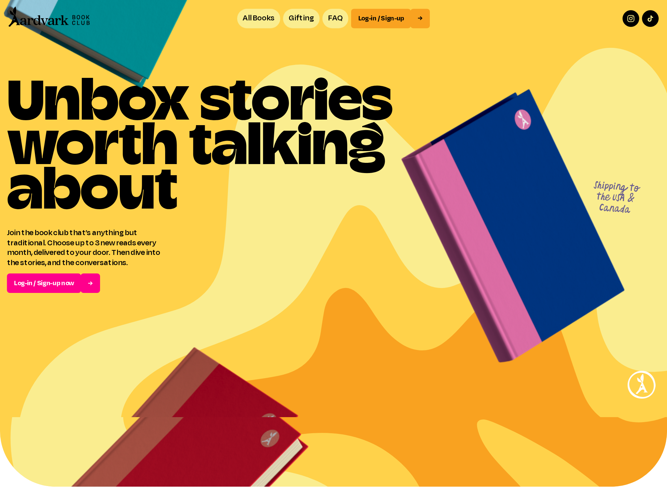
The visual design is unusually confident, cohesive, and well matched to a contemporary reading community.
What works
- The saturated palette, oversized type, book imagery, and hand-drawn accents form a recognizable art direction.
- Rounded panels and recurring illustrated forms create continuity across a very long page.
- The hero communicates a clear emotional proposition before the supporting sections begin.
Opportunities
- Reduce competing focal points in the densest promotional sections.
- Introduce more quiet space or neutral framing around key conversion moments so they are easier to scan.
- Check large display typography at narrow and zoomed viewports, especially where text sits on vivid imagery.
Uniqueness
The homepage has a highly individual visual identity and avoids the generic subscription-commerce template.
What works
- The combination of book-cover presentation, hand-rendered annotations, bright color chapters, and oversized display type is memorable.
- Merchandise, member-choice content, gifting, and genre exploration are integrated into one distinctive editorial world.
- The page uses illustration and shaped containers as brand expression rather than relying solely on standard ecommerce cards.
Opportunities
- Ensure future campaigns preserve the underlying brand logic rather than adding unrelated decorative treatments.
- Use the strongest recurring motifs selectively so novelty does not dilute recognition or comprehension.
User experience
The information architecture is comprehensive and the mobile sequence is understandable, but visual intensity and unresolved accessibility issues create friction.
What works
- The page explains how membership works in a dedicated sequence of steps.
- Current books, genre choices, FAQs, gifting, benefits, and exclusives address common pre-signup questions.
- The screenshot shows clear section boundaries and recognizable interactive patterns.
Opportunities
- Make slider position, available items, and control purpose explicit for keyboard and screen-reader users.
- Increase contrast and provide non-color cues for category and promotional information.
- Test scrolling, focus order, reduced motion, and content comprehension on small screens and at 200% zoom.
Conversion optimization
The page supports subscription conversion effectively by pairing an immediate signup CTA with selection proof, process explanation, benefits, FAQs, gifting, and promotional offers.
What works
- The primary membership CTA appears in both the navigation and hero, reducing the distance to signup.
- The current-book section provides concrete evidence of the subscription’s value and variety.
- FAQs and the step-by-step membership explanation address cost, availability, and joining concerns.
Opportunities
- Clarify the membership price and recurring commitment closer to the primary hero CTA rather than relying mainly on later FAQ content.
- Make the promotional offer’s eligibility, expiration, and terms more prominent and unambiguous.
- Keep the newsletter capture clearly secondary to membership signup and ensure its field label and error states are accessible.
What we'd improve
- 01high
Repair contrast and semantic labeling
Audit every flagged CTA and decorative text treatment against its actual background, then add a meaningful accessible name to the header brand link and a visible or programmatic label to the email field.
- 02high
Correct duplicate IDs and interactive semantics
Replace duplicate IDs with unique identifiers and manually verify accordion, slider, navigation, focus, and canvas fallback behavior using keyboard and assistive technology.
- 03high
Add a reduced-motion and non-canvas experience
Respect prefers-reduced-motion for page transitions, split-text effects, and hero sequencing, and provide equivalent static imagery or meaningful content if the canvas sequence is unavailable.
- 04medium
Strengthen the hero’s commercial clarity
Pair the main signup CTA with concise pricing, billing cadence, shipping scope, or a direct reassurance link so visitors can evaluate commitment without searching the FAQ.
- 05medium
Reduce visual competition around conversion points
Reserve the highest saturation and largest type for the hero and key signup moments; simplify nearby decorative layers and promotional badges to improve scanning.
- 06low
Validate responsive type and product browsing
Test intermediate widths, text enlargement, landscape mobile, and keyboard browsing to confirm that oversized headings, horizontal book content, and merchandise imagery remain usable.