Instacart website analysis
A detailed critique of the homepage's craft, originality, usability, and ability to move visitors toward its intended goal.
Our observations
A strong, credible marketplace homepage with excellent information architecture and practical local utility. Its main opportunities are reducing above-the-fold density, strengthening the primary ordering path, and resolving a small but serious accessible-name issue.
Best practices
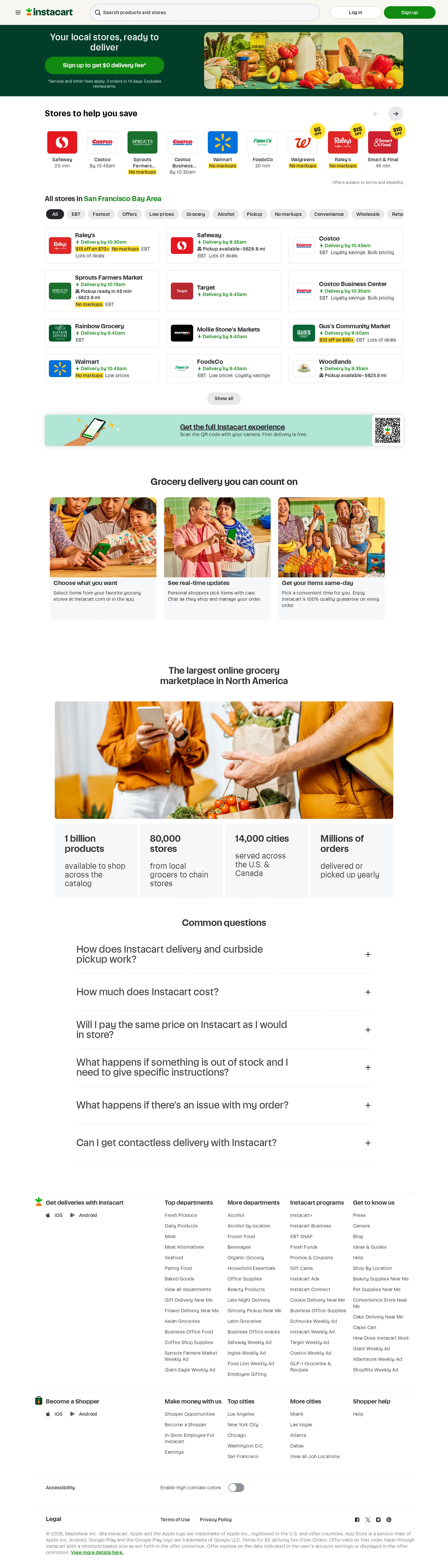
The page demonstrates strong semantic structure and mature marketplace patterns, with a clear H1, coherent heading hierarchy, a single main region, readable contrast samples, and an obvious search-and-discovery path.
What works
- One H1 and an orderly heading hierarchy support page comprehension.
- The sticky header keeps search, account actions, and navigation available.
- The local store area exposes retailer, delivery timing, fees, and promotional context in one scan.
- The FAQ and footer provide useful support and discovery paths beyond the primary transaction.
Opportunities
- Fix the navigation link that is missing an accessible name.
- Audit the dense retailer cards and filter controls with keyboard and screen-reader testing.
- Confirm that image alternatives, accordion states, focus styling, and responsive touch targets remain clear across breakpoints.
Design
The visual system is consistent, brand-led, and highly usable, pairing a recognizable green hero with restrained cards and warm grocery imagery. The interface is more effective than distinctive.
What works
- The green hero immediately communicates brand and primary action.
- Retailer logos and photography add credibility and break up otherwise quiet surfaces.
- Consistent card styling, typography, and dividers create a cohesive marketplace system.
- The content sequence moves naturally from task initiation to proof and reassurance.
Opportunities
- Give the hero a stronger visual focal point and more prominent value proposition relative to the dense store content below.
- Reduce small labels and competing badges in the retailer area to improve hierarchy.
- Introduce more deliberate variation between informational sections so the long page feels less templated.
Uniqueness
Local retailer availability and delivery-window detail make the page meaningfully specific, but the overall composition follows familiar grocery marketplace conventions.
What works
- The location-specific store grid makes the experience feel immediately relevant.
- The combination of nearby availability, service education, scale metrics, and FAQs is commercially comprehensive.
- Retailer-brand variety creates a recognizable marketplace character.
Opportunities
- Use a more ownable visual device or narrative around local shopping rather than relying primarily on standard marketplace cards.
- Make the local context more prominent in the hero so the page feels less like a generic national landing page.
- Consider a more distinctive treatment for the marketplace scale proof and service benefits.
User experience
The homepage supports several visitor intents well: starting an order, comparing nearby stores, understanding delivery, checking fees, and finding help. The main friction comes from information density and the amount of content required before the page reaches its educational sections.
What works
- Search, sign-up, store browsing, filters, and retailer cards are visible without requiring deep navigation.
- Delivery estimates and store-specific details help visitors compare options quickly.
- The FAQ addresses important objections around cost, pricing, substitutions, issues, and contactless delivery.
- The page maintains a clear single-column reading path below the marketplace area.
Opportunities
- Make the next best action clearer for visitors who are not ready to create an account.
- Reduce the number of simultaneous badges and metadata elements in store cards.
- Provide stronger visual separation between retailer discovery, service explanation, and brand proof.
- Validate the long footer and extensive link groups for mobile scanning and keyboard navigation.
Conversion optimization
The page has a clear commercial purpose and presents sign-up, search, nearby retailers, promotions, and delivery information effectively. Conversion could improve by focusing the hero on one primary action and clarifying offer conditions earlier.
What works
- Sign-up is highly visible in the header and hero.
- The local store inventory provides immediate evidence that the service is available and useful.
- Promotional delivery messaging creates a tangible reason to begin.
- FAQs address cost and fulfillment concerns that commonly block ordering.
Opportunities
- Make the main hero action more dominant than secondary discovery content.
- Place a concise explanation of location requirements, fees, and offer eligibility closer to the primary CTA.
- Test whether a location-first interaction or retailer-first interaction produces a clearer starting path.
- Use a persistent or repeated ordering CTA after the store grid and service explanation for visitors who continue scrolling.
What we'd improve
- 01high
Repair the unnamed navigation link
Assign a meaningful accessible name to the flagged navigation link and verify its accessible role and focus state with a screen reader and keyboard-only pass.
- 02high
Simplify the first-screen decision
Reduce competing retailer metadata and strengthen the hero’s primary ordering path so visitors can quickly choose between searching, entering a location, and signing up.
- 03medium
Clarify offer and fee context
Place eligibility, service-fee, and delivery-fee guidance adjacent to the promotional CTA rather than relying primarily on a small supporting note.
- 04medium
Improve retailer-card hierarchy
Prioritize retailer name, earliest delivery or pickup time, and the primary action; visually subordinate secondary badges and promotional annotations.
- 05low
Create stronger section-level differentiation
Add more varied visual framing or editorial rhythm to the benefits, scale proof, and FAQ sections while preserving the restrained retail system.