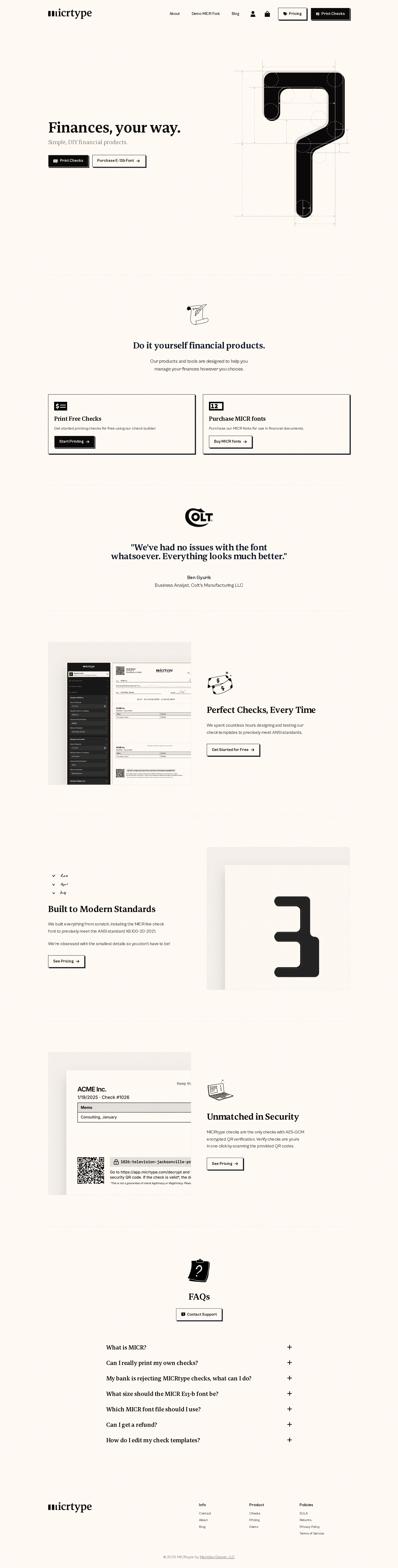
MICRtype website analysis
A detailed critique of the homepage's craft, originality, usability, and ability to move visitors toward its intended goal.
Our observations
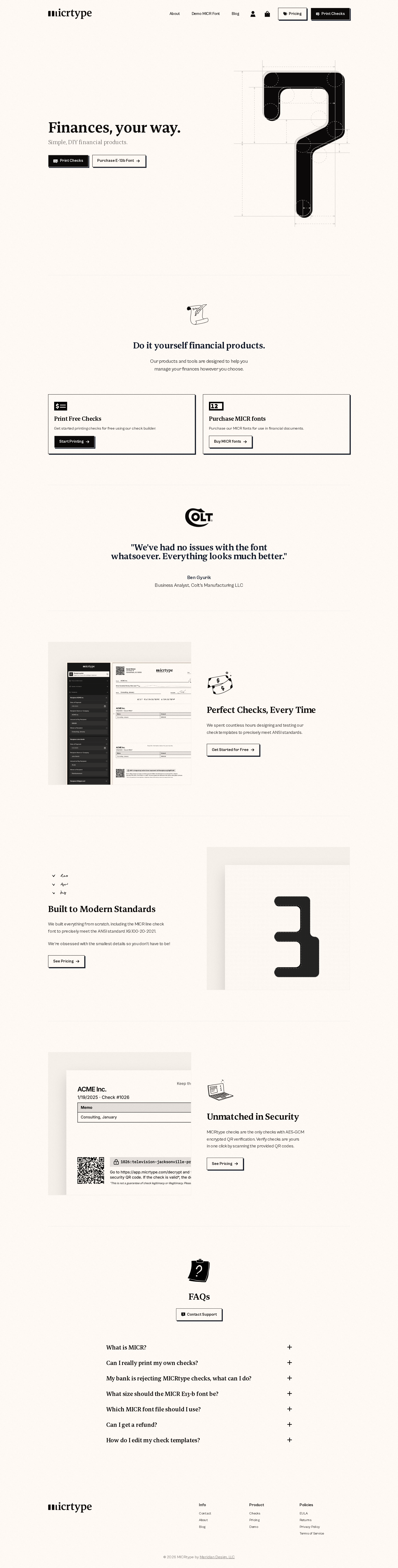
A polished and distinctive editorial-commerce homepage with strong visual authorship and a coherent product story. It is suitable for publication, with the main opportunities centered on information density, above-the-fold clarity, and verification of responsive and interaction details.
Best practices
The page demonstrates strong structural discipline and a coherent content sequence, supported by clean semantic signals in the supplied metadata.
What works
- One H1 and one main landmark are detected, with no heading skips or duplicate IDs reported.
- The page provides a logical progression from proposition to products, proof, feature explanations, FAQs, and footer navigation.
- Repeated calls to action use consistent visual treatment and clear action language.
- The supplied accessibility scan reports no contrast failures in its tested samples.
Opportunities
- The automated accessibility result has zero contrast samples, so it should not be treated as a complete contrast validation.
- Icon-only account and cart controls should be verified for accessible names, visible focus states, and adequate touch targets.
- Confirm that accordion state, keyboard interaction, and focus management work consistently across browsers.
- Validate the responsive header and long-form sections at narrow widths rather than relying on desktop evidence.
Design
The design is exceptionally cohesive, restrained, and recognizable. It uses typography, spacing, document imagery, and material cues to make a niche financial tool feel approachable and considered.
What works
- The paper-and-ink direction is tightly aligned with printable checks and MICR typography.
- The serif/sans-serif pairing establishes a clear editorial hierarchy without needing decorative effects.
- Alternating feature compositions maintain rhythm across a long page while keeping product imagery central.
- Hard-edged borders and offset shadows create a memorable physical-print sensibility.
Opportunities
- Some supporting copy and small navigation elements appear undersized in the supplied screenshot, reducing effortless scanning.
- The very pale background and sparse layouts leave limited visual emphasis for secondary trust or reassurance content.
- The hero graphic is memorable but abstract; a more explicit product cue could clarify the offer for first-time visitors.
Uniqueness
MICRtype has a clear point of view that is uncommon among financial-product sites. Its visual identity is derived from the mechanics of checks and printing rather than generic fintech gradients or dashboard conventions.
What works
- The visual connection between typography, security marks, checks, and print artifacts feels purposeful and ownable.
- The large technical glyph and document imagery give the page a strong editorial signature.
- The interface avoids familiar SaaS visual clichés while remaining commercially legible.
Opportunities
- The distinctive art direction could be reinforced with a more explicit brand story explaining why the print-oriented aesthetic matters to customers.
- The visual language should remain paired with clear functional explanations so novelty never obscures product comprehension.
User experience
The information architecture is sensible and the page appears easy to navigate conceptually, but the screenshot suggests a highly condensed reading experience in places and cannot verify interaction quality.
What works
- Primary navigation, commerce actions, product choices, FAQs, and footer links are all represented.
- The page supports both major paths—printing checks and purchasing MICR fonts—early in the journey.
- FAQ topics address practical concerns such as bank acceptance, font sizing, file choice, refunds, and templates.
Opportunities
- Increase the prominence or legibility of supporting descriptions beneath the hero and product cards.
- Make the difference between free check printing and paid font products unmistakable at a glance.
- Surface key setup requirements, compatibility information, or trust assurances closer to the first call to action.
- Test reading order, image placement, and accordion usability on mobile and with keyboard navigation.
Conversion optimization
The homepage has a strong conversion foundation for a product-led commerce site, with early dual CTAs, repeated actions, social proof, feature evidence, and an FAQ objection-handling section.
What works
- The hero presents two direct paths rather than forcing all visitors into one funnel.
- Product cards provide immediate entry points for the two core offerings.
- A testimonial and concrete visual demonstrations add credibility before later calls to action.
- The FAQ anticipates operational and purchasing objections.
Opportunities
- Add concise pricing or a stronger value qualifier near the first product choices so visitors can assess commitment sooner.
- Clarify the primary audience and use cases above the fold, especially for visitors unfamiliar with MICR.
- Strengthen trust content around bank compatibility, security, refunds, and support near the relevant purchase actions.
- Ensure the final CTA is prominent after the FAQ rather than leaving the footer to carry the closing action.
What we'd improve
- 01high
Clarify the above-the-fold offer
Add a short, plain-language explanation of who MICRtype is for and how the check-printing and font products differ, positioned alongside the initial calls to action.
- 02high
Increase small-text legibility
Review the supporting copy, compact navigation, and footer at the captured desktop scale and establish a more comfortable minimum size and line length for routine scanning.
- 03high
Verify interaction accessibility
Test account/cart controls, accordion buttons, focus visibility, keyboard operation, accessible names, and reduced-motion behavior with assistive technology and a keyboard-only pass.
- 04medium
Move trust information closer to purchase points
Introduce concise evidence about compatibility, security, support, or refund conditions near the product cards and their corresponding calls to action.
- 05medium
Add a closing conversion path
Place a clearly prioritized next step after the FAQ so visitors who finish resolving objections do not have to infer the next action from footer navigation.
- 06low
Validate responsive art direction
Review the hero graphic, alternating feature modules, screenshots, and outlined buttons at phone widths to ensure the editorial composition remains readable and actionable.