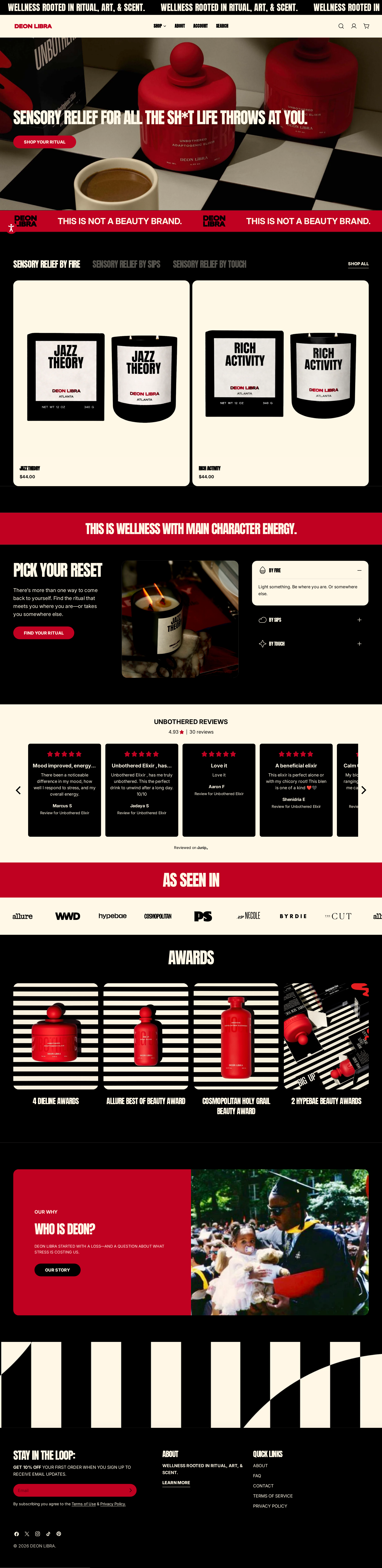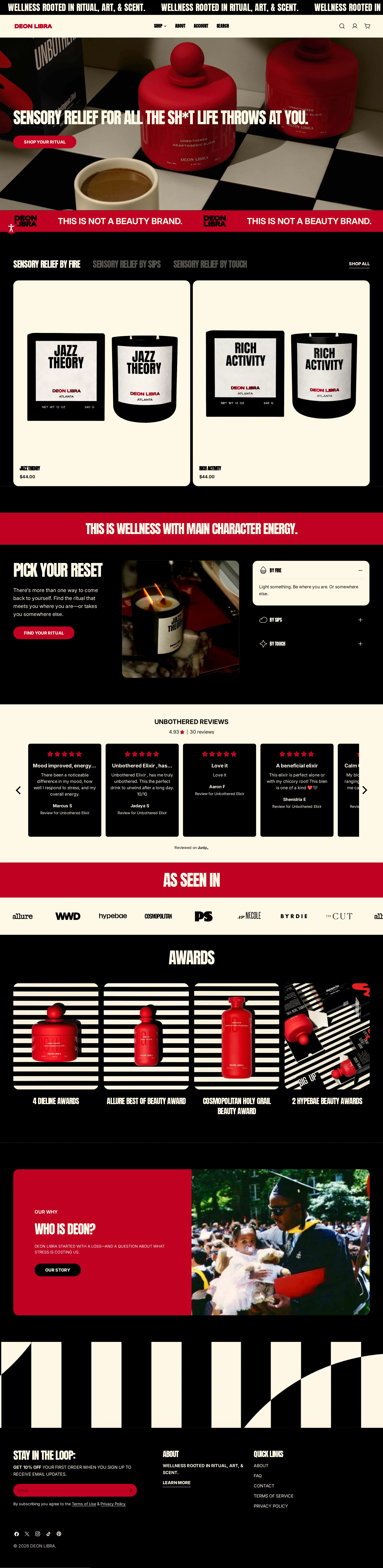
DEON LIBRA website analysis
A detailed critique of the homepage's craft, originality, usability, and ability to move visitors toward its intended goal.
Our observations
A strong, distinctive commerce homepage with exceptional art direction and a clear product-led narrative. It is gallery-worthy, but accessibility, text legibility, and responsive review/product behavior require refinement.
Best practices
The page has sound commerce structure and semantic landmarks, but automated accessibility findings prevent a higher score.
What works
- One main content region, one detected H1, no duplicate IDs, and no heading-level skips were reported.
- The homepage includes semantic navigation and footer regions, visible shopping actions, product prices, reviews, press references, and awards.
- The page provides multiple routes into the catalog rather than relying on a single hero action.
Opportunities
- Give the logo link an explicit accessible name; the automated scan identifies one missing link name.
- Resolve the two serious contrast failures, especially the hero heading and the affected review control.
- Verify focus visibility, keyboard operation, carousel announcements, and reduced-motion behavior in a full accessibility audit rather than assuming compliance from automated results.
Design
A cohesive and memorable visual system turns a wellness storefront into a bold editorial brand experience.
What works
- The black, warm cream, and red palette is repeated consistently across commerce, editorial, and trust sections.
- Packaging imagery creates continuity across hero, product discovery, awards, and founder storytelling.
- The page maintains strong visual hierarchy through condensed display type, red section bands, and alternating content surfaces.
Opportunities
- Increase reading comfort in long-form content by balancing the highly condensed display type with more generous body-text measure and line spacing.
- Reduce visual competition between moving promotional content, oversized headings, and product imagery in the first viewport.
- Use a more explicit visual distinction between editorial statements and actionable controls where both share the same red-and-black treatment.
Uniqueness
The identity is notably differentiated from the restrained, clinical visual language common in wellness commerce.
What works
- The irreverent voice and graphic presentation establish a clear point of view immediately.
- Product photography, red packaging, striped compositions, and condensed typography work together as a recognizable brand world.
- The homepage connects ritual, culture, awards, press, and founder identity instead of presenting products as isolated catalog items.
Opportunities
- Make the product benefit and ingredient story as distinctive as the visual identity; the current presentation communicates attitude more immediately than functional differentiation.
- Ensure future campaigns retain the same brand principles without over-relying on the current red, cream, and black visual formula.
User experience
The scroll journey is well staged and easy to understand at a high level, though dense typography, carousel behavior, and accessibility defects create friction.
What works
- The sequence moves logically from brand promise to products, education, social proof, recognition, and founder context.
- The primary shopping action is visible in the hero, while product tabs and quick-view controls support browsing.
- Accordions provide a compact way to present ritual categories without overwhelming the split-layout section.
Opportunities
- Improve the review carousel's discoverability and ensure partially visible cards do not appear broken or inaccessible, particularly on smaller screens.
- Add concise benefit, format, or use-case cues to product cards so shoppers can distinguish products without relying only on names and imagery.
- Test the sticky header, promotional ticker, tabs, accordion controls, and quick-view actions with keyboard and touch input across viewport sizes.
Conversion optimization
The homepage supports discovery and trust effectively, with a strong primary CTA and repeated evidence of product credibility.
What works
- The hero CTA offers a direct route into shopping, and product cards expose pricing early.
- Reviews, press logos, awards, and a founder story form a strong sequence of trust signals.
- The product section is positioned early enough that visitors can move from brand impression to catalog browsing quickly.
Opportunities
- Clarify the value proposition beside product names with concise benefit-led copy, format information, or ritual guidance.
- Make shipping, returns, subscription, or guarantee information more visible near the first product decision point if those policies are important to purchase confidence.
- Give the newsletter form a clearer benefit and confirmation state; the supplied evidence confirms forms but not their messaging or successful submission behavior.
What we'd improve
- 01high
Repair the identified accessibility failures
Add an explicit accessible name to the logo link and revise the hero heading and review control treatments until their foreground/background combinations pass contrast testing in every relevant state.
- 02high
Make product decisions more informative
Add short, scannable benefit or use-case descriptors to each product card, while retaining the existing product name, price, imagery, and quick-view path.
- 03high
Audit motion and carousels across responsive states
Test the scrolling promotion, parallax hero, review carousel, tabs, and quick-view interactions with keyboard, touch, reduced-motion settings, and narrow viewports. Prevent clipped content from appearing like a broken layout.
- 04medium
Strengthen the first product trust moment
Place concise fulfillment, ingredient, or product-quality reassurance near the initial product grid rather than requiring visitors to infer confidence from later reviews and awards.
- 05medium
Improve long-form reading comfort
Use a more readable text treatment for explanatory copy and verify that display headings remain legible over imagery and red or black backgrounds at all supported sizes.