JW.S website analysis
A detailed critique of the homepage's craft, originality, usability, and ability to move visitors toward its intended goal.
Our observations
A highly distinctive and visually confident creative portfolio homepage with excellent art direction, but weakened by sparse wayfinding, small interface text, and limited evidence of accessible semantic structure.
Best practices
The page is visually coherent and technically simple, with no detected duplicate IDs or motion-related complexity. However, one serious contrast issue, no detected H1, and no detected main landmark reduce structural and accessibility quality.
What works
- Strong visual hierarchy between the artwork and the black interface frame.
- No duplicate IDs or heading skips were detected.
- The page communicates a clear creative-director positioning immediately.
Opportunities
- Add a semantic H1 and a main landmark without compromising the visual treatment.
- Resolve the documented text-contrast failure and review all small gray labels for readability.
- Verify keyboard focus states, image alternatives, touch targets, and narrow-screen behavior; these cannot be established from the supplied screenshot and observations alone.
Design
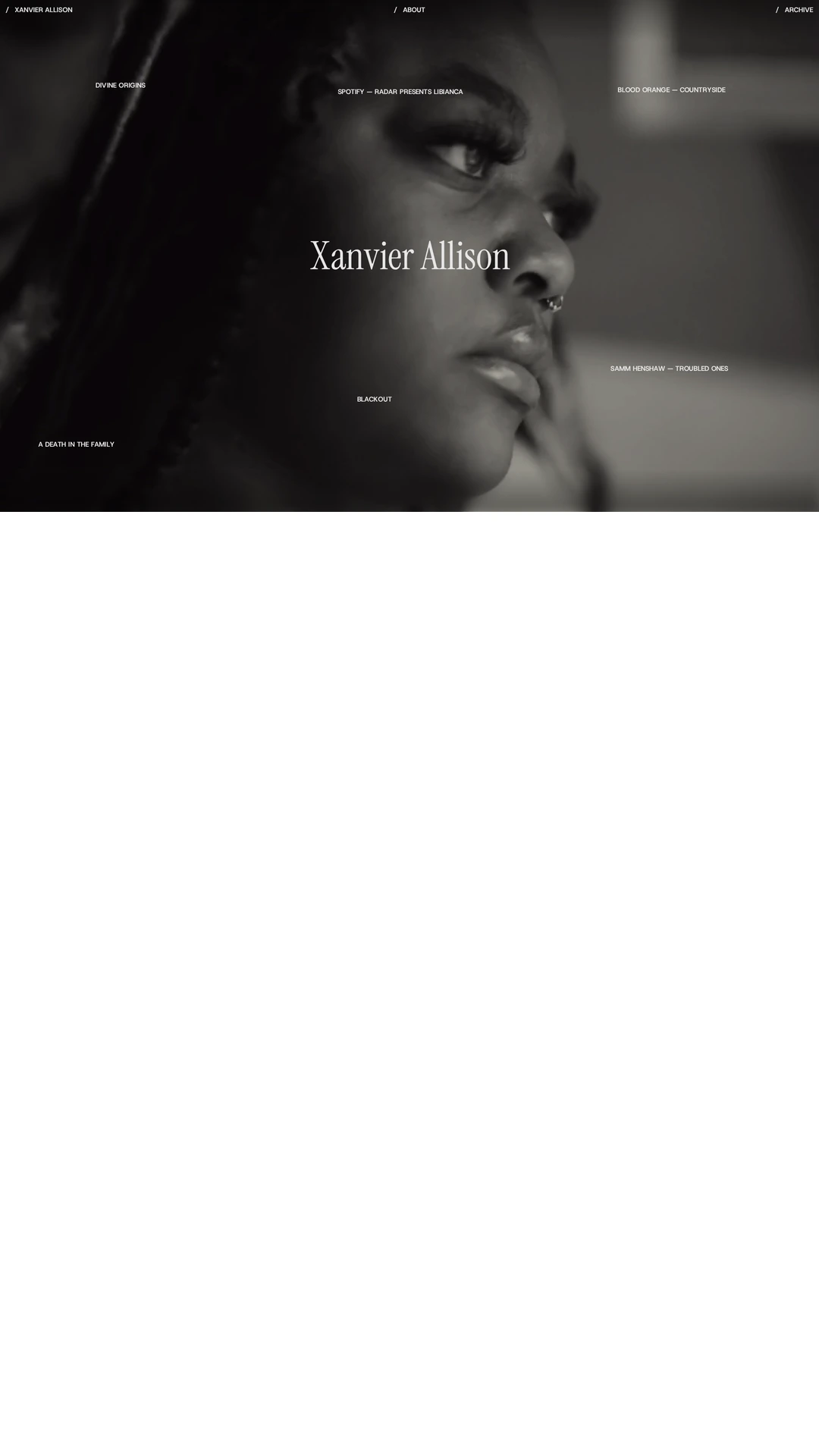
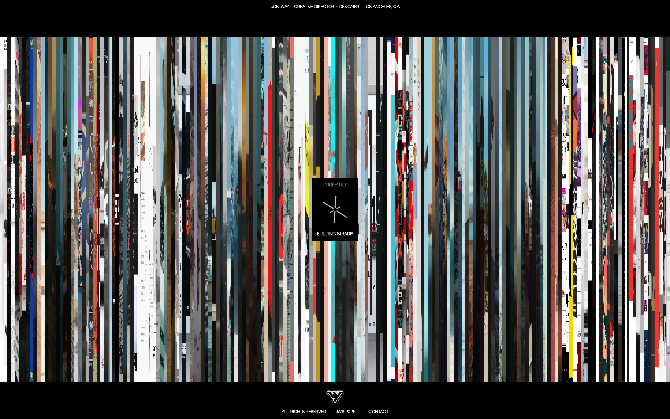
The homepage has a compelling editorial-art direction: a dense, fragmented image field is balanced by disciplined black framing and a small central anchor. The result is memorable and appropriately unconventional for an experimental design portfolio.
What works
- Distinctive image treatment gives the page a recognizable visual signature.
- The restrained chrome prevents the collage from becoming completely unstructured.
- The centered overlay creates a useful focal point within an otherwise distributed composition.
Opportunities
- Increase the legibility or scale of key labels so the interface is not visually over-subordinated to the artwork.
- Provide a slightly clearer relationship between the central marker, the portfolio content, and the contact action.
Uniqueness
The visual language is notably more authored than a standard portfolio template. The vertical fragmentation, sparse black framing, and deliberately compressed metadata create a strong point of view.
What works
- The collage treatment feels concept-led rather than template-driven.
- The page establishes a recognizable tension between visual overload and minimal interface.
- The work is differentiated from conventional thumbnail grids and case-study landing pages.
Opportunities
- Extend the distinctive visual idea into project-level storytelling so the uniqueness is not concentrated only in the homepage treatment.
- Ensure the experimental presentation remains original across future pages rather than becoming a repeated visual formula.
User experience
The homepage is immersive but gives limited visible guidance. Visitors can identify the designer and location, yet the screenshot does not make portfolio exploration, service scope, or the next action sufficiently explicit.
What works
- The identity line is immediately visible.
- The composition creates a clear first-impression moment.
- Contact is present in the footer rather than omitted entirely.
Opportunities
- Expose clearer project names, categories, or an unmistakable exploration affordance.
- Make the contact path more prominent for prospective collaborators and clients.
- Test the experience with keyboard and mobile users, especially around the central overlay and dense image field.
Conversion optimization
For a personal creative portfolio, the page succeeds as positioning and mood-setting, but it provides limited visible evidence for why a prospective client should continue, understand capabilities, or initiate contact.
What works
- The page quickly establishes a premium, experimental creative identity.
- The footer includes a contact route.
- The visual confidence may attract visitors looking for unconventional art direction.
Opportunities
- Add a concise value proposition or capabilities statement near the first interaction point.
- Pair featured work with short context such as role, discipline, or outcome.
- Repeat a clear contact invitation after portfolio exploration rather than relying only on the footer.
What we'd improve
- 01high
Repair semantic and contrast foundations
Add a meaningful H1 and main landmark, then correct the sampled low-contrast text and audit all small interface labels across light and dark states.
- 02high
Clarify the first interaction
Make it immediately apparent how visitors browse the work—through labeled project links, an explicit portfolio control, or a clearly announced interactive region.
- 03high
Strengthen the client path
Introduce a concise capabilities or positioning statement and a more prominent contact invitation so the page supports both artistic discovery and professional inquiries.
- 04medium
Add project context
Use brief, accessible labels for featured work, including project name, discipline, and the designer's role, without overwhelming the visual composition.
- 05medium
Validate responsive and keyboard behavior
Test the repeated media field and central overlay at mobile widths, with keyboard navigation, visible focus, reduced-motion preferences, and screen-reader interpretation.
- 06low
Build continuity beyond the homepage
Carry the visual tension into case-study pages while introducing more conventional reading structure where visitors need process, outcomes, and collaboration details.