

Nothing | US website analysis
A detailed critique of the homepage's craft, originality, usability, and ability to move visitors toward its intended goal.
Our observations
A distinctive, publication-quality product storefront with strong visual art direction and a clear brand signature. It is suitable for the gallery, but accessibility and product-discovery fundamentals need attention before it can be considered exemplary.
Best practices
The page has a coherent visual hierarchy, a single main landmark, semantic navigation and footer regions, and consistent product callouts. Automated observations also identify several meaningful accessibility gaps.
What works
- A consistent component pattern is used for product names, feature statements, imagery, and calls to action.
- The page has one main landmark and a semantic footer/navigation structure.
- The restrained palette and repeated card treatment create a predictable visual language across the long page.
Opportunities
- Six product or promotional images are missing alt text, which can remove important product context for screen-reader users.
- One header control is reported without an associated label, so its purpose may not be announced clearly by assistive technology.
- Two sampled text areas fail contrast checks, matching the low-contrast appearance of some small overlay copy.
- The automated audit reports zero h1 elements, weakening the page's document-level heading structure.
Design
The homepage is exceptionally art-directed, combining product photography, lifestyle scenes, and graphic UI into a memorable retail experience. Its visual polish is occasionally offset by dense or undersized overlay content.
What works
- Full-width panels give phones, audio products, and accessories strong visual presence.
- The black, white, gray, and selective high-saturation color system is distinctive and closely aligned with the product brand.
- Custom fonts and repeated floating cards make the interface feel authored rather than assembled from a generic commerce template.
- Product imagery remains the dominant visual element, making the page immediately understandable as a device storefront.
Opportunities
- Increase the size or spacing of overlay text on smaller screens so product names and benefits remain legible without zooming.
- Provide a stronger visual distinction between informational copy and the primary action within the floating cards.
- Consider adding occasional section labels or category transitions to prevent the long sequence from feeling like an undifferentiated stack of panels.
Uniqueness
The page has a highly recognizable visual identity and an editorial approach to merchandising that stands apart from standard electronics storefronts.
What works
- The combination of experimental lifestyle photography, isolated product renders, and floating monochrome cards is unusually cohesive.
- The product naming, custom typography, and compact control language reinforce a specific brand world.
- The homepage treats shopping content as a curated visual sequence rather than a conventional grid or hero-plus-features layout.
Opportunities
- The visual concept is strong enough to support more explicit brand or category storytelling, which could make the sequence feel even more intentional.
- Distinctive presentation should be balanced with persistent product context, such as category, price, or availability cues, so originality does not obscure shopping tasks.
User experience
The page appears easy to understand at a high level and offers a low-friction visual browsing path, but its long scroll and small overlay cards may make comparison and direct product discovery slower.
What works
- Each panel focuses attention on one product or product story, reducing competing content within a section.
- Repeated placement and styling of callouts makes the action pattern learnable as users scroll.
- The visible navigation is deliberately minimal, preserving focus on the imagery.
Opportunities
- Add a visible product index, category shortcuts, or anchor navigation so returning users can reach phones, audio, and accessories without traversing the entire sequence.
- Expose essential shopping information earlier in each card, especially product category and price where applicable.
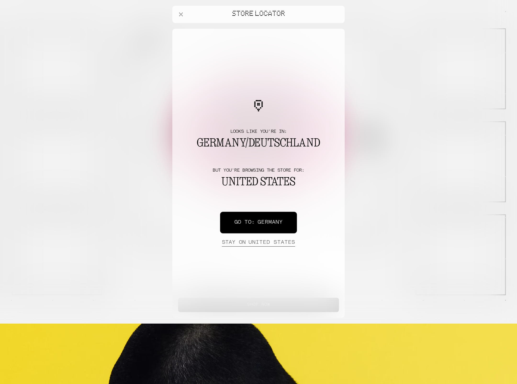
- Ensure the menu, store locator, and other header controls have clear accessible names and sufficiently large interactive targets.
- Use descriptive alternative text for product imagery, distinguishing decorative campaign photography from images that communicate product information.
Conversion optimization
For a brand-led electronics storefront, the page creates strong desire and repeatedly places calls to action near products. Conversion effectiveness is limited by the editorial sequencing and by the small amount of visible decision-support information in the screenshot.
What works
- High-impact product imagery establishes emotional appeal and communicates the range of devices quickly.
- Every major visual panel appears to include a compact action card, keeping a path toward product detail near the relevant image.
- The strong brand presentation can support premium positioning and initial product interest.
Opportunities
- Make the primary action label and destination more prominent within each floating card, especially on mobile.
- Add concise price, product category, or availability information to reduce the need to open multiple product pages for basic qualification.
- Offer a direct product grid or comparison entry point alongside the cinematic scroll for visitors with high purchase intent.
- Test whether fixed or sticky category access improves progression without competing with the imagery; no behavioral or testing evidence is supplied here.
What we'd improve
- 01high
Repair image alternatives and control labels
Add concise, product-specific alt text to the six flagged images, mark purely decorative campaign imagery appropriately, and provide an accessible name to the unlabeled header control via visible text or an aria-label.
- 02high
Restore a clear page heading hierarchy
Add one descriptive h1 for the US storefront and organize promotional panels beneath appropriate section headings without changing the visual hierarchy. Verify that headings remain meaningful when read out of visual order.
- 03high
Improve overlay text contrast and legibility
Adjust the two failing text treatments to meet an appropriate contrast target, and increase type size, line height, or card spacing for the small product callouts on narrow screens.
- 04medium
Add faster product discovery
Provide category shortcuts or an anchored product index for phones, audio, and accessories, plus a direct route to a product listing or comparison view for visitors who do not want to follow the full scroll sequence.
- 05medium
Strengthen purchase-decision content
Place essential information such as price, category, and availability in or immediately beside each product callout where applicable, while retaining the editorial image-led composition.
- 06low
Clarify the scroll sequence
Introduce subtle category labels or progress cues between groups of panels so users understand where they are in the catalog and what content remains.