Anthropic website analysis
A detailed critique of the homepage's craft, originality, usability, and ability to move visitors toward its intended goal.
Our observations
A strong, highly legible editorial homepage with excellent typography and information hierarchy. It is visually ready for consideration, but the serious missing-link-name findings warrant accessibility review before publication in a quality-focused gallery.
Best practices
The page has a single detected H1, a coherent heading hierarchy, a main landmark, a semantic navigation region, and a footer. Contrast testing reported no failures across 159 samples. However, automated accessibility observations identify six links without accessible names, marked as serious.
What works
- The hero communicates the organization’s purpose prominently and above the fold.
- The page uses one detected H1 and avoids heading skips in the supplied audit.
- Contrast testing reported zero failures across 159 sampled combinations.
- Navigation, main content, and footer regions are structurally identifiable.
Opportunities
- Give the six unnamed article and footer links explicit accessible names, using visible titles or concise aria-labels where the visual link is icon-only.
- Check the duplicated H1 text exposed in the heading observation; the repeated accessible string may indicate animation or duplicate DOM content and should be hidden from assistive technology when it is decorative.
- Validate keyboard focus visibility, mobile layout, image alternatives, and reduced-motion behavior separately; these are not established by the supplied evidence.
Design
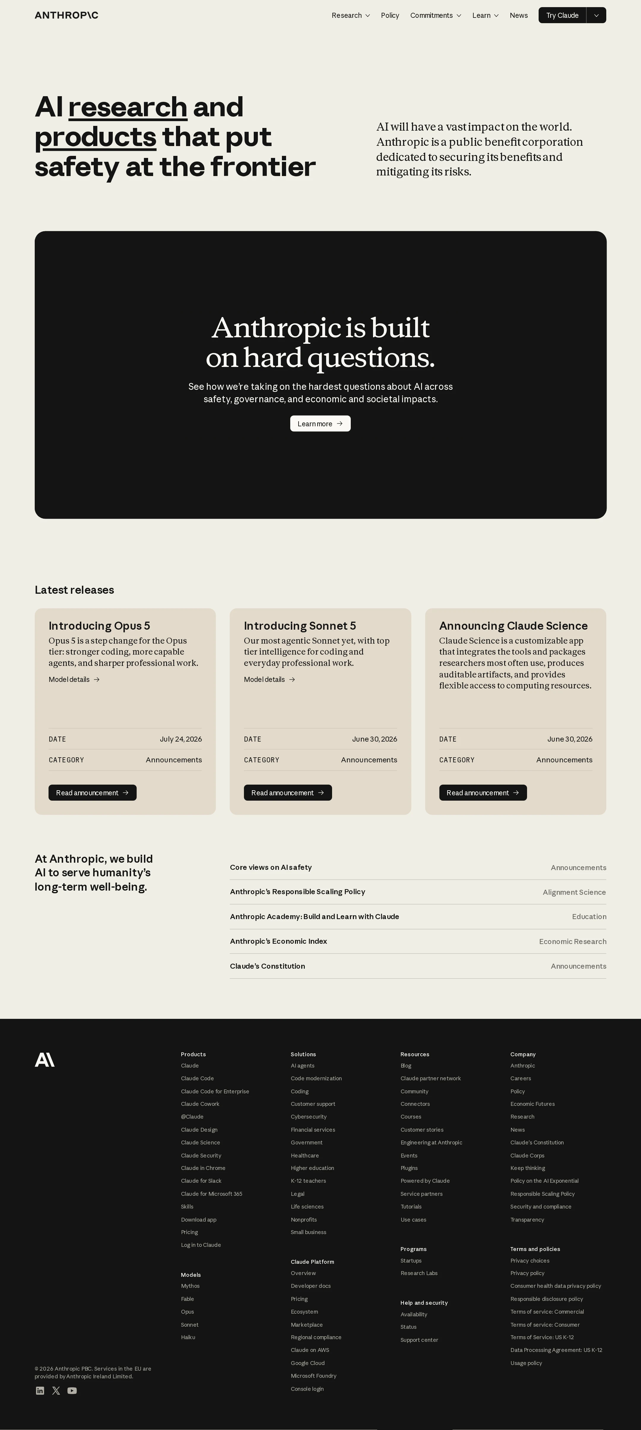
A refined editorial composition with strong typographic contrast, generous spacing, and a disciplined neutral palette. The black CTA block and beige release cards provide enough tonal variation without disrupting the calm visual language.
What works
- The large sans-serif hero headline and serif supporting copy create a distinctive, publication-like hierarchy.
- The ivory background, black panel, and muted beige cards form a cohesive palette with clear section separation.
- Rounded containers and consistent card geometry soften an otherwise institutional presentation.
- The release-card grid makes three current announcements easy to scan.
Opportunities
- Add a more distinctive visual motif or supporting imagery to reduce reliance on typography and flat color fields.
- Consider slightly stronger differentiation between secondary metadata and body copy in the release cards, especially at smaller sizes.
- The footer is information-rich but visually dense; grouping or collapsing less-used link clusters could improve its compositional finish.
Uniqueness
The combination of AI-safety positioning, editorial serif typography, and a warm paper-like palette gives the page a recognizable identity. Its underlying patterns—hero statement, CTA banner, release cards, and mega-footer—remain familiar for a technology company.
What works
- The serif-and-sans pairing feels more editorial and institutional than the typical futuristic AI aesthetic.
- The safety-first message is integrated into the visual hierarchy rather than treated as a secondary trust badge.
- The muted palette is distinctive within a category often dominated by gradients, neon accents, or dark interfaces.
Opportunities
- Develop a signature graphic language for research, safety, or model concepts so the page is identifiable beyond its typography.
- Use the large CTA area for a more ownable visual or interactive expression if it supports the message without adding distraction.
User experience
The desktop information architecture is straightforward: mission, explanatory CTA, latest releases, research resources, and a comprehensive footer. Visible labels and repeated action patterns support scanning, though the quantity of footer links and unnamed-link findings create usability and accessibility concerns.
What works
- Primary navigation separates research, policy, commitments, learning, news, and the Claude product entry point.
- The hero is concise and gives visitors immediate context about Anthropic’s purpose.
- Release cards expose titles, summaries, dates, categories, and dedicated announcement actions.
- The lower resource list provides clear topic labels and category cues.
Opportunities
- Make the hero’s next step more explicit for different audiences, such as researchers, enterprise buyers, developers, or people seeking safety documentation.
- Reduce the cognitive load of the footer through clearer sub-grouping, progressive disclosure, or a more focused set of priority links.
- Ensure every full-card and footer interaction has a programmatically discoverable name, especially the six links reported by the audit.
- Test the desktop-to-mobile transition and long-page navigation; the screenshot does not provide evidence about those states.
Conversion optimization
For a research and corporate credibility homepage, the page does a good job of moving visitors from mission to evidence through releases and safety resources. Conversion intent is intentionally soft, but the main CTA and product navigation could guide distinct visitor types more directly.
What works
- The hero establishes a clear value and trust proposition before asking users to explore further.
- The prominent black CTA section offers a focused path into the company’s approach to difficult AI questions.
- Product links and the visible Claude entry point provide routes toward commercial or product-oriented exploration.
- Recent releases supply timely proof of ongoing activity and make the homepage feel current.
Opportunities
- Replace or supplement the generic 'Learn more' path with audience-specific routes such as 'Explore Claude,' 'Read our safety approach,' or 'Build with the API.'
- Add a concise, visible trust or evidence cue near the hero—such as research, policy, or deployment documentation—without overcrowding the introduction.
- Prioritize one primary action for visitors who arrive with product intent; the current mission-led structure leaves the commercial next step mainly to navigation.
- Use measurable, descriptive link labels rather than generic or unnamed interactions so users and assistive technologies understand the destination.
What we'd improve
- 01high
Repair unnamed links
Inspect the six article and footer anchors identified by the accessibility audit and provide visible text or appropriate accessible names that describe each destination.
- 02high
Resolve duplicated heading exposure
Review the animated H1 markup for duplicated text nodes. Preserve the visual word effect while ensuring only one meaningful heading is exposed to assistive technology.
- 03medium
Clarify audience pathways
Add distinct hero or nearby actions for product users, developers, researchers, and safety-policy readers so the homepage converts intent without requiring users to parse the full navigation.
- 04medium
Strengthen the signature visual system
Introduce a restrained, reusable visual language tied to AI safety and research—such as diagrams, model artifacts, or data-led illustrations—to make the experience more ownable than a typography-and-color system alone.
- 05low
Reduce footer density
Reassess the extensive footer taxonomy and emphasize the highest-value destinations, using progressive disclosure or tighter grouping for long secondary lists.