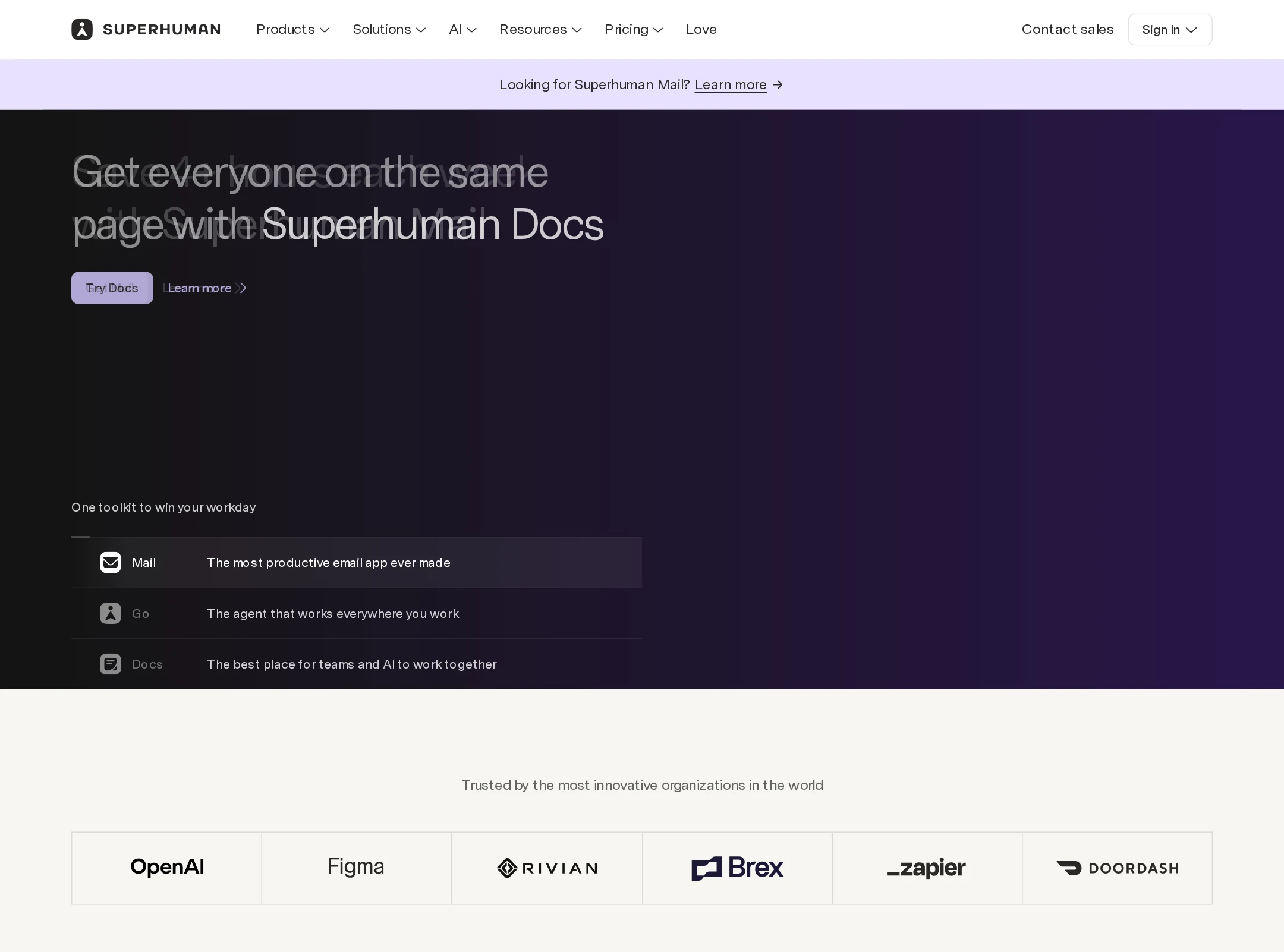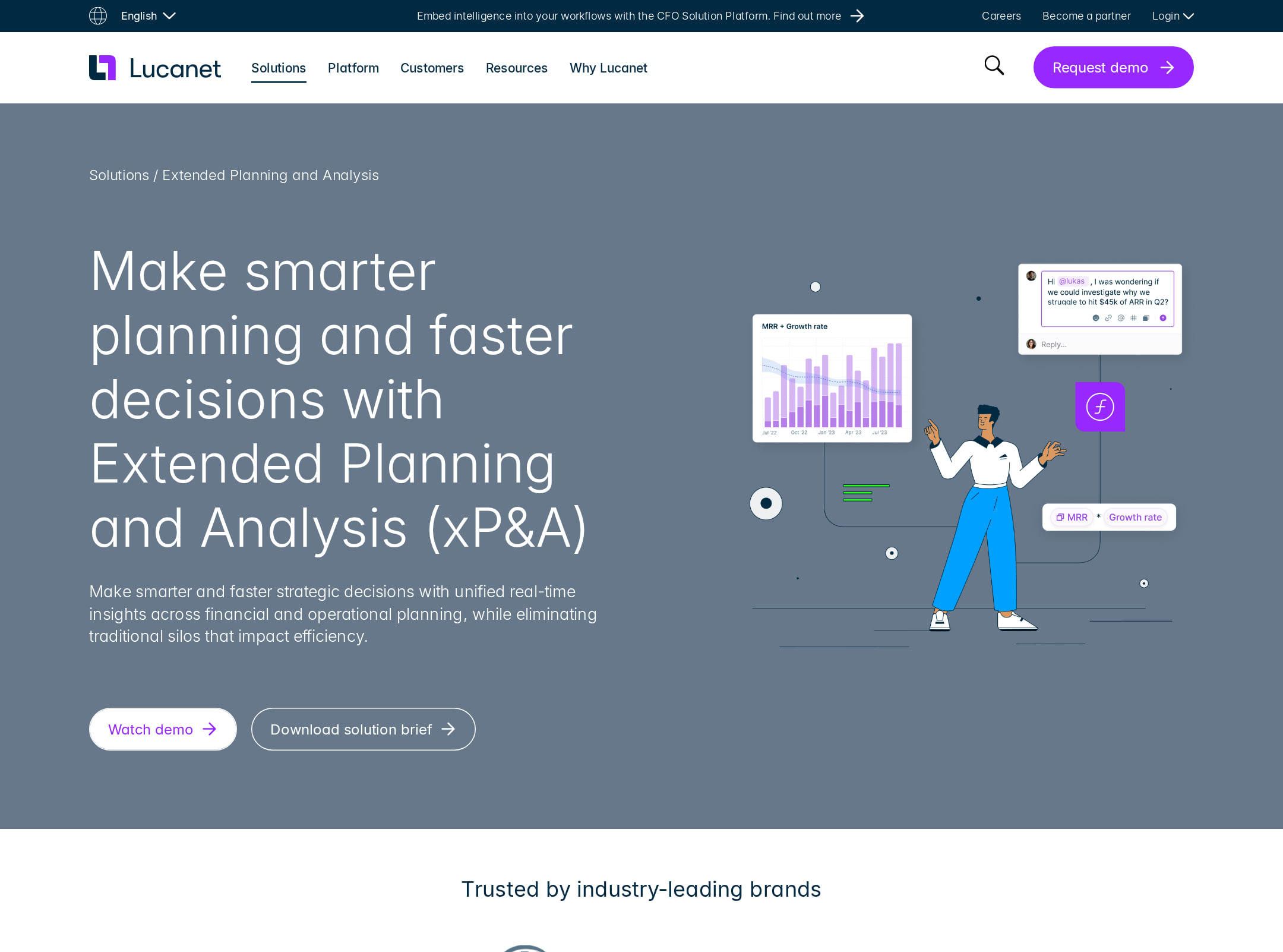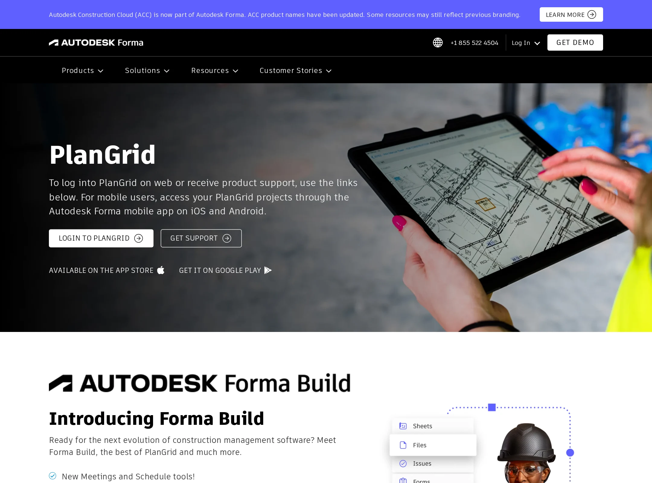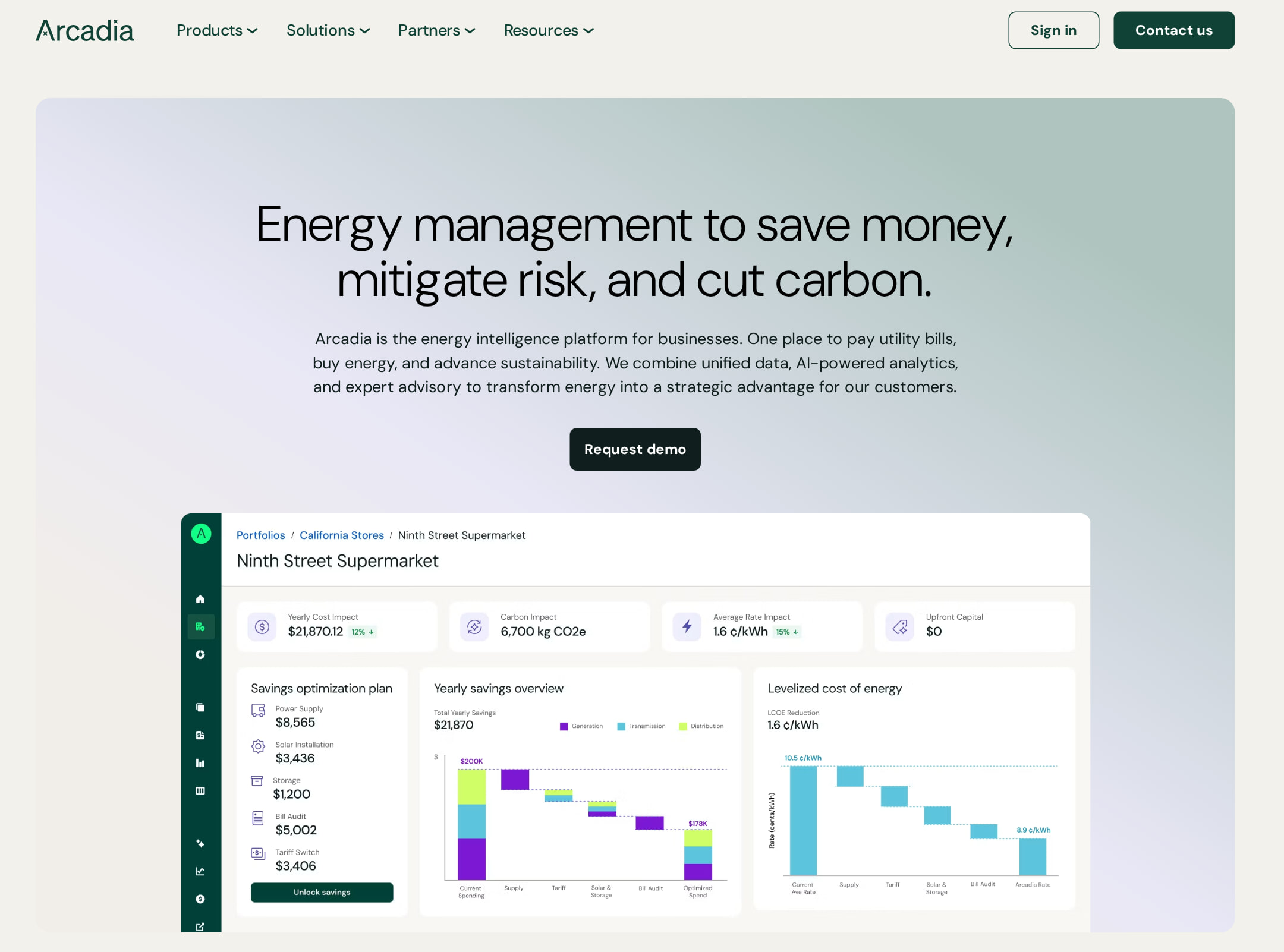


Arcadia website analysis
A detailed critique of the homepage's craft, originality, usability, and ability to move visitors toward its intended goal.
Our observations
Publish after accessibility remediation. Arcadia is a strong, distinctive B2B marketing homepage with an especially effective illustration and color system, but documented contrast and semantic issues prevent an unqualified top-tier rating.
Best practices
The page has a clear heading structure, one detected H1, a semantic main region, navigation, footer, skip link, visible form controls, and a coherent content sequence. Automated accessibility evidence still identifies serious contrast problems, an unnamed link, and duplicate IDs.
What works
- Clear H1-to-H2-to-H3 hierarchy with no detected heading skips.
- Strong semantic page regions, including navigation, main content, form, and footer.
- Visible skip-to-content control and recognizable primary actions.
- Consistent button, card, form, and navigation patterns.
Opportunities
- Resolve the three documented serious contrast failures, especially in the final CTA and required form label treatment.
- Add an accessible name to the link identified by the automated audit.
- Remove duplicate IDs associated with the Request demo CTA and verify label-to-control associations.
- Check keyboard focus visibility and mobile menu semantics; these are not established by the supplied evidence.
Design
The visual system is unusually cohesive for an enterprise platform site. Deep greens, warm neutrals, soft gradients, data UI, and isometric diagrams create a clear identity without excessive decoration.
What works
- Distinctive illustrated platform section gives the product category a memorable visual metaphor.
- Strong contrast between dark proof sections and light explanatory sections creates rhythm.
- Hero combines a concise proposition with a product interface preview and a direct CTA.
- Metric-led content and customer logos reinforce the visual hierarchy.
Opportunities
- Reduce the amount of small supporting copy in dense sections to improve scanability.
- Give the press section slightly more visual separation between cards and metadata.
- Ensure the highly detailed illustrations retain a clear focal point on smaller screens.
Uniqueness
The combination of energy infrastructure subject matter, pastel atmospheric gradients, and large isometric system diagrams feels more authored than a standard SaaS template. The pattern is distinctive while remaining commercially legible.
What works
- Isometric diagrams turn an abstract energy-management proposition into a recognizable visual language.
- The green, cream, lavender, and electric accent palette is specific and consistently applied.
- Editorial press content is integrated into the product narrative rather than treated as generic social proof.
Opportunities
- Develop more original proof storytelling beyond metrics, logos, and press headlines.
- Use the illustration language selectively across deeper product pages so it remains a meaningful brand cue rather than a repeated motif.
User experience
The page offers a logical path from problem to platform capabilities to proof and contact. Its long-form structure is understandable, though information density and small type may increase cognitive load, particularly on narrow screens.
What works
- The hero establishes the audience value proposition immediately.
- Capabilities are grouped into three understandable service areas.
- The integrated-approach sequence provides a useful conceptual explanation of the platform.
- The footer offers extensive navigation and a newsletter entry point.
Opportunities
- Make the product interface and service cards easier to inspect on mobile without requiring users to parse very small text.
- Consider a persistent or repeated contact affordance for users who enter through deep sections.
- Audit illustration captions, card links, and press metadata for reading order and touch target size.
- Test the long page with keyboard and screen-reader users; automated evidence cannot establish interaction quality.
Conversion optimization
For a B2B platform whose likely primary action is initiating a sales conversation, the page supports conversion well through a direct hero CTA, repeated demo intent, evidence of scale, customer logos, press coverage, and a closing contact invitation. The final CTA's documented contrast problems weaken that otherwise clear path.
What works
- Primary demo action appears in the hero and is reinforced later in the page.
- Value proposition links financial savings, risk mitigation, and carbon reduction.
- Metrics, customer logos, service categories, and press coverage provide multiple trust signals.
- The closing contact section creates a clear end-of-page conversion moment.
Opportunities
- Clarify the expected next step and likely commitment near the demo CTA, such as meeting length or what prospects receive.
- Strengthen CTA contrast and ensure the same action has unique, valid IDs wherever repeated.
- Add more audience-specific entry points for operations, finance, procurement, and sustainability teams.
- Pair the newsletter form with a clearer benefit and privacy expectation rather than presenting it as a generic subscription.
What we'd improve
- 01high
Remediate accessibility defects
Fix the three serious text-contrast failures, provide an accessible name for the unnamed link, and remove duplicate Request demo IDs. Re-run automated checks and perform keyboard and screen-reader verification.
- 02high
Improve small-screen readability
Increase the size and line length quality of supporting copy, press metadata, and diagram annotations at mobile breakpoints; verify that cards and illustrations remain scannable without excessive zooming.
- 03medium
Make the sales path more explicit
Add concise context around the demo CTA explaining who the conversation is for, what happens after submission, and the expected response timeline.
- 04medium
Strengthen audience routing
Offer clearly labeled pathways for major B2B audiences such as finance, procurement, operations, and sustainability so visitors can reach relevant proof faster.
- 05low
Refine press and footer scanning
Increase grouping and hierarchy in the press grid and simplify the extensive footer navigation into clearer priority levels, especially for mobile users.