

Lucanet Extended Planning & Analysis website analysis
A detailed critique of the homepage's craft, originality, usability, and ability to move visitors toward its intended goal.
Our observations
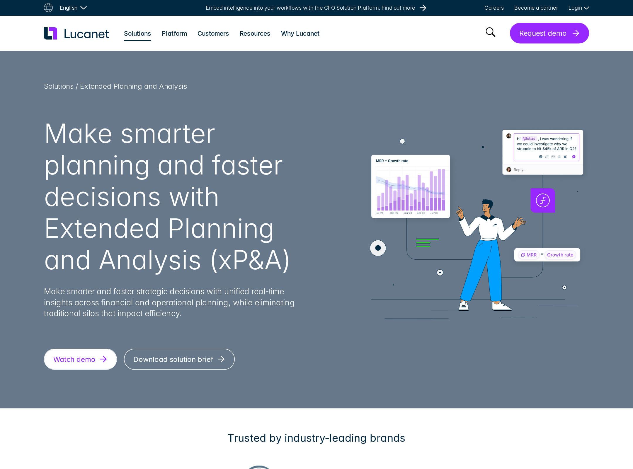
A strong and polished B2B SaaS marketing page with convincing product storytelling and visual consistency. It merits gallery consideration after accessibility and structural issues are addressed, particularly the documented contrast failures and unnamed image links.
Best practices
The page uses a single H1, one main landmark, semantic navigation, repeated calls to action, and a logical product-marketing progression. However, the automated audit reports serious contrast problems, unnamed links, duplicate IDs, and a heading-level skip.
What works
- The page has one detected H1 and one main landmark.
- The content is organized into recognizable sections covering problems, capabilities, proof points, resources, and conversion actions.
- The navigation, accordion, tabs, and footer are represented as identifiable semantic structures.
- The repeated CTA treatment supports a long-form page where visitors may convert at different scroll positions.
Opportunities
- Fix all 10 reported contrast failures, especially CTA text, video consent links, and tab labels.
- Provide accessible names for the two image links identified by the audit.
- Remove the 12 duplicate-ID instances, including repeated teaser and image IDs, to reduce ambiguity for assistive technology and scripted interactions.
- Correct the detected H2-to-H4 heading skip and verify the complete heading hierarchy across the long page.
Design
A cohesive and professional visual system supports the product narrative well. The strongest design elements are the dark navy content bands, bright purple accents, interface previews, and consistent card treatments. The page is effective but somewhat conventional for enterprise software and visually dense over its full length.
What works
- Navy, white, pale-gray, and purple are used consistently across hero, content bands, cards, and footer.
- The vivid purple accent creates clear visual emphasis for primary actions and key metrics.
- Interface previews, layered diagrams, and product illustrations make an otherwise abstract financial-planning product more tangible.
- Alternating light and dark sections help separate major content groups on the long page.
Opportunities
- Reduce repetition between feature, proof, resource, and CTA sections to create a tighter narrative.
- Increase typographic scale or whitespace in dense sections where screenshot text and supporting copy compete for attention.
- Make the visual treatment of secondary content more distinctive; several card and resource areas appear structurally similar.
- Ensure accent buttons and light text remain visually legible in every color combination.
Uniqueness
The page is well executed but its visual language remains familiar within the enterprise-finance SaaS category. The combination of product UI, customer statistics, feature tabs, and purple branding is effective rather than highly distinctive.
What works
- The dark navy and electric-purple combination gives the page a recognizable brand presence.
- The layered planning illustration and Modeler Agent section add more visual character than a purely screenshot-led product page.
- The page connects financial planning with cross-functional operational planning, giving the information architecture a clear product-specific angle.
Opportunities
- Develop a more proprietary visual motif around connected planning, modeling, or financial decision-making.
- Replace some generic testimonial and resource-card patterns with more editorial or interactive proof formats.
- Use more distinctive data visualizations or product storytelling to separate the page from comparable finance-platform sites.
User experience
The page appears to offer a clear scroll-based explanation of the product, moving from positioning to pain points, capabilities, proof, and resources. Tabs, accordions, and interface previews can support scanning, but the page’s considerable length and small content blocks may make prioritization difficult. The supplied evidence does not establish actual interaction performance or user-testing outcomes.
What works
- The hero states the product category and intended business outcome immediately.
- The problem accordion gives visitors a compact way to inspect common planning challenges.
- Tabs organize several capabilities without requiring every feature to occupy a separate full section.
- Customer counts, case-study content, and interface imagery provide multiple forms of reassurance.
Opportunities
- Add a persistent or strategically placed in-page navigation so visitors can jump directly to capabilities, proof, pricing or contact actions.
- Make the primary next step more explicit for different audiences, such as requesting a demo versus exploring product details.
- Review mobile typography and card density carefully; the screenshot indicates a very long, information-heavy experience.
- Ensure tab and accordion states have clear keyboard focus, expanded-state, and active-state indicators.
Conversion optimization
Conversion support is strong for an enterprise product page: the hero and subsequent sections repeat CTAs, explain business pain points, show the product in context, and provide customer proof. The page would benefit from a more explicit conversion path and more visible qualification information for high-intent buyers.
What works
- The hero presents a clear product promise and visible CTA treatment.
- Product screenshots and feature explanations reduce abstraction and help visitors understand the offering.
- Customer logos, statistics, case-study content, and customer imagery contribute useful trust signals.
- Calls to action recur throughout the long page rather than appearing only at the top.
Opportunities
- State the expected CTA outcome more precisely, including what happens after a demo or contact request.
- Add concise qualification details such as implementation approach, integrations, target company size, or time-to-value near high-intent CTAs.
- Test whether repeated CTAs should be differentiated by intent—for example, demo, product tour, or resource download—instead of using similar treatments throughout.
- Improve contrast on CTA and consent-related text so conversion controls remain legible and trustworthy.
What we'd improve
- 01high
Resolve the reported contrast failures
Audit the 10 flagged elements against their actual backgrounds, then adjust text, button, tab, and consent-link colors or background tones. Re-run automated checks across desktop and mobile states.
- 02high
Repair accessible names and duplicate IDs
Give both image links meaningful accessible names or remove link semantics when the images are not interactive. Generate unique IDs for every teaser and image instance, then verify label, tab, and accordion relationships.
- 03high
Correct the heading hierarchy
Replace the detected H4 headings with the appropriate heading level based on their section structure, and review the full document outline for skipped or duplicated levels.
- 04medium
Clarify the conversion journey
Differentiate primary actions by intent and add short supporting text explaining the next step, expected response, and relevant audience for each major CTA.
- 05medium
Improve long-page navigation and scanning
Add a compact sticky section index or anchor navigation, and consider consolidating overlapping feature, proof, and resource sections to reduce scroll fatigue.
- 06low
Add more proprietary product storytelling
Use distinctive planning or decision-making visualizations, annotated workflows, or interactive product narratives to make the experience more memorable than a conventional enterprise SaaS template.