

Old Friends website analysis
A detailed critique of the homepage's craft, originality, usability, and ability to move visitors toward its intended goal.
Our observations
A visually strong and distinctive studio portfolio that is suitable for gallery consideration, but should receive an accessibility and clarity pass before being treated as exemplary.
Best practices
The page has a single detected H1, a main landmark, and no heading skips or duplicate IDs. However, automated observations report serious issues with 13 unnamed links and 16 text-contrast failures across 131 samples.
What works
- Clear primary heading communicates the studio category and core offering.
- A single H1 and main landmark provide a reasonable document foundation.
- The project grid creates a consistent, scannable content pattern.
Opportunities
- Provide accessible names for every project, preview, and navigation link, rather than relying on visual context.
- Increase text contrast for card titles and descriptions, especially where labels sit over colorful imagery.
- Verify keyboard focus visibility and interaction order for the animated grid, slider controls, and custom cursor experience.
Design
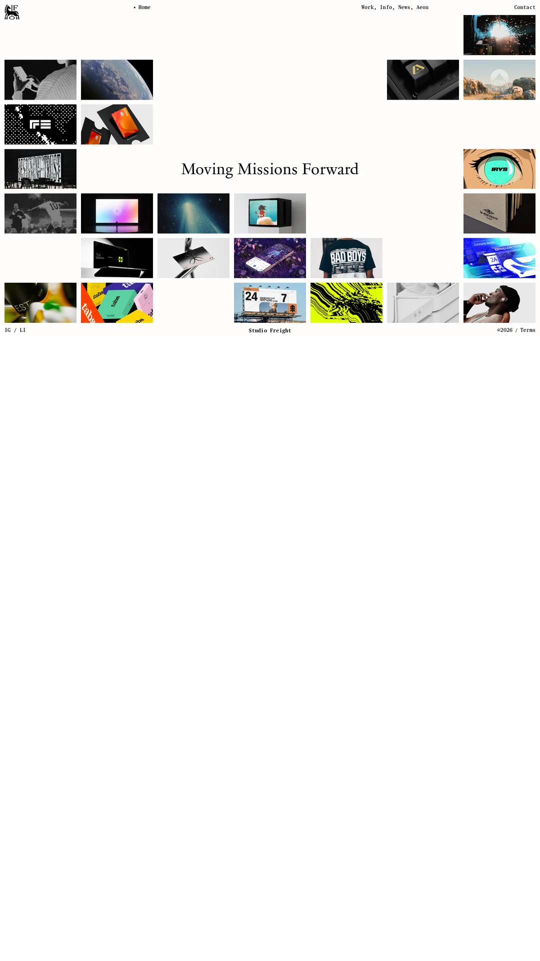
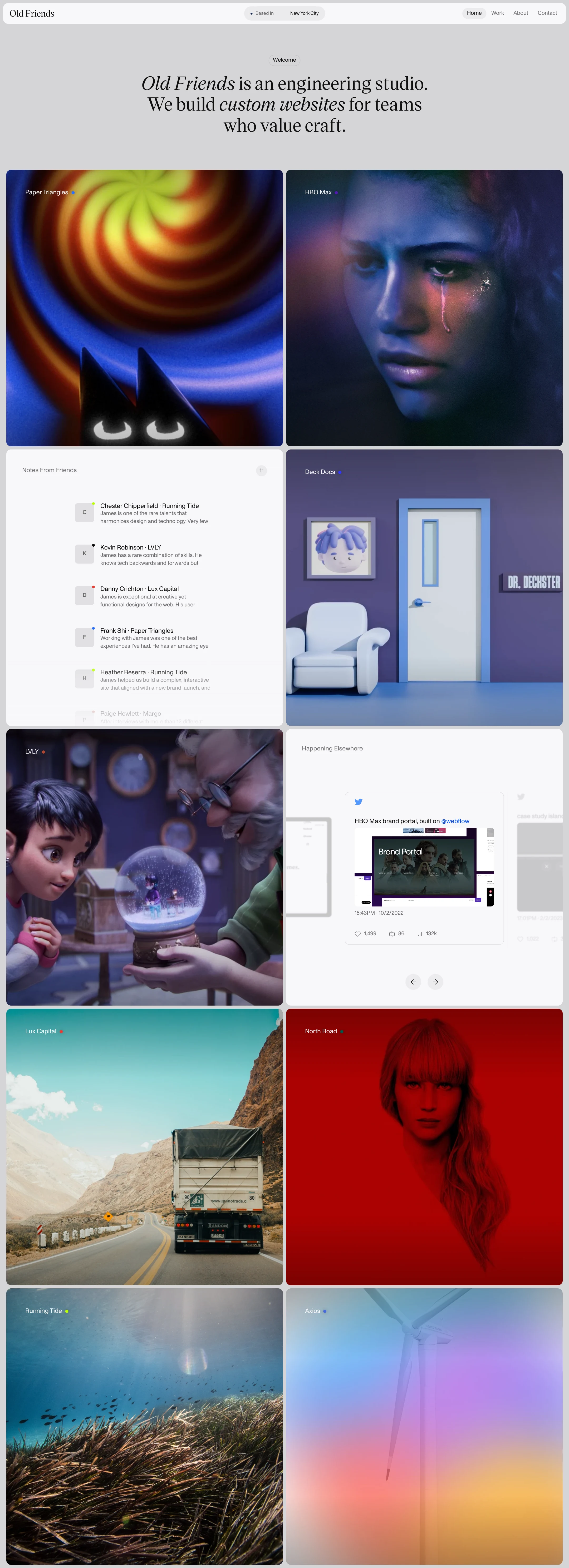
The visual system is cohesive, art-directed, and unusually expressive for an engineering-studio portfolio. Restrained chrome and a neutral base let the project work lead, while the serif introduction establishes a memorable editorial tone.
What works
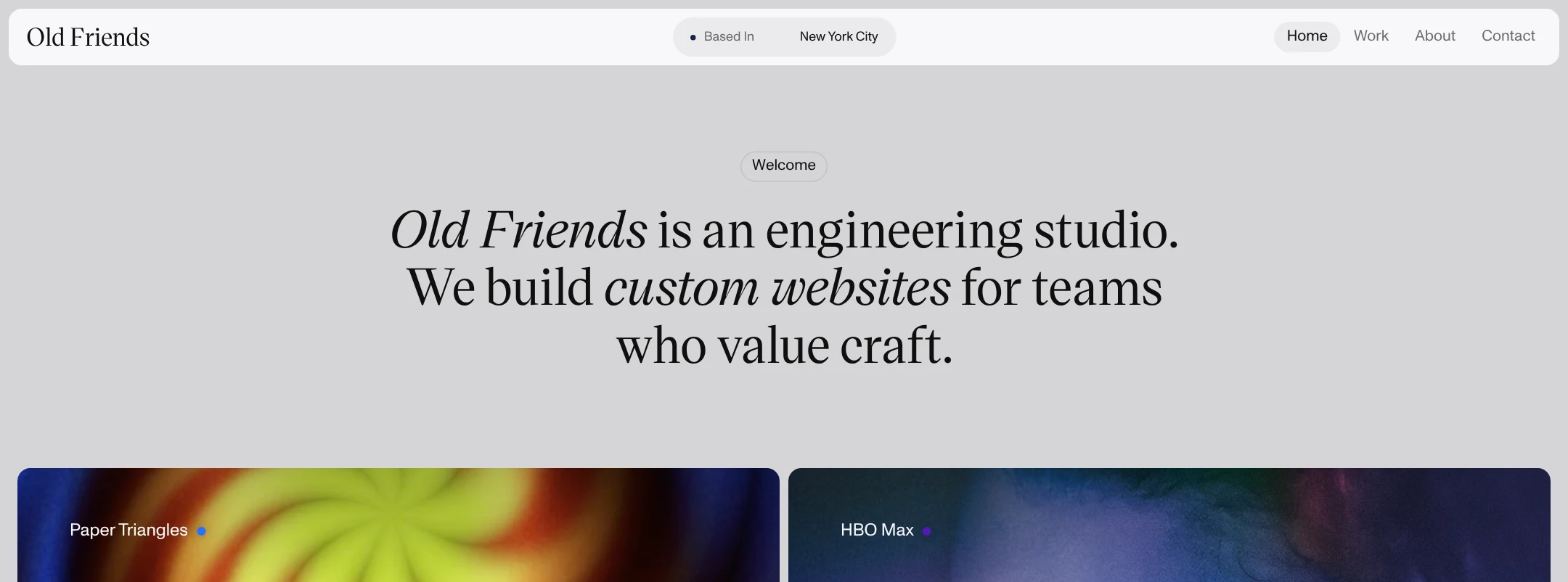
- Strong typographic contrast between the expressive serif hero and compact grotesque interface text.
- Consistent two-column rhythm and rounded card treatment make a large body of work feel organized.
- The saturated, varied imagery creates an immediate sense of creative range without requiring excessive interface decoration.
- The neutral background and compact top navigation keep attention on the work.
Opportunities
- Add slightly more visual differentiation between project types or statuses if the portfolio continues to grow.
- Ensure the most important project information remains legible at a glance on every image treatment.
- Consider a short supporting line that clarifies whether the studio focuses on strategy, design, engineering, or end-to-end delivery.
Uniqueness
The combination of editorial copy, serif typography, cinematic project imagery, notes-style content, and colorful interactive-looking cards gives the homepage a recognizable point of view.
What works
- The opening statement is direct and distinctive rather than a generic agency slogan.
- The project sequence mixes conventional case-study imagery with social-proof or studio-note modules, creating a more authored portfolio narrative.
- Color accents and art-directed imagery make the page easy to distinguish from neutral SaaS-style agency galleries.
Opportunities
- Make the studio's own engineering perspective more visible through brief process, technical, or interaction details rather than expressing most of the personality through imagery.
- Use project metadata consistently enough to help visitors understand the scope and role of the studio behind each piece.
User experience
The page offers a clear top-to-bottom browsing path and makes project discovery visually inviting. The experience is weakened by reported unnamed links, contrast failures, and a heavy reliance on visual interpretation; the supplied evidence does not establish how the animations or custom interactions behave across devices.
What works
- The hero establishes who the studio is before the project browsing begins.
- The alternating project and editorial modules provide variety during scrolling.
- Compact navigation exposes Home, Work, About, and Contact without competing with the portfolio.
Opportunities
- Add descriptive link text or accessible labels that identify each project and its destination.
- Keep all project titles and descriptions readable without depending on hover states or image contrast.
- Provide a straightforward alternative to any slider or motion-based presentation, and confirm reduced-motion behavior for the detected animations.
- Make card affordances and navigation controls explicit for keyboard and touch users.
Conversion optimization
For a reputation-building portfolio, the page succeeds at creating desire and demonstrating visual range, but it leaves the next business step understated. The visible navigation includes Contact, yet the hero does not present an immediate inquiry action or explain the type of engagement available.
What works
- The opening positioning is concise and quickly establishes a custom-websites offering.
- A broad project selection can build confidence in creative capability and range.
- A persistent top navigation includes a direct Contact destination.
Opportunities
- Add a visible primary CTA near the hero, such as an invitation to discuss a project, while retaining the understated visual language.
- Include concise project outcomes, responsibilities, or services so prospective clients can assess fit beyond visual quality.
- Use the project cards to link to fuller case studies with context, role, deliverables, and results where available.
- Repeat a contact invitation after the project grid so the conversion path does not depend on returning to the header.
What we'd improve
- 01high
Repair link naming and text contrast
Give all 13 reported unnamed links descriptive accessible names, and revise the 16 failing text samples with stronger color, overlays, or solid text panels. Re-test the image cards and preview modules at their actual states.
- 02high
Add a prominent, specific inquiry CTA
Place a clear Contact or Start a project action directly below the hero statement and repeat it after the selected work. Use supporting copy to set expectations about the studio's typical engagements.
- 03medium
Strengthen project context
Add consistent metadata to each project card—client, service, role, and a concise outcome—while preserving the image-led grid. This will improve both qualification and case-study discovery.
- 04medium
Make motion and custom interactions resilient
Confirm that the rotating/translating elements, slider, videos, and custom cursor do not block navigation or comprehension. Respect reduced-motion preferences and provide keyboard- and touch-friendly controls.
- 05low
Clarify the studio's engineering differentiator
Introduce a compact process or capabilities section that explains how design and engineering are combined, giving the homepage more evidence of technical expertise beyond the visual portfolio.