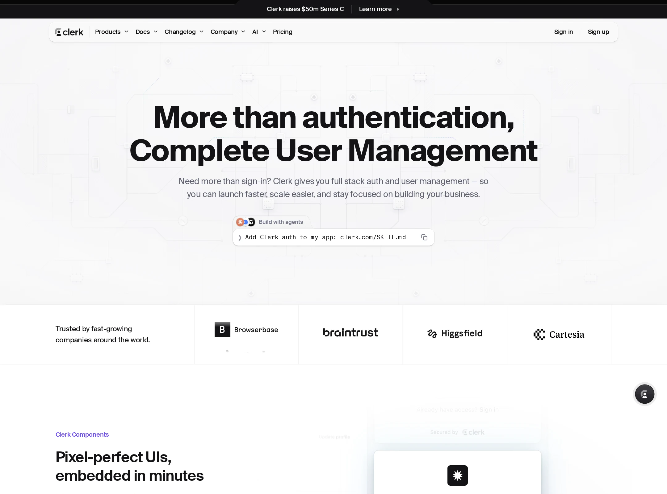


Clerk website analysis
A detailed critique of the homepage's craft, originality, usability, and ability to move visitors toward its intended goal.
Our observations
Publish. The homepage is an unusually polished and coherent SaaS presentation with strong product storytelling and distinctive section composition. It has meaningful accessibility and semantic-quality concerns that should be addressed before treating it as a best-practice reference.
Best practices
The page has a clear primary heading, semantic navigation, a single main landmark, and a detectable footer. Automated observations also report 72 contrast failures, five duplicate-ID groups, and six H1 elements, which materially reduce its best-practice score.
What works
- The hero is clearly detectable above the fold and communicates the product category immediately.
- Navigation, main content, and footer landmarks are present.
- The page uses recognizable section headings for authentication, multi-tenancy, billing, security, and integrations.
Opportunities
- Resolve the reported text-contrast failures, especially in small muted labels and product-demo copy.
- Remove duplicate IDs from repeated SVG definitions and interactive components.
- Restrict the page to one meaningful H1; the additional H1 elements appear to come from embedded sign-in, sign-up, or waitlist states.
- Audit interactive demo controls and generated component IDs after fixing the structural issues.
Design
A refined, premium visual system combines monochrome contrast, generous whitespace, technical UI compositions, and strong alternation between light and dark sections.
What works
- The black, white, and soft-gray palette creates a consistent product-led identity.
- Product interfaces are used as the primary visual content rather than generic illustrations, making the offering tangible.
- The alternating section treatments and clipped geometric boundaries create a strong sense of rhythm across a long page.
- Typography, borders, shadows, and compact code-like details reinforce the developer-tool positioning.
Opportunities
- Increase the scale or contrast of secondary copy in visually dense sections.
- Reduce the number of competing interface fragments in some mosaics so the main product benefit remains dominant.
- Make section transitions slightly less repetitive if the page continues to expand with additional content.
Uniqueness
The page stands out through its detailed interface mosaics, simulated authentication states, and strong editorial sequencing rather than relying on a conventional SaaS card grid.
What works
- The product UI demonstrations provide a distinctive alternative to abstract gradients or stock imagery.
- The dark authentication showcase and light business-management sections create a memorable narrative structure.
- Developer-oriented details such as code, framework references, and embedded states support a specific brand point of view.
Opportunities
- Add one or two more unmistakably branded visual motifs beyond the monochrome UI system.
- Ensure the many interface examples communicate a clear progression rather than reading as a collection of related screenshots.
User experience
The apparent information architecture is strong, but the very long, highly visual page depends on small text, dense demonstrations, and motion-like transitions. Automated results indicate accessibility friction even though the screenshot is visually usable.
What works
- The hero establishes the product purpose quickly and is followed by concrete evidence of functionality.
- Content is organized around recognizable developer and business needs, including authentication, organizations, billing, and security.
- The page appears to support both technical evaluation and broader product understanding.
Opportunities
- Improve contrast and text sizing for captions, metadata, and supporting copy.
- Add stronger visual wayfinding or section navigation for the long scroll experience.
- Check that animated or transition-based product demonstrations remain understandable when motion is reduced; the supplied data reports many transitions but no animated elements detected.
- Verify that repeated interactive examples do not create confusing focus order or duplicate accessible names.
Conversion optimization
For a developer-focused SaaS marketing page, the homepage does a good job of demonstrating capability and credibility. Conversion could be more direct if the main action, audience paths, and proof points were made more prominent and consistent throughout the scroll.
What works
- The hero presents a clear product proposition and appears to include an immediate action.
- Showing authentication, billing, organization, and security interfaces gives visitors concrete reasons to evaluate the product.
- Framework and tool integrations address important adoption questions for the apparent audience.
- The page balances product detail with broader business-facing use cases.
Opportunities
- Keep one persistent, high-contrast primary CTA visible as users move through the long page.
- Offer explicit paths for developers, product teams, and larger organizations rather than asking every visitor to interpret the same sequence.
- Place concise trust, pricing, or adoption evidence closer to the first conversion opportunity instead of relying primarily on later-page content.
- Use benefit-led labels beside complex demos so visitors can understand the conversion value without inspecting each interface.
What we'd improve
- 01high
Repair contrast failures
Review the 72 reported text-contrast failures, prioritizing small gray labels, captions, code text, and controls in both light and dark sections. Increase contrast or adjust background treatments while preserving the visual hierarchy.
- 02high
Fix duplicate IDs and heading structure
Remove the five duplicate-ID groups, particularly repeated SVG clip and filter definitions, and ensure embedded authentication or waitlist states do not introduce multiple page-level H1 elements.
- 03medium
Strengthen long-page wayfinding
Add a compact section index, anchored navigation, or persistent product-category cues so visitors can move directly to authentication, organizations, billing, security, or integrations.
- 04medium
Clarify conversion paths by audience
Pair the primary CTA with distinct routes for individual developers, teams, and enterprise buyers, using short labels that explain the next step and expected commitment.
- 05low
Simplify dense UI mosaics
Reduce secondary panels or enlarge key labels in the busiest product showcases so each section communicates one dominant capability at a glance.