

Checkly website analysis
A detailed critique of the homepage's craft, originality, usability, and ability to move visitors toward its intended goal.
Our observations
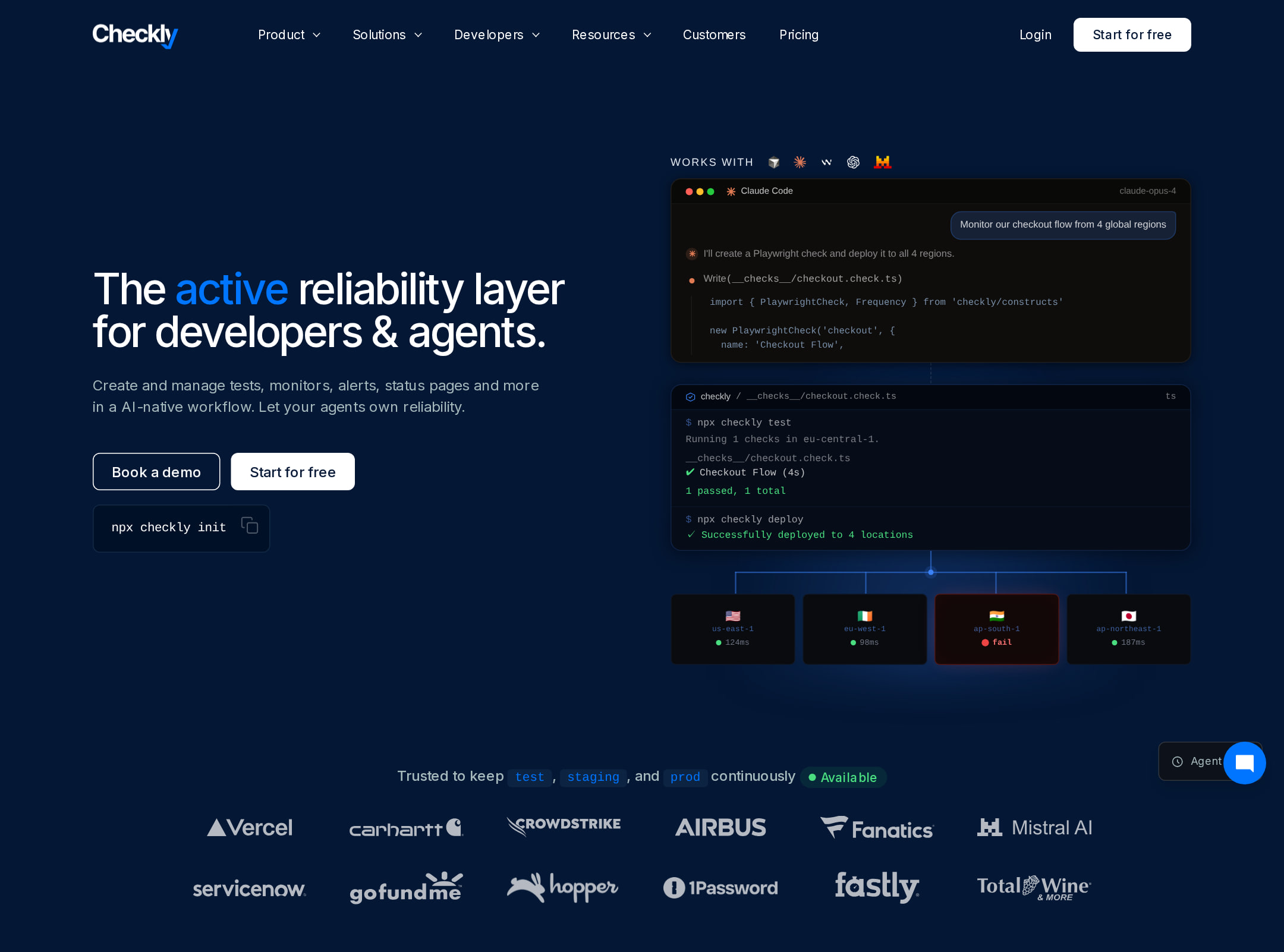
A visually distinctive and commercially focused developer SaaS homepage with strong product storytelling, but it needs substantial accessibility and legibility refinement.
Best practices
The page has one detected H1, a semantic navigation region, a main landmark, and a semantic footer. However, the automated observations identify serious implementation issues that lower the score.
What works
- Clear primary page structure with navigation, hero, main content, and footer landmarks.
- One H1 establishes a single top-level page topic.
- The page provides multiple forms of product evidence, including code, interface previews, customer proof, and integrations.
- Next.js and JSON-LD are supplied as implementation signals.
Opportunities
- Address the 180 reported text-contrast failures, especially in navigation, muted copy, code examples, and supporting labels.
- Add accessible names or visible labels to the 10 reported unlabeled controls and two unnamed links.
- Remove duplicate IDs for glow and signal-related elements to improve DOM reliability.
- Repair the reported heading-level skip and review heading hierarchy across the long page.
Design
A strong, coherent dark-mode system makes the site feel tailored to developers and reliability tooling. The visual language is polished, though the page sometimes sacrifices immediate readability for atmosphere and density.
What works
- Deep navy backgrounds, white typography, and green/blue status accents form a consistent product-oriented palette.
- Code blocks and dashboard previews make the product category legible without relying only on abstract claims.
- The page uses varied section compositions, including split layouts, cards, timelines, integrations, testimonials, and workflow demonstrations.
- Product screenshots are integrated into the narrative rather than isolated in a generic feature grid.
Opportunities
- Increase type size and contrast for secondary copy and interface annotations that appear very small in the supplied screenshot.
- Reduce the number of visually dense sections or add stronger spacing and grouping to make the long page easier to scan.
- Use a more consistent visual scale for screenshots and supporting text so lower-page sections do not feel uneven.
Uniqueness
The combination of code-first testing, monitoring interfaces, and reliability workflow storytelling gives the page a credible developer-tool identity. The dark SaaS aesthetic is familiar, but the execution is more product-specific than generic.
What works
- The homepage connects testing, monitoring, incident communication, and resolution into one visual narrative.
- Animated and static code representations reinforce the developer audience and distinguish the page from screenshot-only SaaS sites.
- The interface previews show operational context rather than merely decorative product screens.
- The AI and agent-oriented sections reflect a contemporary reliability workflow positioning.
Opportunities
- Make the central differentiator more explicit earlier, since the hero positioning is compact and may require subsequent scrolling to understand the full product scope.
- Give the most distinctive code-to-monitoring workflow a stronger signature visual motif that can be recognized independently of the brand.
User experience
The information architecture supports a long consideration journey, but dense content, small text, motion, and reported accessibility defects create friction for scanning and interaction.
What works
- The navigation appears comprehensive, with grouped product, persona, use-case, developer, and resource paths.
- The page follows a sensible progression from positioning and proof to capabilities, integrations, onboarding, and footer resources.
- Repeated product visuals provide context for visitors evaluating a technical platform.
- A signup-oriented CTA is present in the hero and again near the lower-page onboarding section.
Opportunities
- Provide clearer visual section landmarks and a compact jump navigation for a homepage of this length.
- Ensure all animated code and interface motion respects the user's reduced-motion preference; the supplied observations record 17 animated elements and no detected reduced-motion preference.
- Improve contrast and control naming before relying on the current navigation and interactive product examples.
- Consider shortening or collapsing lower-priority explanatory sections for visitors who need a faster route to pricing, documentation, or signup.
Conversion optimization
For a developer SaaS landing page, the homepage offers a credible conversion path through a clear hero, technical evidence, customer proof, integrations, and a low-friction signup message. Conversion effectiveness is constrained by the amount of content and by CTA and text legibility issues visible in the screenshot.
What works
- The hero establishes the audience and product category quickly, with a prominent product preview beside the positioning copy.
- Technical buyers receive evidence in the formats they value: code, dashboards, integrations, workflow descriptions, and customer testimony.
- The page answers several evaluation questions, including how the product fits development workflows and how users can get started.
- The lower-page onboarding message gives the signup action a concrete time-oriented promise.
Opportunities
- Increase CTA prominence and contrast consistently across the page, particularly where buttons and small links sit against the dark background.
- Surface pricing, trial terms, or a more explicit evaluation path earlier if those details are available elsewhere in the site.
- Add concise proof points near the hero so visitors can assess trust before committing to the long scroll.
- Use clearer CTA labels that distinguish signup, documentation, demo, and product exploration actions.
What we'd improve
- 01high
Fix contrast and accessible naming defects
Audit the 180 reported contrast failures, prioritizing navigation, muted body copy, code annotations, and CTA states. Add programmatic names to the 10 unlabeled controls and two unnamed links, then re-run accessibility checks across desktop and responsive layouts.
- 02high
Repair DOM identifiers and heading structure
Make glow, signal-glow, and signal-gradient IDs unique or replace them with reusable classes, and correct the reported heading-level skip so the long-form page has a predictable semantic outline.
- 03medium
Improve long-page scanning
Add stronger section labels, a compact in-page contents mechanism, or more pronounced visual breaks so visitors can move directly to testing, monitoring, integrations, documentation, or signup.
- 04medium
Strengthen the above-the-fold conversion case
Pair the hero CTA with a short trust or proof row and clarify the next step, such as free signup, trial scope, documentation access, or demo request, without requiring visitors to interpret the product preview.
- 05low
Tune motion and visual density
Verify that code scrolling, pulse, ping, and hero transitions pause or simplify under prefers-reduced-motion, and consider reducing decorative motion where it competes with small explanatory text.