

Pentagram website analysis
A detailed critique of the homepage's craft, originality, usability, and ability to move visitors toward its intended goal.
Our observations
An exceptional, highly recognizable agency portfolio that merits inclusion for its visual direction and editorial structure. It should receive implementation review before being treated as an accessibility benchmark.
Best practices
The page has a clear semantic navigation region, one detected H1, a substantial footer, and a newsletter form. However, the accessibility findings indicate meaningful quality gaps in contrast, link naming, heading structure, and ID uniqueness.
What works
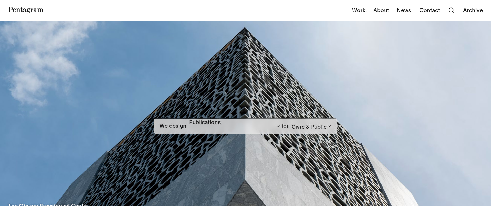
- The header and navigation are clearly established above the fold.
- The page exposes a broad project set rather than relying on a single promotional hero.
- A newsletter form and footer provide a defined downstream engagement point.
- Project groupings and headings create a recognizable content hierarchy.
Opportunities
- Resolve the 24 reported contrast failures, especially text placed over project imagery.
- Give the four absolute news links accessible names that describe their destinations.
- Remove duplicate IDs for mainNavHeading and thematicIndex.
- Correct the reported heading-level skip and verify the hierarchy across thematic sections.
Design
The visual system is exceptionally controlled and well suited to a design consultancy: alternating tonal environments, large type, generous gutters, and varied project compositions make the work itself the primary interface.
What works
- The dark/light alternation creates strong pacing across an unusually long homepage.
- Large typographic section titles give otherwise varied project collections a consistent editorial framework.
- Project imagery is arranged in varied grids and scales without losing the overall brand language.
- The restrained black, white, gray, and occasional vivid project colors keep attention on the featured work.
Opportunities
- Introduce more explicit visual markers for section boundaries or progress on the very long page.
- Consider slightly more consistent project-card metadata so the portfolio is easier to compare and scan.
- Review image-overlay treatment at different image tones to preserve legibility without reducing the visual impact.
Uniqueness
The page feels authored rather than template-driven. Its thematic sequencing, collage-like portfolio blocks, and confident use of black space are distinctive within agency portfolio design.
What works
- The editorial, thematic framing gives the portfolio more character than a conventional case-study index.
- The combination of large statements and compact image clusters reflects the subject matter of a multidisciplinary design studio.
- The page uses the studio’s own design sensibility as the organizing device rather than depending on generic agency tropes.
Opportunities
- Make the underlying thematic logic more immediately discoverable for first-time visitors.
- A small amount of explanatory context could clarify why projects are grouped together without weakening the art direction.
User experience
The visual hierarchy supports browsing and discovery, but the page’s extreme length and image-heavy presentation increase navigation effort. The supplied scan also identifies serious contrast and link-label issues that may impede some users.
What works
- The latest-projects area provides a direct route into current work, including projects such as De Niro Con, Pfizer, and Jetour.
- Multiple project groupings support exploratory browsing across disciplines and subjects.
- The strong contrast between section modes helps users recognize changes in content type.
- The footer provides clear access to additional site content and newsletter signup.
Opportunities
- Add persistent or more prominent filtering, thematic navigation, or a table of contents so visitors can reach relevant work faster.
- Ensure every image-led link exposes a useful text label and preserves that label at all responsive sizes.
- Test the long page on mobile and with keyboard navigation; the supplied data does not establish behavior or usability across those conditions.
- Reduce ambiguity in image-only or overlay-driven cards by pairing them with consistently visible project names and categories.
Conversion optimization
For a reputation-led consultancy, the homepage’s primary conversion is confidence and project discovery rather than an aggressive sales action. The volume and quality of work build credibility effectively, while the newsletter is a secondary engagement path; a more explicit inquiry route could improve business conversion.
What works
- The breadth of named work demonstrates range across cultural, commercial, editorial, and technology projects.
- Recognizable project names and a polished presentation provide strong proof of capability.
- The latest-projects module signals ongoing activity and keeps the portfolio from feeling archival.
- The newsletter form creates a low-commitment way to continue the relationship.
Opportunities
- Make the route for prospective clients to start a conversation more prominent near the beginning and at meaningful portfolio intervals.
- Add concise service or discipline labels to project entries so visitors can quickly assess relevance.
- Use selected project summaries or outcomes alongside imagery to convert visual interest into a clearer understanding of value.
- Provide a persistent contact or inquiry affordance without competing with the portfolio presentation.
What we'd improve
- 01high
Repair contrast and accessible naming
Audit the 24 reported contrast failures, prioritizing text overlays in the swiper and project imagery. Add programmatic, descriptive names to the four unnamed footer-news links and verify them with keyboard and screen-reader checks.
- 02high
Fix document structure defects
Remove duplicate mainNavHeading and thematicIndex IDs, then correct the reported heading-level skip. Recheck the complete heading outline after dynamic and thematic sections render.
- 03medium
Improve long-page navigation
Add a visible contents mechanism, filter, or thematic index that lets visitors jump directly to disciplines and project groups, with an accessible current-state indication.
- 04medium
Strengthen the client inquiry path
Place a clearly labeled contact or project-inquiry action in the header or early homepage and repeat it near the footer, while retaining newsletter signup as a lower-commitment option.
- 05low
Clarify project-card context
Pair image-led cards with consistent visible metadata such as discipline, year, or project type so visitors can scan the portfolio without relying solely on visual recognition.